
I usually drag this chart out after quarterly earnings have been finalized, but I'm hearing a lot about bargain hunting, and I thought that a dose of reality was called for. (If you've never seen this chart before, welcome to DecisionPoint -- an explanation for the chart can be found immediately below it.) We can see that, in spite of the beating the market has taken, it is still above the top of the normal value range, which spans P/Es between 10 and 20. As of today the S&P 500 P/E is over 22, so there is no cushion of fundamental value under the market. In fact the market would have to decline another -10% just to become merely overvalued with a P/E of 20.
I am not saying that we wait until the market gets back down to the undervalued level to get back in -- the last time the market was undervalued was 1984 -- I am simply saying that we shouldn't delude ourselves into thinking that a less overvalued price is a "bargain."
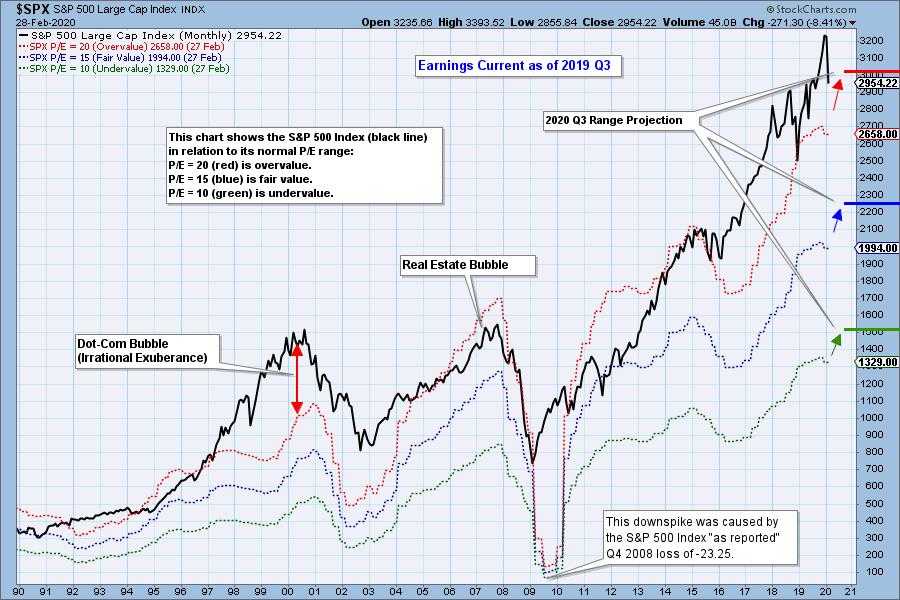
* This chart shows us the normal value range of the S&P 500 Index, indicating where the S&P 500 would have to be in order to have an overvalued P/E of 20 (red line), a fairly valued P/E of 15 (blue line) or an undervalued P/E of 10 (green line). There are three hash marks on the right side of the chart, which show where the range markers are projected be at the end of 2020 Q3.
The DecisionPoint Alert Weekly Wrap presents an end-of-week assessment of the trend and condition of the Stock Market, the U.S. Dollar, Gold, Crude Oil, and Bonds. The DecisionPoint Alert daily report (Monday through Thursday) is abbreviated and gives updates on the Weekly Wrap assessments.
Watch the latest episode of DecisionPoint on StockCharts TV's YouTube channel here!
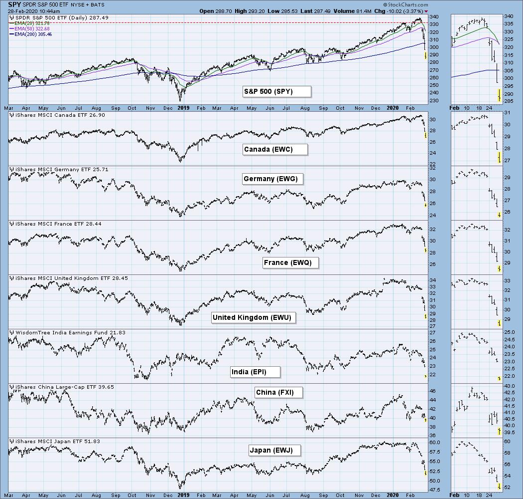
GLOBAL MARKETS
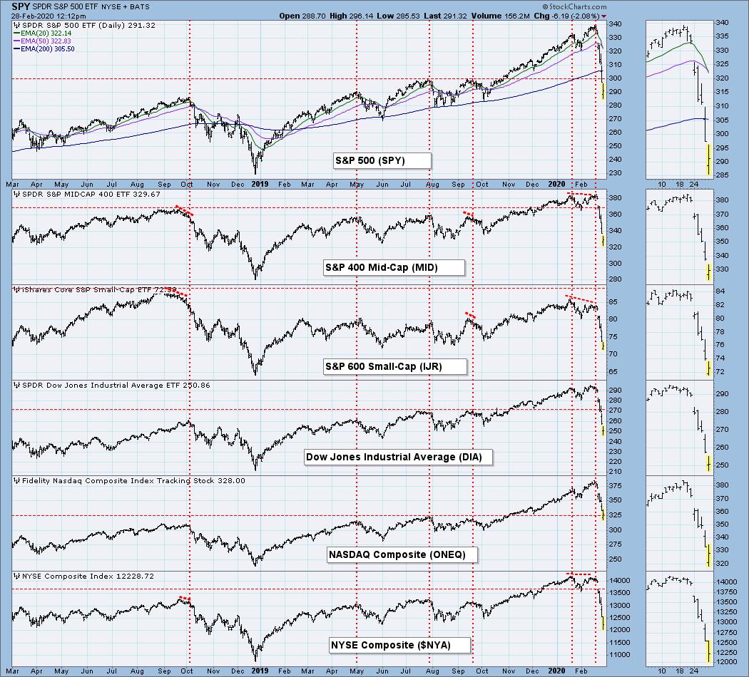
BROAD MARKET INDEXES
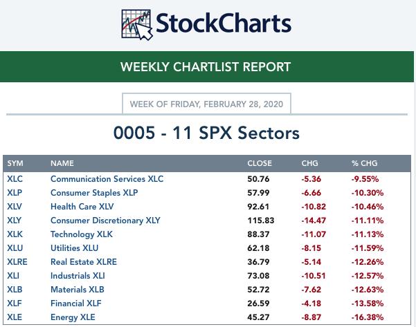
SECTORS
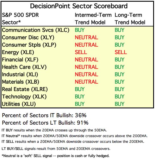
Each S&P 500 Index component stock is assigned to one, and only one, of 11 major sectors. This is a snapshot of the Intermediate-Term (Silver Cross) and Long-Term (Golden Cross) Trend Model signal status for those sectors.
ETF TRACKER: This is a list of about 100 ETFs intended to track a wide range of U.S. market indexes, sectors, global indexes, interest rates, currencies, and commodities. StockCharts.com subscribers can acquire it in the DecisionPoint Trend and Condition ChartPack.
Top 10 . . .
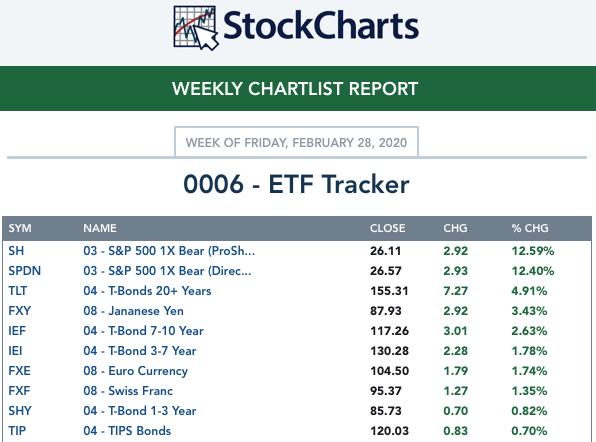
. . . and bottom 10: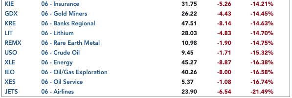
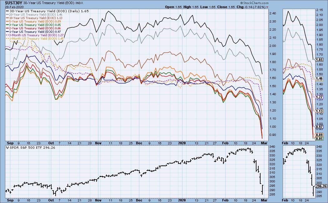
INTEREST RATES
This chart is included so we can monitor rate inversions. In normal circumstances the longer money is borrowed the higher the interest rate that must be paid. When rates are inverted, the reverse is true.
STOCKS
IT Trend Model: BUY as of 9/6/2019
LT Trend Model: BUY as of 2/26/2019
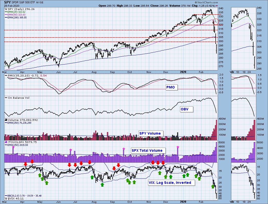
SPY Daily Chart: Today the 20EMA dropped below the 50EMA, causing the IT Trend Model to change from BUY to NEUTRAL. That alone is a sign that we'll see a bounce next week, if only for a day or two. On Friday SPX Total Volume was 252% of the one-year average daily volume, quite a bit higher than the volume on the four quadruple-witching options expiration shown (pink asterisk).
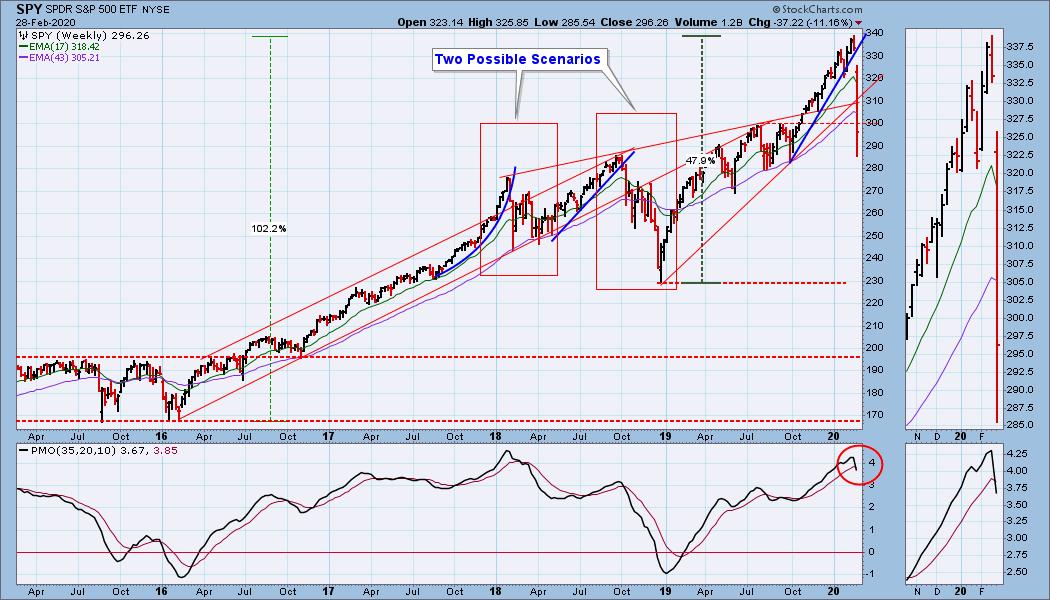
SPY Weekly Chart: The weekly PMO has crossed down through the signal line, which is negative for the long-term. I have boxed off two previous tops and the aftermath that followed them. I'll mention them again below, but they are examples of what I think we can expect next.
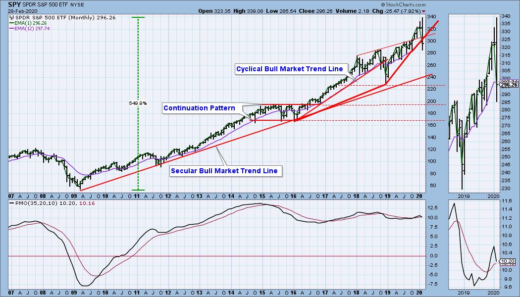
SPY Monthly Chart: The monthly PMO is falling, but it is still above the signal line.
Climactic Market Indicators: I rarely show a traditional view of the VIX, but it illustrates the importance of this week's reading. On four previous occasions, readings as low as this week's signaled the beginning of bottom formation, though not necessarily the bottom.
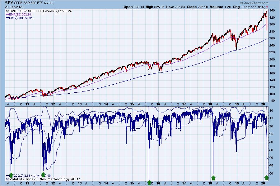
There were climactic readings all this week, but Thursday and Friday were the most intense. With SPY closing on its high on Friday, it is a good chance that it was an exhaustion climax, meaning there is a good chance of a bounce Monday.
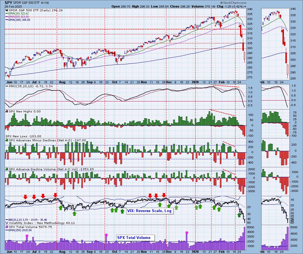
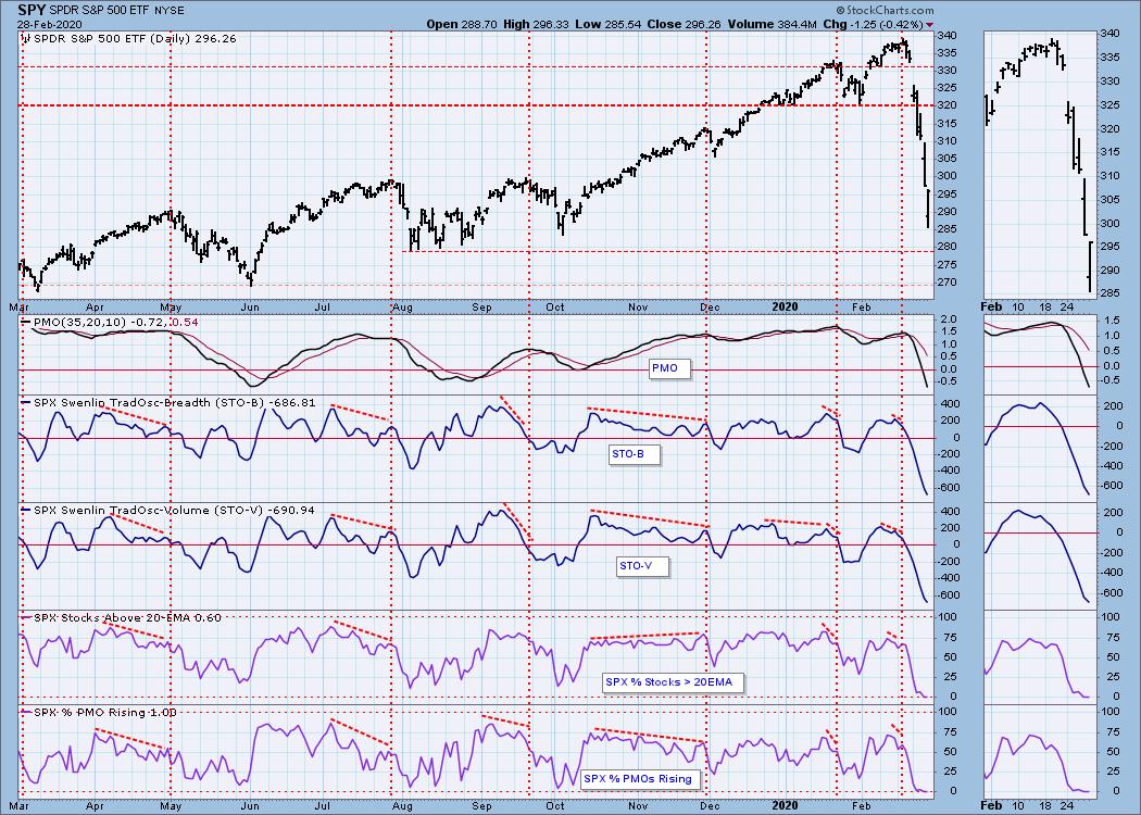
Short-Term Market Indicators: The short-term market trend is DOWN and the condition is OVERSOLD. The STO-B and STO-V are extremely oversold.
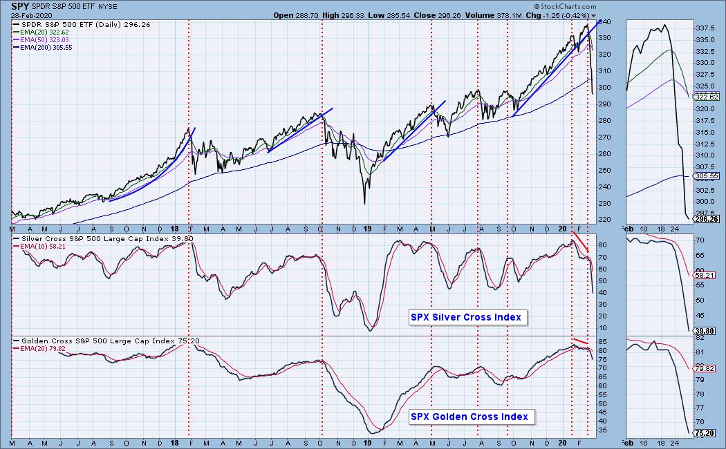
Intermediate-Term Market Indicators: The intermediate-term market trend is DOWN. The condition is NEUTRAL based upon the Silver Cross Index and still OVERBOUGHT based upon the longer-term Golden Cross Index.
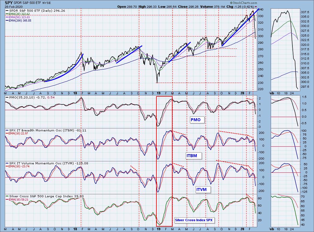
These indicators are OVERSOLD based upon their lows after March 2019, but we must consider that the bear is back in town, in which case the December 2018 lows would be the relevant benchmark, and current readings would be NEUTRAL.
CONCLUSION: Back in the day when they made westerns, a cattle drive movie had to have at least one stampede. You know, the cattle are quietly grazing for the night, and then back at the chuck wagon the cook drops a pie pan on a rock and all hell breaks loose. The cattle panic and start running over everything in their path.
In the current stock market we are seeing a panic, or at least it is the closest thing to a panic that I have seen in my many years as a market observer. And I am stunned at the irrationality of it all. The catalyst is the coronavirus, which so far is nowhere near as deadly as the flu, which killed about 80,000 Americans in the 2017-2018 flu season. Nevertheless, a reminder, do not stand in front of the cattle while they are stampeding. Also, the stampede can stop almost as quickly as it started, hence my expectation of a bounce on Monday.
This is not to say that there is nothing to see here. On the contrary, the media focus has created a situation where real fundamental damage (not to mention technical damage) is being done, due to the supply chain disruptions, etc. Can you imagine if every flu season were treated with the same hyper-focus as coronavirus has been treated? On the other hand, maybe fewer people would die if it were. At any rate, it will take some time for companies to recover from this huge disruption.
I mentioned before on the weekly chart above that we can see two prior corrections (early-2018 and mid-2018) that provide roadmaps for how this correction may resolve. Both started with a sharp decline, and both chopped sideways for a few months. After the sideways chop, the first correction ended by rallying higher, and the second correction broke down, turning that correction into a bear market. There are plenty of other ways this can turn out, but I'll be looking for something that looks like those two examples.
Be sure to watch Erin and me on StockCharts TV on Monday at 5 PM ET.
Have you subscribed the DecisionPoint Diamonds yet? DP does the work for you by providing handpicked stocks/ETFs from exclusive DP scans! Add it with a discount! Contact support@decisionpoint.com for more information!
DOLLAR (UUP)
IT Trend Model: BUY as of 1/22/2020
LT Trend Model: BUY as of 5/25/2018
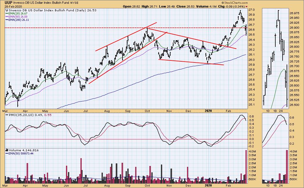
UUP Daily Chart: UUP may be headed lower. It broke support on Friday, and the PMO id below the signal line and falling.
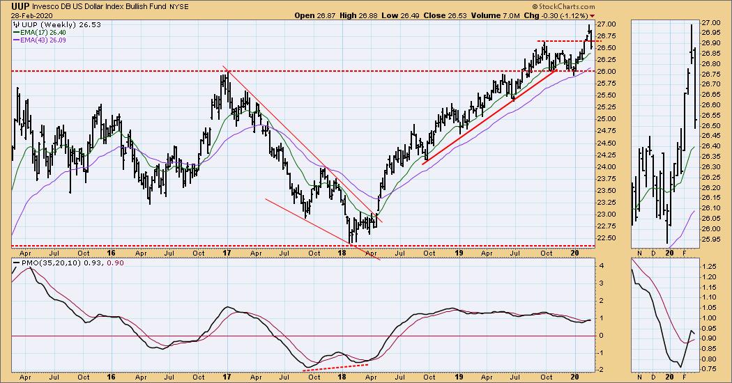
UUP Weekly Chart: Immediate support has been broken, but longer-term support looks strong.
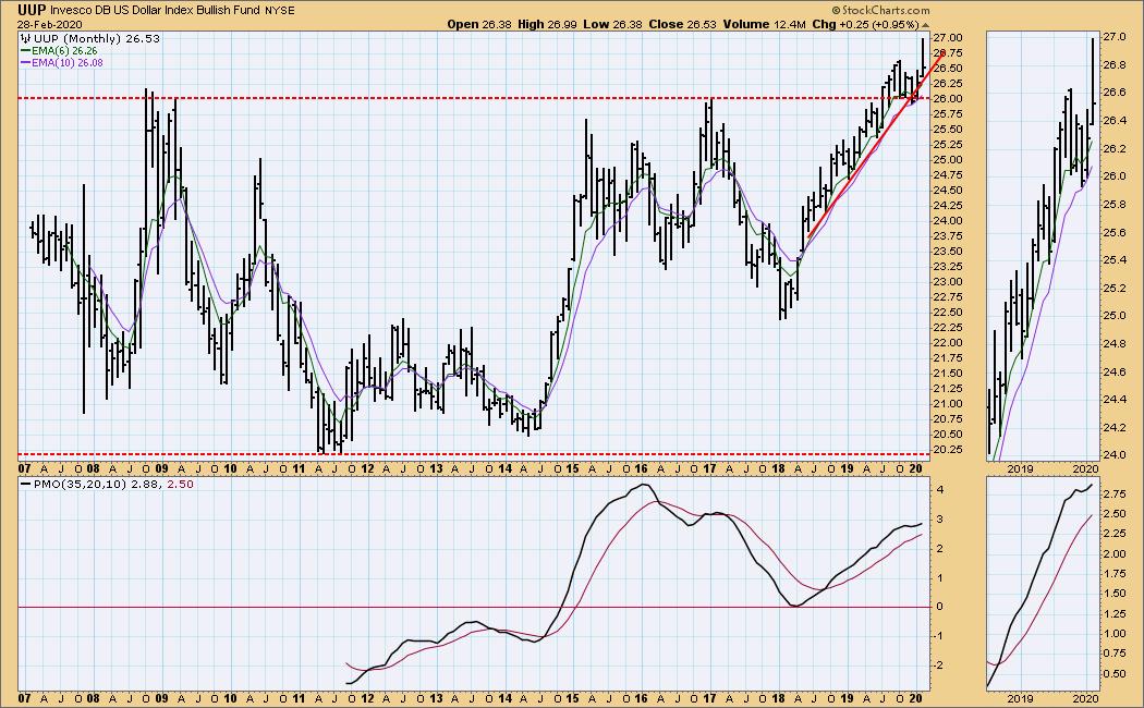
UUP Monthly Chart: We can see that the support is very long-term.
GOLD
IT Trend Model: BUY as of 12/26/2019
LT Trend Model: BUY as of 1/8/2019
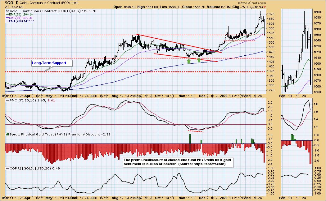
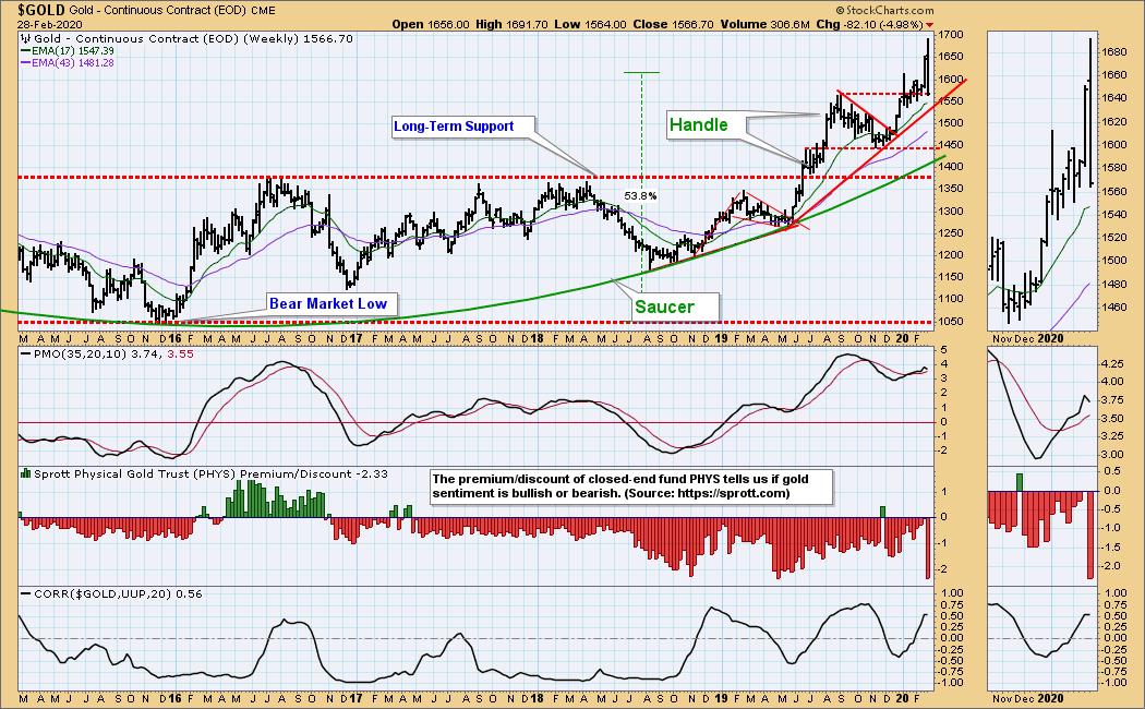
GOLD Daily Chart: At first gold seemed to benefit from the flight to safety from stocks, but I have no idea what happened on Friday, and I have yet to find a rational for it elsewhere. The daily PMO is close to crossing down through the signal line.
GOLD Weekly Chart: The saucer with handle delivered on expectations, and horizontal support has held. The weekly PMO has turned down.
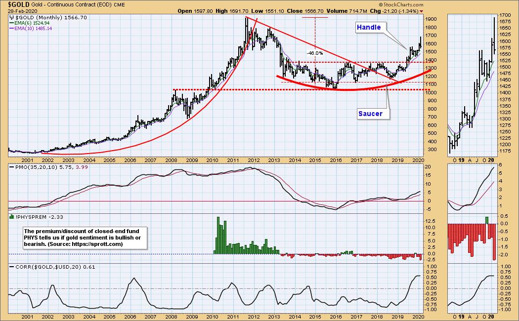
GOLD Monthly Chart: In this time frame gold still looks pretty solid.
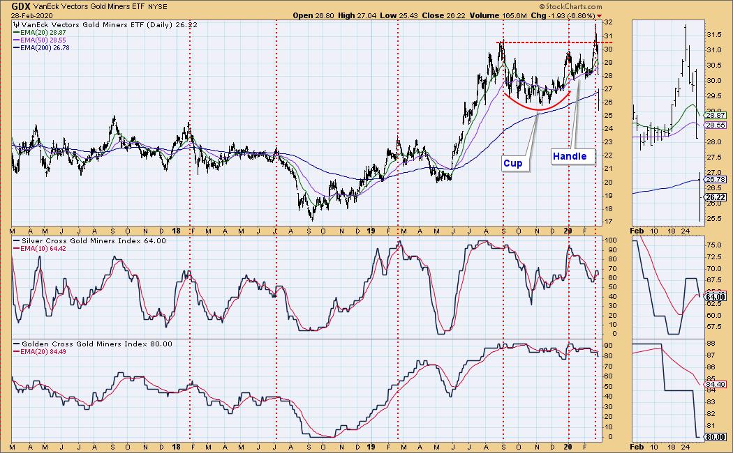
GOLD MINERS Golden and Silver Cross Indexes: The cup with handle formation on this chart has aborted.
CRUDE OIL (USO)
IT Trend Model: NEUTRAL as of 1/27/2020
LT Trend Model: SELL as of 2/3/2020
USO Daily Chart: USO has killed support, but it has held at the December 2018 low.
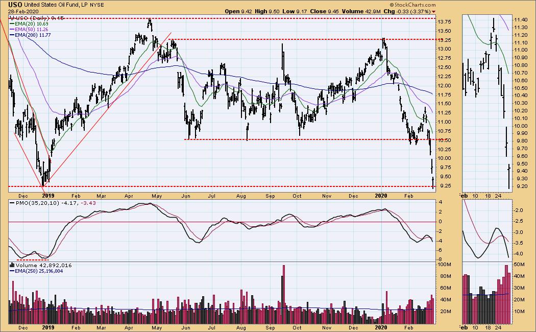
USO Weekly Chart: USO has fallen to a lower level of support, but the way it is behaving, a drop to the 2016 low (WTIC 25) does not seem out of the question.
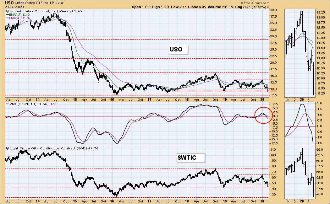
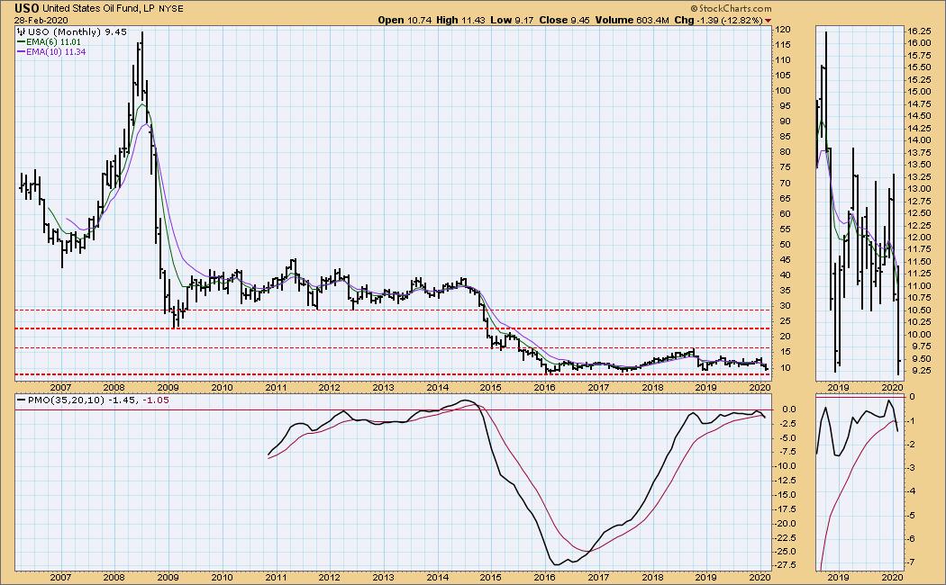
USO Monthly Chart: The bottom of the basing pattern is at 7.50.
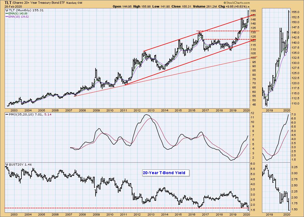
BONDS (TLT)
IT Trend Model: BUY as of 1/22/2020
LT Trend Model: BUY as of 1/2/2019
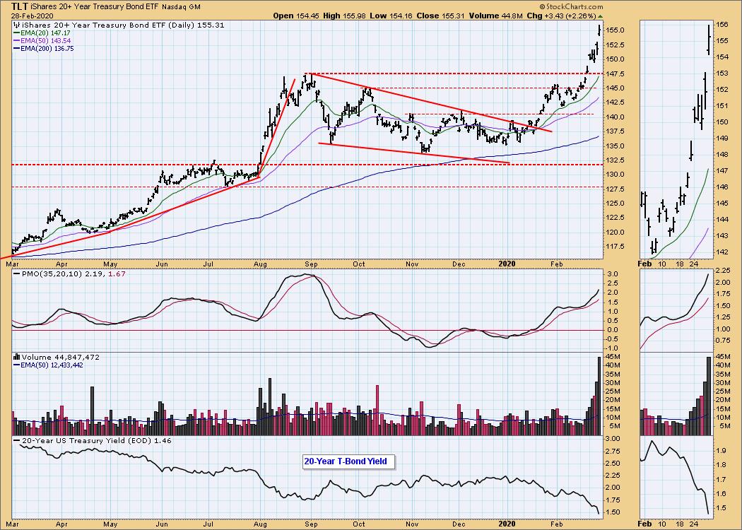
TLT Daily Chart: Bonds have attracted a lot of the "flight to safety" money, so prices are rising and yields are dropping.
TLT Weekly Chart: Decisive breakout, but the advance is getting a bit too steep.
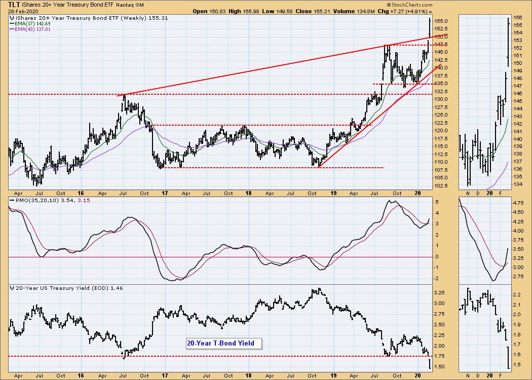
TLT Monthly Chart: TLT has even cleared the long-term rising trend channel.
Technical Analysis is a windsock, not a crystal ball.
Happy Charting! - Carl
NOTE: The signal status reported herein is based upon mechanical trading model signals, specifically, the DecisionPoint Trend Model. They define the implied bias of the price index based upon moving average relationships, but they do not necessarily call for a specific action. They are information flags that should prompt chart review. Further, they do not call for continuous buying or selling during the life of the signal. For example, a BUY signal will probably (but not necessarily) return the best results if action is taken soon after the signal is generated. Additional opportunities for buying may be found as price zigzags higher, but the trader must look for optimum entry points. Conversely, exit points to preserve gains (or minimize losses) may be evident before the model mechanically closes the signal.
Helpful DecisionPoint Links:
DecisionPoint Alert Chart List
DecisionPoint Golden Cross/Silver Cross Index Chart List
DecisionPoint Sector Chart List
Price Momentum Oscillator (PMO)
Swenlin Trading Oscillators (STO-B and STO-V)