
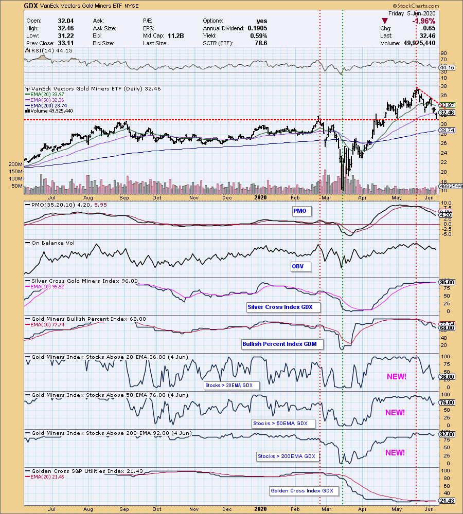
This week we added some indicators to the Gold Miners Index (GDX) chart. First, Erin really likes the RSI, so she encouraged me to put that on the daily charts, GDX included. Next, the Stocks Above Their 20EMA, 50EMA, and 200EMA indicators are some of my faves, and StockCharts.com is now calculating the GDX version of them for us. What do these indicators tell us? When price is above a particular EMA (Exponential Moving Average), we can consider it to be positive in that time frame. Pretty simple.
The DecisionPoint Alert Weekly Wrap presents an end-of-week assessment of the trend and condition of the Stock Market, the U.S. Dollar, Gold, Crude Oil, and Bonds. The DecisionPoint Alert daily report (Monday through Thursday) is abbreviated and gives updates on the Weekly Wrap assessments.
Watch the latest episode of DecisionPoint on StockCharts TV's YouTube channel here!
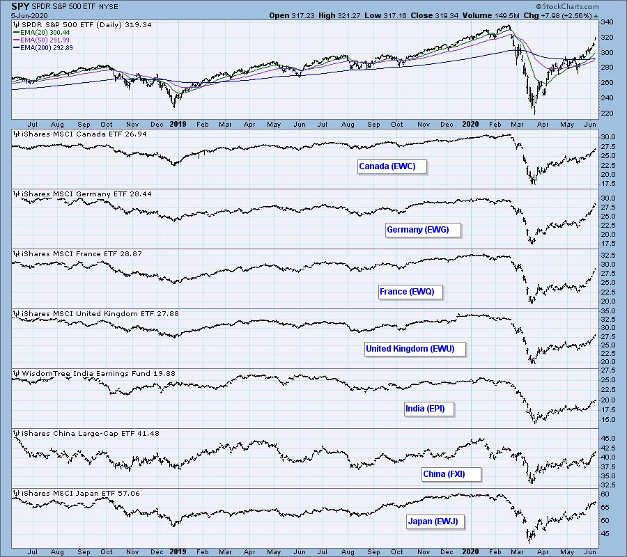
GLOBAL MARKETS
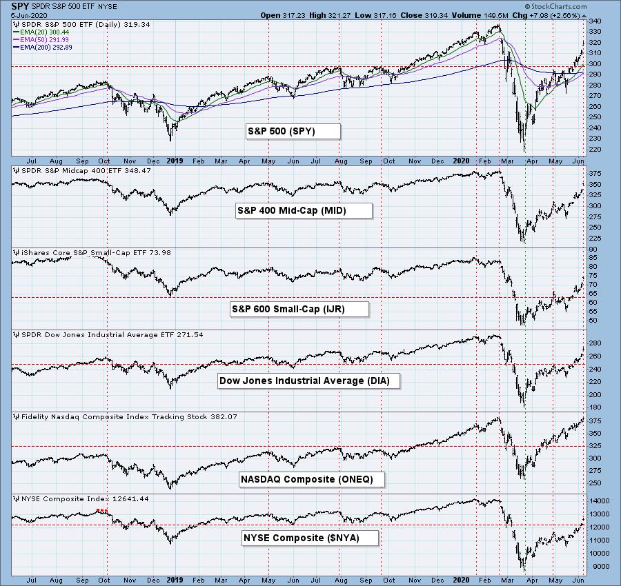
BROAD MARKET INDEXES
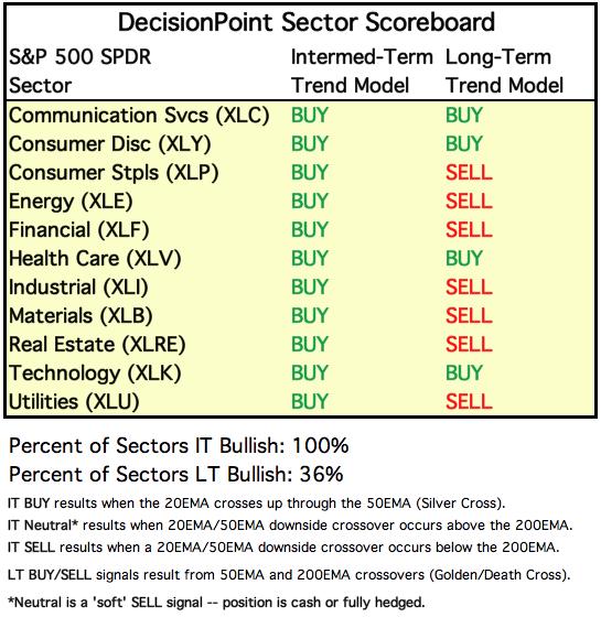
SECTORS
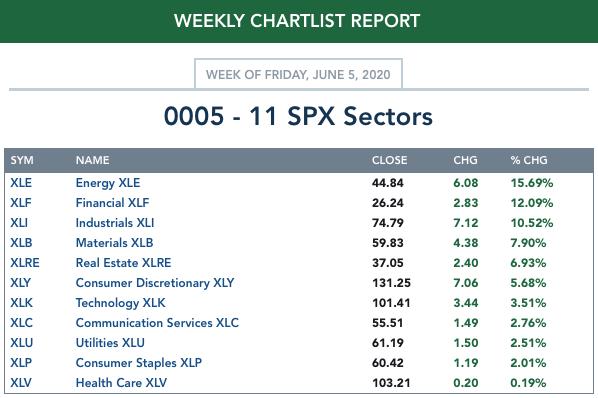
Each S&P 500 Index component stock is assigned to one, and only one, of 11 major sectors. This is a snapshot of the Intermediate-Term (Silver Cross) and Long-Term (Golden Cross) Trend Model signal status for those sectors.
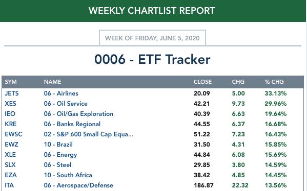
ETF TRACKER: This is a list of about 100 ETFs intended to track a wide range of U.S. market indexes, sectors, global indexes, interest rates, currencies, and commodities. StockCharts.com subscribers can acquire it in the DecisionPoint Trend and Condition ChartPack.
Top 10 . . .
. . . and bottom 10: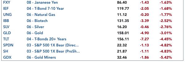
INTEREST RATES
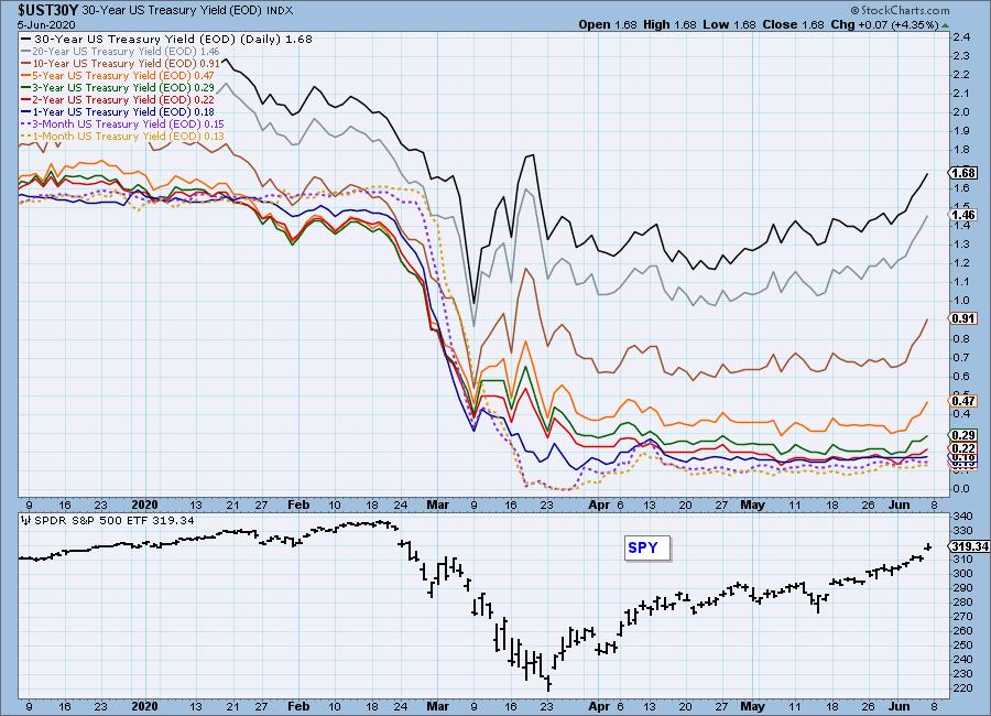
This chart was originally included so we can monitor rate inversions. Currently, we're more concerned with rates going to or below zero.
STOCKS
IT Trend Model: BUY as of 5/8/2020
LT Trend Model: SELL as of 3/19/2020
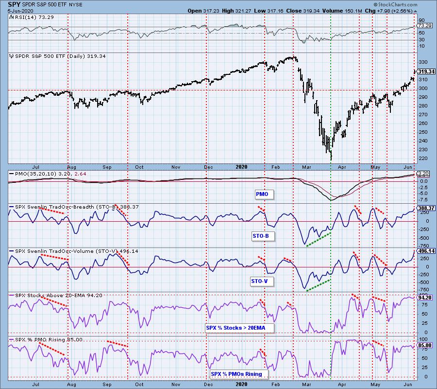
SPY Daily Chart: On Wednesday, ADP reported that there were only 2.76 million job losses for May, versus an expected 8 million jobs lost. On Friday, the Labor Department reported that 2.5 million jobs had been added, and that the Unemployment Rate dropped to 13.3% versus an expected 19.8%. These positive reports gave an enormous boost to the market, with those two days accounting for most of the week's nearly +5% gain.
Friday's candlestick is a bearish shooting star, although I'd like to see a longer tail. Also, Friday's up gap and high volume could be the sign of a blowoff. (See the climax chart below.)
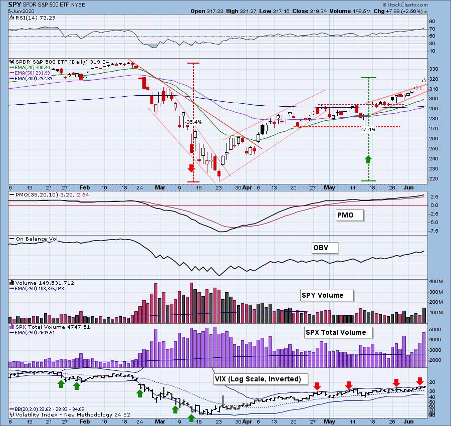
Everything on this chart says overbought.
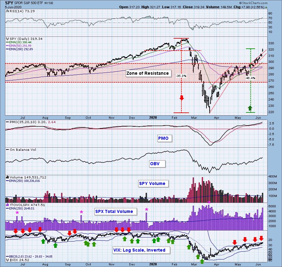
SPY Weekly Chart: The rally is vertical in longer time frames, which has about the same implications as a parabolic up move. Negative.
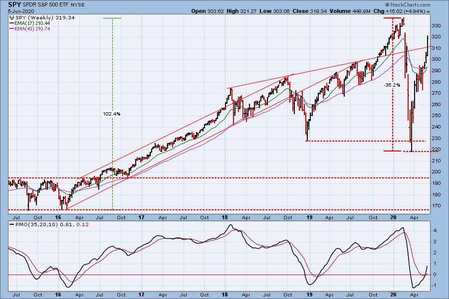
Climactic Market Indicators: We have numerous climactic readings today, and because of the up trend, we must interpret as an exhaustion climax. For the last three weeks, price is arcing into a parabolic that will have negative repercussions in this time frame, meaning not as serious as it would be with a parabolic on a monthly chart.
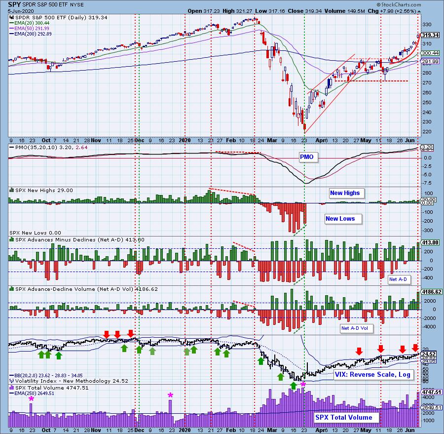
Short-Term Market Indicators: The short-term market trend is UP and the condition is OVERBOUGHT.
Intermediate-Term Market Indicators: The Silver Cross and Bullish Percent Indexes are very overbought. The Golden Cross Index shows that there are still 65% of SPX stocks with a 50EMA below the 200EMA.
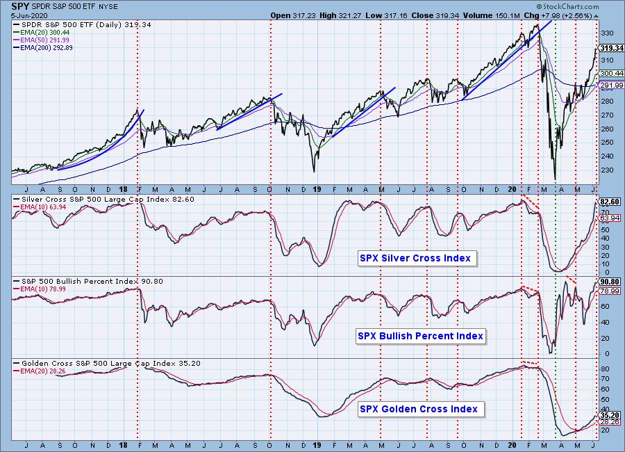
The intermediate-term market trend is UP and the condition is OVERBOUGHT. The PMO at 3.2 is very overbought. The Percent of PMO Crossover BUY Signals has a sharp negative divergence.
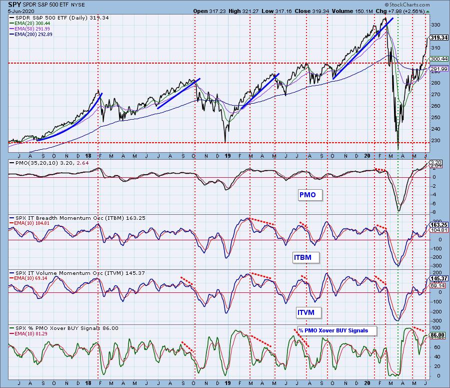
CONCLUSION: There is no ambiguity regarding the condition of the market. It is overbought. Overbought indicator readings can precede price tops by several weeks, but they can also coincide with the price top. Today's action appears to be a blowoff, seconded by an upside exhaustion climax, so in my opinion, that points toward the overbought conditions causing a pullback to start next week. We shall see.
There is a Fed meeting next week with the announcement on Wednesday. There has been no hint of another rate cut, and in my opinion, there is virtually no chance that they will raise rates.
Have you subscribed the DecisionPoint Diamonds yet? DP does the work for you by providing handpicked stocks/ETFs from exclusive DP scans! Add it with a discount! Contact support@decisionpoint.com for more information!
DOLLAR (UUP)
IT Trend Model: NEUTRAL as of 5/28/2020
LT Trend Model: BUY as of 5/25/2018
UUP Daily Chart: The bottom of the trading range was violated last week, and a persistent decline ensued. Being oversold, UUP seemed to be starting a bottom on Friday.
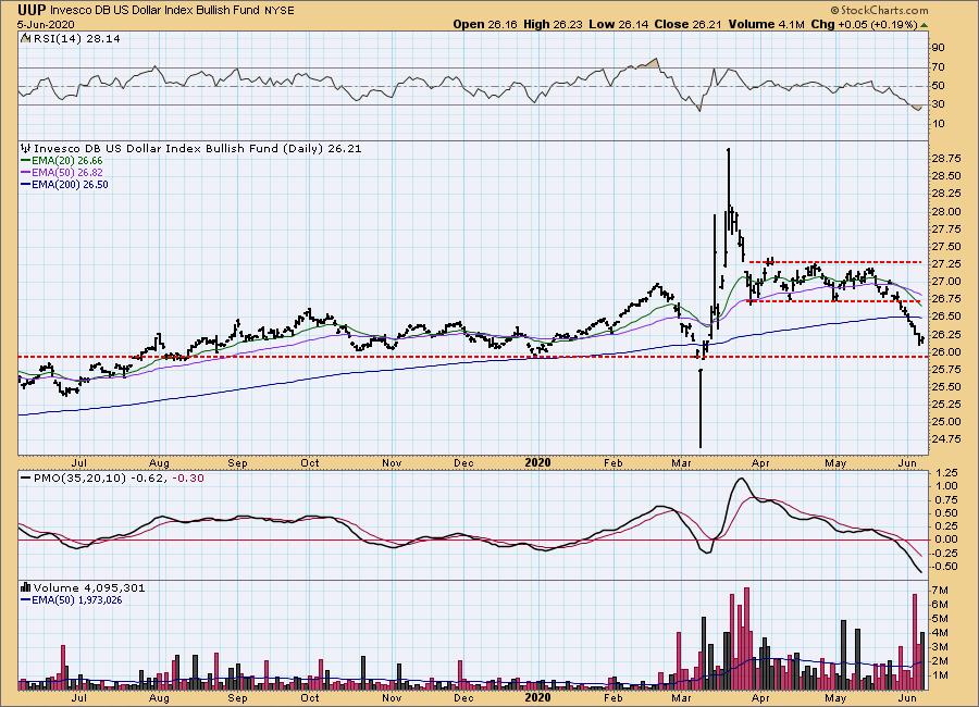
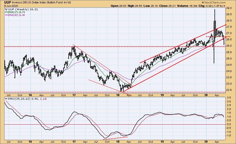
UUP Weekly Chart: After the horizontal support failed, the rising trend line failed shortly thereafter. UUP is now approaching long-term horizontal support. This will be an important test.
GOLD
IT Trend Model: BUY as of 3/24/2020
LT Trend Model: BUY as of 1/8/2019
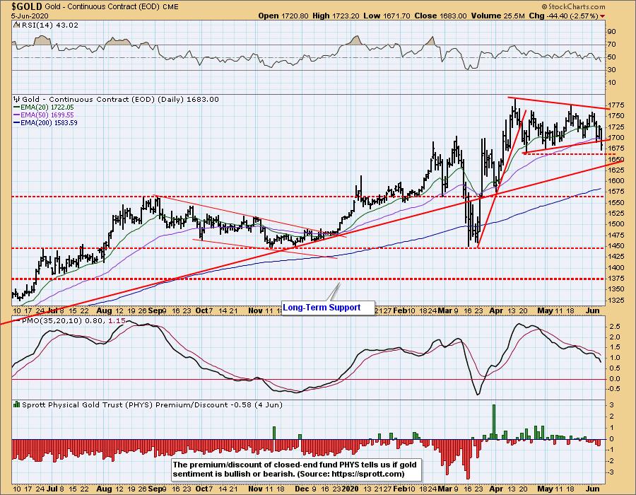
GOLD Daily Chart: The bottom of the bullish pennant formation has been tested for two weeks, and it finally succumbed on Friday. Next is an horizontal support line drawn from the mid-April low. There is also quite a bit of congestion at that level in February and March, but before we can look for gold's decline to stop, we need to see the daily PMO turn up.
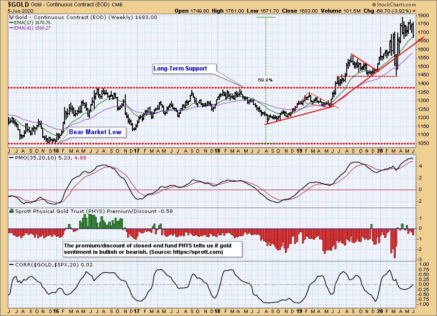
GOLD Weekly Chart: A decline back to the rising trend line (about 1650) won't inflict serious technical damage in this time frame. Note, when drawing that rising trend line, I ignored the March down spike, considering it an aberration. The weekly PMO has turned down, a negative sign.
GOLD MINERS Index: GDX is in decline and not at all oversold yet. It has reached a good level for support based upon three previous tops.

CRUDE OIL ($WTIC)
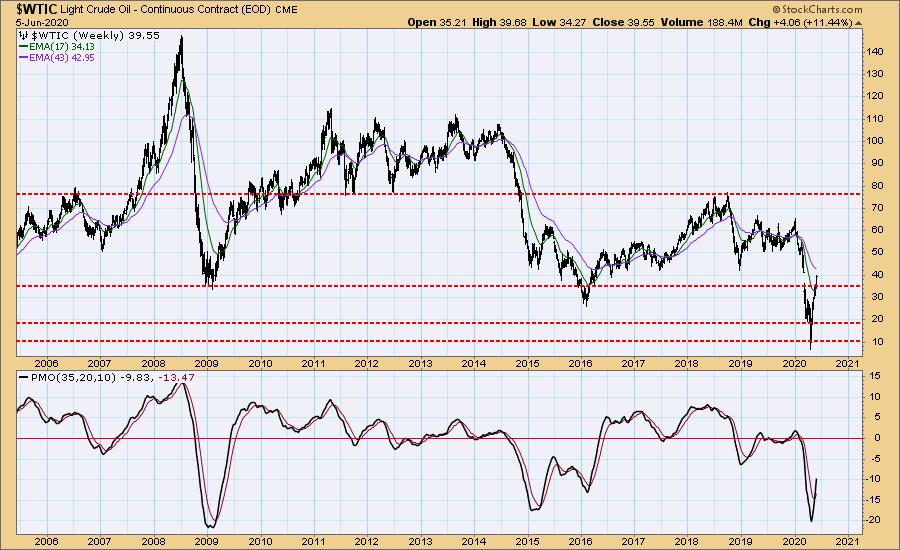
Until further notice we will use $WTIC to track the oil market. Since this is a continuous contract dataset, it doesn't "play well" with our Trend Models, and we will not report Trend Model signals for oil.
$WTIC Daily Chart: Crude oil is trying to fill the March gap. If it is able to do so, it could be subject to a very overbought condition.
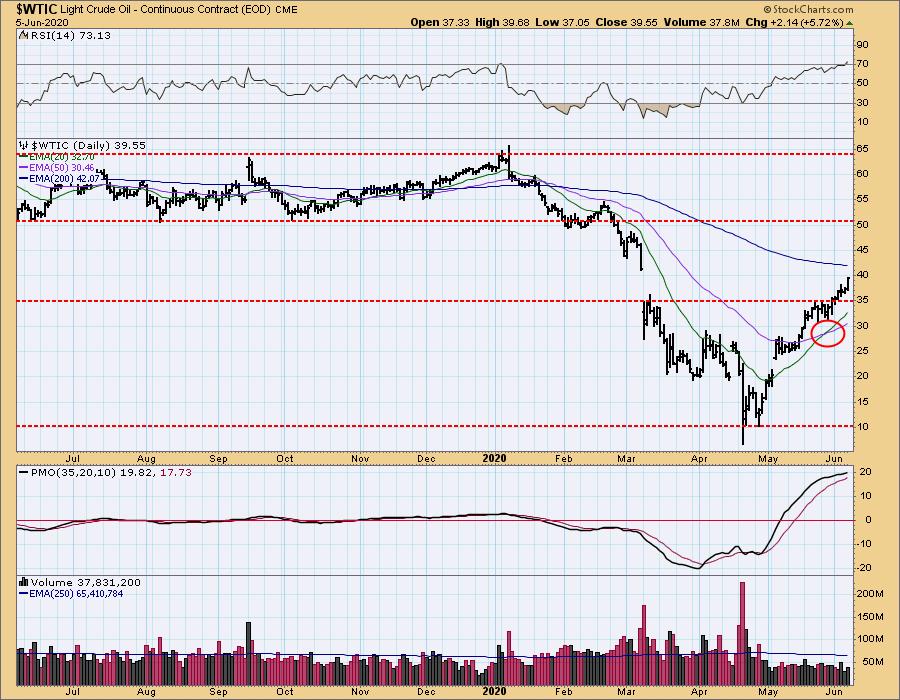
$WTIC Weekly Chart: Considering the fundamental situation (over supply), it seems unreasonable to expect the rally to exceed the top of the gap, about 41.
BONDS (TLT)
IT Trend Model: NEUTRAL as of 6/5/2020
LT Trend Model: BUY as of 1/2/2019
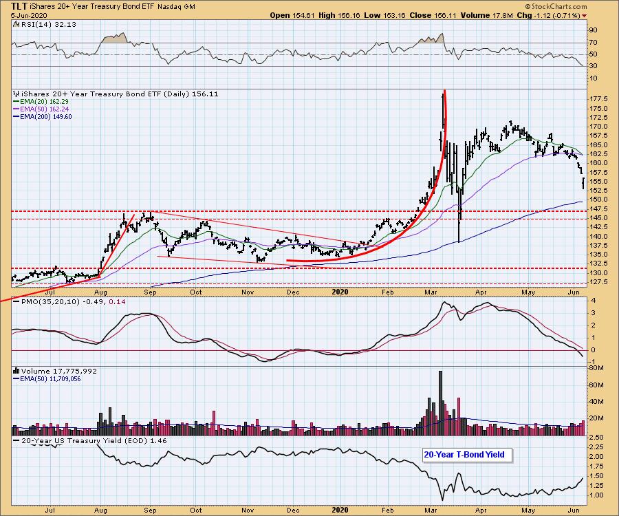
TLT Daily Chart: The 20EMA so close to crossing down through the 50EMA that it will surely happen Monday, so I'm going to go ahead and call it as a change from IT Trend Model BUY to NEUTRAL. Nevertheless, the gap down on Friday looks like it may be the end of the decline. The RSI and PMO are oversold, and it seems unlikely that yields will go much higher, or bonds much lower.
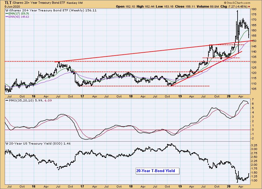
TLT Weekly Chart: The weekly PMO is very overbought and has crossed down through the signal line. As I said, it doesn't seem likely that rates are going significantly higher, so support for bonds should be close at hand.
Technical Analysis is a windsock, not a crystal ball.
Happy Charting! - Carl
NOTE: The signal status reported herein is based upon mechanical trading model signals, specifically, the DecisionPoint Trend Model. They define the implied bias of the price index based upon moving average relationships, but they do not necessarily call for a specific action. They are information flags that should prompt chart review. Further, they do not call for continuous buying or selling during the life of the signal. For example, a BUY signal will probably (but not necessarily) return the best results if action is taken soon after the signal is generated. Additional opportunities for buying may be found as price zigzags higher, but the trader must look for optimum entry points. Conversely, exit points to preserve gains (or minimize losses) may be evident before the model mechanically closes the signal.
Helpful DecisionPoint Links:
DecisionPoint Alert Chart List
DecisionPoint Golden Cross/Silver Cross Index Chart List
DecisionPoint Sector Chart List
Price Momentum Oscillator (PMO)
Swenlin Trading Oscillators (STO-B and STO-V)