
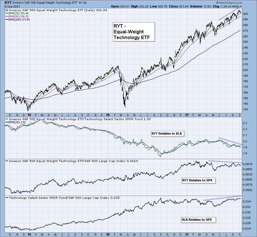
We have been pointing out that mega-cap stocks, particularly in the Technology sector, are helping to keep the market afloat. I was looking for a way to visualize this better. While scrolling the DP ChartPack ChartLists on StockCharts.com, I found a list I hadn't looked at in a very very long time. The list compares equal-weight sector ETFs to their cap-weighted siblings. It was very interesting. The Technology comparison hit the mark for me.
Below is the price chart for RYT, the equal-weight Technology ETF. Technology has taken a leadership role in moving the markets and it likely will continue to. RYT relative strength to XLK was very negative. RYT's relative strength line has been meandering mostly sideways and has formed a negative divergence with its price tops.
XLK on the other hand has been steadily outperforming the SPX. In fact, the relative strength line for XLK/SPX has rising tops where RYT/SPX has declining tops. As long as these stocks continue to perform the market should hang in there, but when they begin to fail, there aren't many other Technology stocks under the surface to pick up the slack.
If you are interested in getting the the DP ChartPack with these charts that compare all of the equal-weight sector ETFs with the cap-weighted sector ETFs, go to Your Account on StockCharts.com and click on Manage ChartPacks. The DP ChartPacks are currently free to download if you have a StockCharts Extra membership or above. These charts are in the "DP Market Indicators" ChartPack.
The DecisionPoint Alert Weekly Wrap presents an end-of-week assessment of the trend and condition of the Stock Market, the U.S. Dollar, Gold, Crude Oil, and Bonds. The DecisionPoint Alert daily report (Monday through Thursday) is abbreviated and gives updates on the Weekly Wrap assessments.
Watch the latest episode of DecisionPoint on StockCharts TV's YouTube channel here!
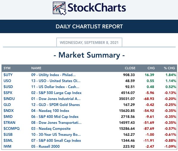
MAJOR MARKET INDEXES
SECTORS
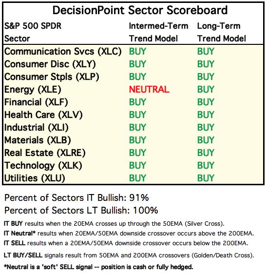
Each S&P 500 Index component stock is assigned to one, and only one, of 11 major sectors. This is a snapshot of the Intermediate-Term (Silver Cross) and Long-Term (Golden Cross) Trend Model signal status for those sectors.
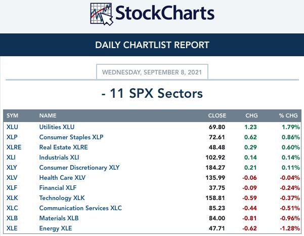
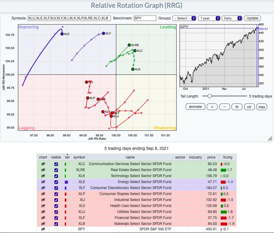
RRG® Chart: XLRE entered the Leading quadrant. XLK is beginning to lose some relative strength, but it is still in Leading. XLY is improving and should enter the Leading quadrant soon. All other sectors are lagging.

Don't miss the RECORDING of Mr. RRG, Julius de Kempanear's appearance in the FREE DP Trading Room from Monday!
Topic: DecisionPoint Trading Room
Start Time : Sep 7, 2021 08:45 AM
Meeting Recording Link HERE.
Access Passcode: Sept@7th
If you haven't registered for the free Trading Room yet, here is the LINK.
CLICK HERE for an animated version of the RRG chart.
CLICK HERE for Carl's annotated Sector charts.
THE MARKET (S&P 500)
IT Trend Model: BUY as of 5/8/2020
LT Trend Model: BUY as of 6/8/2020
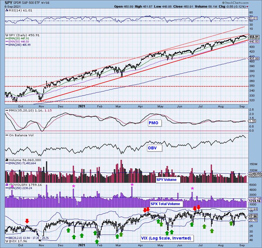
SPY Daily Chart: We've cleaned up the annotations on our 5-month candlestick chart for the SPY. It is now easy to see the short-term bearish rising wedge. Price is now testing the 20-EMA. This has previously been an area where price often finds short-term support. The "doji" candlestick could be bullish here. When they arrive after a filled candle to the downside, they can often times indicate a short-term pivot point. However, they aren't confirmed until you have the third candlestick with a higher close. Still, it is worth noting.
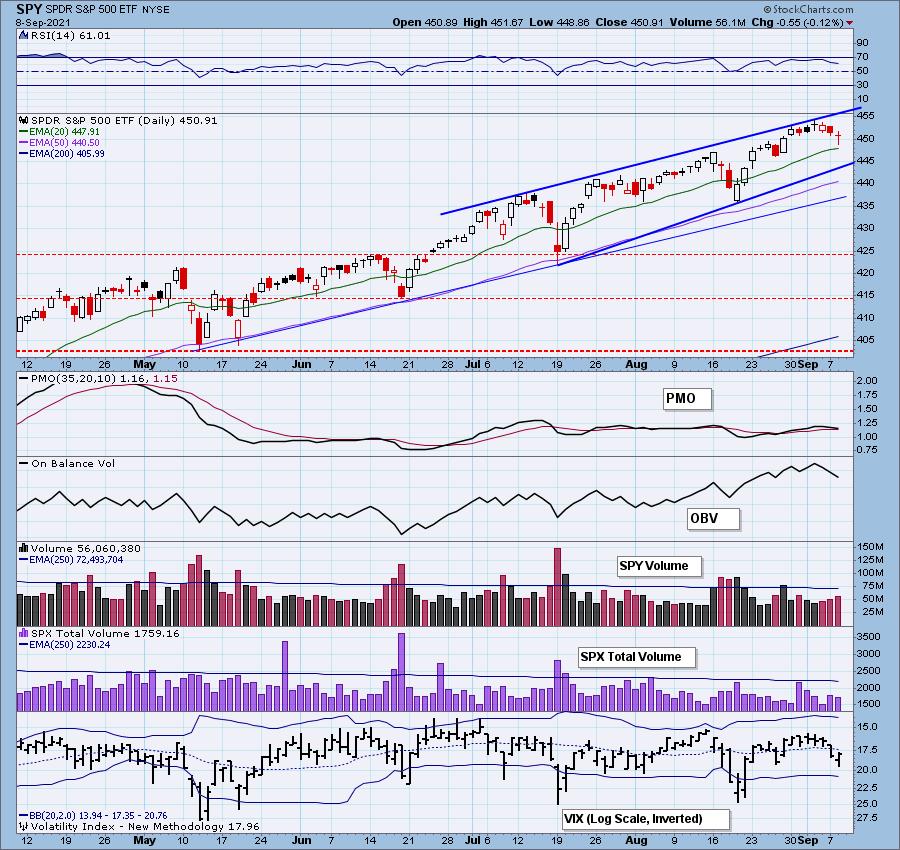
The RSI is positive and the PMO is currently on a crossover BUY signal. I wouldn't put much emphasis on the PMO right now given its mostly sideways movement. Total volume was on par with yesterday. The VIX is interesting, but I'll cover that in the Climax Indicators section.
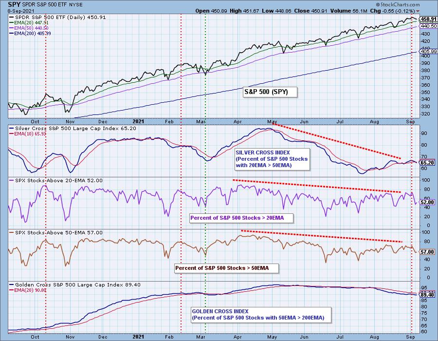
Participation: The following chart uses different methodologies for objectively showing the depth and trend of participation for intermediate- and long-term time frames.
- The Silver Cross Index (SCI) shows the percentage of SPX stocks on IT Trend Model BUY signals (20-EMA > 50-EMA).
- The Golden Cross Index (GCI) shows the percentage of SPX stocks on LT Trend Model BUY signals (50-EMA > 200-EMA).
- The Bullish Percent Index (BPI) shows the percentage of SPX stocks on Point & Figure BUY signals.
The SCI continues lower after yesterday's negative crossover its signal line. The GCI continues to trickle very slowly lower.
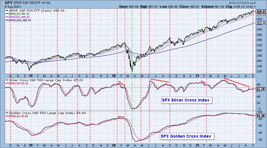
Interestingly we did see a slight improvement in participation today... very slight. I'll keep an eye on this tomorrow as a bottom on these indicators here would be bullish given they are in near-term oversold territory.
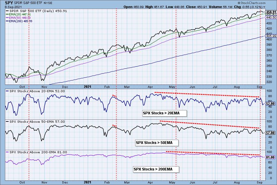
Climax Analysis: Definitely not a climax day. Net A-D and Net A-D Volume show us the result of a doji candlestick where price closes on its open--very little movement. The VIX stayed completely below its EMA on the inverted scale, but it finished on its low. This could mark a low as the VIX reversed into the end of the day. However, I would look for a puncture of the lower Bollinger Band to really signal a possible price bottom.
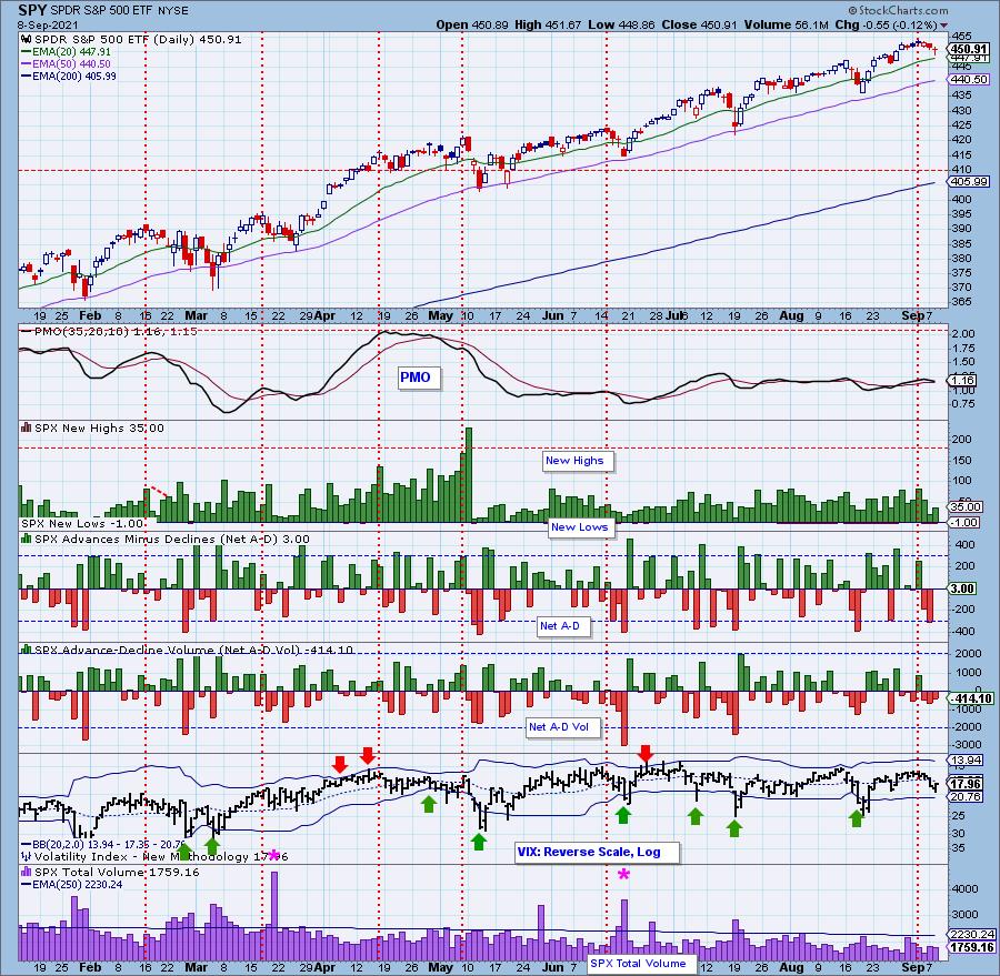
Short-Term Market Indicators: The short-term market trend is DOWN and the condition is SOMEWHAT OVERSOLD.
Not surprisingly the STOs both continued lower. They are now getting somewhat oversold, but certainly have more downside available. Momentum among SPX stocks was mostly unchanged. Currently 1/3rd of the SPX have positive momentum as measure by rising PMOs. These readings are getting somewhat overbought as well.
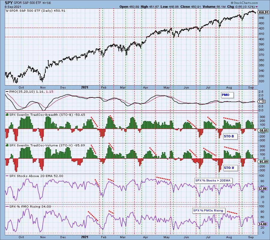
Intermediate-Term Market Indicators: The intermediate-term market trend is UP and the condition is OVERBOUGHT.
IT indicators are continuing to move lower and less than half of the SPX have crossover BUY signals.
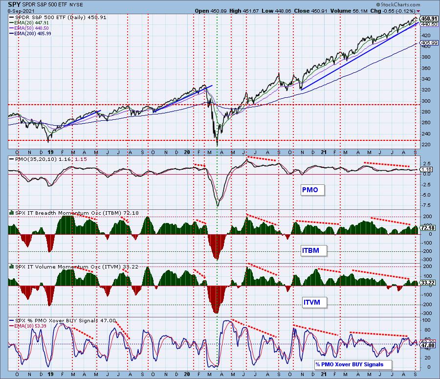
Bias Assessment: It occurred to us that one of the ways we can measure market bias is to compare the SCI to the percent of stocks above their 20/50-EMAs. When the percentages are lower than the SCI, the market bias is bearish and if they are higher, it is bullish. Any "mechanical" signal requires additional analysis to confirm the numbers.
The bearish bias continues as participation percentages are lower than the SCI reading. There's no way for the SCI to move higher unless more stocks have price above their 20/50-EMAs.
CONCLUSION: The market closed right on the open today setting up a possible one-day reversal that would form the bullish morning star doji three candle formation. Participation actually ticked up slightly in near-term oversold territory. Price is nearing the 20-EMA where we have often seen the market reverse. However, the bigger picture is more bearish. There is a bearish rising wedge and STOs/ITBM/ITVM are all in decline. Add to that the bearish bias in the short and intermediate terms and you have a recipe for at least a test of the bottom of the rising wedge pattern. I am 70% exposed to the market.
Have you subscribed the DecisionPoint Diamonds yet? DP does the work for you by providing handpicked stocks/ETFs from exclusive DP scans! Add it with a discount! Contact support@decisionpoint.com for more information!
BITCOIN
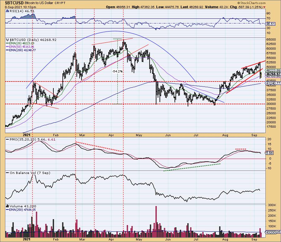
Bitcoin is digesting yesterday's corrective move. Price has managed to stay above the 50-EMA, but given the now negative RSI and very negative PMO, I'm expecting a test of $42,500. I've noticed a lot of chatter online about cryptocurrency being the new inflation buster. It's a currency that cannot be manipulated by the big banks and the Fed. Of course, that may be a "plus", but oversight can be a good thing too. This is just an observation, I have no opinion one way or the other (at least for now).
INTEREST RATES
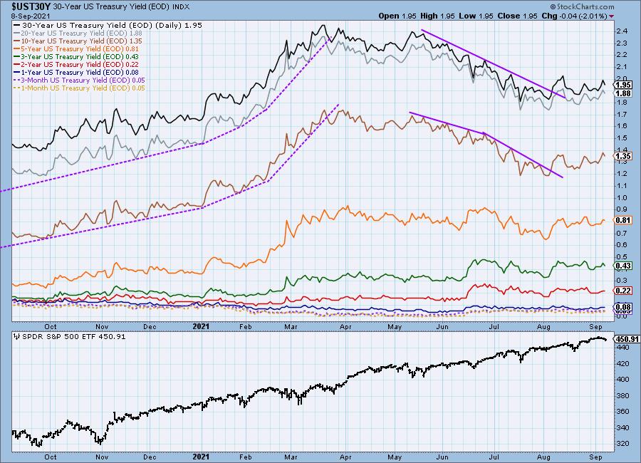
Yields are moving mostly sideways since breaking out of their declining trend.
10-YEAR T-BOND YIELD
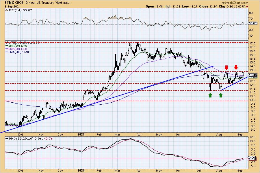
We can now make out an ascending triangle on $TNX. It is formed by a flat top and rising bottoms. It is a bullish formation and suggests readings will eventually break above overhead resistance. The PMO has reached positive territory and the RSI is also positive. It would surprise me if rates begin to rise here.
DOLLAR (UUP)
IT Trend Model: BUY as of 6/22/2021
LT Trend Model: BUY as of 8/19/2021
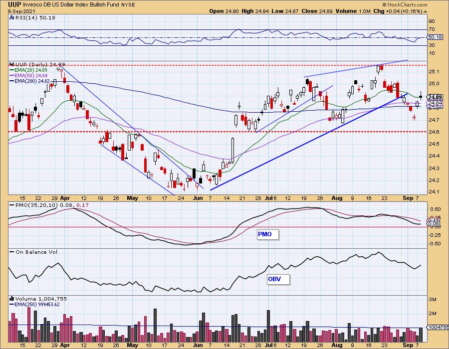
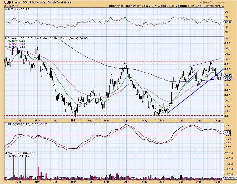
UUP Daily Chart: Yesterday I said that I wouldn't trust the current rally unless we got a close above the 20-EMA. Well, price closed ON the 20-EMA. The PMO and RSI are flat and neutral. This bounce does look credible, but indicators aren't revealing anything.
GOLD
IT Trend Model: NEUTRAL as of 6/24/2021
LT Trend Model: SELL as of 8/9/2021
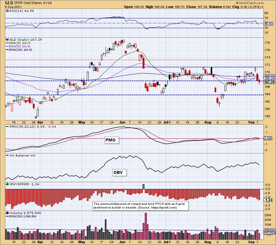
GLD Daily Chart: With another decline in Gold, GLD was not able to execute the IT Trend Model "Silver Cross" BUY signal. The PMO is topping and the RSI is negative. However, I noticed that discounts are getting oversold. When discounts move higher it tells us that participants are bearish. These readings are now beginning to compete with the readings we saw back in May. They are also near the July readings and nothing much happened to Gold during that time. We would like to see even deeper discounts moving forward.
(Full disclosure: I own GLD)
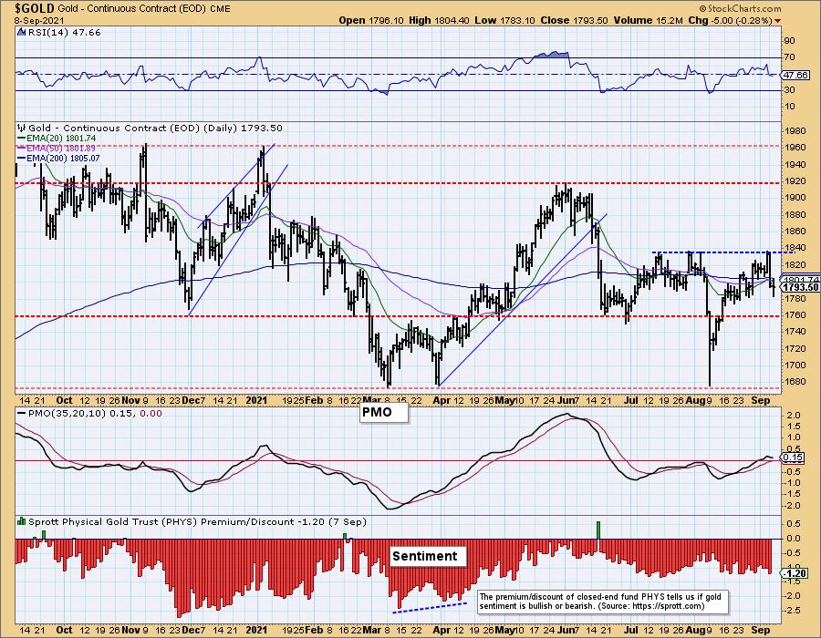
GOLD Daily Chart: $GOLD looks ready to test support at $1760.
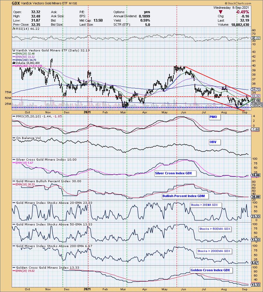
GOLD MINERS Golden and Silver Cross Indexes: Gold Miners were down today. Price is now testing the very short-term rising bottoms trendline. The SCI is flat and participation is still lacking. Be prepared for a likely test of the March/August lows.
CRUDE OIL (USO)
IT Trend Model: BUY as of 9/7/2021
LT Trend Model: BUY as of 3/9/2021
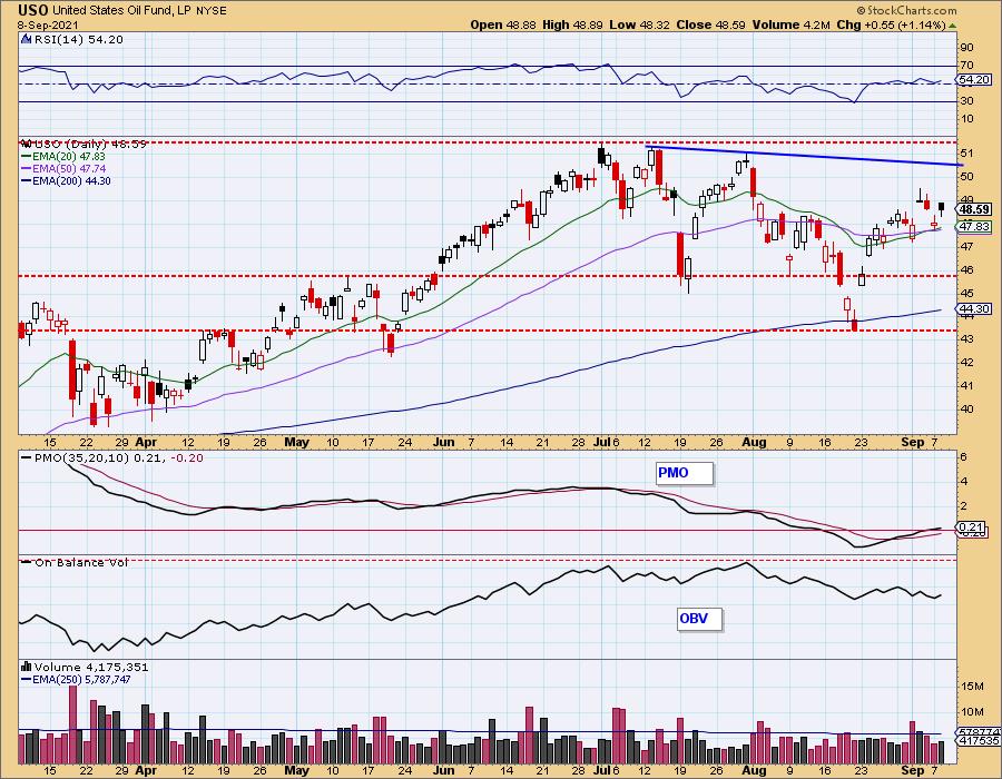
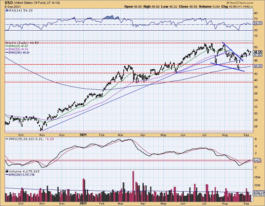
USO Daily Chart: Crude Oil rallied today after its positive 20/50-EMA crossover that triggered an IT Trend Model "Silver Cross" BUY signal. The RSI is rising in positive territory and the PMO is now in positive territory. I had some integrated oil and gas stocks creep into my Diamond scans as well as a pipeline stock or two. I'm looking for the short-term declining tops line to be tested soon.
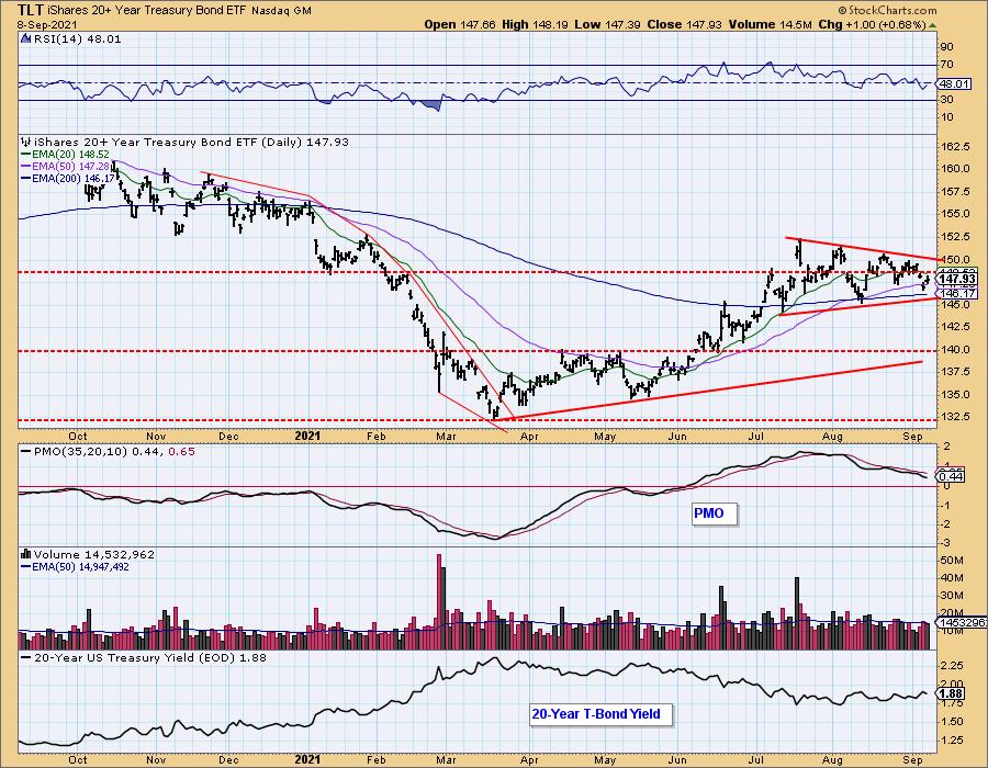
BONDS (TLT)
IT Trend Model: BUY as of 6/10/2021
LT Trend Model: BUY as of 8/10/2021
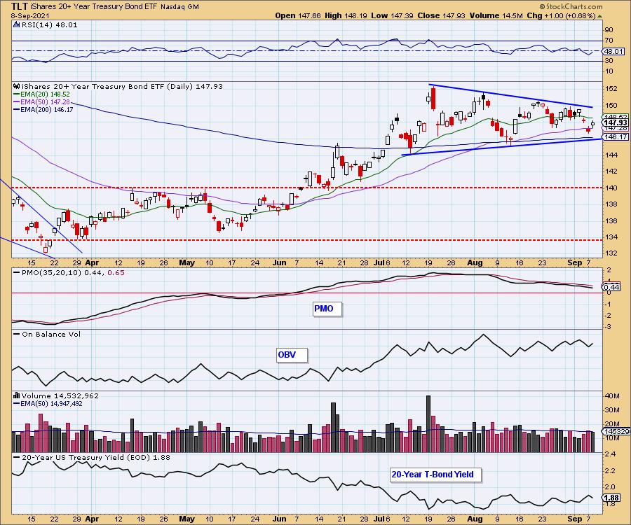
TLT Daily Chart: TLT continues to oscillate in the bullish symmetrical triangle. Price tested both the bottom of the triangle and the 200-EMA and is now moving higher. My review of $TNX suggests that yields could be ready to breakout. That would put the kibosh on Bonds breaking out.
Technical Analysis is a windsock, not a crystal ball.
--Erin Swenlin
(c) Copyright 2021 DecisionPoint.com
Disclaimer: This blog is for educational purposes only and should not be construed as financial advice. The ideas and strategies should never be used without first assessing your own personal and financial situation, or without consulting a financial professional. Any opinions expressed herein are solely those of the author, and do not in any way represent the views or opinions of any other person or entity.
NOTE: The signal status reported herein is based upon mechanical trading model signals, specifically, the DecisionPoint Trend Model. They define the implied bias of the price index based upon moving average relationships, but they do not necessarily call for a specific action. They are information flags that should prompt chart review. Further, they do not call for continuous buying or selling during the life of the signal. For example, a BUY signal will probably (but not necessarily) return the best results if action is taken soon after the signal is generated. Additional opportunities for buying may be found as price zigzags higher, but the trader must look for optimum entry points. Conversely, exit points to preserve gains (or minimize losses) may be evident before the model mechanically closes the signal.
Helpful DecisionPoint Links:
DecisionPoint Alert Chart List
DecisionPoint Golden Cross/Silver Cross Index Chart List
DecisionPoint Sector Chart List
Price Momentum Oscillator (PMO)
Swenlin Trading Oscillators (STO-B and STO-V)
DecisionPoint is not a registered investment advisor. Investment and trading decisions are solely your responsibility. DecisionPoint newsletters, blogs or website materials should NOT be interpreted as a recommendation or solicitation to buy or sell any security or to take any specific action.