
The rally was impressive right out of the gate this morning. After the steep initial rising trend, price consolidated somewhat and then began a slow and steady ascent. The PMO fell during that period, but price continued higher. How?
I often explain that the PMO measures acceleration, so think of your foot on the accelerator of a car as you press it down and pull it off to adjust your speed. The PMO reflects whether your foot is pressing on the pedal (price accelerates higher, PMO rises), pulling up off the peddle (price slows its ascent, PMO tops/flattens/falls) or completely removing your foot from the pedal and applying brakes (price moves downward, PMO steepens its descent).
You initially have to press the accelerator down to begin moving forward. If you're getting on a freeway here in California, you press it very hard. That's what happened this morning when the market opened. The PMO shot higher as the foot was applied strongly to the accelerator.
Then price began to slow its ascent and flatten around 10:45a, our foot begins to release the pedal--the PMO moves lower. Remember, the car will keep going forward even if you pull your foot completely off the pedal so price can certainly continue rising even when the PMO is slowing or moving lower.
From noon to the price top around 2:30p, the foot was slowly releasing the accelerator (PMO moves lower) and price slowed its ascent.
Then price topped as did the PMO at 2:30p. Our foot is no longer on the accelerator as we've been releasing it between noon and 2:30p. Not only is our foot off the pedal, we've started to apply brakes (price moves lower), so the PMO begins to pick up speed to the downside around 2:35p.
When price bottomed after 3:00p, the PMO did too. We are now putting our foot on the accelerator as price begins to move higher.
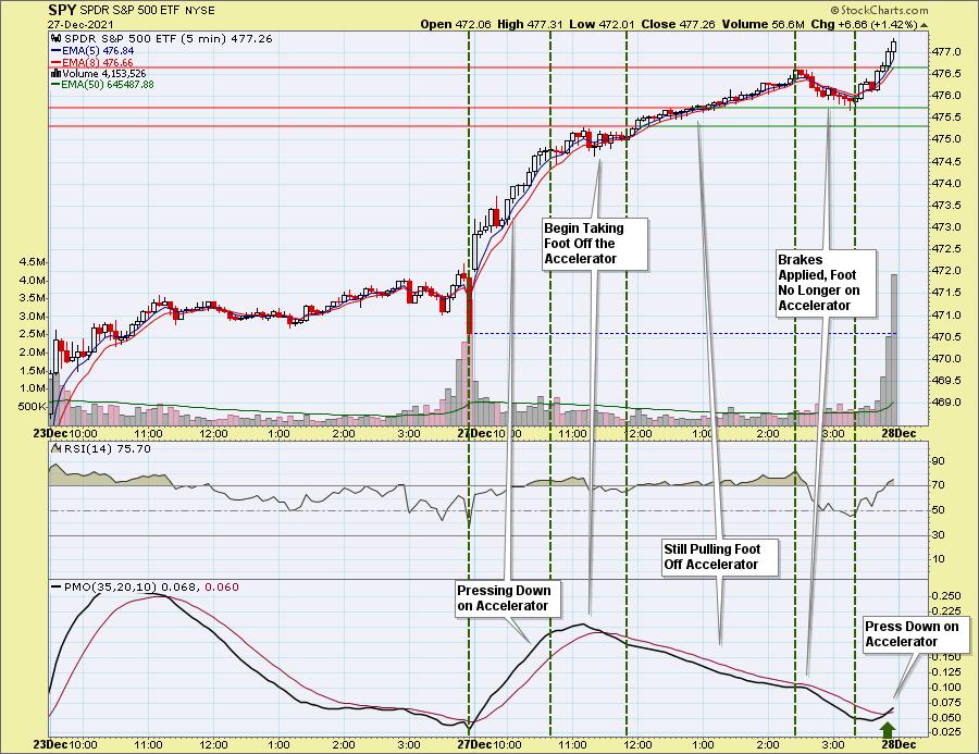
I hope you found this useful and an easy way to visualize what the PMO, PPO and MACD are measuring. Price tells us what's happening to the car. The PMO tells us where our foot is on the accelerator.
The DecisionPoint Alert Weekly Wrap presents an end-of-week assessment of the trend and condition of the Stock Market, the U.S. Dollar, Gold, Crude Oil, and Bonds. The DecisionPoint Alert daily report (Monday through Thursday) is abbreviated and gives updates on the Weekly Wrap assessments.
Watch the latest episode of DecisionPoint on StockCharts TV's YouTube channel here!
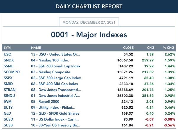
MAJOR MARKET INDEXES
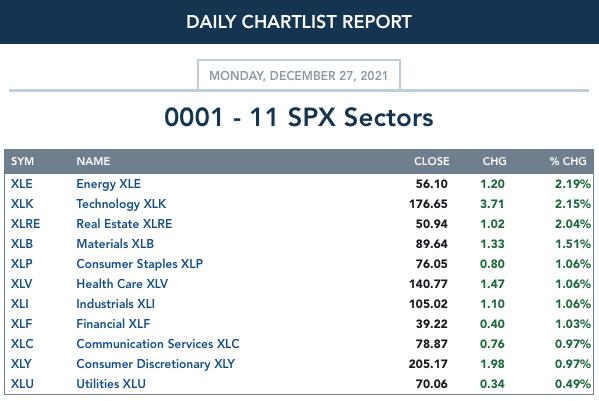
SECTORS
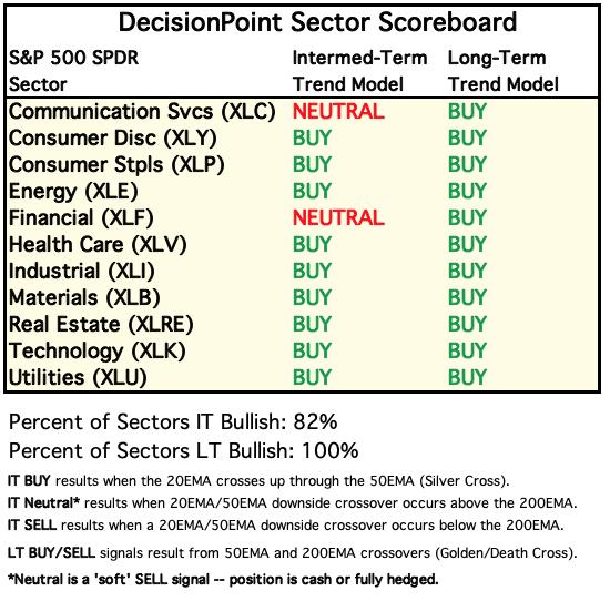
Each S&P 500 Index component stock is assigned to one, and only one, of 11 major sectors. This is a snapshot of the Intermediate-Term (Silver Cross) and Long-Term (Golden Cross) Trend Model signal status for those sectors.
RRG® Chart: Defensive sectors are still Leading, but XLB and XLC are moving with a bullish northeast heading toward Leading out of Improving. XLK is moving west toward Lagging, but is still only in Weakening. XLY is beginning to move northward toward Improving, but it is Lagging. XLE and XLI have the worst short-term relative performance and they are continuing in a bearish southwest direction.
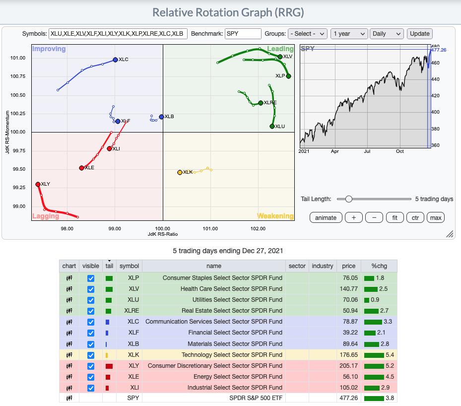
RRG® charts show you the relative strength and momentum for a group of stocks. Stocks with strong relative strength and momentum appear in the green Leading quadrant. As relative momentum fades, they typically move into the yellow Weakening quadrant. If relative strength then fades, they move into the red Lagging quadrant. Finally, when momentum starts to pick up again, they shift into the blue Improving quadrant.
CLICK HERE for an animated version of the RRG chart.
CLICK HERE for Carl's annotated Sector charts.
THE MARKET (S&P 500)
IT Trend Model: BUY as of 10/18/2021
LT Trend Model: BUY as of 6/8/2020
SPY Daily Chart: We saw new all-time highs on Thursday and today we saw price trade almost exclusively at all-time highs. Total Volume has begun to shrink even as price rises. While that is bearish and suggests investors are losing interest in the rally, with holiday trading, we can't make such a sweeping conclusion.
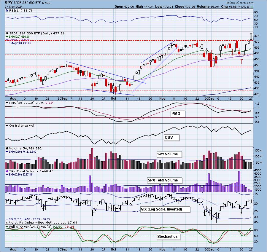
The PMO triggered a crossover BUY signal last week. The RSI is positive and Stochastics are looking strong above 80. The OBV is still showing a negative divergence as OBV tops are declining and price tops are rising. Looking at the long-term rising trend channel, it does appear that price is going to test the top. That could wind up being a reversal point.
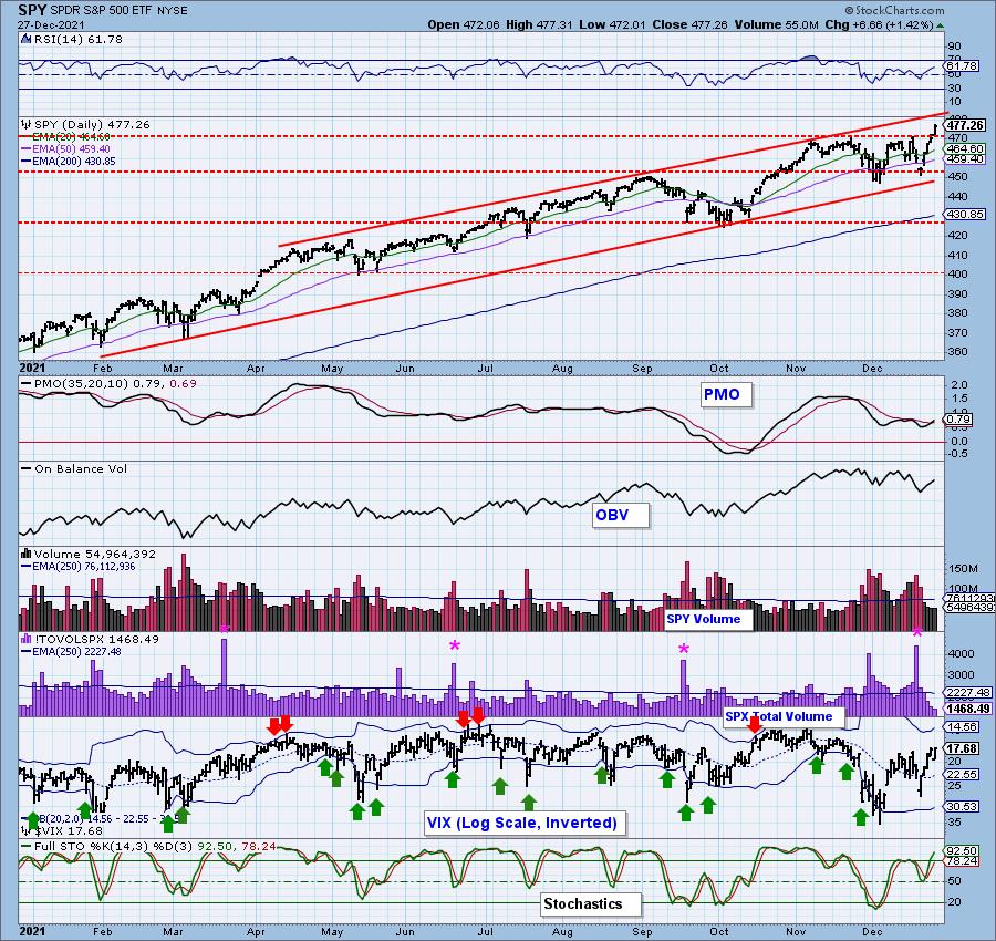
PARTICIPATION: The following chart objectively shows the depth and trend of participation in two time frames.
- Intermediate-Term - the Silver Cross Index (SCI) shows the percentage of SPX stocks on IT Trend Model BUY signals (20-EMA > 50-EMA). The opposite of the Silver Cross is a "Dark Cross" -- those stocks are, at the very least, in a correction.
- Long-Term - the Golden Cross Index (GCI) shows the percentage of SPX stocks on LT Trend Model BUY signals (50-EMA > 200-EMA). The opposite of a Golden Cross is the "Death Cross" -- those stocks are in a bear market.
The SCI climbed above its signal line which is bullish. The GCI is holding steady at 78.60%, but it did move below its signal line last week. Both indicators are in strong negative divergences with price tops.
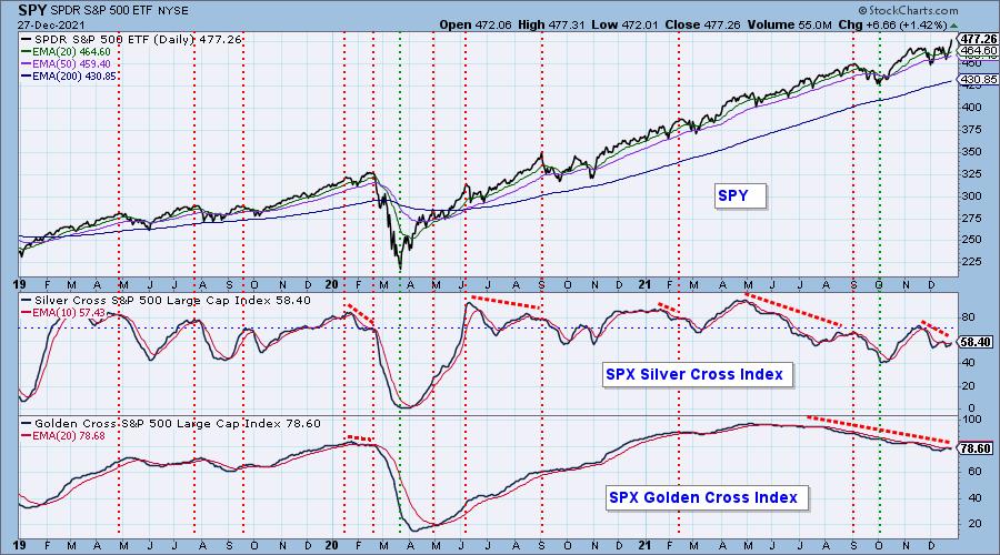
S&P 500 New 52-Week Highs/Lows: We had an expansion of New Highs that we would consider "climactic". I'll discuss the implications of this climactic reading next. However, before we leave the chart, I want to point out another negative divergence. On the bright side, the 10-DMA of the High-Low Differential is rising again.
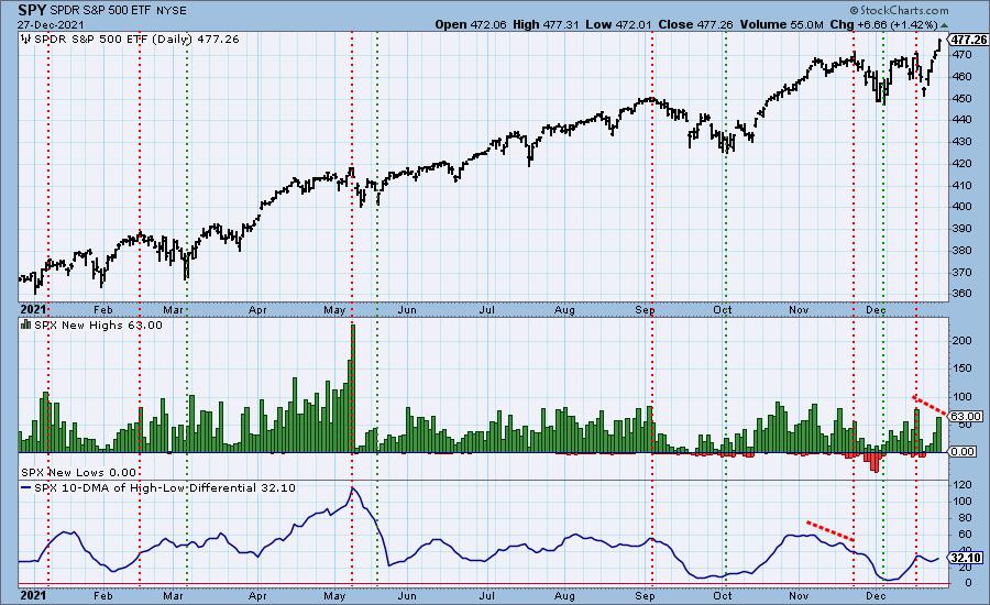
Climax* Analysis: We have climactic readings on New Highs (above), SPX Net A-D and SPY Up/Down Volume Ratios. However, this wasn't confirmed by NYSE Up/Down Volume Ratio which indicates that participation was narrowly focused on the very largest of the large-cap stocks. We will still call it an upside exhaustion climax (the third in a row). SPX Total Volume was depressed due to the holiday, so the conviction regarding the move is low. Think of it as a "mild climax".
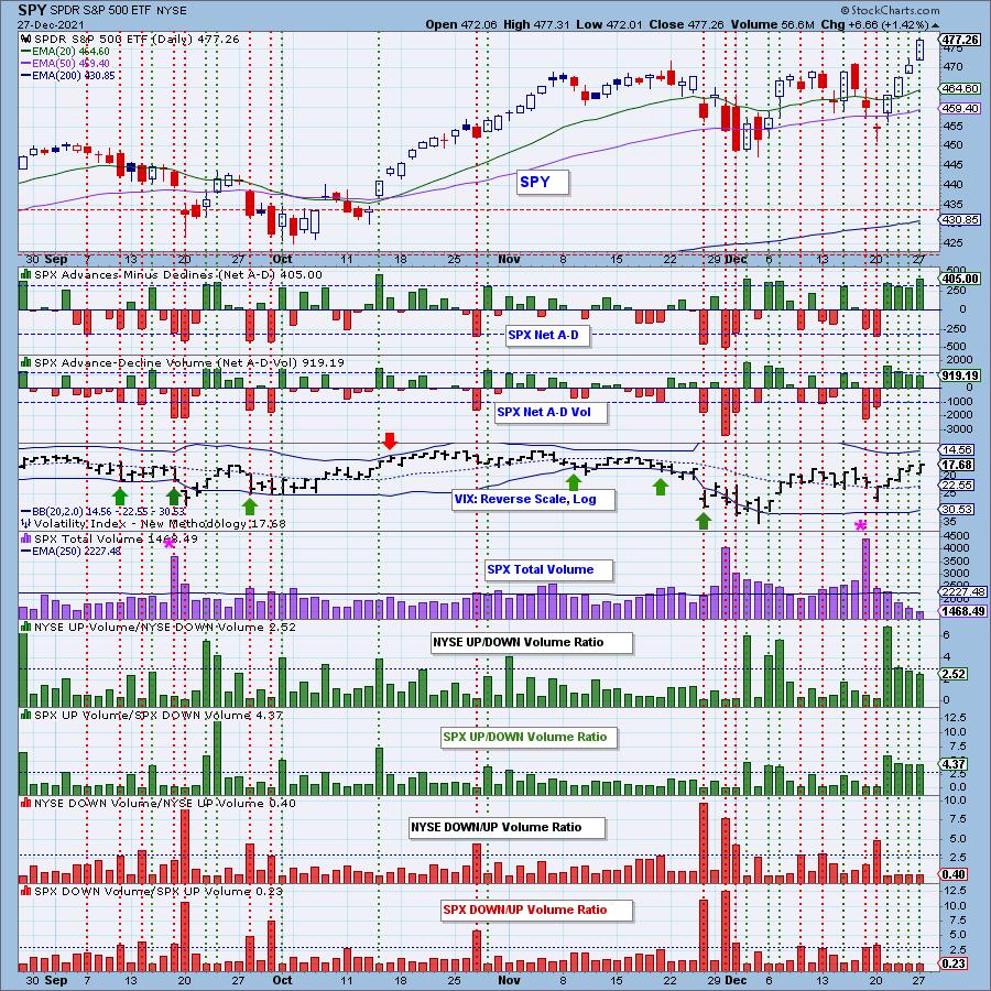
*A climax is a one-day event when market action generates very high readings in, primarily, breadth and volume indicators. We also include the VIX, watching for it to penetrate outside the Bollinger Band envelope. The vertical dotted lines mark climax days -- red for downside climaxes, and green for upside. Climaxes indicate either initiation or exhaustion.
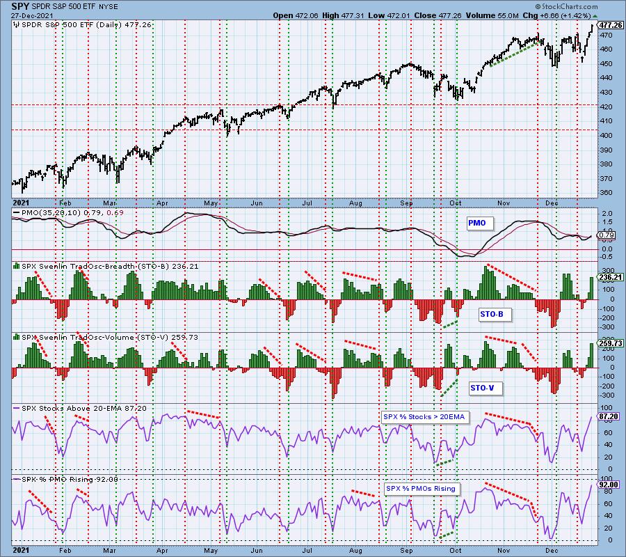
Short-Term Market Indicators: The short-term market trend is UP and the condition is OVERBOUGHT.
STOs are rising strongly. The STO-V doesn't have a negative divergence with price. The biggest problem for these indicators is that they are overbought. However, we will not ignore the bullish 92% reading on PMOs rising. With that many stocks showing rising momentum, the rally could see a continuation or at worst consolidation. Given that reading is overbought, we will want to keep an eye on it. When it begins to top, the market could too.
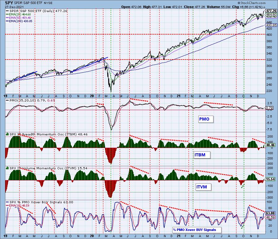
Intermediate-Term Market Indicators: The intermediate-term market trend is UP and the condition is NEUTRAL.
IT indicators are rising and are only in neutral territory. We have more PMO crossover BUY signals coming in. The problem with the chart are the negative divergences.
Bias Assessment: There is a strong bullish bias in the short term given the very high participation readings of stocks > 20/50-EMAs are above the 58.4% SCI reading. This tells us that with that kind of participation, the SCI can continue to move higher which is very good for the market. Intermediate-term bias is neutral to bullish given the SCI is below 70%, but is rising. Long term, The GCI is at a healthy 78.6% giving us a bullish bias. However, we do see fewer stocks > 200-EMA and that will eventually erode the GCI.
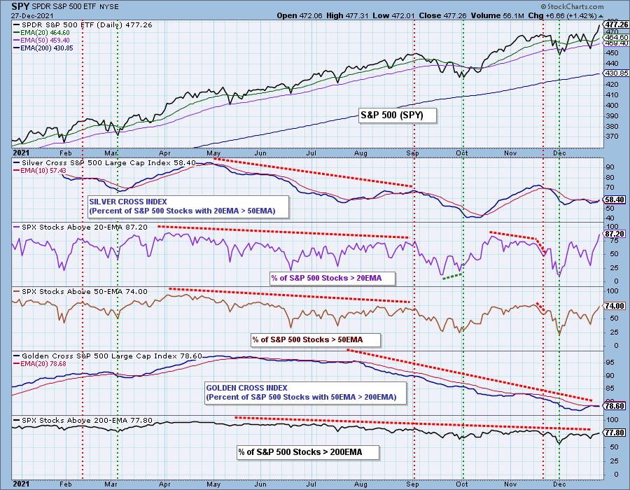
CONCLUSION: The Santa rally is on. This morning in the Seeking Alpha Wall Street Breakfast email seasonality was addressed regarding the last five trading sessions of December and the first two trading days of January. Since 1928, the S&P 500 has finished positive during this period 78.5%of the time, according to data from Bank of America. No wonder we talk about Santa Claus rallies. We had a mild upside exhaustion climax, but participation and the market bias are very bullish right now and given seasonality it could eke out some more gains or consolidate. Unfortunately, those pesky negative divergences will likely come to roost after the new year. Enjoy the holiday season(ality), but think with a very short-term timeframe in mind when managing your investments.
I'm 10% exposed to the market. I'm playing it safe for now, but I am considering expanding my exposure.
Have you subscribed the DecisionPoint Diamonds yet? DP does the work for you by providing handpicked stocks/ETFs from exclusive DP scans! Add it with a discount! Contact support@decisionpoint.com for more information!
BITCOIN
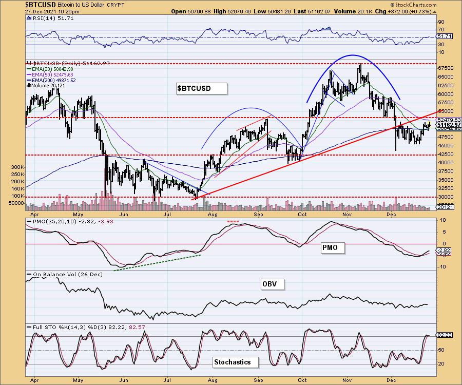
Bitcoin looks bullish with a small flag formation and price holding above the 200-EMA. The RSI just moved into positive territory and the PMO is rising on a BUY signal. Stochastics are above 80 and are beginning to oscillate. While I believe overhead resistance will pose a problem at the 50-EMA and September high, it is configured more positively than we have seen it in some time so I'm expecting a breakout.
INTEREST RATES
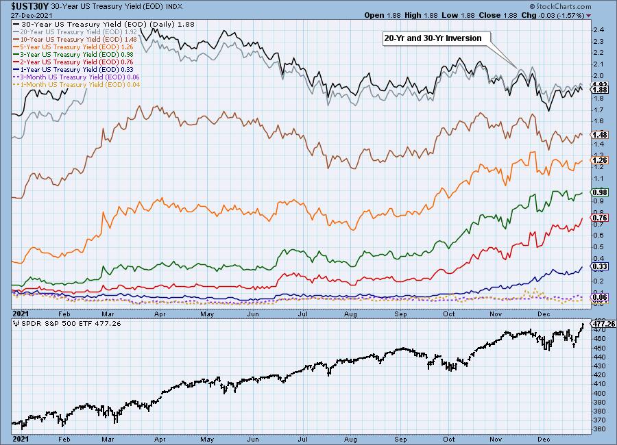
Rates are moving mostly sideways with a slight rising trend.
10-YEAR T-BOND YIELD
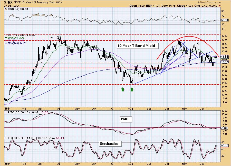
$TNX is attempting to break from the topping formation. Stochastics are tentative and the RSI is neutral. However, there is a new PMO crossover BUY signal today and we have a bullish double-bottom formation.
DOLLAR (UUP)
IT Trend Model: BUY as of 6/22/2021
LT Trend Model: BUY as of 8/19/2021
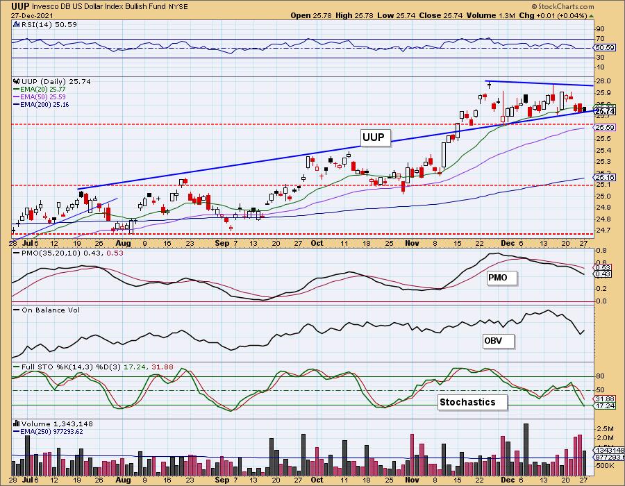
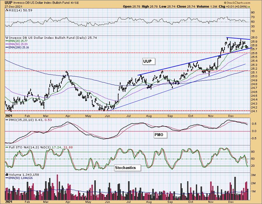
UUP Daily Chart: The Dollar is inside a symmetrical triangle. It is a continuation pattern that suggests and upside breakout ahead. However, the indicators are looking terrible. There's a high likelihood we will see a breakdown and test of the late November low.
GOLD
IT Trend Model: SELL as of 12/7/2021
LT Trend Model: SELL as of 12/3/2021
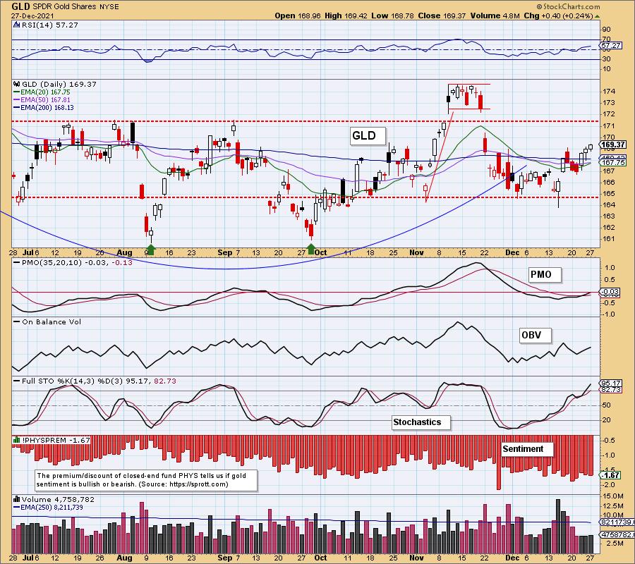
GLD Daily Chart: Gold is continuing to rally. The PMO is rising on a crossover BUY signal and the RSI is positive. Better news is the nearing IT Trend Model "Silver Cross" BUY signal (20-EMA is about to cross above the 50-EMA). Stochastics are now above 80 and are still rising.
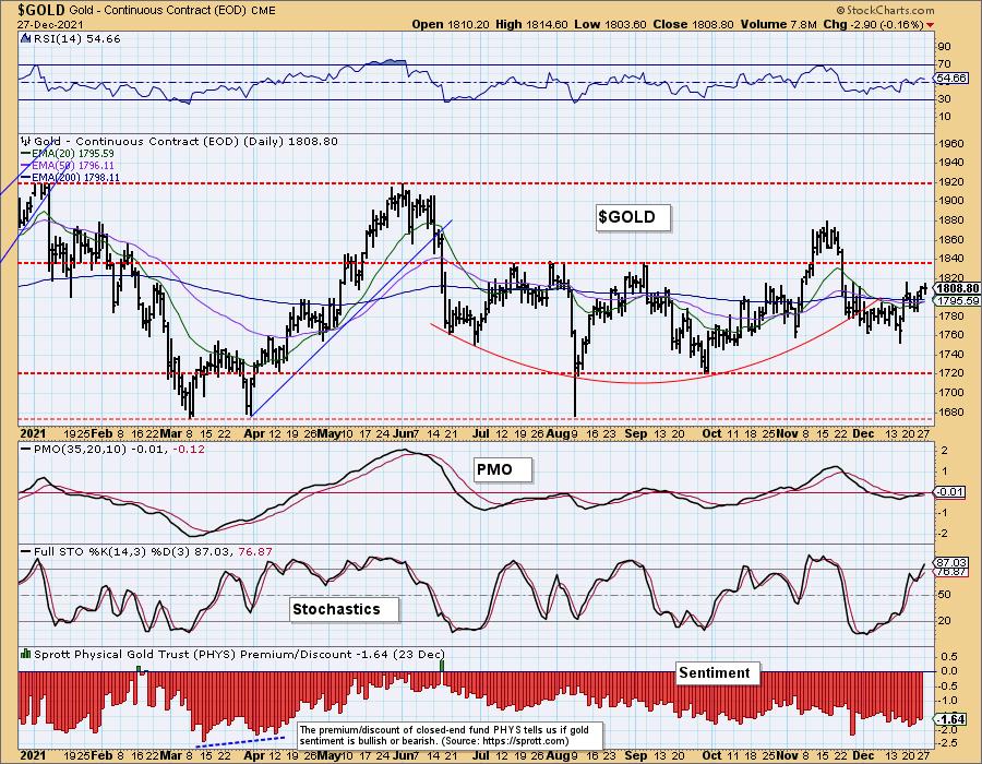
GOLD Daily Chart: The next level of overhead resistance will be a challenge for Gold at $1840, but with positive indicators it should be successful.
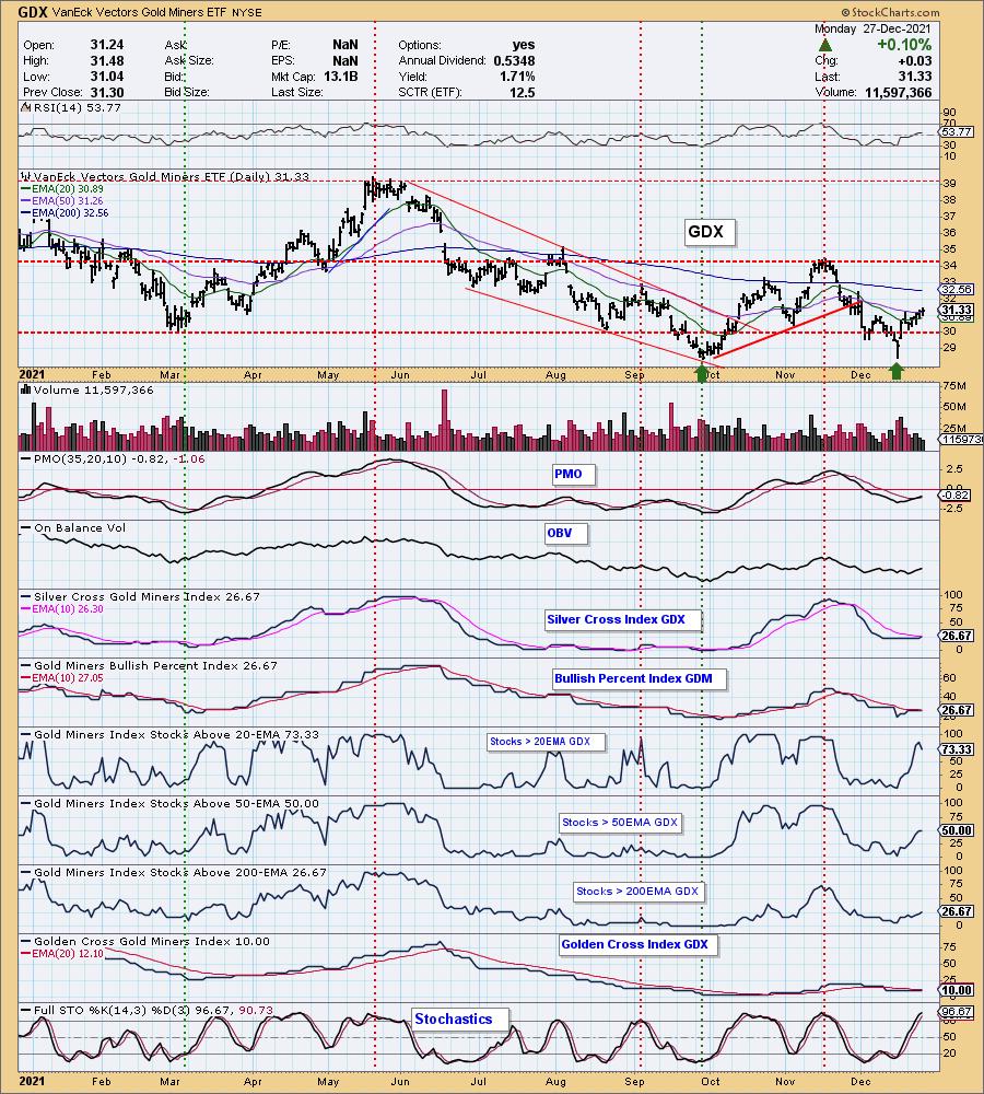
GOLD MINERS Golden and Silver Cross Indexes: If Gold continues to rally as we believe it will, Gold Miners will have the wind at their backs. They are coming out of an oversold drop below $29. The RSI is positive and the PMO is on a crossover BUY signal. Participation percentages are well above the SCI giving GDX a bullish bias moving forward.
CRUDE OIL (USO)
IT Trend Model: NEUTRAL as of 11/30/2021
LT Trend Model: BUY as of 3/9/2021
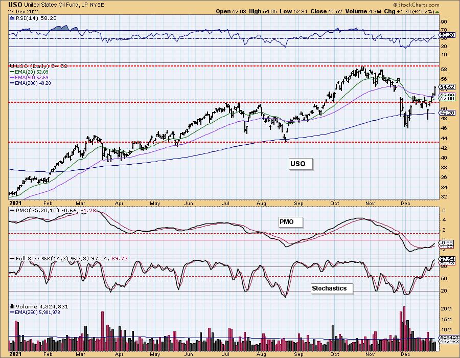
USO Daily Chart: Crude Oil broke out strongly today despite rumors of demand drying up again with Omicron variant. Technically the chart is sound. The RSI is positive, the PMO is on a crossover BUY signal and Stochastics are rising above 80.
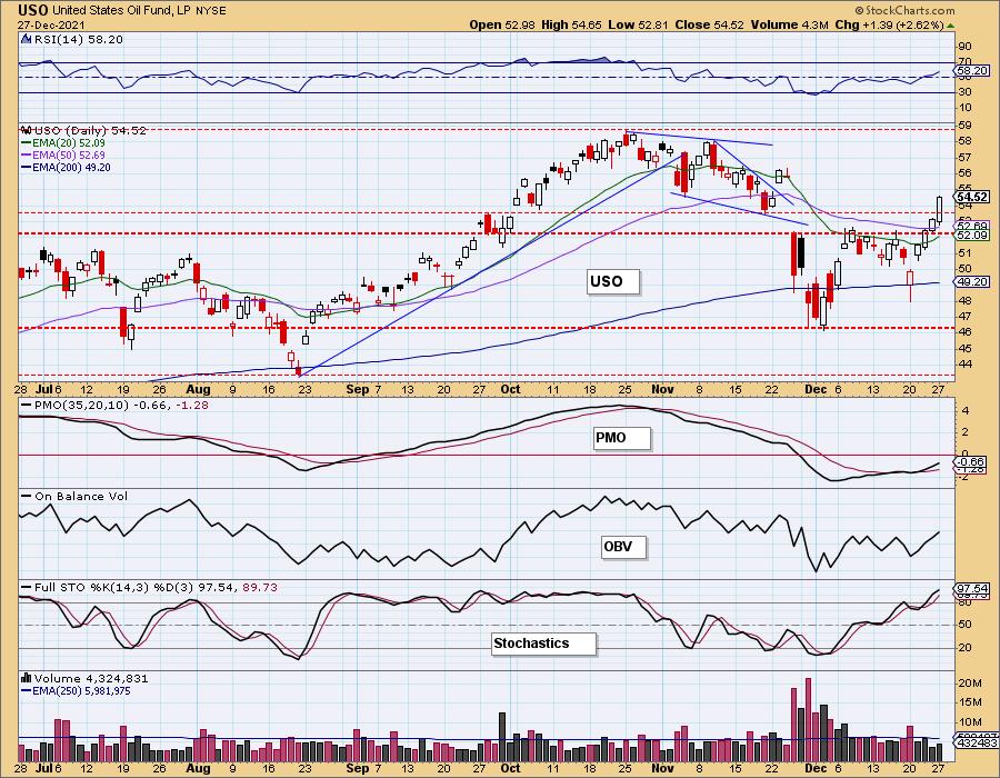
Price spent the day above the 50-EMA. If USO reaches $56 that will close the late November gap and suggest that price will continue to run and test the October high.
BONDS (TLT)
IT Trend Model: BUY as of 11/8/2021
LT Trend Model: BUY as of 11/5/2021
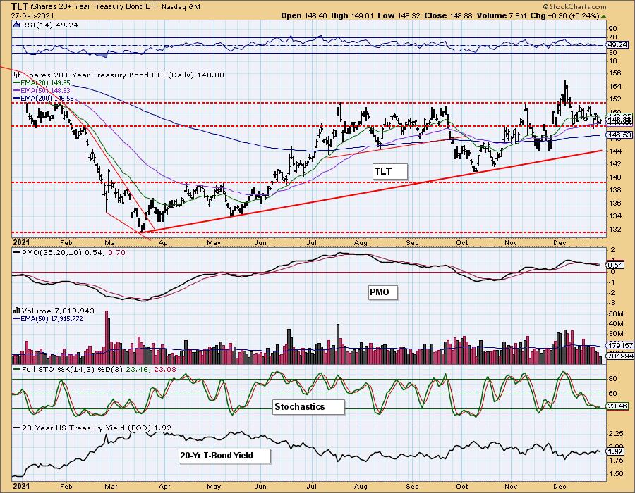
TLT Daily Chart: Rates are moving mostly sideways. The TLT chart is neutral. It isn't bullish given the negative RSI and PMO SELL signal, but it isn't bearish given price is holding the short-term rising trend and 50-EMA as support and Stochastics may be bottoming.
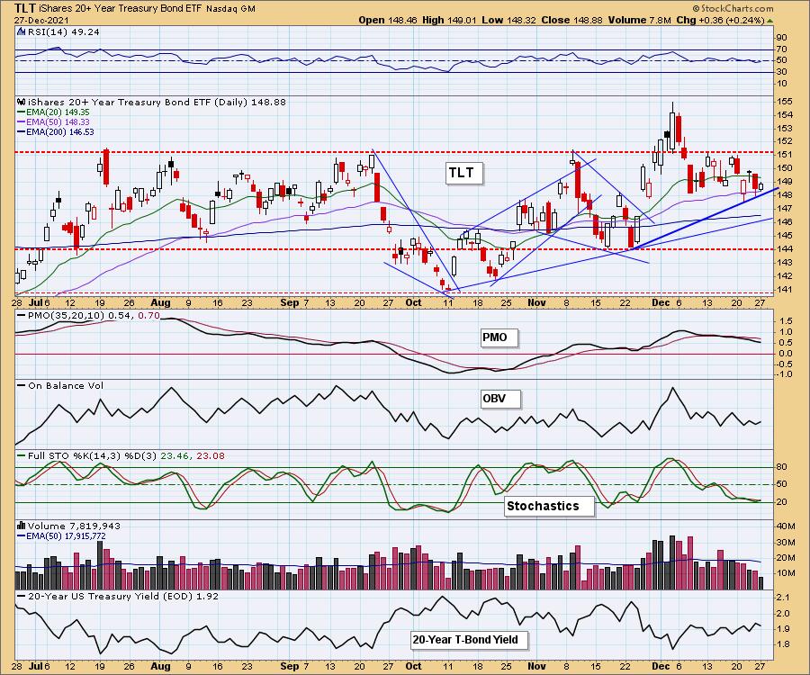
Overall, with rates beginning to rise, we don't think TLT will do much.
Technical Analysis is a windsock, not a crystal ball.
--Erin Swenlin
(c) Copyright 2021 DecisionPoint.com
Disclaimer: This blog is for educational purposes only and should not be construed as financial advice. The ideas and strategies should never be used without first assessing your own personal and financial situation, or without consulting a financial professional. Any opinions expressed herein are solely those of the author, and do not in any way represent the views or opinions of any other person or entity.
NOTE: The signal status reported herein is based upon mechanical trading model signals, specifically, the DecisionPoint Trend Model. They define the implied bias of the price index based upon moving average relationships, but they do not necessarily call for a specific action. They are information flags that should prompt chart review. Further, they do not call for continuous buying or selling during the life of the signal. For example, a BUY signal will probably (but not necessarily) return the best results if action is taken soon after the signal is generated. Additional opportunities for buying may be found as price zigzags higher, but the trader must look for optimum entry points. Conversely, exit points to preserve gains (or minimize losses) may be evident before the model mechanically closes the signal.
Helpful DecisionPoint Links:
DecisionPoint Alert Chart List
DecisionPoint Golden Cross/Silver Cross Index Chart List
DecisionPoint Sector Chart List
Price Momentum Oscillator (PMO)
Swenlin Trading Oscillators (STO-B and STO-V)
DecisionPoint is not a registered investment advisor. Investment and trading decisions are solely your responsibility. DecisionPoint newsletters, blogs or website materials should NOT be interpreted as a recommendation or solicitation to buy or sell any security or to take any specific action.
