
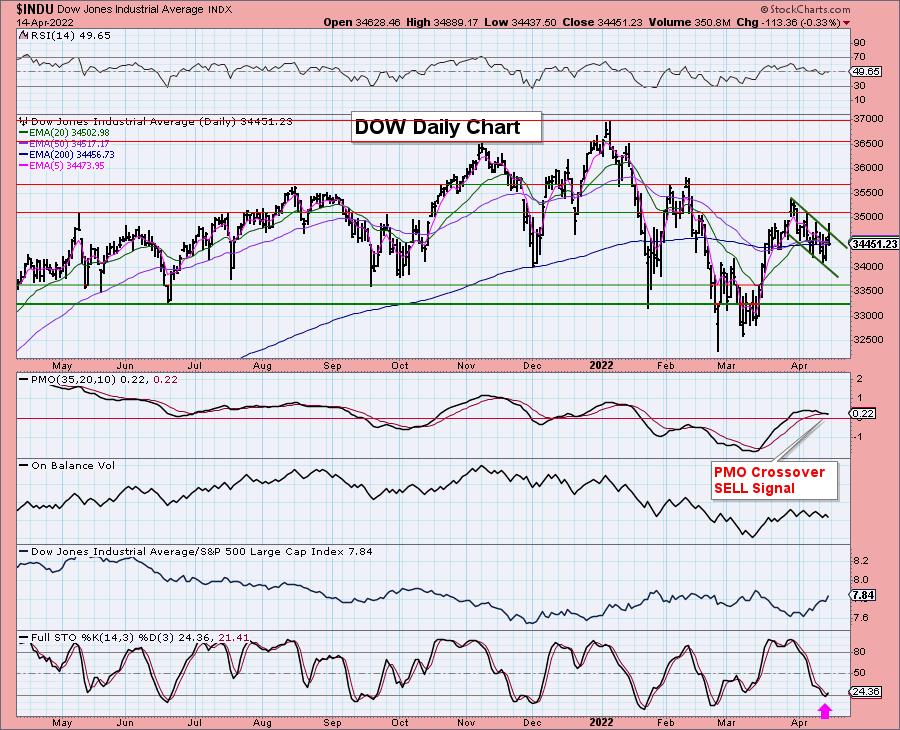
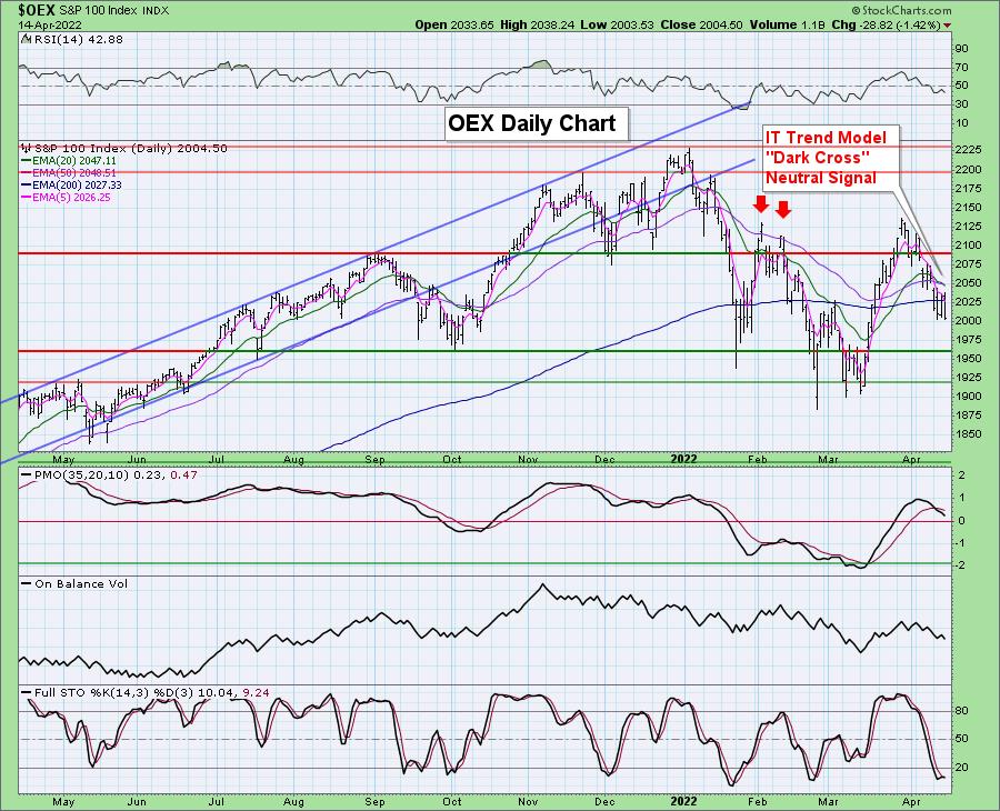
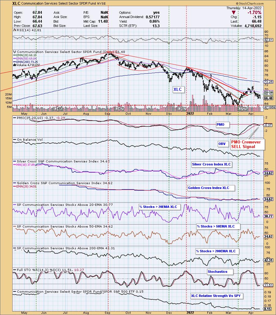
The hits keep on coming for the market. Today we had three new bearish signal changes. First, the Dow had a Price Momentum Oscillator (PMO) Crossover SELL signal. The SP100 ($OEX) saw an IT Trend Model "Dark Cross" Neutral signal. Communication Services (XLC) generated a PMO Crossover SELL signal.
The Dow is first. It attempted to breakout from its declining trend channel, but failed miserably as it closed near its low for the day. Stochastics may be turning up in oversold territory, but that PMO SELL signal suggests it will move even lower.
A "Dark Cross" is a negative 20/50-day EMA crossover. In this case it was a "Neutral" signal because the crossover occurred above the 200-day EMA. Price has lost the 200-day EMA for support and also closed near its low on the day. It had already triggered a PMO SELL signal. The RSI is negative and falling and Stochastics have turned down in oversold territory. We would expect price to move even lower.
XLC had seen some improvement of late but it is falling apart now. The RSI is negative and volume is flying out. Participation is anemic with the Silver Cross Index (SCI) and Golden Cross Index (GCI) both at a low 34%. %Stocks > 20/50/200-day EMAs is lower than both the SCI and GCI which gives us a bearish bias in all three timeframes for XLC.
The DecisionPoint Alert Weekly Wrap presents an end-of-week assessment of the trend and condition of the Stock Market, the U.S. Dollar, Gold, Crude Oil, and Bonds. The DecisionPoint Alert daily report (Monday through Thursday) is abbreviated and gives updates on the Weekly Wrap assessments.
Watch the latest episode of DecisionPoint on StockCharts TV's YouTube channel here!
MAJOR MARKET INDEXES
For Today: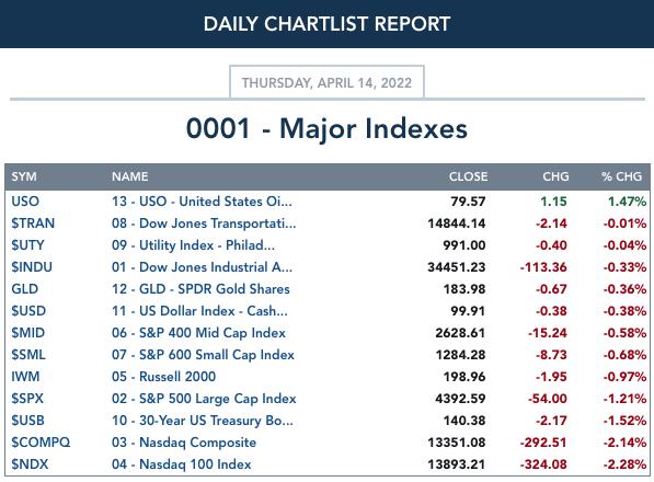
For the Week: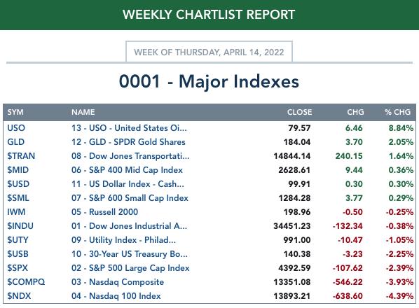
SECTORS
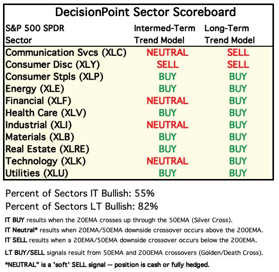
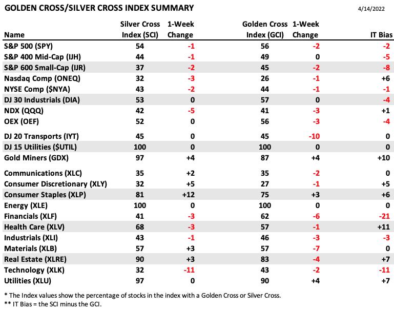
Each S&P 500 Index component stock is assigned to one of 11 major sectors. This is a snapshot of the Intermediate-Term (Silver Cross) and Long-Term (Golden Cross) Trend Model signal status for those sectors.
For Today: 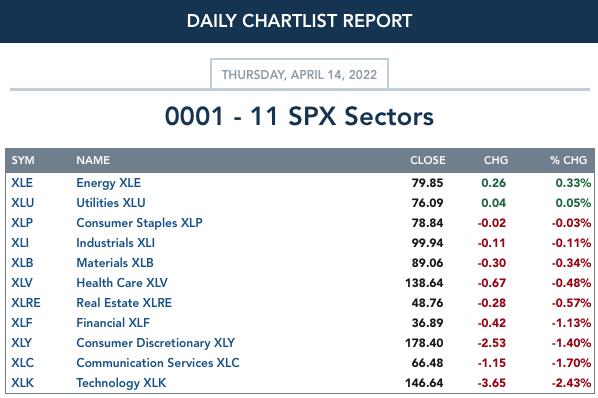
For the Week: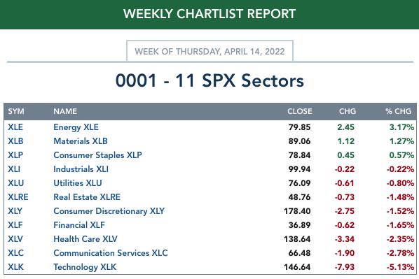
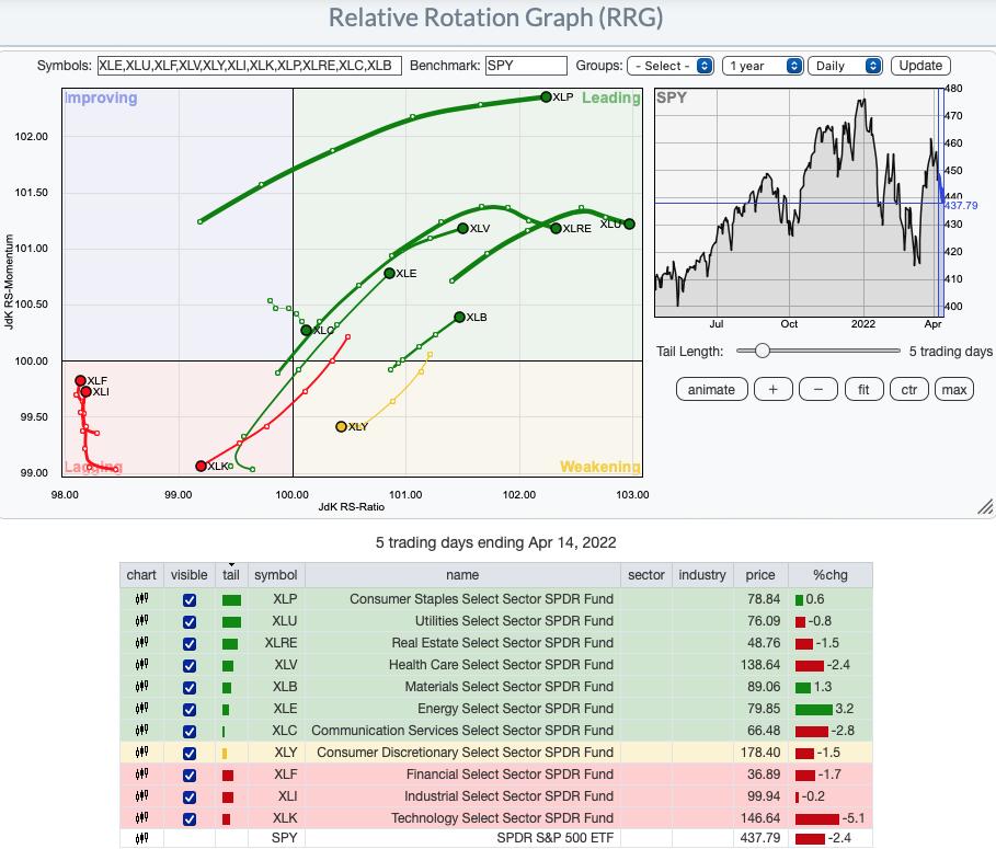
Short-Term (Daily) RRG® Chart: The short-term RRG displays most sectors in the Leading quadrant. The most bullish are Consumer Staples (XLP), Healthcare (XLV), Energy (XLE) and Materials (XLB) given they have bullish northeast headings within the Leading quadrant. Real Estate (XLRE), Utilities (XLU) and Communication Services (XLC) have headings that are deteriorating as they now move southeast. Not terrible, but it does suggest weakness.
Consumer Discretionary (XLY) and Technology (XLK) look the most bearish. XLK in particular. Both have bearish southwest headings with XLK sitting in the Lagging quadrant versus XLY which resides in the Weakening quadrant.
Financials (XLF) and Industrials (XLI) are in the bearish Lagging quadrant but are headed northward toward the Improving quadrant.
Intermediate-Term (Weekly) RRG® Chart: The longer-term RRG is similar.
XLK is the most bearish with a southwest heading within the Lagging quadrant. At least XLY, also in the Lagging quadrant, is headed northward toward the Improving quadrant.
XLC is oscillating between Lagging and Improving quadrants. You saw the chart in the opening--not a good looking setup.
XLF is next up in the bearish category given its sharp southwest bearish heading while within the Weakening quadrant. It should hit the Lagging quadrant in another week or two unless we see a strong reversal in that sector which we don't foresee.
The rest of the sectors reside in the Leading quadrant. All now have bullish northeast headings with the exception of XLE and XLI which are both headed toward the Weakening quadrant. We still like XLE, but would like to see more improvement on the XLI sector chart.
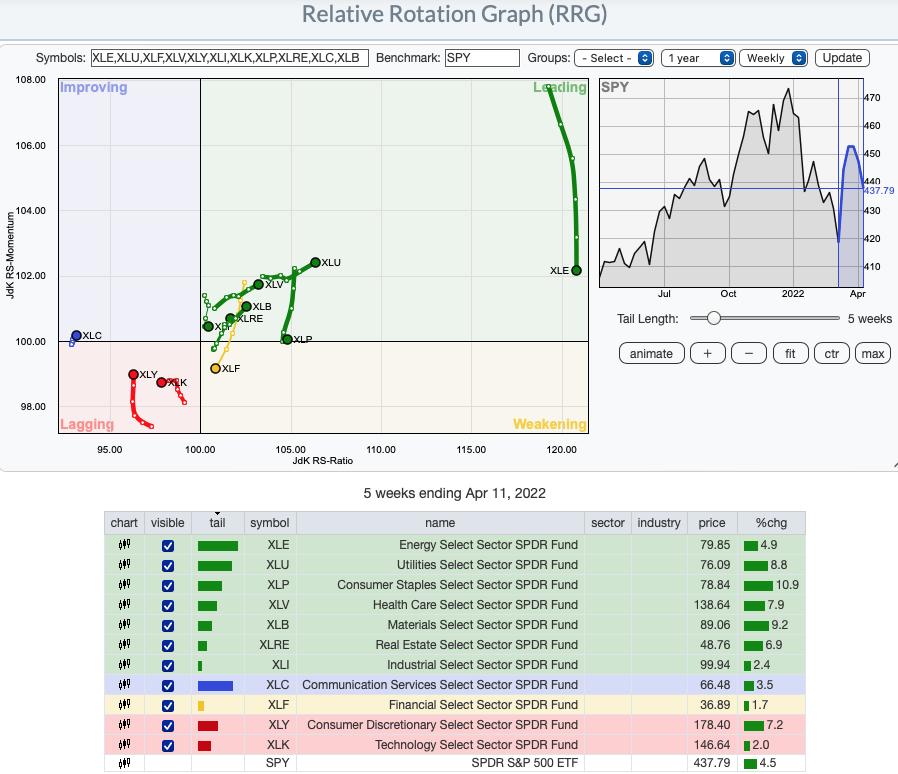
RRG® charts show you the relative strength and momentum for a group of stocks. Stocks with strong relative strength and momentum appear in the green Leading quadrant. As relative momentum fades, they typically move into the yellow Weakening quadrant. If relative strength then fades, they move into the red Lagging quadrant. Finally, when momentum starts to pick up again, they shift into the blue Improving quadrant.
CLICK HERE for an animated version of the RRG chart.
CLICK HERE for Carl's annotated Sector charts.
THE MARKET (S&P 500)
IT Trend Model: NEUTRAL as of 1/21/2022
LT Trend Model: BUY as of 6/8/2020
SPY Daily Chart: The falling wedge formation tried to resolve upward today, but it couldn't quite make it. If price stays level one more trading day, it will exit the wedge sideways, which is really not a breakout and would imply price will probably head lower eventually. There was rather more volume today than we expected for the last day of a short week, but that is probably explained by options expiration.
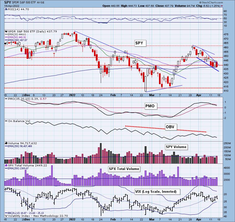
The RSI is in negative territory below net neutral (50) and the PMO is on a SELL signal that generated this week. Stochastics have ticked down in oversold territory. Even the VIX turned down below its EMA. The 200-day EMA is holding as support, but we know most of the other indexes have lost similar support.
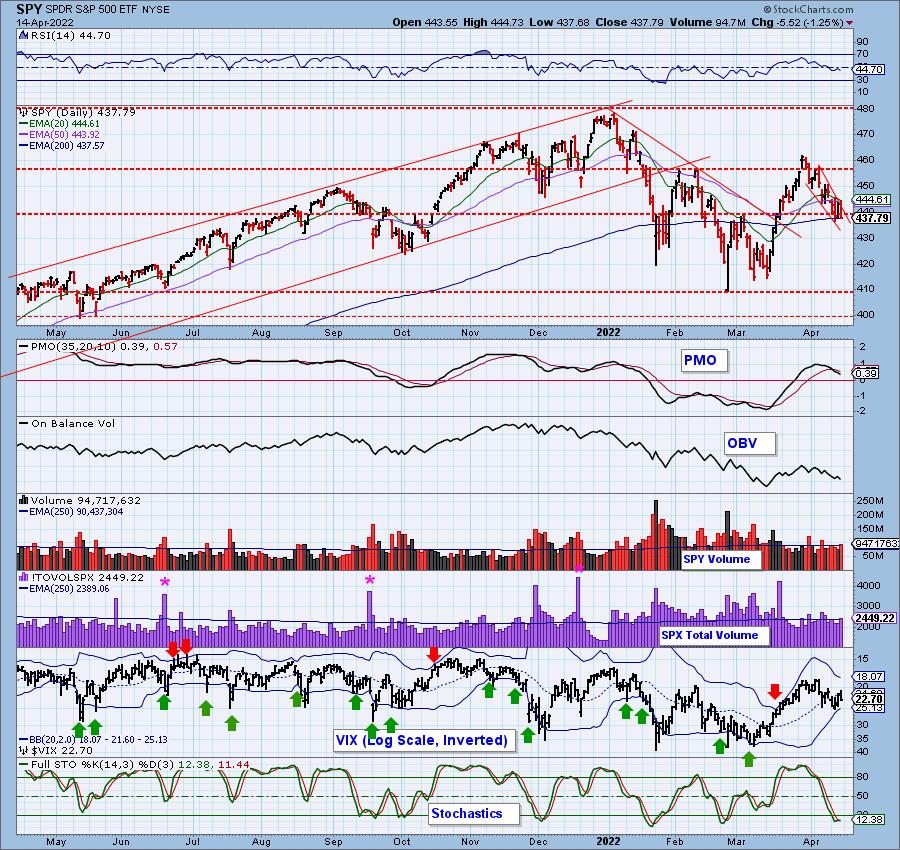
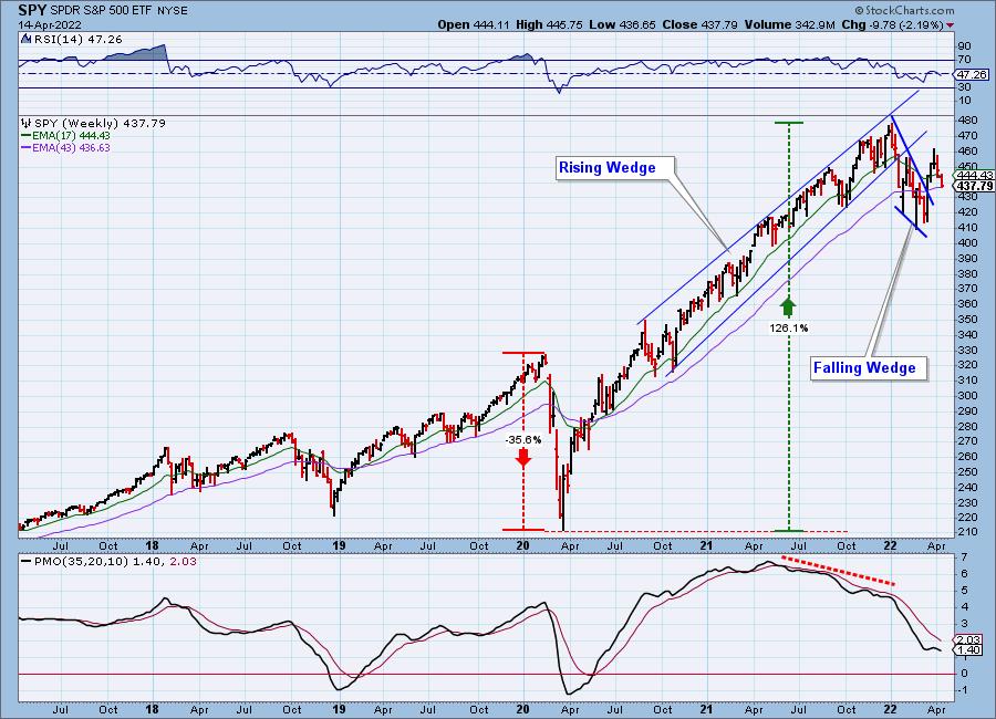
SPY Weekly Chart: The bullish falling wedge was confirmed on the breakout, but price has deteriorated since. The 43-week EMA mimics the 200-day EMA on the daily chart. That support is holding, but given the weekly RSI is now negative and falling, and the weekly PMO has topped below its signal line, we aren't confident that this level will hold much longer.
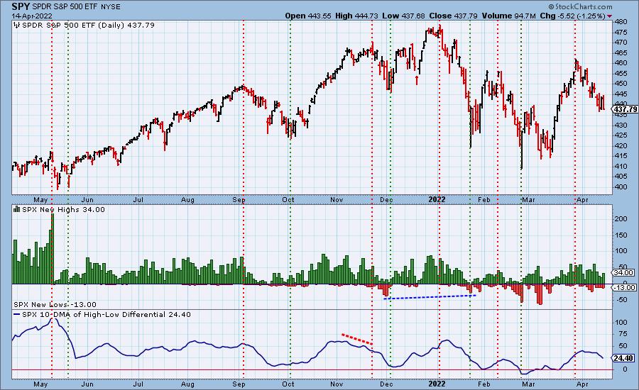
New 52-Week Highs/Lows: New Highs and New Lows expanded today. The stocks that have been making new 52-week highs continue to do so. They are in strong industry groups and until those pockets of strength are erased, we could continue to see more New Highs on this chart.
Climax Analysis: There was no follow through for yesterday's upside initiation climax. Today's SPX Net A-D barely reached climax levels, and it was alone in that effort.
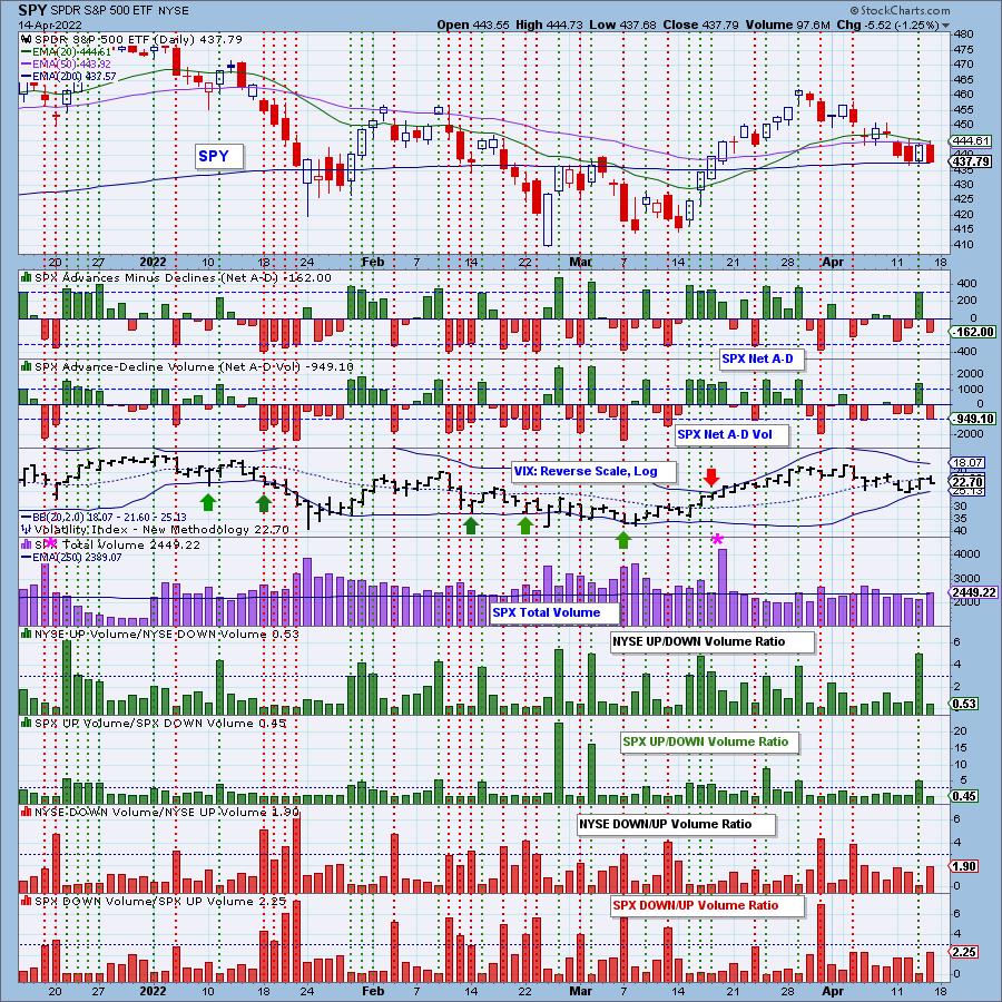
*A climax is a one-day event when market action generates very high readings in, primarily, breadth and volume indicators. We also include the VIX, watching for it to penetrate outside the Bollinger Band envelope. The vertical dotted lines mark climax days -- red for downside climaxes, and green for upside. Climaxes indicate either initiation or exhaustion.
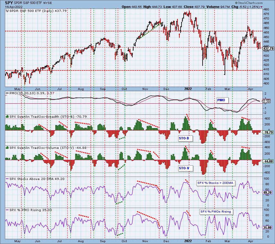
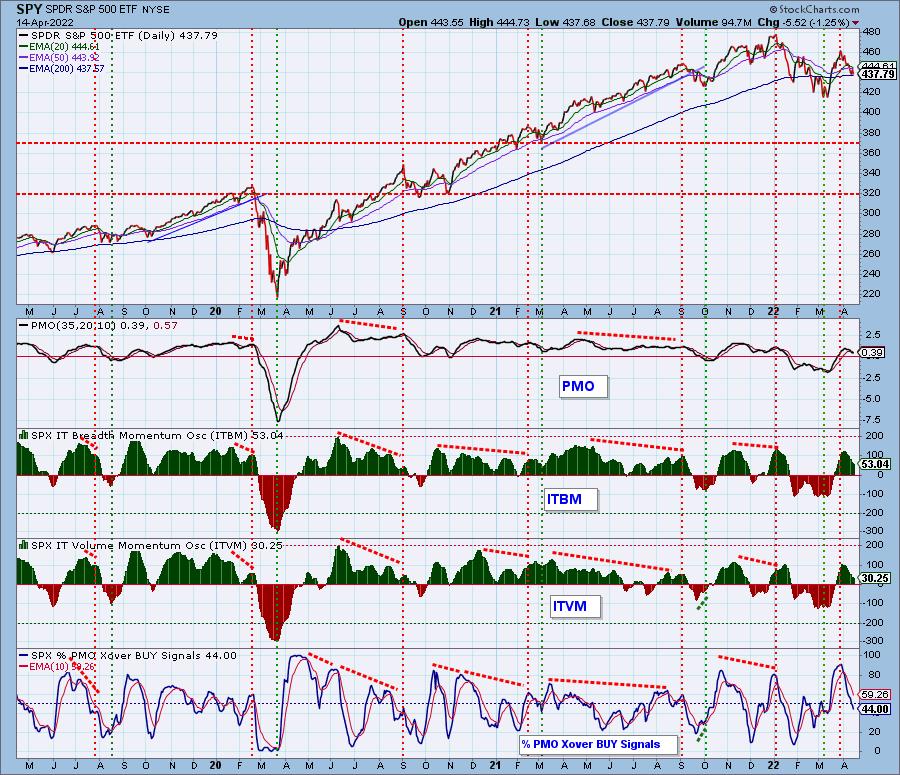
Short-Term Market Indicators: The short-term market trend is DOWN and the condition is NEUTRAL.
STOs were mixed today with the STO-B falling and the STO-V rising. Both are in neutral territory. %PMOs Rising continues to trend lower. It will be very difficult for a rebound rally here given only about 1/3rd of the SPX have rising momentum.
Intermediate-Term Market Indicators: The intermediate-term market trend is DOWN and the condition is SOMEWHAT OVERBOUGHT.
The ITBM and ITVM continue lower suggesting weakness in the intermediate term. %PMO BUY signals are trending lower and lower making the picture even more bearish.
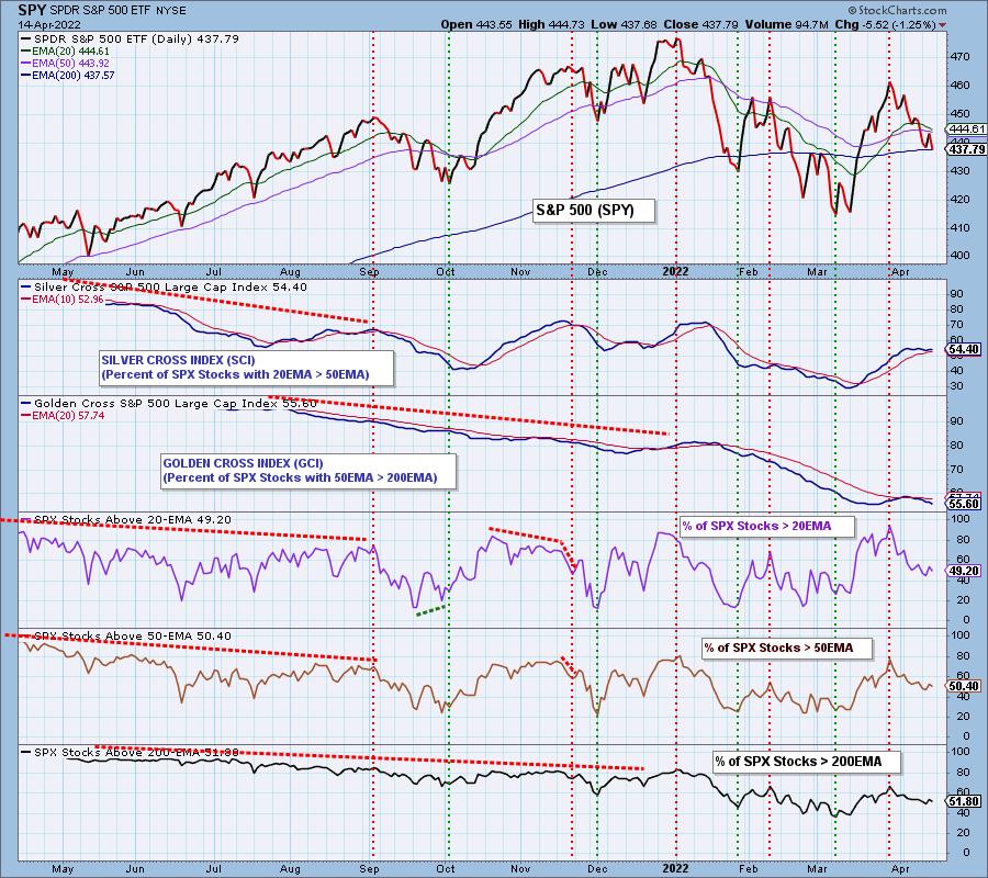
PARTICIPATION and BIAS Assessment: The following chart objectively shows the depth and trend of participation in two time frames.
- Intermediate-Term - the Silver Cross Index (SCI) shows the percentage of SPX stocks on IT Trend Model BUY signals (20-EMA > 50-EMA). The opposite of the Silver Cross is a "Dark Cross" -- those stocks are, at the very least, in a correction.
- Long-Term - the Golden Cross Index (GCI) shows the percentage of SPX stocks on LT Trend Model BUY signals (50-EMA > 200-EMA). The opposite of a Golden Cross is the "Death Cross" -- those stocks are in a bear market.
Financials (XLF) shows a very bearish IT bias currently and with weak earnings season beginning for these stocks, that bias could get even worse.
Consumer Staples (XLP) saw the biggest one-week change in the SCI. That sector is on fire and should continue to lead in this weak market.
Gold Miners (GDX) and Healthcare (XLV) are showing a very positive bias. Utilities (XLU) and Real Estate (XLRE) are seeing improvement in their IT bias as well.
The following table summarizes participation for the major market indexes and sectors. The 1-Week Change columns inject a dynamic aspect to the presentation.
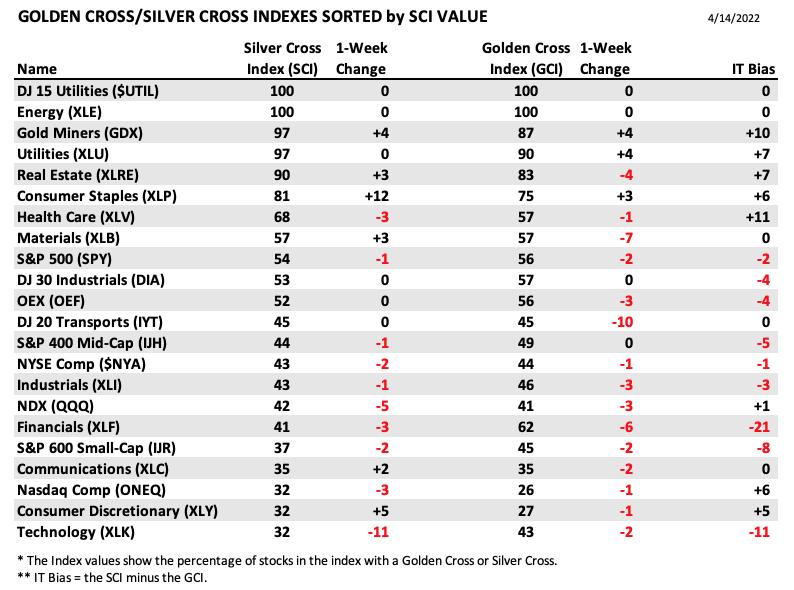
This week we are adding a new SCI/GCI table sorted by SCI values. This give a clear picture of strongest to waekest index in terms of participation.
The GCI continues lower beneath its signal line. It can easily be read as a bearish long-term bias.
The SCI was flat this week, but is currently falling well below our bullish 70% threshold. This gives us an IT bearish bias.
Given the %Stocks > 20/50/200-day EMAs are below both the SCI and GCI, the short-term bias is also bearish.
CONCLUSION: With yesterday's upside initiation climax and the formation of a bullish falling wedge, the market had an opportunity to rebound. It has yet to do so. While it remains above the 200-day EMA, the indicators suggest that level of support will disintegrate soon. New Highs are not contracting to the degree you would expect on a decline of this magnitude. It tells us that there are winners that are continuing to win. Look toward the Energy sector and Consumer Staples. These sectors have the best participation. In any case, if you're going to be 'in', be ready to manage all positions in the short term regardless of their sector.
Erin is 15% exposed to the market but will likely expand her exposure next week to take advantage of obvious strength within certain industry groups as directed by her Diamonds scans.
Have you subscribed the DecisionPoint Diamonds yet? DP does the work for you by providing handpicked stocks/ETFs from exclusive DP scans! Add it with a discount! Contact support@decisionpoint.com for more information!
BITCOIN
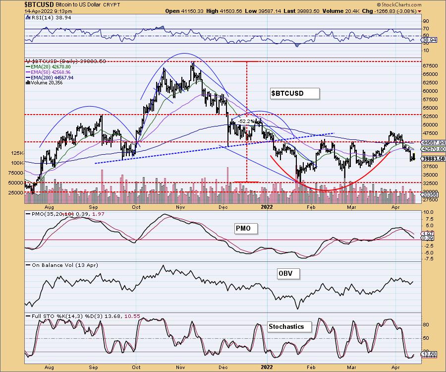
The handle on the cup and handle pattern has extended almost halfway down the trading range that the cup is bounded by. We have yet to get the upside breakout this pattern calls for. Indicators are very negative with the exception of Stochastics which have reversed in oversold territory. The next level of short-term support lies at $37,500. Despite positive Stochastics, we would look for a test of that support.
INTEREST RATES
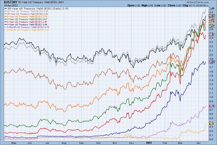
Rates continue to skyrocket and we don't see any relief in sight. Bonds are getting decimated and will continue to. If you want to trade the interest rates, consider the ETF (PFIX).
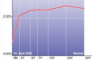
The Yield Curve Chart from StockCharts.com shows us the inversions taking place. The red line should move higher from left to right. Inversions are occurring where it moves downward.
10-YEAR T-BOND YIELD
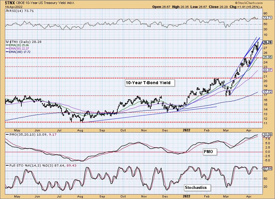
Today the rising wedge became a little bit tighter, and the implications, based on the RSI, PMO and Stochastics, are that the formation will resolve upward, rather than downward as we normally expect. We can't predict the future, but certain price behavior leads us to expect a certain resolution. We shall see.
MORTGAGE INTEREST RATES (30-Yr)**
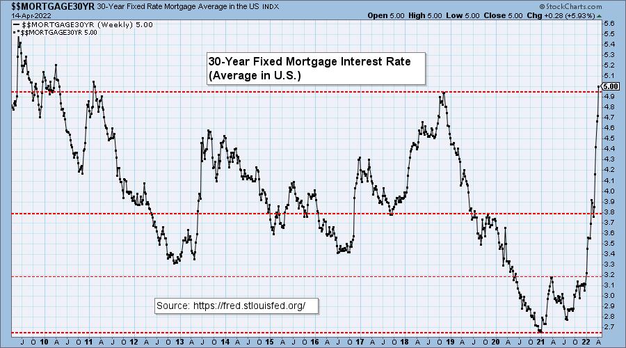
**We watch the 30-Year Fixed Mortgage Interest Rate, because, for the most part, people buy homes based upon the maximum monthly payment they can afford. As rates rise, a fixed monthly payment will carry a smaller mortgage amount. As buying power shrinks, home prices will come under pressure.
--
This week the 30-year fixed rate mortgage hit a 10-year high of 5.0%. Now a nominal monthly payment of $2,015 can only service a mortgage that is -25% smaller than the amount of 16 months ago.

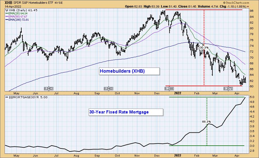
On Monday's DP TV Show Carl presented the following chart, which shows that the mortgage rate increase since December has caused a -30% drop for stocks in the Homebuilders Sector. This tells us that building houses will be less profitable, so fewer houses will be built. Won't that make home prices go up? Not if people can't afford them. Demand will go down, and people will stay where they are.
DOLLAR (UUP)
IT Trend Model: BUY as of 6/22/2021
LT Trend Model: BUY as of 8/19/2021
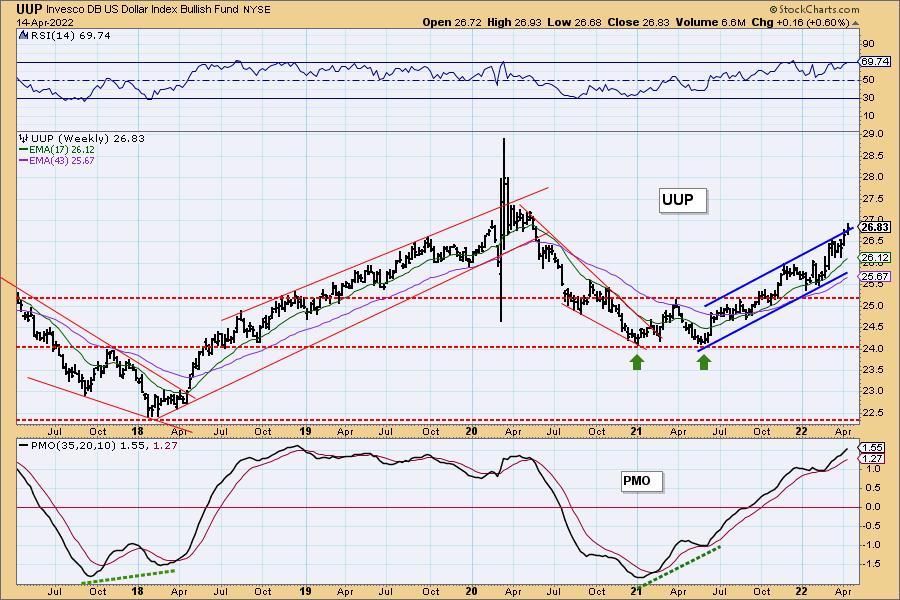
UUP Daily Chart: Things were looking a bit tenuous for the Dollar yesterday with a bearish engulfing candlestick paired with topping indicators. Today indicators are realigning. Still, we have a shooting star candlestick today, also a bearish pattern. If the Dollar fails to reach the top of its rising trend channel, it will set up a bearish rising wedge.
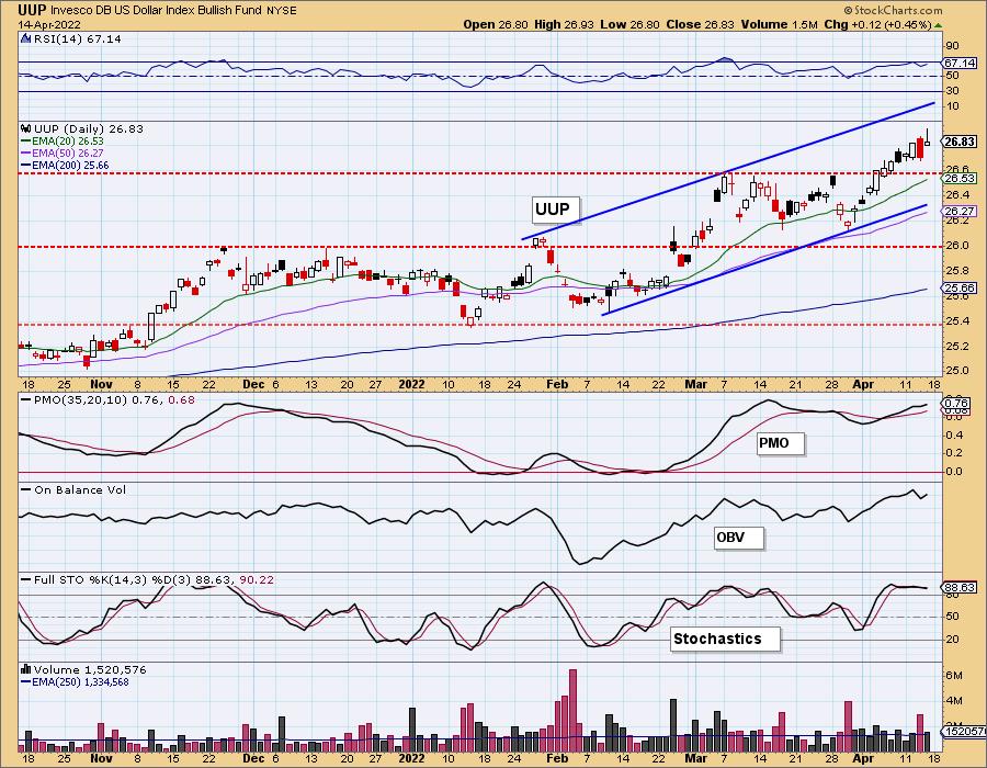
Given price has burst from the top of the intermediate-term rising trend channel, we could see price break down.
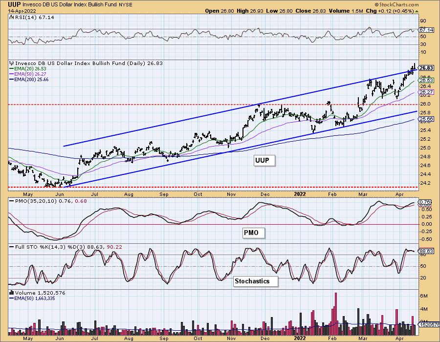
UUP Weekly Chart: We can see the same rising trend channel on the weekly chart and its attempts to breakout above it. Weekly indicators are bullish, but price looks extended.
GOLD
IT Trend Model: BUY as of 12/29/2021
LT Trend Model: BUY as of 1/12/2022
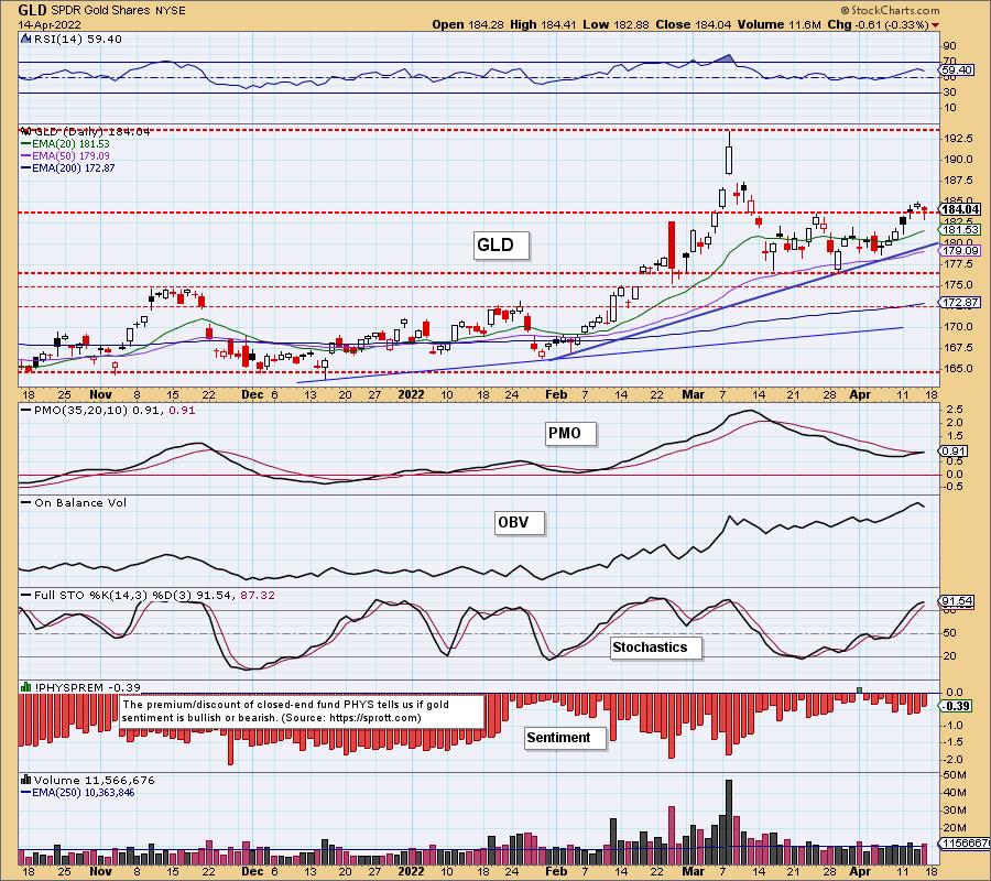
GOLD Daily Chart: Gold declined slightly today but managed to stay above the late March top. Indicators are still positive. In fact, the PMO is in the midst of a crossover BUY signal on GLD.
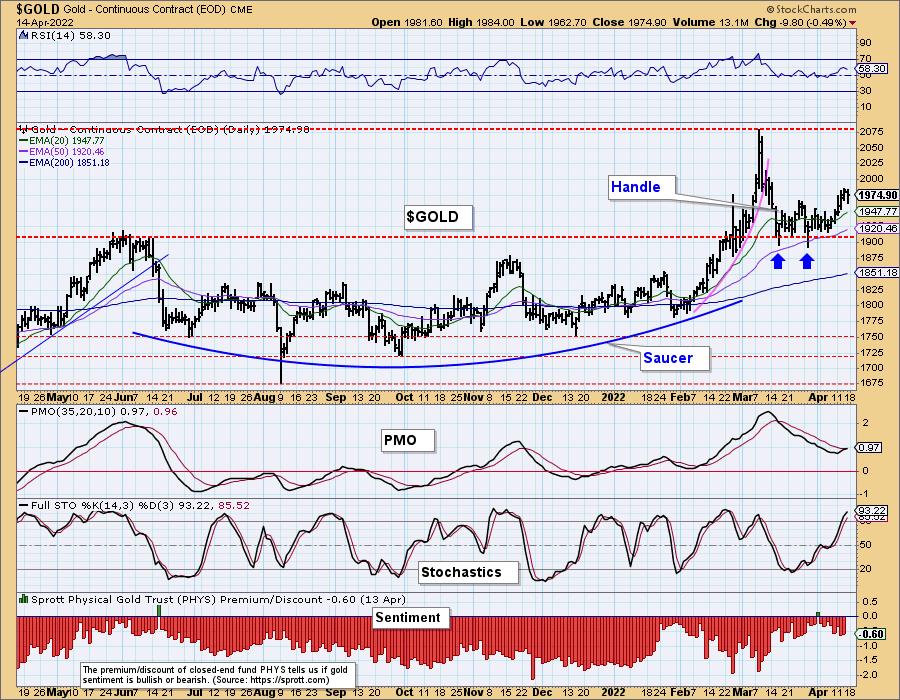
Unlike Bitcoin's cup with handle pattern, Gold's handle is progressing as it should with a breakout from the declining trend of the handle. In the case of $GOLD, the PMO has already generated a PMO crossover BUY signal.
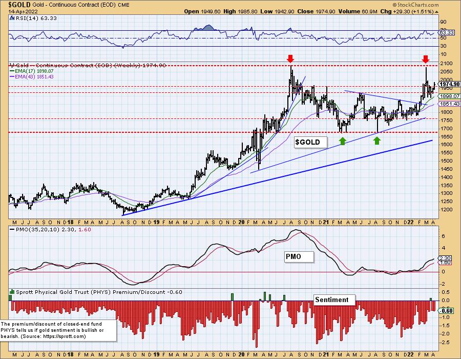
GOLD Weekly Chart: Gold is headed toward overhead resistance at all-time highs. The weekly RSI is positive, rising and not overbought. The weekly PMO is accelerating higher. Discounts are still low suggesting investors are more bullish than earlier this year. All-time highs should be tested.
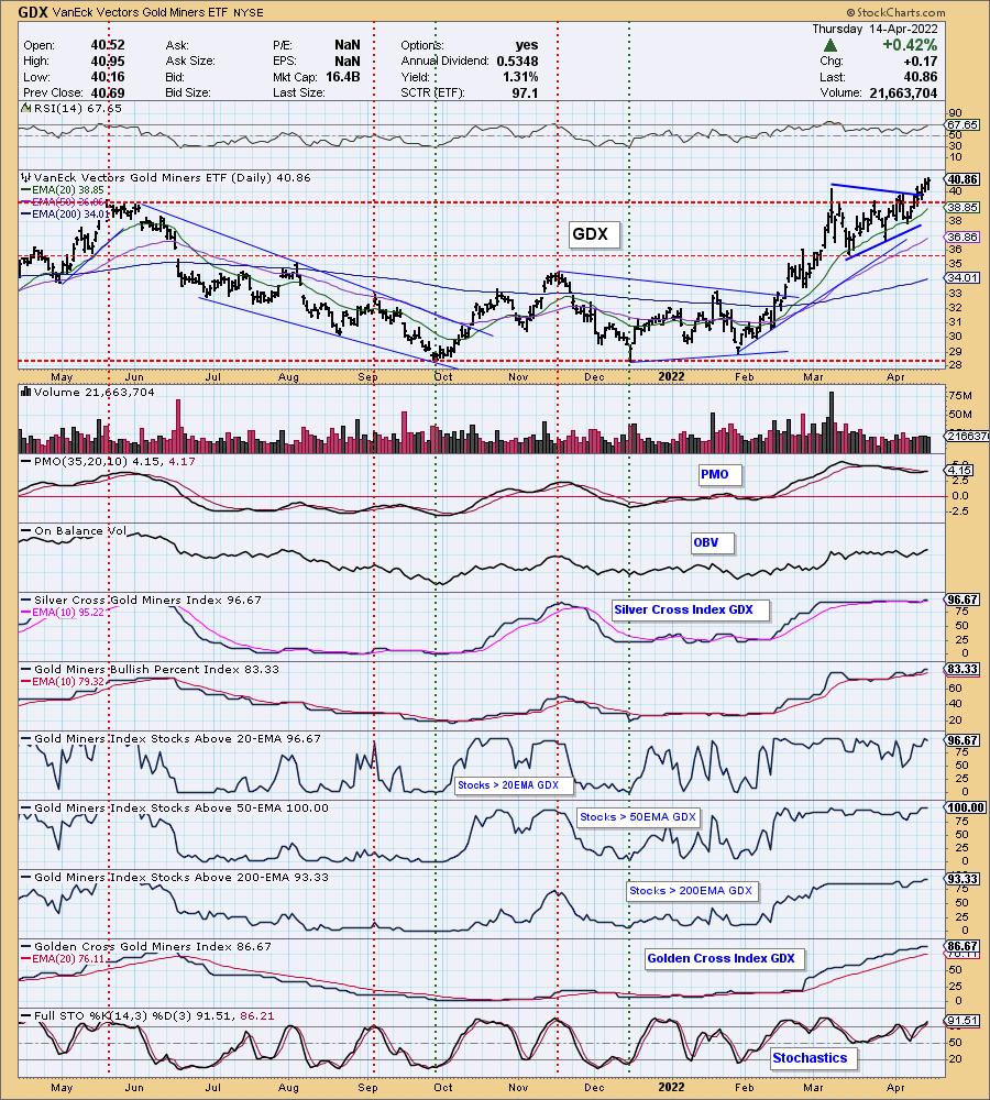
GOLD MINERS Golden and Silver Cross Indexes: GDX broke out of its symmetrical triangle this week and continues higher. The PMO is about to generate a crossover BUY signal and the RSI is positive. Stochastics are now above 80. Participation continues to be outstanding so we would look for the rally to continue for Gold Miners.
CRUDE OIL (USO)
IT Trend Model: BUY as of 1/3/2022
LT Trend Model: BUY as of 3/9/2021
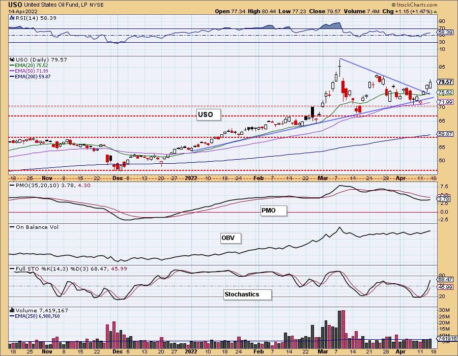
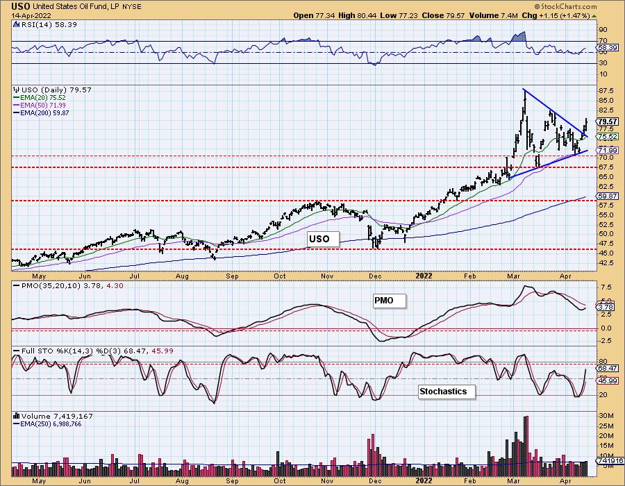
USO Daily Chart: Speaking of symmetrical triangles, Crude Oil broke from the continuation pattern to the upside as expected. The indicators are very bullish. The PMO is beginning to rise and hasn't given us a crossover BUY signal, but we believe it is only a matter of time.
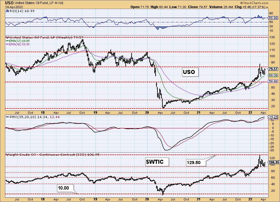
USO/$WTIC Weekly Chart: After hitting strong overhead resistance at 2019 lows, USO did turn back down. However, this time around we believe it will overcome. The weekly RSI is positive and not overbought. The weekly PMO is still rising. $WTIC is bouncing off recent lows. Higher prices are likely.
BONDS (TLT)
IT Trend Model: NEUTRAL as of 1/5/2022
LT Trend Model: SELLas of 1/19/2022
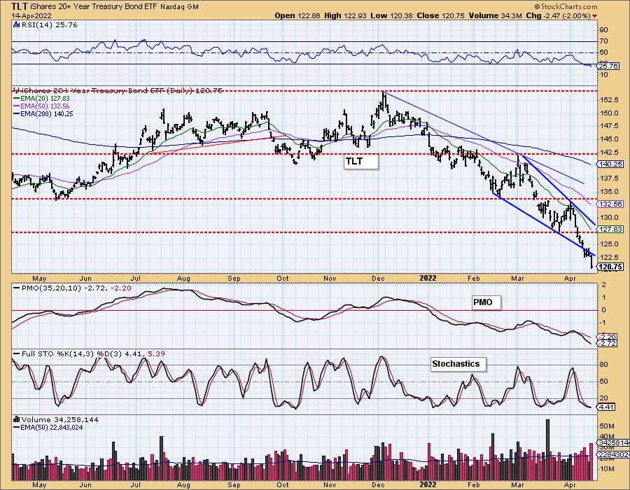
TLT Daily Chart: Bonds continue to fall fast and with rates rising as they are, we don't see any relief ahead. Indicators are very bearish and the OBV shows us that volume is flying out of TLT.
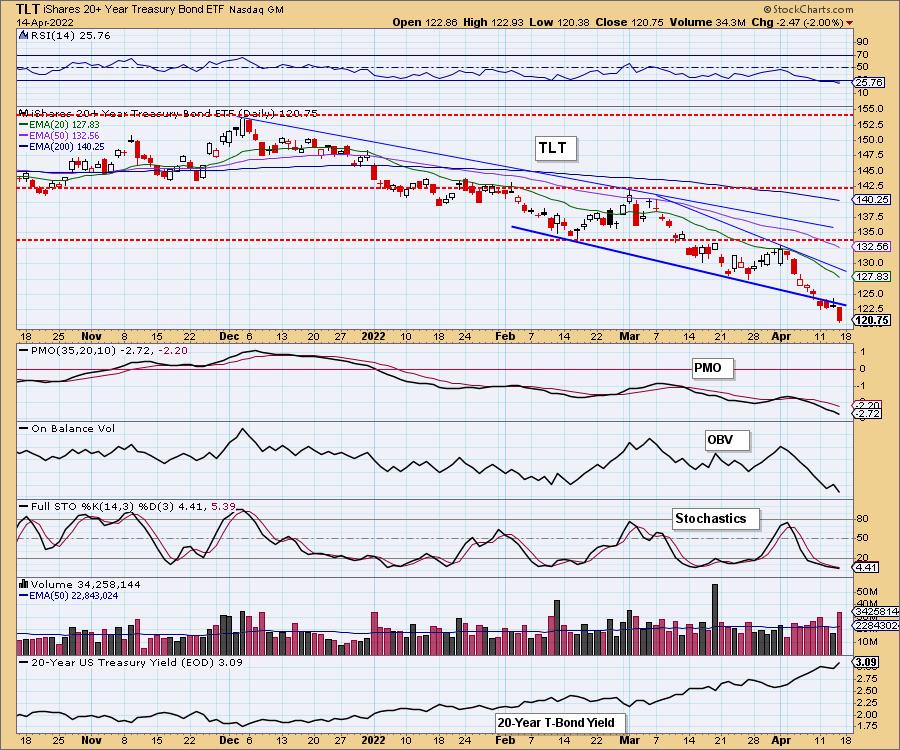
A bearish resolution to a bullish chart pattern (double-bottom) is especially bearish.
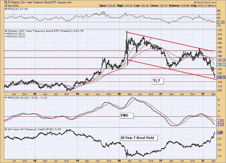
TLT Weekly Chart: The weekly chart shows us that TLT is about to tap the bottom of its declining trend channel. The weekly RSI and PMO are oversold, but still falling fast. If price can't remain in the bearish declining trend channel, then we would look for price to continue to waterfall downward to $105.
Technical Analysis is a windsock, not a crystal ball. --Carl Swenlin
(c) Copyright 2022 DecisionPoint.com
Disclaimer: This blog is for educational purposes only and should not be construed as financial advice. The ideas and strategies should never be used without first assessing your own personal and financial situation, or without consulting a financial professional. Any opinions expressed herein are solely those of the author, and do not in any way represent the views or opinions of any other person or entity.
NOTE: The signal status reported herein is based upon mechanical trading model signals, specifically, the DecisionPoint Trend Model. They define the implied bias of the price index based upon moving average relationships, but they do not necessarily call for a specific action. They are information flags that should prompt chart review. Further, they do not call for continuous buying or selling during the life of the signal. For example, a BUY signal will probably (but not necessarily) return the best results if action is taken soon after the signal is generated. Additional opportunities for buying may be found as price zigzags higher, but the trader must look for optimum entry points. Conversely, exit points to preserve gains (or minimize losses) may be evident before the model mechanically closes the signal.
Helpful DecisionPoint Links:
DecisionPoint Alert Chart List
DecisionPoint Golden Cross/Silver Cross Index Chart List
DecisionPoint Sector Chart List
Price Momentum Oscillator (PMO)
Swenlin Trading Oscillators (STO-B and STO-V)
DecisionPoint is not a registered investment advisor. Investment and trading decisions are solely your responsibility. DecisionPoint newsletters, blogs or website materials should NOT be interpreted as a recommendation or solicitation to buy or sell any security or to take any specific action.
