
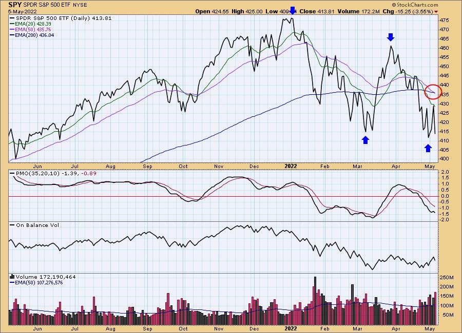
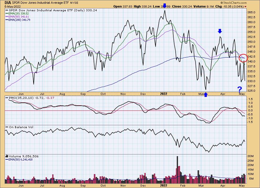
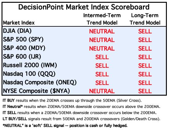
When the 50-day EMA crosses down through the 200-day EMA, it is widely known as a Death Cross. Perhaps this is overly dramatic, but it was named long before we became involved with the financial markets. We were set to announce this early yesterday, but the rally prevented the crossovers from happening. No problem today. SPY has established an intermediate-term falling trend with a top beneath a top and a bottom beneath a bottom. DIA is still waiting for that last bottom.
The DecisionPoint Alert Weekly Wrap presents an end-of-week assessment of the trend and condition of the Stock Market, the U.S. Dollar, Gold, Crude Oil, and Bonds. The DecisionPoint Alert daily report (Monday through Thursday) is abbreviated and gives updates on the Weekly Wrap assessments.
Watch the latest episode of DecisionPoint on StockCharts TV's YouTube channel here!
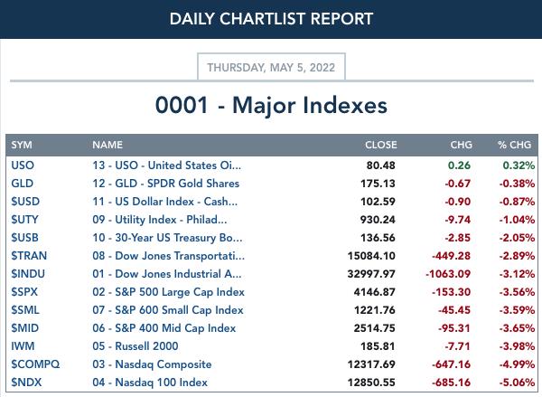
MAJOR MARKET INDEXES
SECTORS
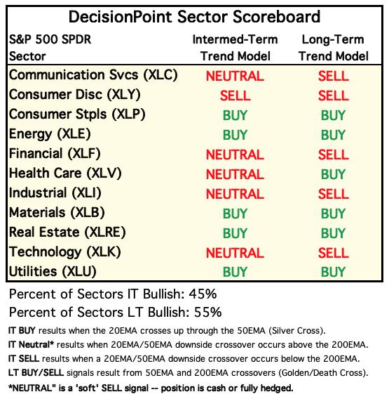
Each S&P 500 Index component stock is assigned to one of 11 major sectors. This is a snapshot of the Intermediate-Term (Silver Cross) and Long-Term (Golden Cross) Trend Model signal status for those sectors.
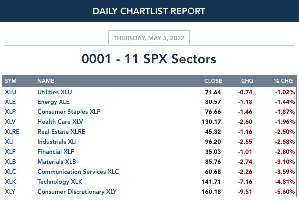
RRG® Chart: Below we have RRG charts using $ONE as the benchmark.
$ONE: Using $ONE as the benchmark, we are given a clear picture of "actual performance" rather than "relative performance". In a decline, this seems a better representation.
First note that NONE of the sectors are in the Improving or Leading quadrants--that's why you don't even see them on the graph. That right away tells us the market is in trouble.
Bright spots or sectors showing some improvement are XLK, XLC and XLE. I do not trust the Technology sector and XLC has been the dog of the sectors fore some time. XLE on the other hand is quickly rising and is near a breakout.
XLP is in the Weakening quadrant but is headed quickly to Lagging. XLB and XLF do appear to be improving, but overall I read the rest of the sectors as bearish and getting more bearish.
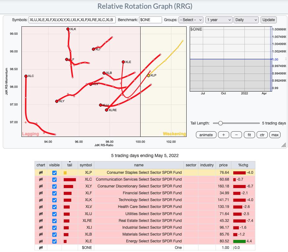
RRG® charts show you the relative strength and momentum for a group of stocks. Stocks with strong relative strength and momentum appear in the green Leading quadrant. As relative momentum fades, they typically move into the yellow Weakening quadrant. If relative strength then fades, they move into the red Lagging quadrant. Finally, when momentum starts to pick up again, they shift into the blue Improving quadrant.
CLICK HERE for an animated version of the RRG chart.
CLICK HERE for Carl's annotated Sector charts.
THE MARKET (S&P 500)
IT Trend Model: NEUTRAL as of 1/21/2022
LT Trend Model: SELL as of 5/5/2022
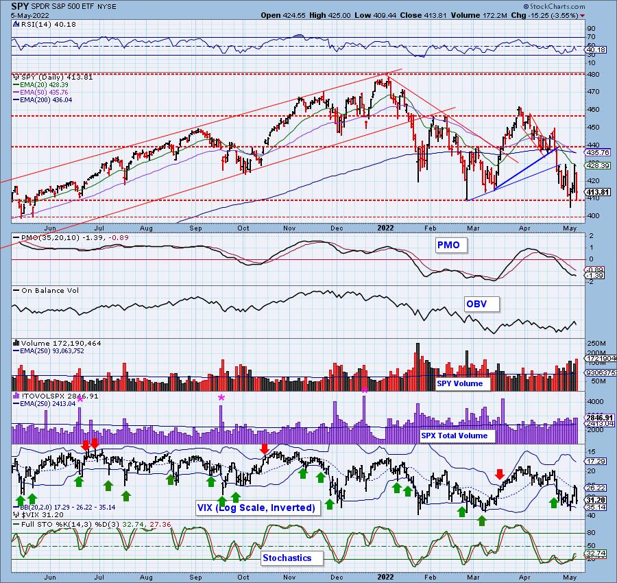
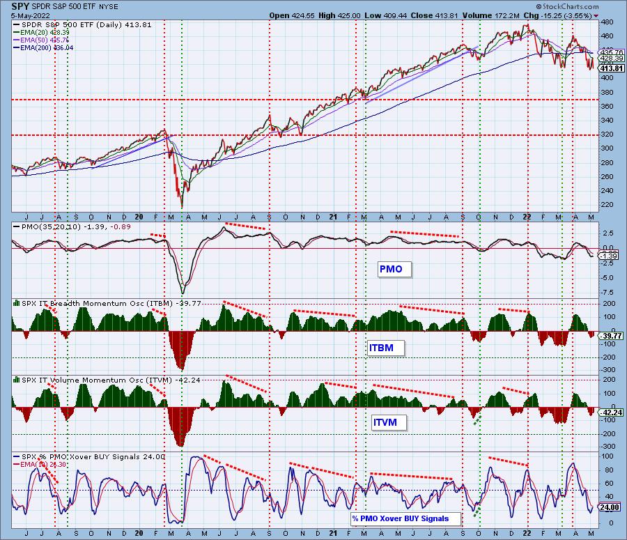
SPY Daily Chart: Whiplash continues. It is now clear to us that yesterday was a blow off spurred on by short covering. Now the market is ready to resume the decline. The RSI turned down in negative territory and the PMO has topped beneath the signal line.
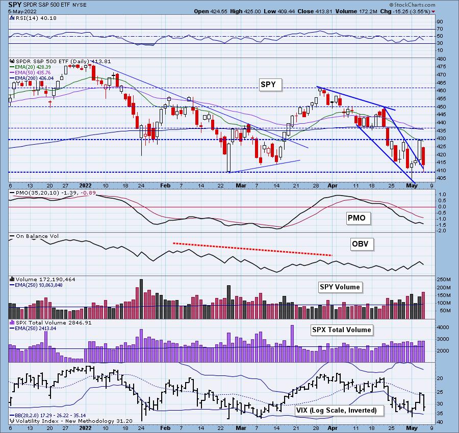
Price is currently holding above support at the June and February lows. The VIX dropped just after getting above its moving average on our inverted scale. This is a sign of profound weakness in our opinion.
Here is the latest recording:
Topic: FREE DecisionPoint Trading Room
Start Time: May 2, 2022 09:00 AM
Meeting Recording Link.
Access Passcode: May#the2nd
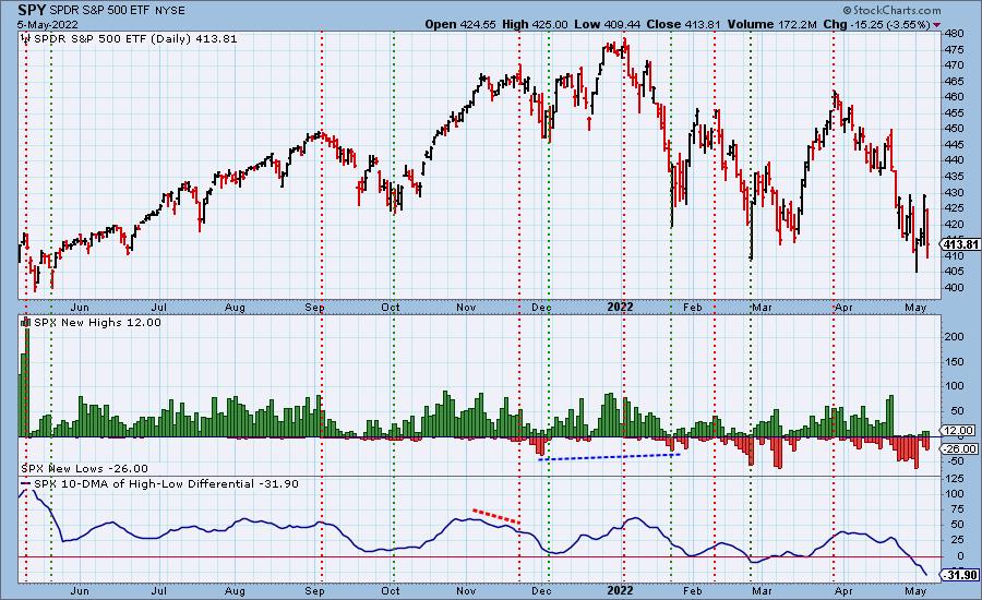
S&P 500 New 52-Week Highs/Lows: New Highs remained about the same. We saw an increase in New Lows (as one would expect), but they haven't reached oversold levels.
Climax* Analysis: Yesterday's massive climax indicator readings were matched or exceeded in reverse today, giving us a downside initiation climax. Looking at the last 10 trading days, we can see only three that were not climactic. Of the remaining seven four were downside climaxes, but price has more or less remained in a range.
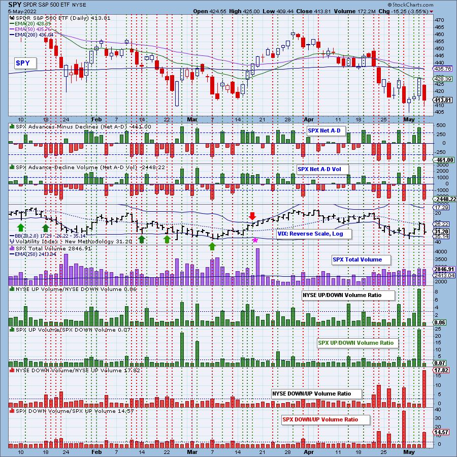
*A climax is a one-day event when market action generates very high readings in, primarily, breadth and volume indicators. We also include the VIX, watching for it to penetrate outside the Bollinger Band envelope. The vertical dotted lines mark climax days -- red for downside climaxes, and green for upside. Climaxes are at their core exhaustion events; however, at price pivots they can be seen to be initiating a change of trend.
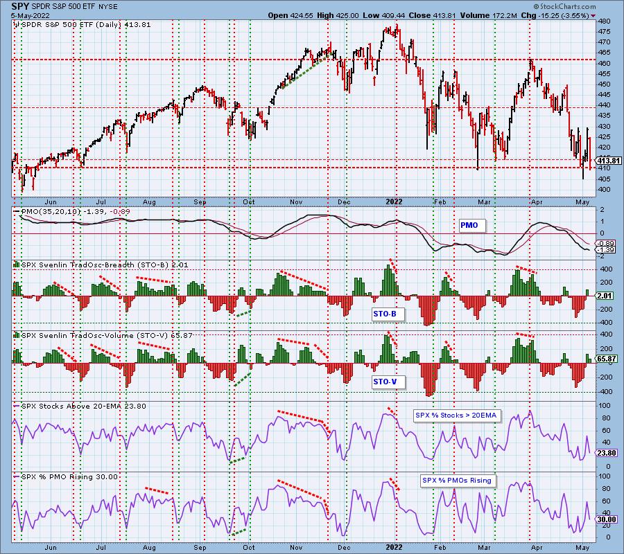
Short-Term Market Indicators: The short-term market trend is DOWN and the condition is NEUTRAL.
STOs were mixed today, but remain in neutral territory--ready to drop at a moments notice. PMOs Rising took a hit as did %Stocks above their 20-day EMA.
Intermediate-Term Market Indicators: The intermediate-term market trend is DOWN and the condition is SOMEWHAT OVERSOLD.
It's a bit of an eye test, but the ITBM moved lower while the ITVM contracted a bit. They are in the process of reversing direction. No change on the amount of crossover BUY signals today.
PARTICIPATION and BIAS Assessment: The following chart objectively shows the depth and trend of participation in two time frames.
- Intermediate-Term - the Silver Cross Index (SCI) shows the percentage of SPX stocks on IT Trend Model BUY signals (20-EMA > 50-EMA). The opposite of the Silver Cross is a "Dark Cross" -- those stocks are, at the very least, in a correction.
- Long-Term - the Golden Cross Index (GCI) shows the percentage of SPX stocks on LT Trend Model BUY signals (50-EMA > 200-EMA). The opposite of a Golden Cross is the "Death Cross" -- those stocks are in a bear market.
We're back to a bearish bias in all timeframes as participation of stocks above their 20/50/200-day EMAs are falling and all percentages are lower than the SCI and GCI.
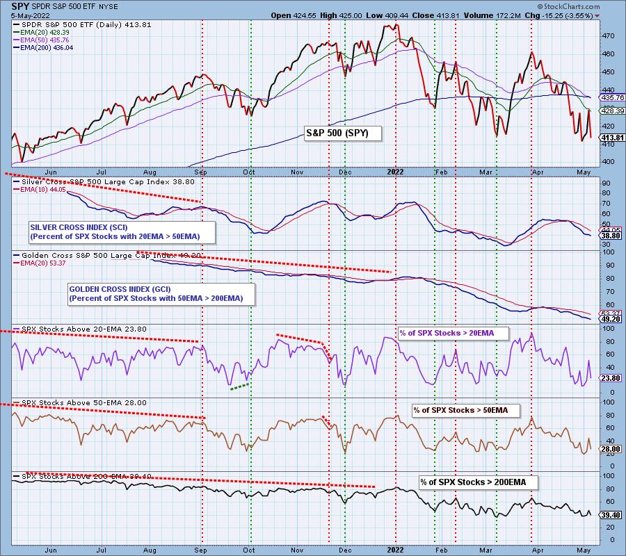
CONCLUSION: Yesterday cleared out the shorts, and today cleared out the new longs, and it is hard to determine which way the market will go next. We favor a downside resolution of the recent trading range based on a number of factors. The bias is bearish across the board, momentum within the index is failing and the PMO topped beneath its signal line. Oh! And throw in a "Death Cross" to confirm the bear market. Be extremely careful with longs.
Be sure and read Carl's free blog article published today regarding market whiplash!
Erin is 25% exposed to the market, 15% is on the "short side".
Have you subscribed the DecisionPoint Diamonds yet? DP does the work for you by providing handpicked stocks/ETFs from exclusive DP scans! Add it with a discount! Contact support@decisionpoint.com for more information!
BITCOIN
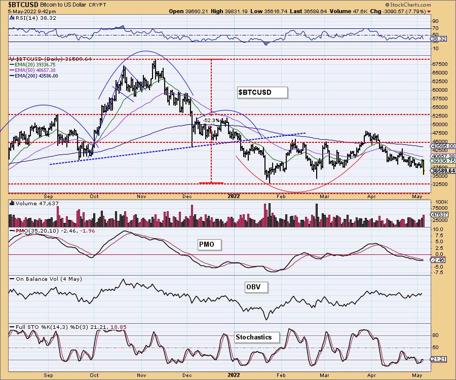
Quick digression: Today Erin had a refrigerator repairman come to the house. When he found out she was a stock market analyst, his question was "What do you think of Bitcoin"? We don't like it, particularly given today's big breakdown below $37,500. It is in a clear declining trend. Next stop is $32,500.
INTEREST RATES
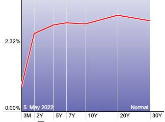
Yields remain in strong rising trends.
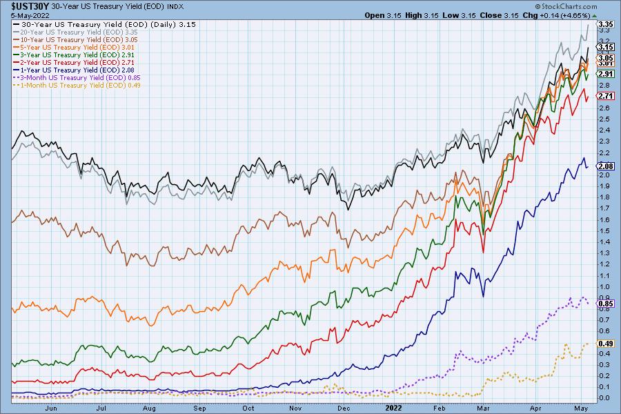
The Yield Curve Chart from StockCharts.com shows us the inversions taking place. The red line should move higher from left to right. Inversions are occurring where it moves downward.
10-YEAR T-BOND YIELD
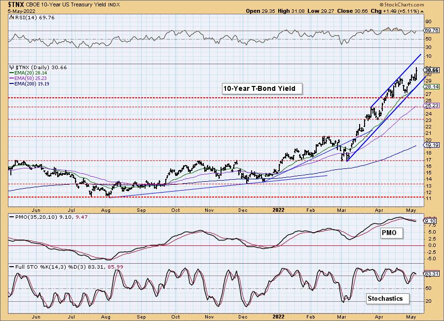
The 10-year yield rallied strongly today. It is in a clear rising trend channel. The PMO began to drift lower and could continue to if the rising trend doesn't change. How is this possible? Remember the PMO measure momentum and if it is in a steady trend or moving sideways, you'll see the PMO flatten. In the case of $TNX, it's been in a steady rising trend, but the pullback in mid-April is canceling out the positive momentum that began to come back on this rally. The PMO is rising now. The RSI is positive and Stochastics are above 80.
DOLLAR (UUP)
IT Trend Model: BUY as of 6/22/2021
LT Trend Model: BUY as of 8/19/2021
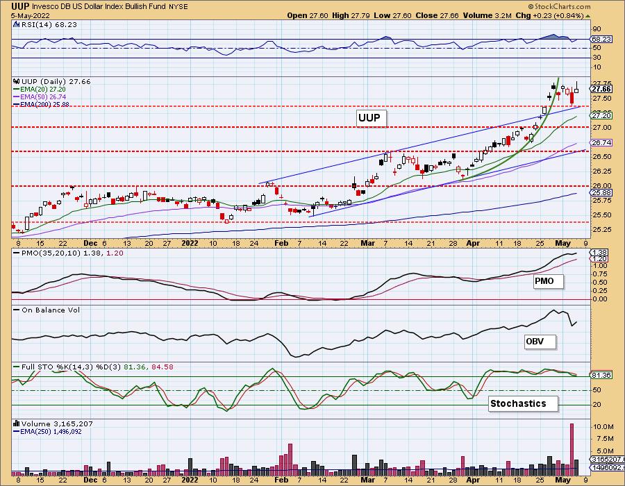
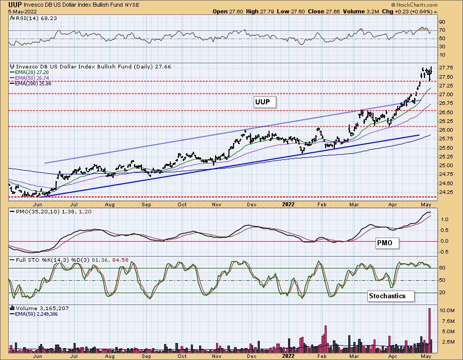
UUP Daily Chart: UUP now taking a pause after its parabolic rise. We have a long wick on today's candle which is considered a bearish shooting star. The indicators are still quite positive so more consolidation seems likely.
GOLD
IT Trend Model: NEUTRAL as of 5/3/2022
LT Trend Model: BUY as of 1/12/2022
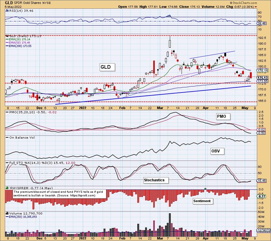
GLD Daily Chart: Gold formed a higher low and higher high but was unable to finish the day with a positive close. The RSI remains negative. The PMO is still falling. Stochastics are firmly in negative territory suggesting quite a bit of internal weakness.
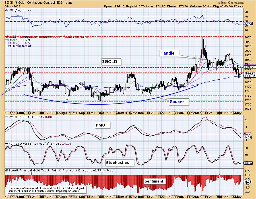
GOLD Daily Chart: We were asked about the saucer and handle. The pattern is a bit wonky, but the psychology is the same. Price moving up parabolically after a rounded bottom (saucer), followed by a pullback or handle. The handle is extending further. At this point what is most important is the 200-day EMA is holding as support. If that support is lost and the "handle" moves much lower (like on Bitcoin), the pattern will be scrapped.
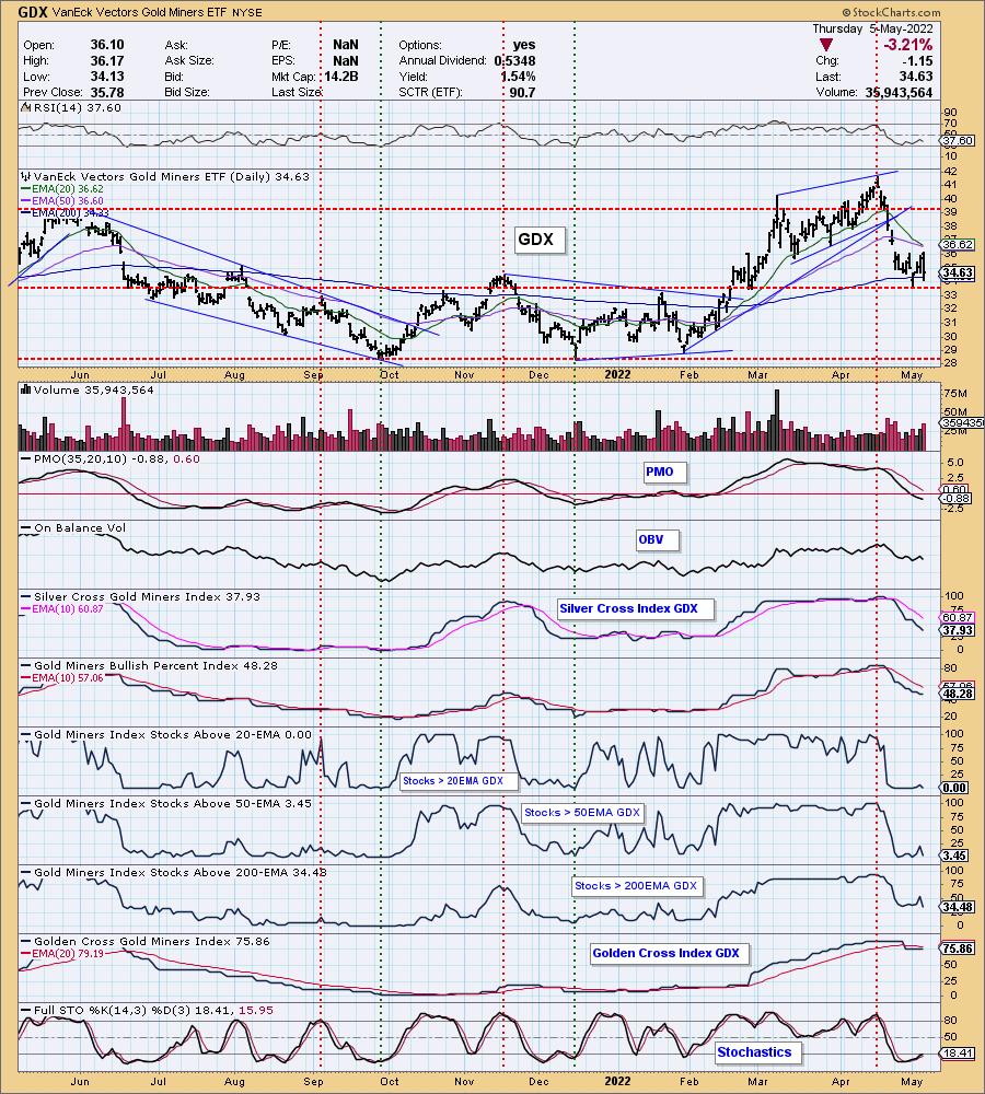
GOLD MINERS Golden and Silver Cross Indexes: Yesterday's comments still apply:
"GDX is bouncing off the 200-day EMA and support at the November high. While this is encouraging, indicators are not. Participation is not improving in a meaningful way. %Stocks > 20/50-day EMAs is paltry and the SCI is still declining quickly. The PMO is below the zero line and the RSI is in negative territory. Stochastics are mostly flat. Not enough positive data on this chart to imply this rally is sustainable."
CRUDE OIL (USO)
IT Trend Model: BUY as of 1/3/2022
LT Trend Model: BUY as of 3/9/2021
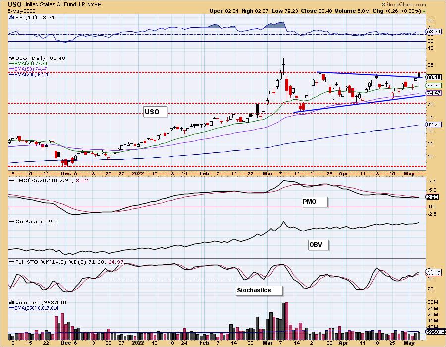
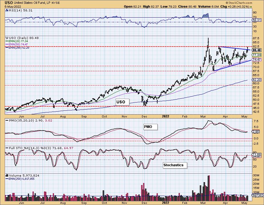
USO Daily Chart: Crude rallied but formed a bearish black filled candlestick. This occurred just as price hit overhead resistance. The PMO hasn't given us the crossover BUY signal yet, but the RSI and Stochastics are positive. We do expect a breakout here, but this candlestick could mean another day spent underneath resistance at the $82.50 level.
BONDS (TLT)
IT Trend Model: NEUTRALas of 1/5/2022
LT Trend Model: SELL as of 1/19/2022
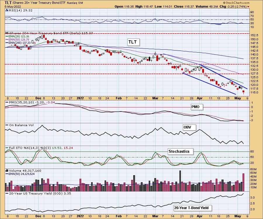
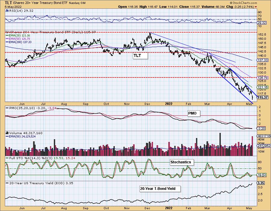
TLT Daily Chart: We still have a bullish falling wedge on TLT, but we aren't at all optimistic that we will get a breakout from the pattern given the RSI, PMO and Stochastics are negative.
Good Luck & Good Trading!
Erin Swenlin
Technical Analysis is a windsock, not a crystal ball. --Carl Swenlin
(c) Copyright 2022 DecisionPoint.com
Disclaimer: This blog is for educational purposes only and should not be construed as financial advice. The ideas and strategies should never be used without first assessing your own personal and financial situation, or without consulting a financial professional. Any opinions expressed herein are solely those of the author, and do not in any way represent the views or opinions of any other person or entity.
NOTE: The signal status reported herein is based upon mechanical trading model signals, specifically, the DecisionPoint Trend Model. They define the implied bias of the price index based upon moving average relationships, but they do not necessarily call for a specific action. They are information flags that should prompt chart review. Further, they do not call for continuous buying or selling during the life of the signal. For example, a BUY signal will probably (but not necessarily) return the best results if action is taken soon after the signal is generated. Additional opportunities for buying may be found as price zigzags higher, but the trader must look for optimum entry points. Conversely, exit points to preserve gains (or minimize losses) may be evident before the model mechanically closes the signal.
Helpful DecisionPoint Links:
DecisionPoint Alert Chart List
DecisionPoint Golden Cross/Silver Cross Index Chart List
DecisionPoint Sector Chart List
Price Momentum Oscillator (PMO)
Swenlin Trading Oscillators (STO-B and STO-V)
DecisionPoint is not a registered investment advisor. Investment and trading decisions are solely your responsibility. DecisionPoint newsletters, blogs or website materials should NOT be interpreted as a recommendation or solicitation to buy or sell any security or to take any specific action.
