
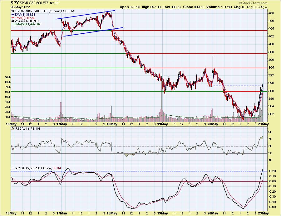
The SPY was up just +0.04% today. It clawed back from a loss of over 2% to close on that positive note. A review of trading for the week on the 5-minute candlestick reveals that this end of day rally broke through overhead resistance at yesterday's lows. The 5-minute RSI and PMO are overbought but this is probably the best looking reversal we saw all week. You'll note that the bearish rising wedge I pointed out on Tuesday fulfilled with gusto. Now we have an encouraging upside reversal going into next week.
The DecisionPoint Alert Weekly Wrap presents an end-of-week assessment of the trend and condition of the Stock Market, the U.S. Dollar, Gold, Crude Oil, and Bonds. The DecisionPoint Alert daily report (Monday through Thursday) is abbreviated and gives updates on the Weekly Wrap assessments.
Watch the latest episode of DecisionPoint on StockCharts TV's YouTube channel here!
MAJOR MARKET INDEXES
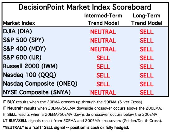
For Today: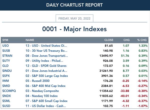
For the Week: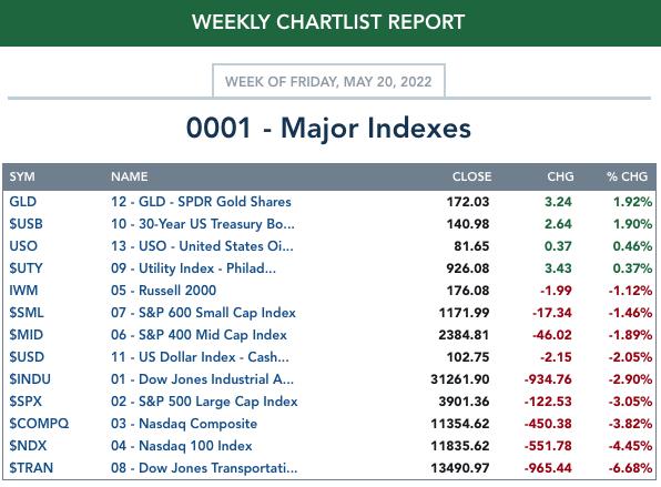
SECTORS
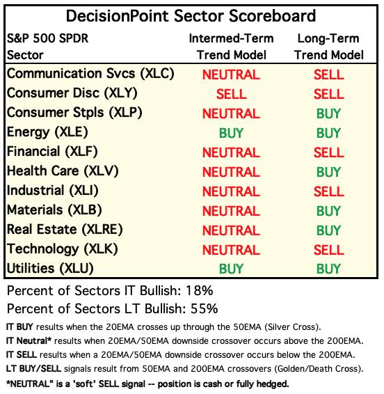
Each S&P 500 Index component stock is assigned to one of 11 major sectors. This is a snapshot of the Intermediate-Term (Silver Cross) and Long-Term (Golden Cross) Trend Model signal status for those sectors.
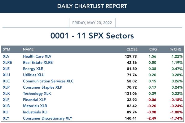
For Today:
For the Week: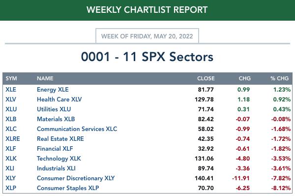
RRG® Daily Chart ($ONE Benchmark):
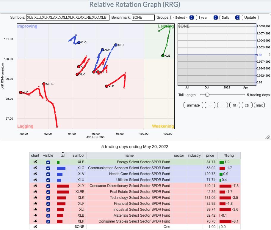
The daily RRG tells us that the most bullish sectors are Energy (XLE) which resides in the Leading quadrant and Communication Services (XLC), Healthcare (XLV) and Utilities (XLU). Of the four, XLE has a bearish southwest heading and should hit the Weakening quadrant soon if the rally doesn't resume. The other three are not yet in the Leading quadrant, but they do have bullish northeast headings. Of the four, XLU is nearest to Leading and has a slight advantage over the other two.
The remaining sectors are all in the Lagging quadrant. XLRE is showing improvement as it moves northward toward the Improving quadrant, but all of the others have bearish southwest headings.
RRG® Weekly Chart ($ONE Benchmark):
None of the sectors have bullish northeast headings with the exception of XLC which has reversed and is headed toward the Improving quadrant.
Of those in the Leading quadrant, XLB is maintaining a precarious position in the quadrant. XLV and XLU are headed toward the Weakening quadrant where they will join XLP and XLE. XLE is moving quickly into Weakening. Crude Oil has been consolidating sideways which likely has affected the position of XLE. XLP does have a northward component to its heading. However, it will need more than what it is seeing if it wants to enter the Leading quadrant.
The remaining sectors are in the Lagging quadrant. We already noted XLC's bullish northeast heading. XLF and XLK are also swinging back toward Improving. Unfortunately, it will take a lot of improvement to get into the Improving quadrant and looking at those sector charts leaves us pessimistic.
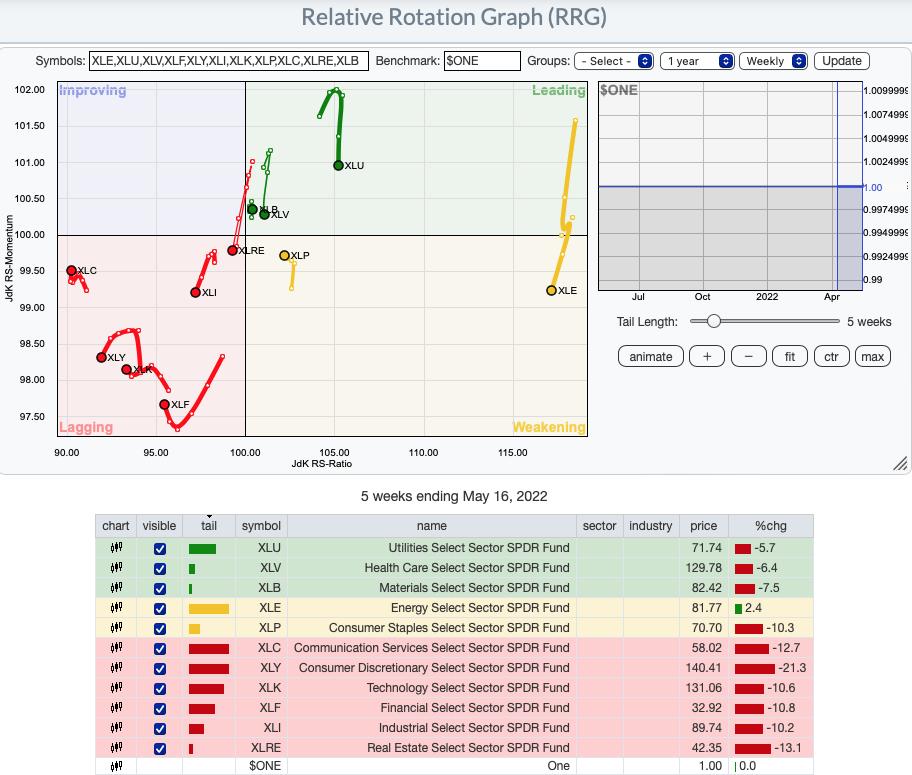
RRG® charts show you the relative strength and momentum for a group of stocks. Stocks with strong relative strength and momentum appear in the green Leading quadrant. As relative momentum fades, they typically move into the yellow Weakening quadrant. If relative strength then fades, they move into the red Lagging quadrant. Finally, when momentum starts to pick up again, they shift into the blue Improving quadrant.
CLICK HERE for an animated version of the RRG chart.
CLICK HERE for Carl's annotated Sector charts.
THE MARKET (S&P 500)
IT Trend Model: NEUTRAL as of 1/21/2022
LT Trend Model: SELL as of 5/5/2022
SPY Daily Chart: On options expiration week we always expect the last two days of the week to have relatively low volatility. Friday's price range was over four percent, but there was only two points difference between Wednesday's close and Friday's close. We should also remember that the increase in Total Volume is due to options expiration.
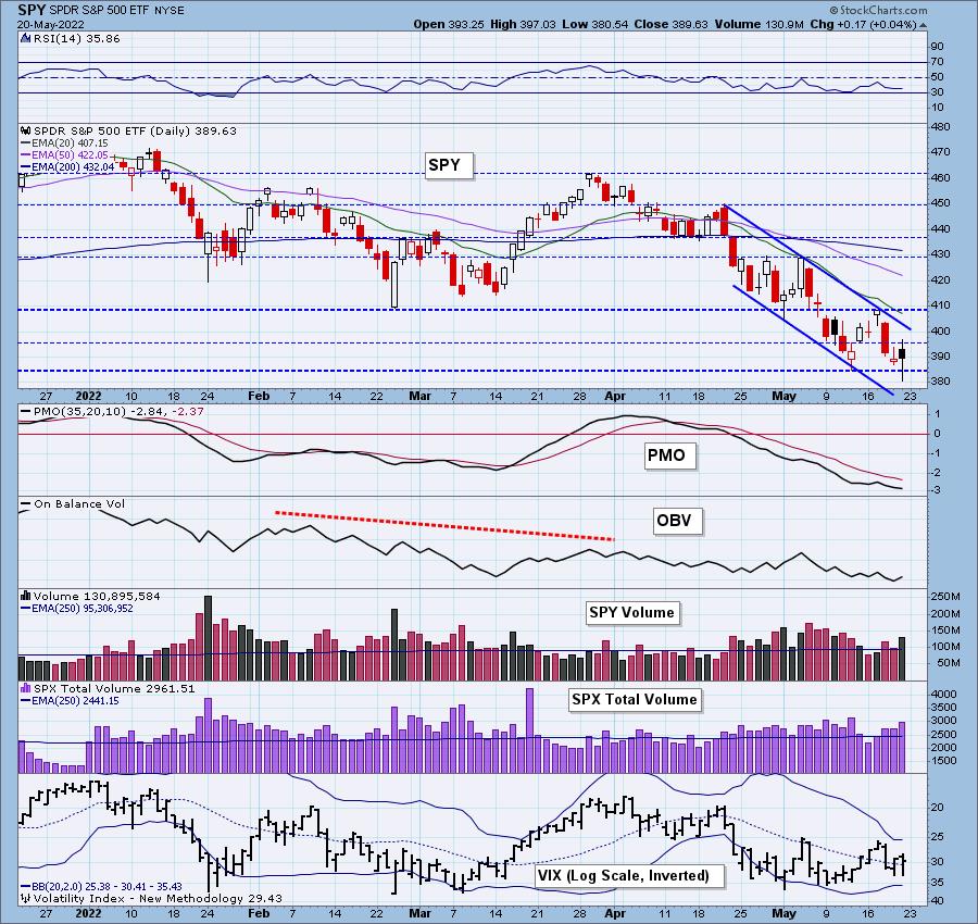
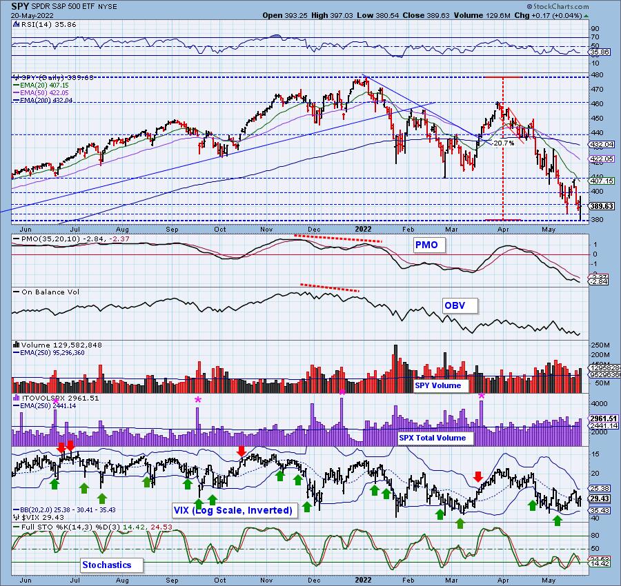
The indicators remain bearish with the PMO topping this week below the signal line and continuing to move lower. The RSI has been negative since mid-April. Stochastics are still falling after topping for a third time below net neutral (50).
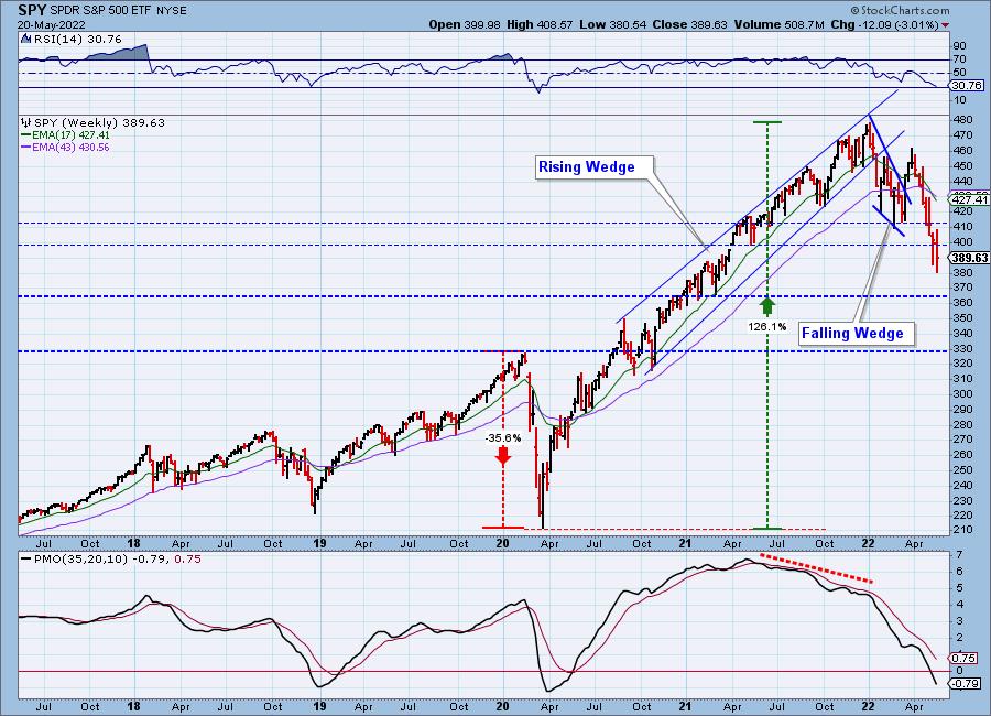
SPY Weekly Chart: Important support was lost this week at the early 2021 gap support zone. The next possible stopping point is $365 which aligns with the early 2021 lows. That isn't particularly sturdy. The 2020 top before the bear market is the strongest level.
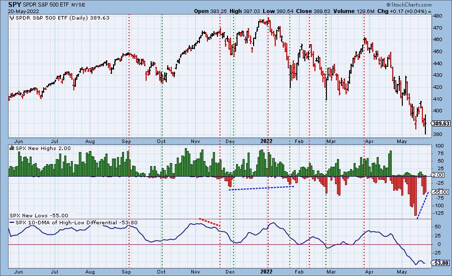
New 52-Week Highs/Lows: There is a positive divergence of New Lows versus the price lows from this week and last week that suggests a potential bounce next week. This is a divergence we are watching closely as the 2020 bear market bottom was in when we saw a positive divergence on New Lows.
Climax Analysis: There were no climactic readings today but this week saw two climax days. Tuesday's upside exhaustion climax saw follow-through that led into Wednesday's downside initiation climax.
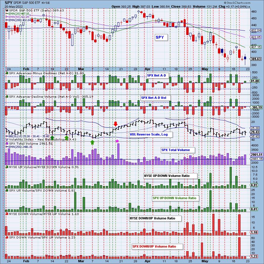
*A climax is a one-day event when market action generates very high readings in, primarily, breadth and volume indicators. We also include the VIX, watching for it to penetrate outside the Bollinger Band envelope. The vertical dotted lines mark climax days -- red for downside climaxes, and green for upside. Climaxes are at their core exhaustion events; however, at price pivots they can be seen to be initiating a change of trend.
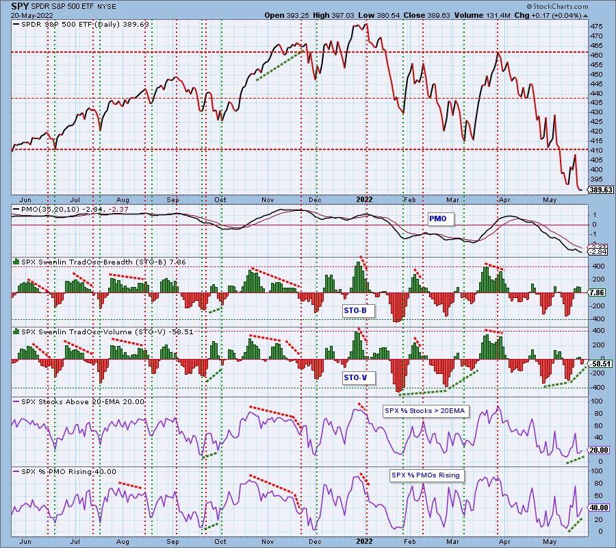
Short-Term Market Indicators: The short-term market trend is DOWN and the condition is NEUTRAL.
STOs are now both declining which should temper any bullish expectations. We now have 40% of the SPX with rising momentum which is a foundation for a rally--a weak one, but a foundation nonetheless.
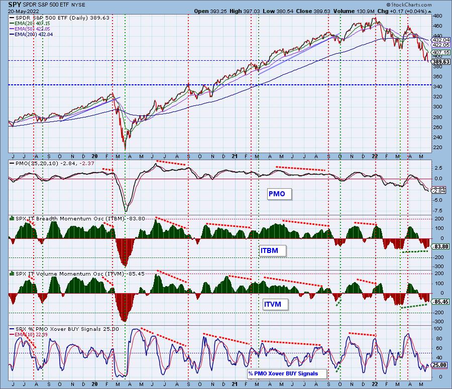
Intermediate-Term Market Indicators: The intermediate-term market trend is DOWN and the condition is OVERSOLD.
ITBM/ITVM are mixed but still show positive divergences with price lows. One quarter of the SPX have PMO BUY signals. That's a good start, but more improvement is needed to sustain a rally in the intermediate term.
PARTICIPATION and BIAS Assessment: The following chart objectively shows the depth and trend of participation in two time frames.
- Intermediate-Term - the Silver Cross Index (SCI) shows the percentage of SPX stocks on IT Trend Model BUY signals (20-EMA > 50-EMA). The opposite of the Silver Cross is a "Dark Cross" -- those stocks are, at the very least, in a correction.
- Long-Term - the Golden Cross Index (GCI) shows the percentage of SPX stocks on LT Trend Model BUY signals (50-EMA > 200-EMA). The opposite of a Golden Cross is the "Death Cross" -- those stocks are in a bear market.
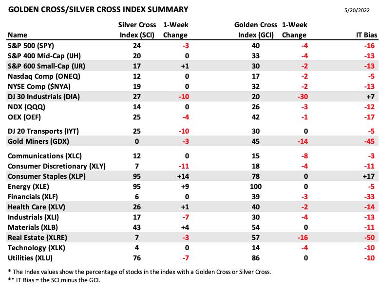
The following table summarizes participation for the major market indexes and sectors. The 1-Week Change columns inject a dynamic aspect to the presentation.
The following table summarizes participation for the major market indexes and sectors. The 1-Week Change columns inject a dynamic aspect to the presentation.
In spite of SPY closing down for the week, there was quite a bit of improvement for SCI readings.
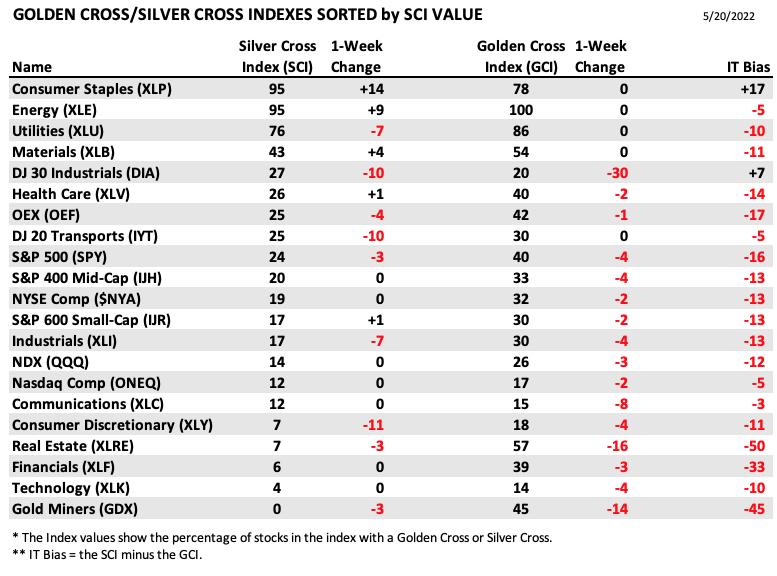
This table is sorted by SCI values. This gives a clear picture of strongest to weakest index/sector in terms of participation. Despite Target (TGT) pressuring XLP below major support levels, the health within the sector is improving based on an increase of 14 percentage points on its SCI.
We have positive divergences on Stocks > 20EMA and Stocks > 50EMA, which is more evidence for a bounce next week.
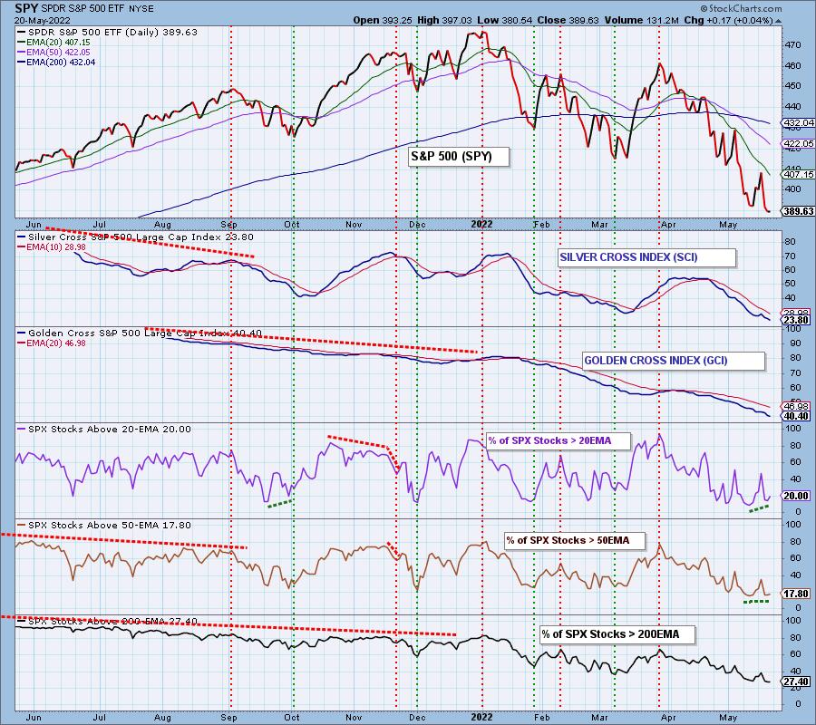
CONCLUSION: We wouldn't call this the end of the bear market, but we have positive divergences peppering our indicator charts that were in place at the 2020 bear market low. We will say that next week the market is primed for higher prices based on those positive divergences. However, we must temper our expectations as we have seen very little follow-through on bullish signals versus bearish signals.
Erin is 20% exposed with a 10% hedge. She will consider releasing some of her hedges next week if the market follows through on these bullish positive divergences.
Have you subscribed the DecisionPoint Diamonds yet? DP does the work for you by providing handpicked stocks/ETFs from exclusive DP scans! Add it with a discount! Contact support@decisionpoint.com for more information!
BITCOIN
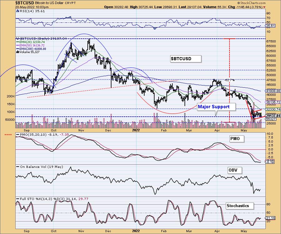
Bitcoin has spent the past two weeks clinging to major support. In the process it has formed a bearish reverse flag. We noted this week that based on the chart pattern, if price does break down here, the minimum downside target would be $10,000. Bitcoin must hold this support level.
INTEREST RATES
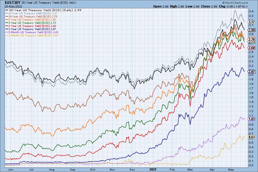
The longer duration yields appear to be topping, but we have to assume that is not an indication of a longer-term trend change. It may be due to a new flight into Bonds as the bear market drags on.
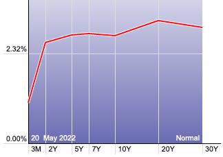
The Yield Curve Chart from StockCharts.com shows us the inversions taking place. The red line should move higher from left to right. Inversions are occurring where it moves downward.
10-YEAR T-BOND YIELD
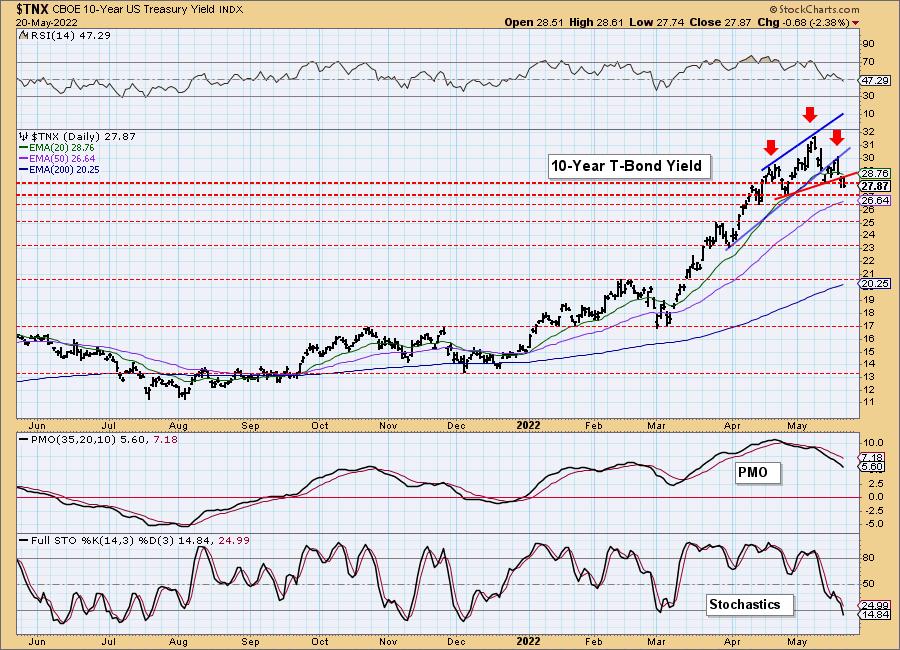
The head and shoulders pattern has now been confirmed with the drop below the rising neckline (red). There are plenty of areas of support, but based on the pattern calculations the downside target would be near the 2.3% support level. Indicators remain negative and are falling so we would look for $TNX to at least test the 50-day EMA.
MORTGAGE INTEREST RATES (30-Yr)**
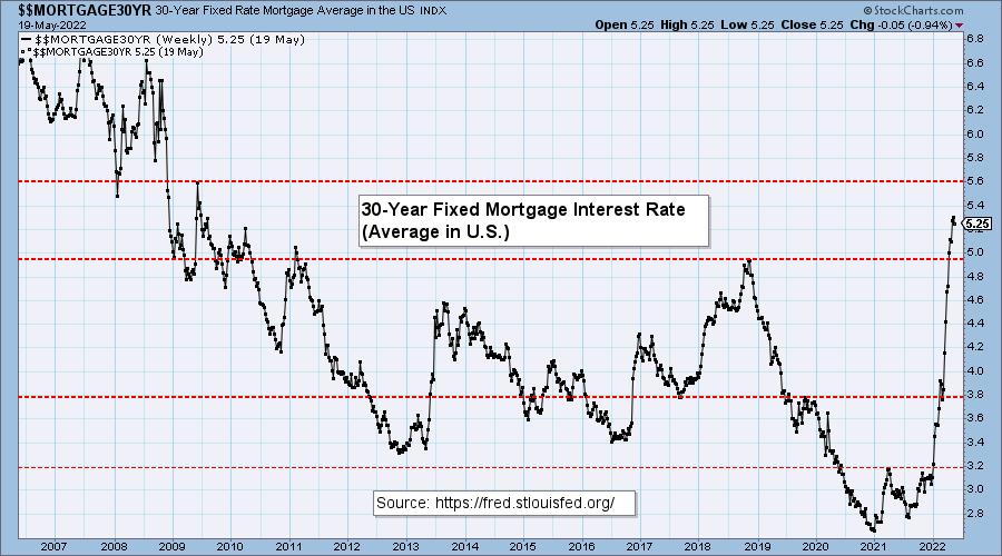
**We watch the 30-Year Fixed Mortgage Interest Rate, because, for the most part, people buy homes based upon the maximum monthly payment they can afford. As rates rise, a fixed monthly payment will carry a smaller mortgage amount. As buying power shrinks, home prices will come under pressure.
--
This week the 30-Year Fixed Rate fell from 5.30 to 5.25.

DOLLAR (UUP)
IT Trend Model: BUY as of 6/22/2021
LT Trend Model: BUY as of 8/19/2021
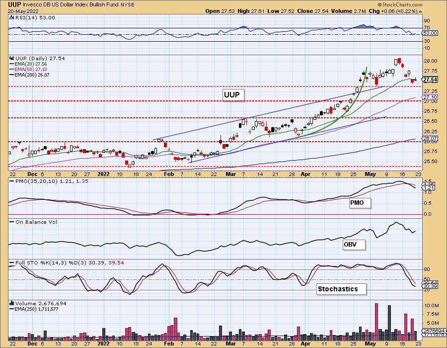
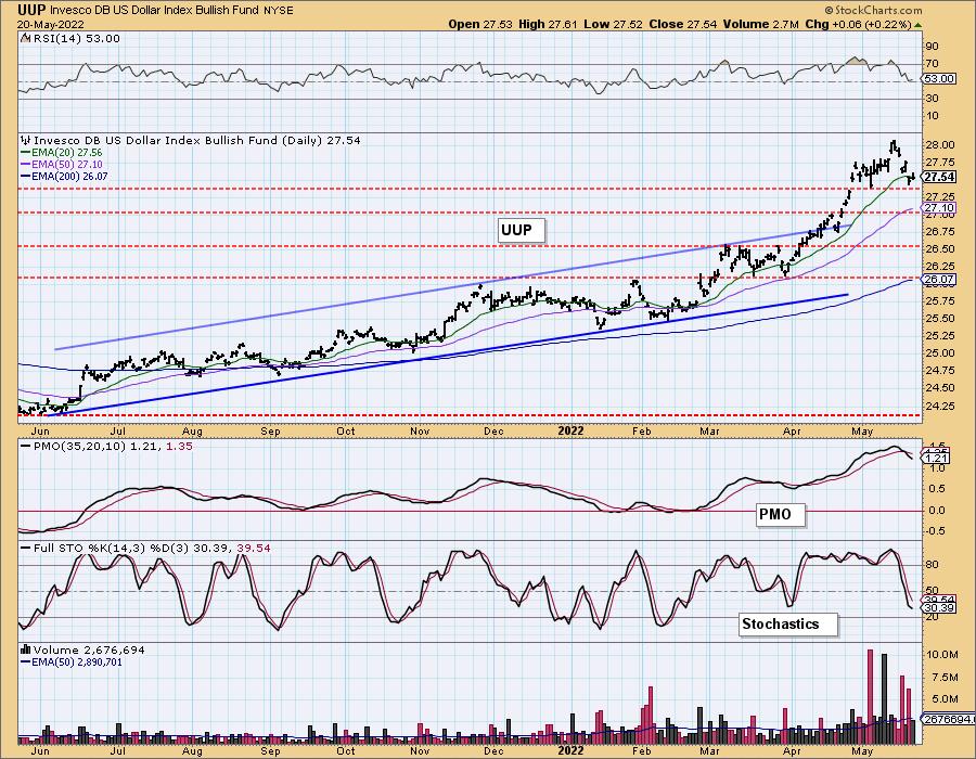
UUP Daily Chart: After a long rally, the Dollar began to pullback this week. UUP lost support at the 20-day EMA but is still holding onto support at the May low. The RSI remains positive, but the PMO and Stochastics are not favorable.
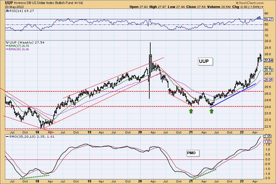
UUP Weekly Chart: We have seen an almost parabolic rally in the Dollar since the mid-2021 low. Interestingly, the 2020 high was $28.01. UUP hit $27.97 last week and now it is being turned away. We expect to see the Dollar pull back further, but eventually make the turn back up. The weekly RSI is no longer overbought and the weekly PMO is still rising. UUP is very overbought so consolidation or more decline would set the stage for a breakout the next time it tests that resistance level.
GOLD
IT Trend Model: BUY as of 5/3/2022
LT Trend Model: BUY as of 1/12/2022
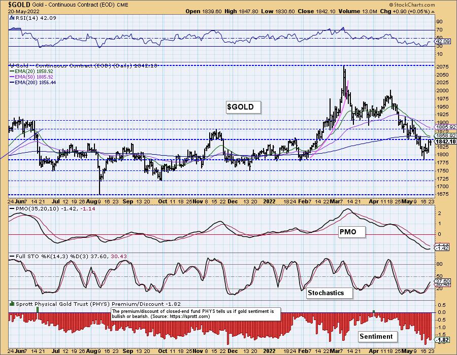
GOLD Daily Chart: With the Dollar declining, Gold has enjoyed a small rally this week. GLD is up against strong resistance at the 200-day EMA and the January high.
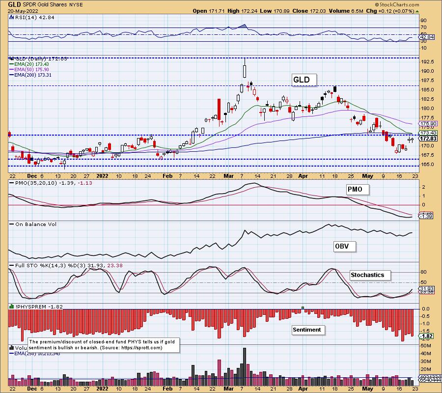
Stochastics are rising and the PMO has turned back up, but the RSI is flat and negative. We do expect Gold to rebound here. Discounts remain high so bearish sentiment is strong. This is good as strong bearish sentiment generally leads to rallies.
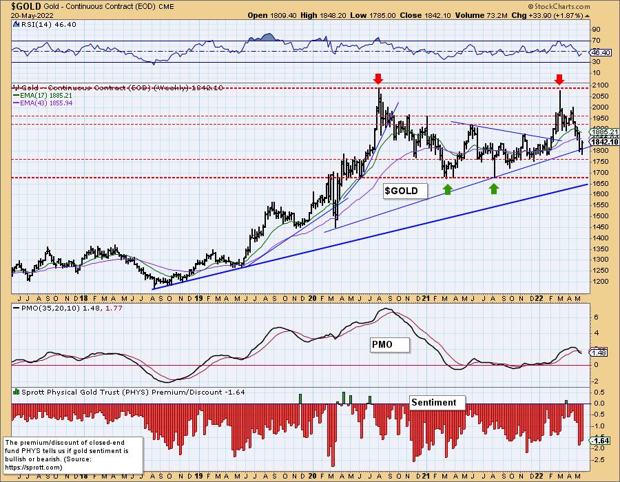
GOLD Weekly Chart: This week's bounce keeps the intermediate-term rising bottoms trendline drawn from the 2020 low mostly intact. The strongest level of support lies just below $1700. The weekly RSI is rising but still in negative territory. The weekly PMO is on a crossover SELL signal but it is beginning to decelerate. Gold is due for a resurgence but a rally in the market next week could keep Gold in a holding pattern.
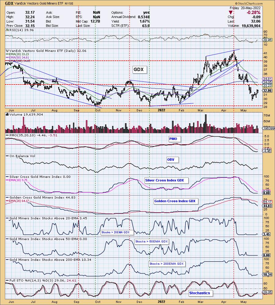
GOLD MINERS Golden and Silver Cross Indexes: Gold Miners have reversed without having to test support at $28. The RSI is flat and negative, but we are seeing the PMO turning up and Stochastics rising. Overhead resistance is arriving quickly at the 200-day EMA and November high. We are encouraged seeing %Stocks > 20-day EMA above the %Stocks > 50-day EMA as that implies new strength. However, participation is still VERY thin. If you're going to foray into this industry group, consider setting tight stops.
CRUDE OIL (USO)
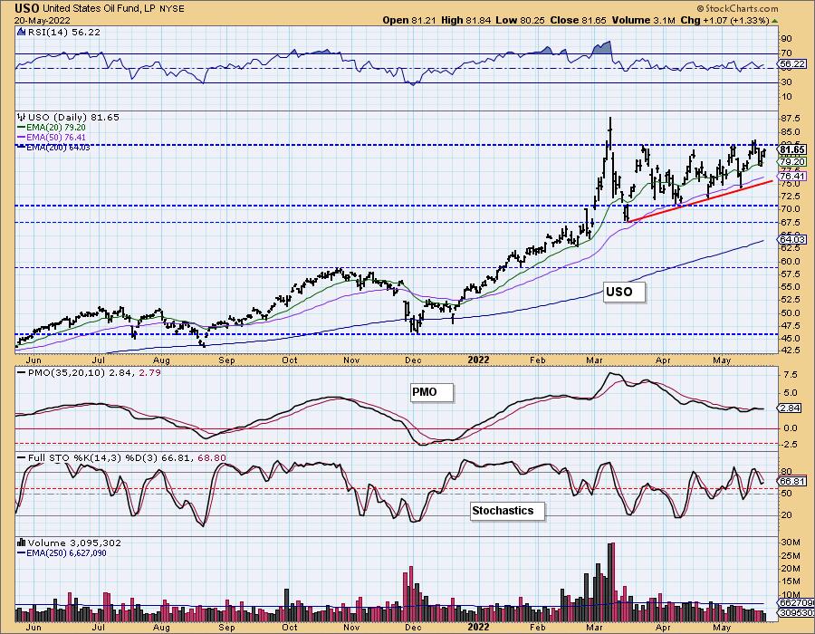
IT Trend Model: BUY as of 1/3/2022
LT Trend Model: BUY as of 3/9/2021
USO Daily Chart: It appeared the bullish ascending triangle would see the expected breakout this week. Instead price dipped again. The good news is that price has rebounded without having to test the bottom of the pattern.
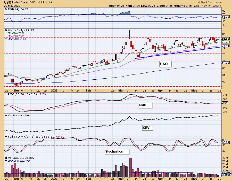
Stochastics ticked back up today and the RSI is staying above net neutral (50). The PMO is suspect, but is clinging to a crossover BUY signal.
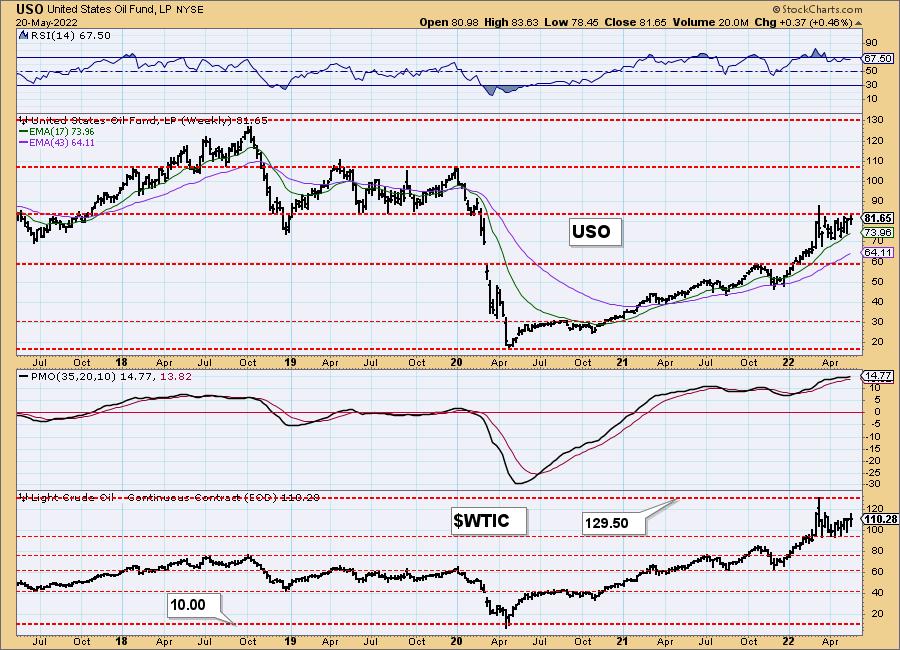
USO/$WTIC Weekly Chart: Looking at USO it isn't completely surprising to see price stalling given 2019 lows have arrived as overhead resistance. The weekly RSI and PMO are still positive so we do expect a breakout from the ascending triangle soon.
BONDS (TLT)
IT Trend Model: NEUTRAL as of 1/5/2022
LT Trend Model: SELLas of 1/19/2022
TLT Daily Chart: With yields falling and a resurgence of investors in treasuries, TLT saw a small rally to finish the week. There is a small double-bottom that implies a breakout above this area of overhead resistance at the 20-day EMA and confirmation line that aligns with the mid-April bottom.
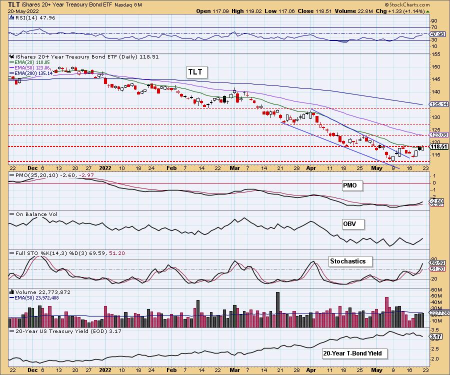
Indicators are looking up. Stochastics are rising along with the PMO. The RSI isn't in positive territory yet, but it looks like it will reach it quickly on a breakout from the double-bottom pattern. Based on the chart pattern calculation, $124.50 is the upside target. That would mean at least a challenge of the 50-day EMA.
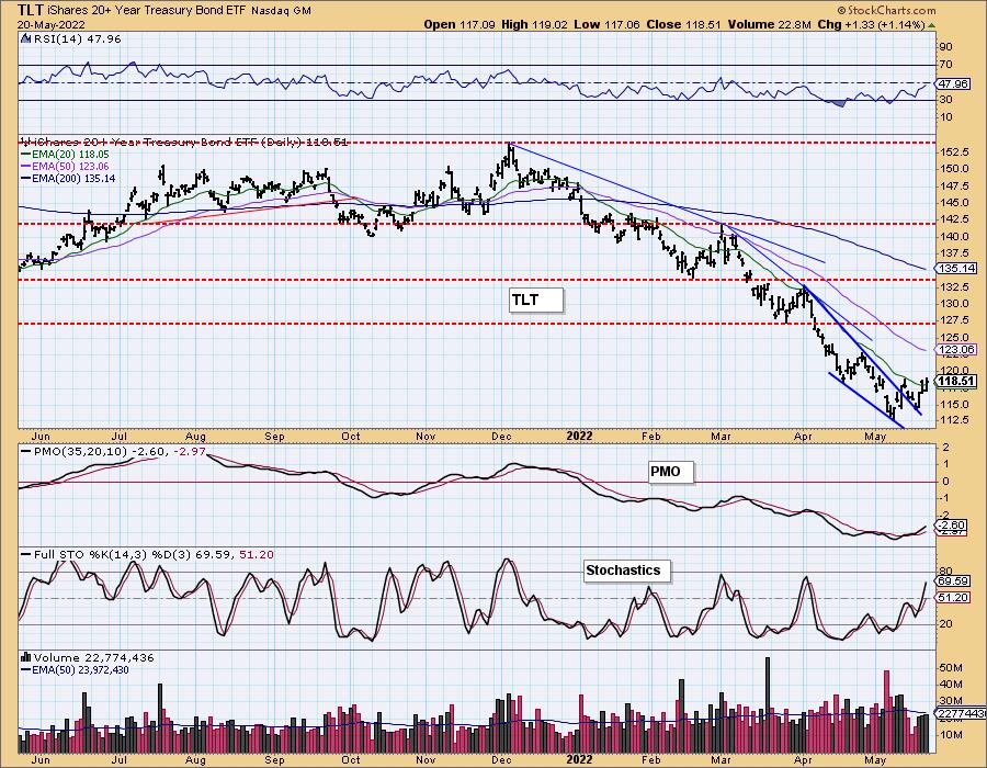
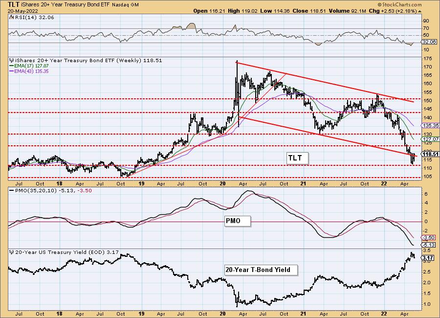
TLT Weekly Chart: This bounce is coming off a meaningful support level. The weekly RSI has left oversold territory and more importantly, the weekly PMO is bottoming. We expect the rally to continue for TLT, but we also know that yields will likely find support and reverse higher. That will end the run for TLT.
Good Luck & Good Trading,
Carl & Erin Swenlin
Technical Analysis is a windsock, not a crystal ball. --Carl Swenlin
(c) Copyright 2022 DecisionPoint.com
Disclaimer: This blog is for educational purposes only and should not be construed as financial advice. The ideas and strategies should never be used without first assessing your own personal and financial situation, or without consulting a financial professional. Any opinions expressed herein are solely those of the author, and do not in any way represent the views or opinions of any other person or entity.
NOTE: The signal status reported herein is based upon mechanical trading model signals, specifically, the DecisionPoint Trend Model. They define the implied bias of the price index based upon moving average relationships, but they do not necessarily call for a specific action. They are information flags that should prompt chart review. Further, they do not call for continuous buying or selling during the life of the signal. For example, a BUY signal will probably (but not necessarily) return the best results if action is taken soon after the signal is generated. Additional opportunities for buying may be found as price zigzags higher, but the trader must look for optimum entry points. Conversely, exit points to preserve gains (or minimize losses) may be evident before the model mechanically closes the signal.
Helpful DecisionPoint Links:
DecisionPoint Alert Chart List
DecisionPoint Golden Cross/Silver Cross Index Chart List
DecisionPoint Sector Chart List
Price Momentum Oscillator (PMO)
Swenlin Trading Oscillators (STO-B and STO-V)
DecisionPoint is not a registered investment advisor. Investment and trading decisions are solely your responsibility. DecisionPoint newsletters, blogs or website materials should NOT be interpreted as a recommendation or solicitation to buy or sell any security or to take any specific action.
