
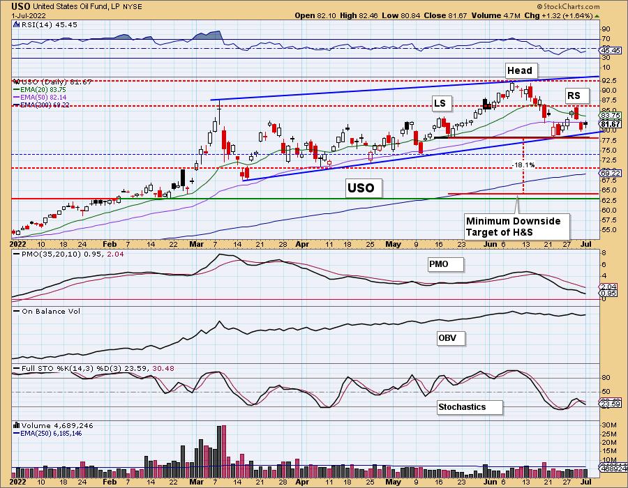
We will cover Crude Oil in detail later, but this chart needed to bubble up to the top (pun not intended). We have been annotating a large bearish rising wedge (in blue) for some time. This week a new short-term bearish chart pattern has developed. There is a short-term head and shoulders pattern on USO. The expectation is a breakdown below the neckline (annotated in black) with a decline that is the height of the pattern. If that minimum downside target is reached, we would be looking at a decline to below $65 or basically to support at $62.50. Crude Oil (USO) and Energy (XLE) are both sitting on strong support, so a reversal here isn't out of the question. However, seeing two very bearish chart patterns lining up here, we would be very careful with any positions related to Crude Oil.

The DecisionPoint Alert Weekly Wrap presents an end-of-week assessment of the trend and condition of the Stock Market, the U.S. Dollar, Gold, Crude Oil, and Bonds. The DecisionPoint Alert daily report (Monday through Thursday) is abbreviated and gives updates on the Weekly Wrap assessments. SUBSCRIBE HERE!
MAJOR MARKET INDEXES
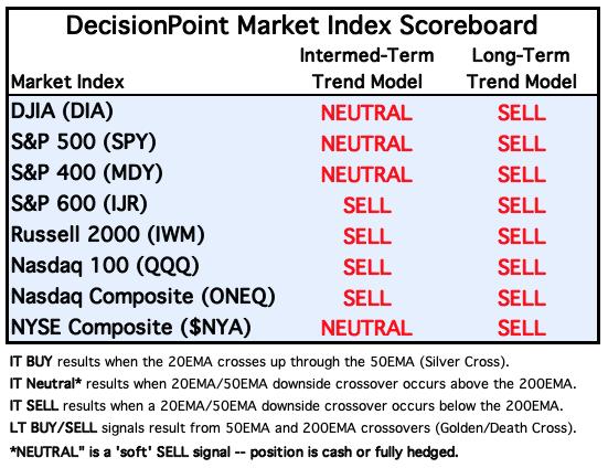
For Today: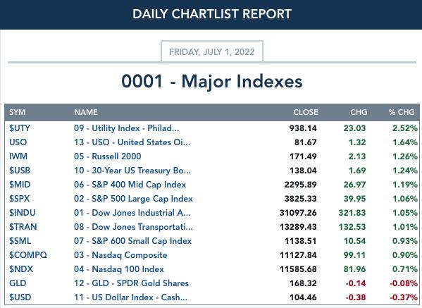
For the Week: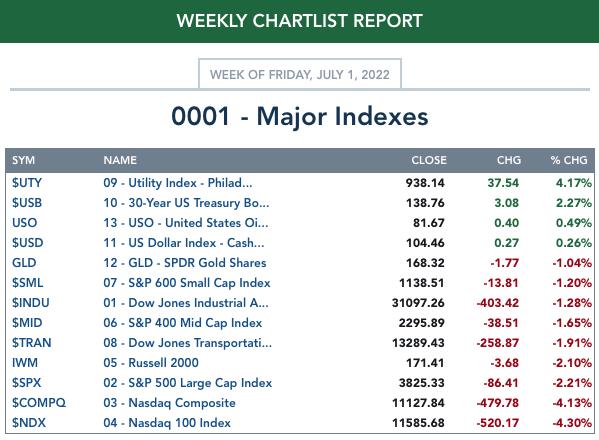
SECTORS
Each S&P 500 Index component stock is assigned to one of 11 major sectors. This is a snapshot of the Intermediate-Term (Silver Cross) and Long-Term (Golden Cross) Trend Model signal status for those sectors.
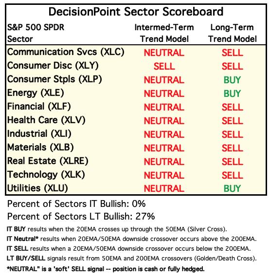
For Today: 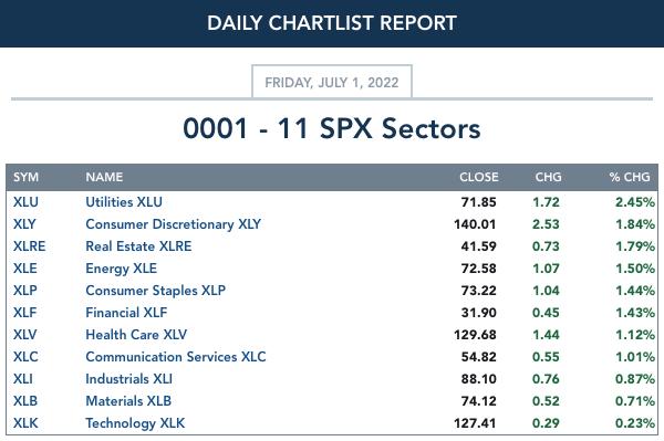
For the Week: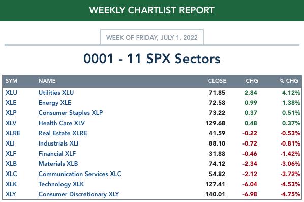
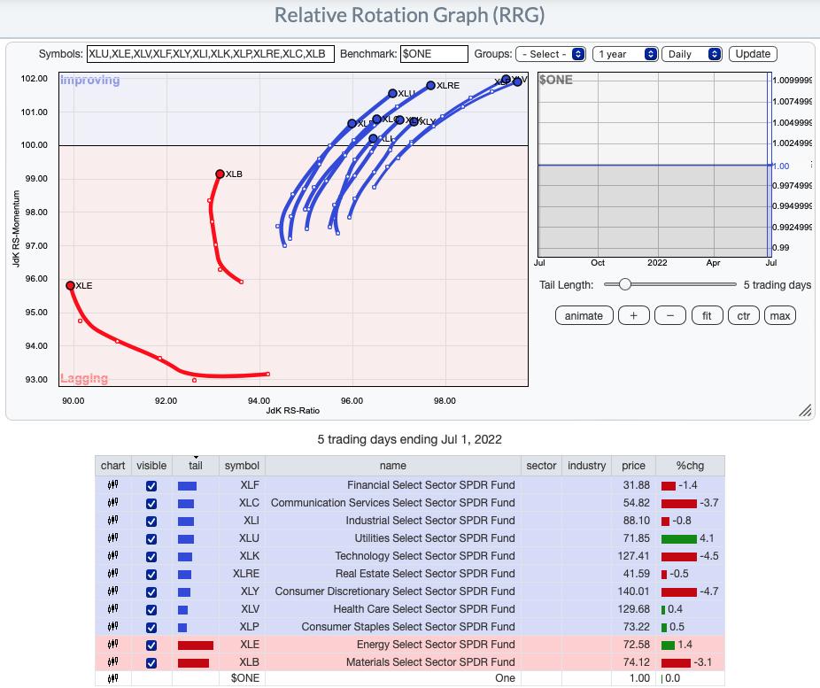
RRG® Daily Chart ($ONE Benchmark):
All of the sectors with the exception of Materials (XLB) and Energy (XLE) have bullish northeast headings and are listed in the Improving quadrant. This bolsters our opinion that we are looking at a bear market rally in the works. We are seeing fairly broad participation among the sectors. Unlike previous weeks, we now have identified pockets of strength within various industry groups. Currently the cream that is rising to the top are the defensive areas of the market: Utilities (XLU), Real Estate (XLRE), Healthcare (XLV) and Consumer Staples (XLP). This is why we have spent most of our time in Diamonds Reports within these sectors.
RRG® Weekly Chart ($ONE Benchmark):
The bear market is still here based on the longer-term weekly RRG. All are in the Lagging quadrant with the exception of XLU and XLE. The bearish southwest headings are the big problem, although we note that Communication Services (XLC), Technology (XLK) and Healthcare (XLV) are reversing the those headings and now have northward components to their heading. All are deeply within the Lagging quadrant so don't get too excited.
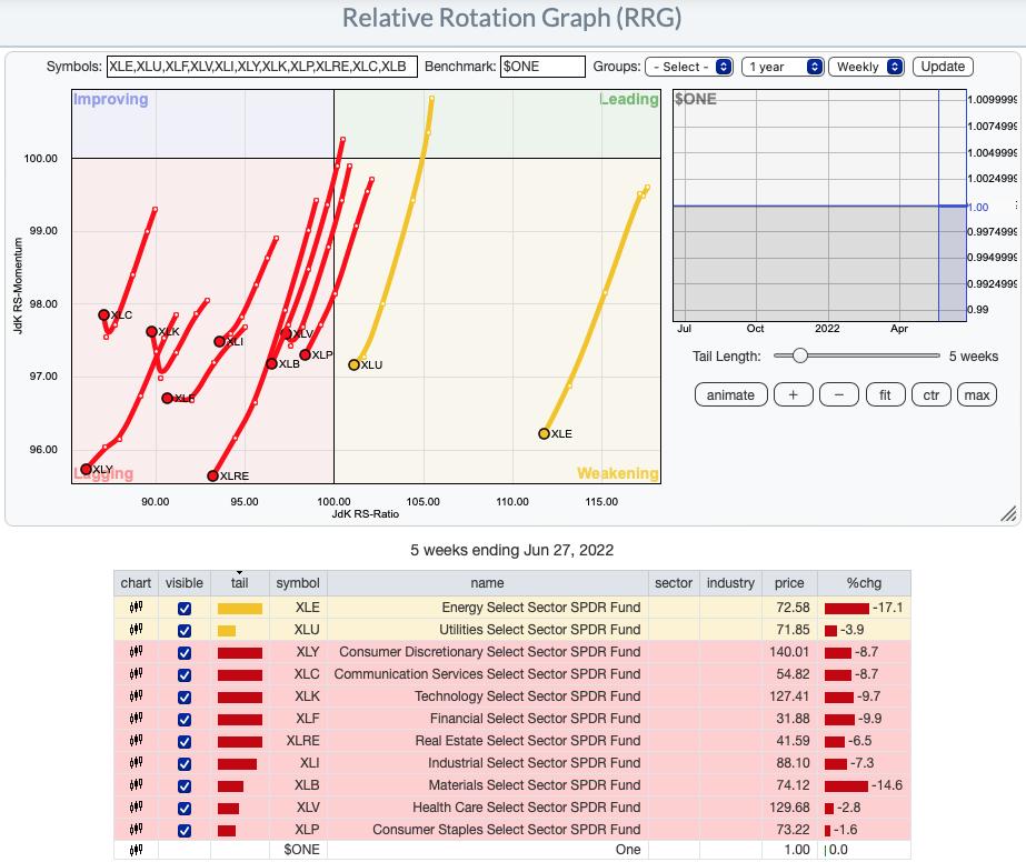
RRG® charts show you the relative strength and momentum for a group of stocks. Stocks with strong relative strength and momentum appear in the green Leading quadrant. As relative momentum fades, they typically move into the yellow Weakening quadrant. If relative strength then fades, they move into the red Lagging quadrant. Finally, when momentum starts to pick up again, they shift into the blue Improving quadrant.
CLICK HERE for an animated version of the RRG chart.
CLICK HERE for Carl's annotated Sector charts.
THE MARKET (S&P 500)
IT Trend Model: NEUTRAL as of 1/21/2022
LT Trend Model: SELL as of 5/5/2022
SPY Daily Chart: There are two bullish formations on the SPY chart. First is a longer-term falling wedge. Second is a short-term falling wedge. Both of these patterns call for an upside breakout.
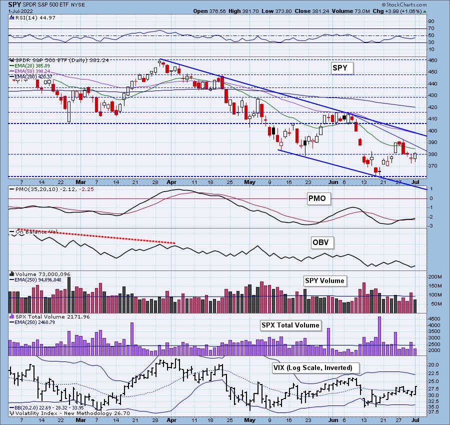
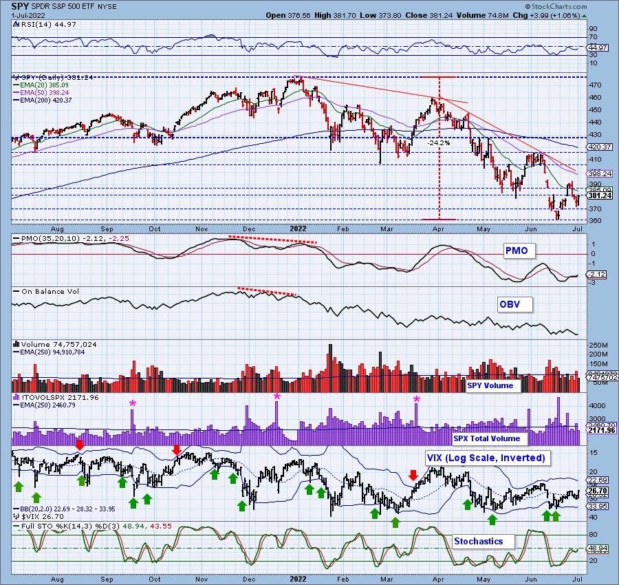
Indicators had begun to look soft, but after today's rally, the PMO has accelerated its rise and the RSI, while negative, is rising again. Stochastics have turned back up and the VIX moved strongly above its moving average on our inverted scale. When the VIX oscillates above its moving average, it indicates internal strength.
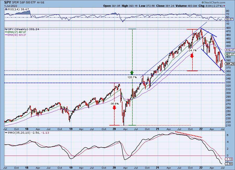
SPY Weekly Chart: The weekly chart also sports a bullish falling wedge, but indicators aren't favorable. The weekly RSI is negative and falling. The weekly PMO is still in decline.
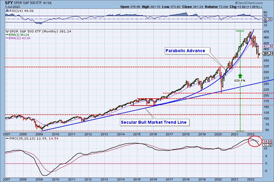
SPY Monthly Chart: The monthly chart is also very bearish. Despite a positive close on the month, the monthly RSI stayed in negative territory and the monthly PMO is still in decline showing no deceleration.
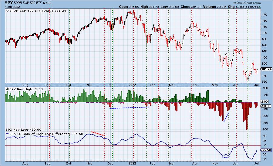
New 52-Week Highs/Lows: New Lows contracted somewhat, but New Highs are not seeing much improvement. The 10-DMA of the High-Low Differential is rising strongly again. That is typically good for the market.
Climax Analysis: Today we got an upside initiation climax. It wasn't terribly robust, and SPX Total Volume did not confirm. We don't think this climax will initiate anything. We have a three-day weekend to cool things off, and, again, volume wasn't there. While volume doesn't matter too much for declines, it really needs to be there on upward thrusts to confirm.
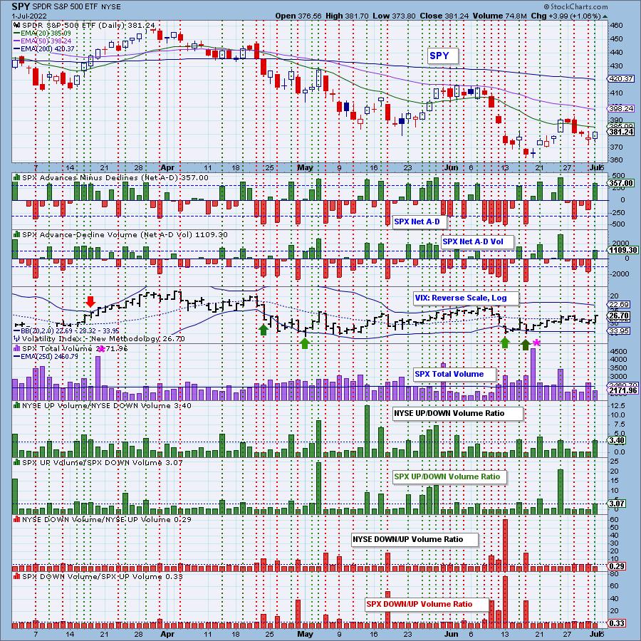
*A climax is a one-day event when market action generates very high readings in, primarily, breadth and volume indicators. We also include the VIX, watching for it to penetrate outside the Bollinger Band envelope. The vertical dotted lines mark climax days -- red for downside climaxes, and green for upside. Climaxes are at their core exhaustion events; however, at price pivots they may be initiating a change of trend.
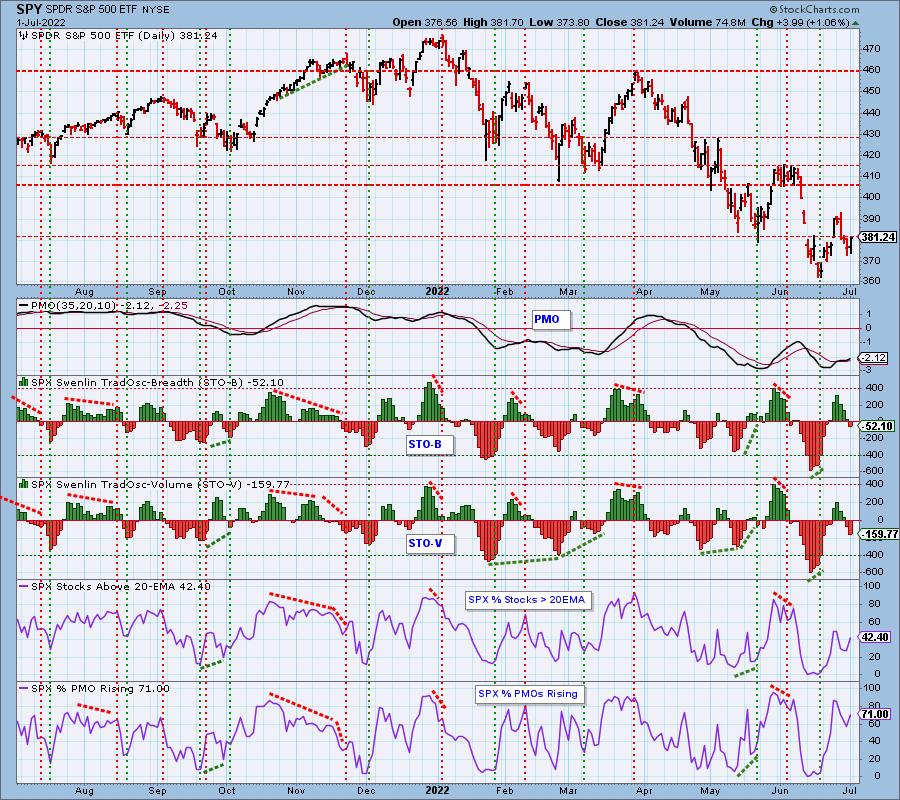
Short-Term Market Indicators: The short-term market trend is UP and the condition is NEUTRAL.
The STOs continued lower today which we don't like, but participation is opening up with 71% of stocks with rising momentum. More stocks are now over their 20-day EMAs as well.
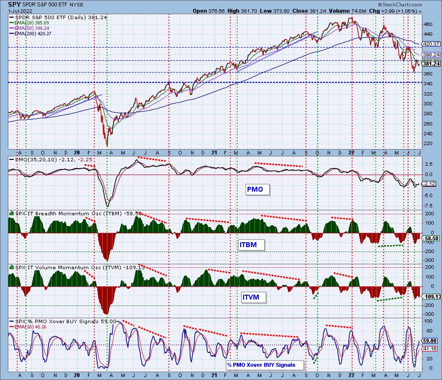
Intermediate-Term Market Indicators: The intermediate-term market trend is DOWN and the condition is OVERSOLD.
The ITBM/ITVM both turned up today which is a relief. We now have almost 60% of stocks with PMO crossover BUY signals. That is enough to fuel a rally.
PARTICIPATION and BIAS Assessment: The following chart objectively shows the depth and trend of participation in two time frames.
- Intermediate-Term - the Silver Cross Index (SCI) shows the percentage of SPX stocks on IT Trend Model BUY signals (20-EMA > 50-EMA). The opposite of the Silver Cross is a "Dark Cross" -- those stocks are, at the very least, in a correction.
- Long-Term - the Golden Cross Index (GCI) shows the percentage of SPX stocks on LT Trend Model BUY signals (50-EMA > 200-EMA). The opposite of a Golden Cross is the "Death Cross" -- those stocks are in a bear market.
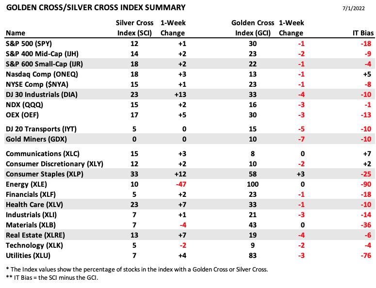
The following table summarizes participation for the major market indexes and sectors. The 1-Week Change columns inject a dynamic aspect to the presentation.
The following table summarizes participation for the major market indexes and sectors. The 1-Week Change columns inject a dynamic aspect to the presentation.
With the exception of XLK, XLB and XLE, all sectors and indexes saw the same or positive changes to their Silver Cross Indexes.
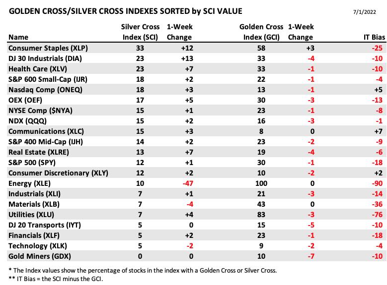
This table is sorted by SCI values. This gives a clear picture of strongest to weakest index/sector in terms of participation.
Energy had been the leader, but its SCI lost 47% this week. It is by far the weakest of the bunch.
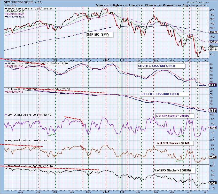
We almost have a "bull stack" on participation. A bull stack is when we see percentages in the shorter terms overtake percentages in the longer term. Right now we have the same amount of stocks above their 50/200-day EMAs. We want to see the %Stocks > 50-day EMA to be greater than %Stocks > 200-day EMA.
The short-term bias is bullish given there are more stocks above their 20/50-day EMAs than the SCI percentage.
The intermediate-term bias is bearish, but given the SCI turning up, it is getting slightly less bearish.
The long-term bias is bearish. The GCI is at a low 29.6% and there are fewer percentage of stocks above their 50/200-day EMAs. The GCI will not be able to improve until those percentages move higher.
CONCLUSION: It was not looking good this morning, but the market surged to finish the day higher. Yesterday's downside exhaustion climax played out as expected. Today's upside initiation climax suggests more upside ahead. IT indicators are beginning to turn back up and participation is broadening. However, we must remain guarded given the STOs are still in decline. Our economic woes are not over and neither is global unrest. These conditions leave the market continually vulnerable to decline. We should see relief rallies along the way and this looks like one. Be very careful expanding your exposure and remember trading "reversals" in a bear market is dangerous.
Erin is 50% exposed to the market.
Have you subscribed the DecisionPoint Diamonds yet? DP does the work for you by providing handpicked stocks/ETFs from exclusive DP scans! Add it with a discount! Contact support@decisionpoint.com for more information!
BITCOIN
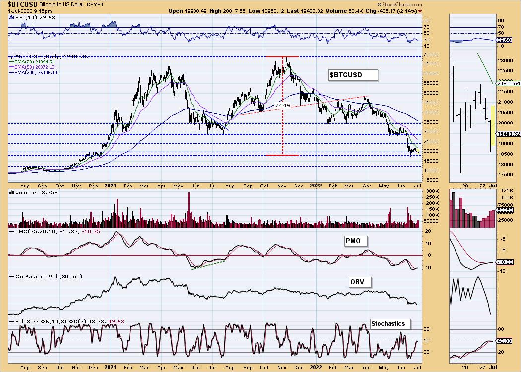
Bitcoin created a new level of support at $17,500 based on the mid-June intraday low. $20,000 has essentially been lost as support in our minds. Indicators are somewhat mixed, but mostly bearish. The RSI is negative and falling into oversold territory. The PMO is on a crossover BUY signal, but it only "drifted" above the signal line. That BUY signal is already in jeopardy. Stochastics are topping below net neutral (50). Sentiment is very bearish except among the Bitcoin-faithful who are too invested and must convince themselves the bottom is here. With sentiment so bearish, we have to wonder if we will see a reversal, but technicals tell us it isn't really likely.
INTEREST RATES
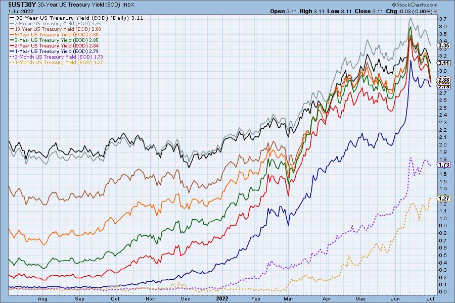
Yields are falling fast with horizontal support on long-term rates being broken. We expect to see them move down further.
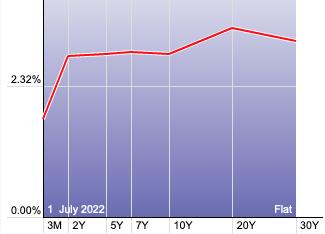
The Yield Curve Chart from StockCharts.com shows us the inversions taking place. The red line should move higher from left to right. Inversions are occurring where it moves downward.
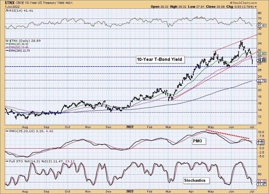
10-YEAR T-BOND YIELD
$TNX nearly hit support at 2.7%. We've been expecting a decline to that level. The swift decline that took price below its 50-day EMA does have us thinking support at 2.7% won't hold this time around. Technicals are very bearish and this drop is executing a bearish rising wedge.
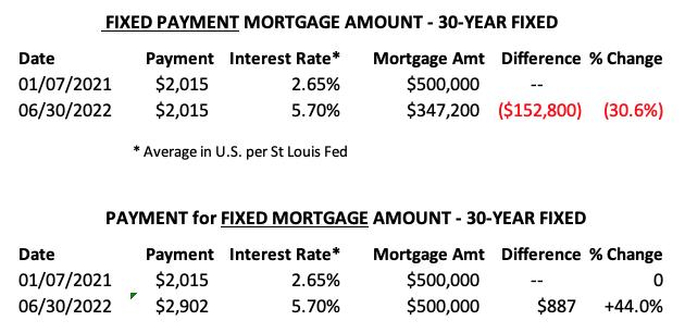
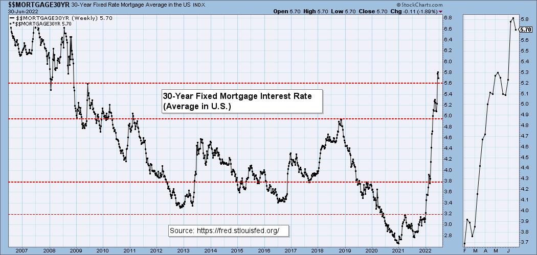
MORTGAGE INTEREST RATES (30-Yr)**
**We watch the 30-Year Fixed Mortgage Interest Rate, because, for the most part, people buy homes based upon the maximum monthly payment they can afford. As rates rise, a fixed monthly payment will carry a smaller mortgage amount. As buying power shrinks, home prices will come under pressure.
--
This week the 30-Year Fixed Rate fell from 5.81 to 5.70.
DOLLAR (UUP)
IT Trend Model: BUY as of 6/22/2021
LT Trend Model: BUY as of 8/19/2021
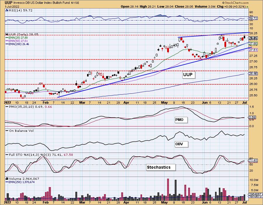
UUP Daily Chart: UUP is nearing the top of a bearish rising wedge pattern. Today's filled black candlestick suggests a decline could begin next week. We do note that if interest rates continue to fall it is likely to put downward pressure on the Dollar. For now the RSI is positive and Stochastics are rising in positive territory. The PMO is indecisive, but is technically on a crossover BUY signal. The cup with handle pattern has executed, but the pattern tells us to expect a breakout above the left side of the cup. If price turns back down here, it would mean the top of the intermediate-term and short-term bearish rising wedges would likely see the expected breakdown. Tuesday will be telling either way.
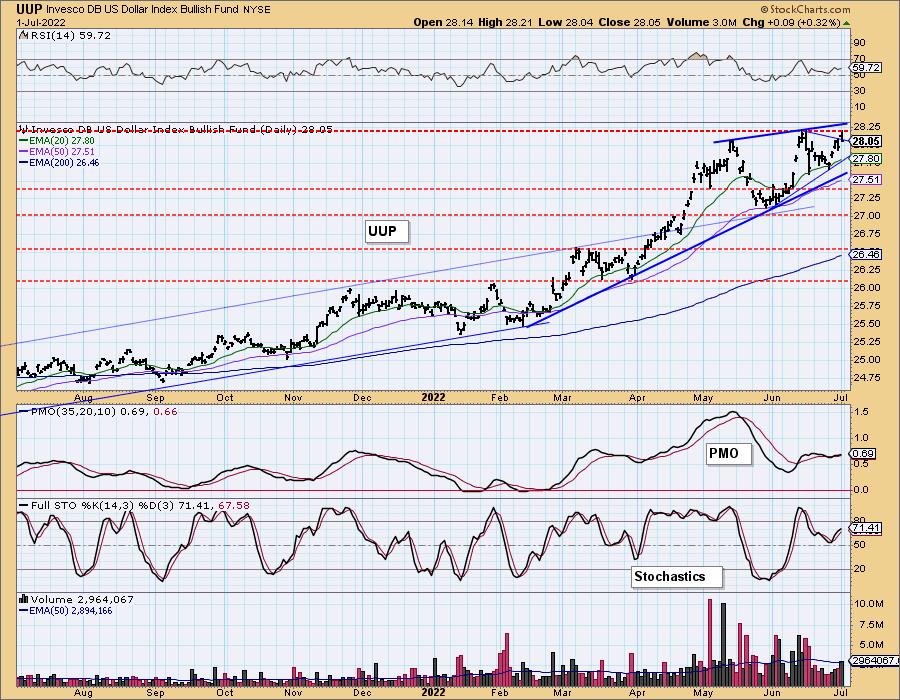
UUP Weekly Chart: The bearish rising wedge is obvious on the weekly chart. Weekly indicators are still positive, but overhead resistance at the 2020 intraweek high is arriving and the daily chart is beginning to weaken.
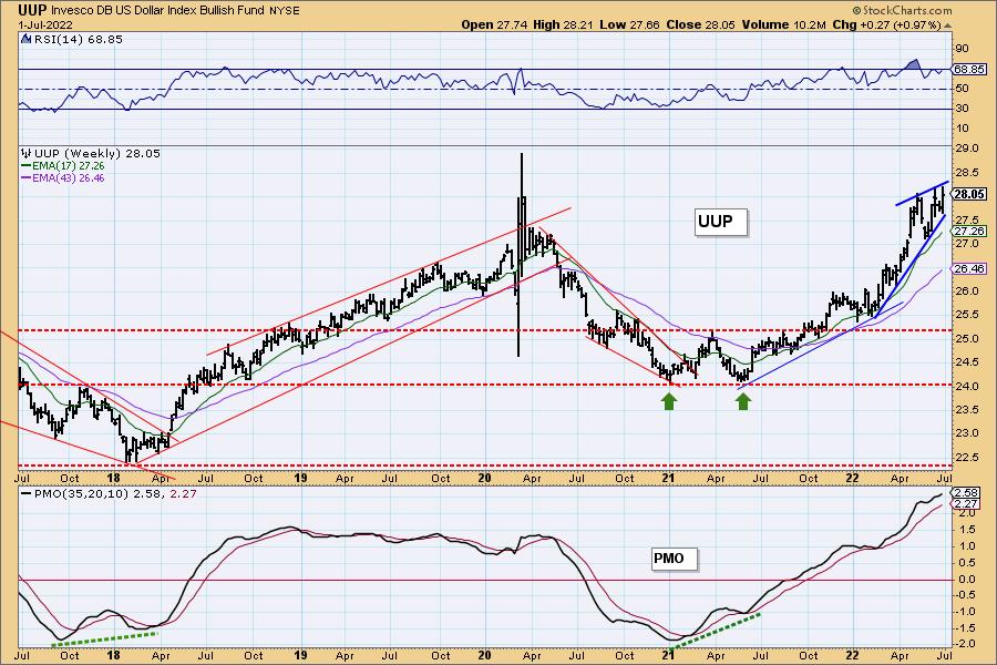
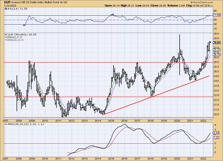
UUP Monthly Chart: The monthly chart is more favorable with the monthly RSI positive (although overbought) and the monthly PMO rising on a crossover BUY signal. Still overhead resistance at $29 will likely be a problem.
GOLD
IT Trend Model: NEUTRAL as of 5/3/2022
LT Trend Model: SELL as of 6/30/2022
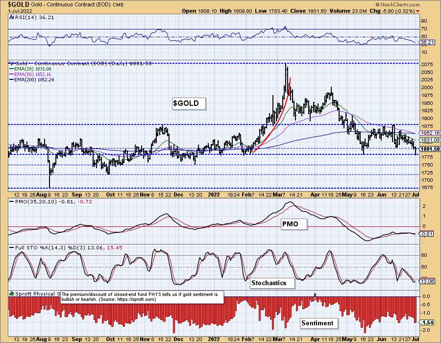
GOLD Daily Chart: This week Gold triggered a "death cross" (50-day EMA dropped below the 200-day EMA). GLD dropped to intermediate-term support today. It formed a hollow red candlestick which is bullish and suggests a bounce off this level coming. Given Stochastics are beginning to turn up in oversold territory, this should result in a bounce. Upside potential is limited given multiple areas of overhead resistance.
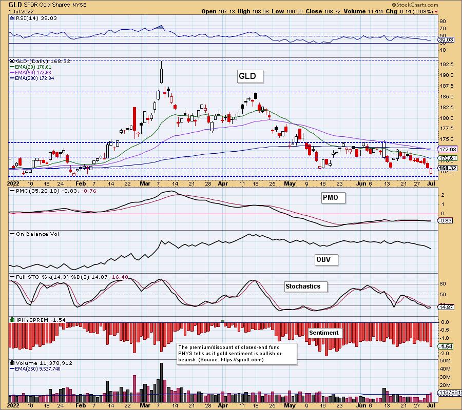
Discounts spiked today as investors get even more bearish on Gold. We aren't to sentiment reversal levels, but the more bearish investors get, the better that will be for Gold.
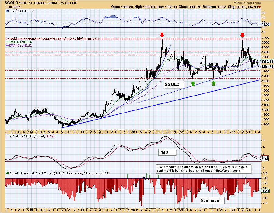
GOLD Weekly Chart: The weekly chart is concerning. The weekly RSI is negative and the weekly PMO is falling. We saw a break in the long-term rising bottoms trendline. The longer-term rising trend hasn't been compromised and support is near at $1750. If $1750 doesn't hold, $1700 better.
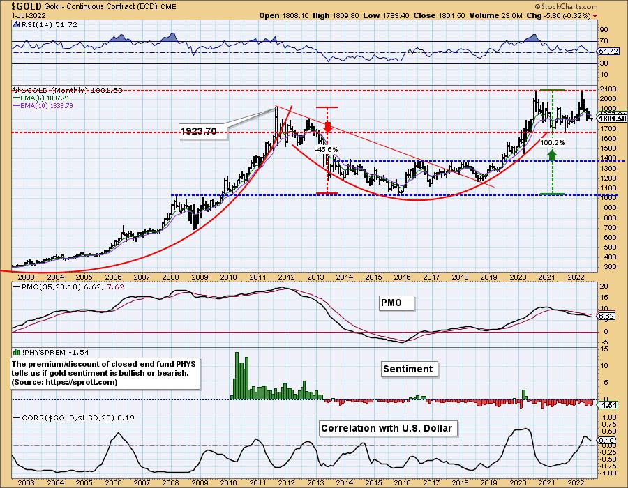
GOLD Monthly Chart: We look at the second top as a breakdown of the large cup with handle pattern. We should have seen a breakout based on the pattern. The pattern's failure and the falling monthly PMO suggests that Gold will need to correct further. One thing that is interesting to note is that in the long term, there really is no correlation between Gold and Dollar. The correlation reading is near zero. This tells us that Gold has decoupled with the Dollar in the long term. This means that Gold isn't bound by the moves in the Dollar in the long term. Not sure if that will work in Gold's favor, so far it hasn't.
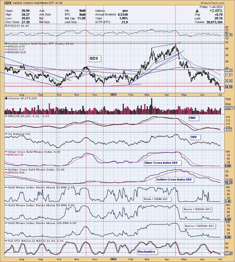
GOLD MINERS Golden and Silver Cross Indexes: GDX broke major support this week. Even with today's powerful rally, GDX is still below prior support (now overhead resistance). The RSI turned up, but is still negative. The PMO is still falling after topping beneath the zero line. Stochastics turned up, but participation is almost non-existent. There is no internal strength. We'd avoid this group.
CRUDE OIL (USO)
IT Trend Model: BUY as of 1/3/2022
LT Trend Model: BUY as of 3/9/2021
USO Daily Chart: We covered this chart in the opening.
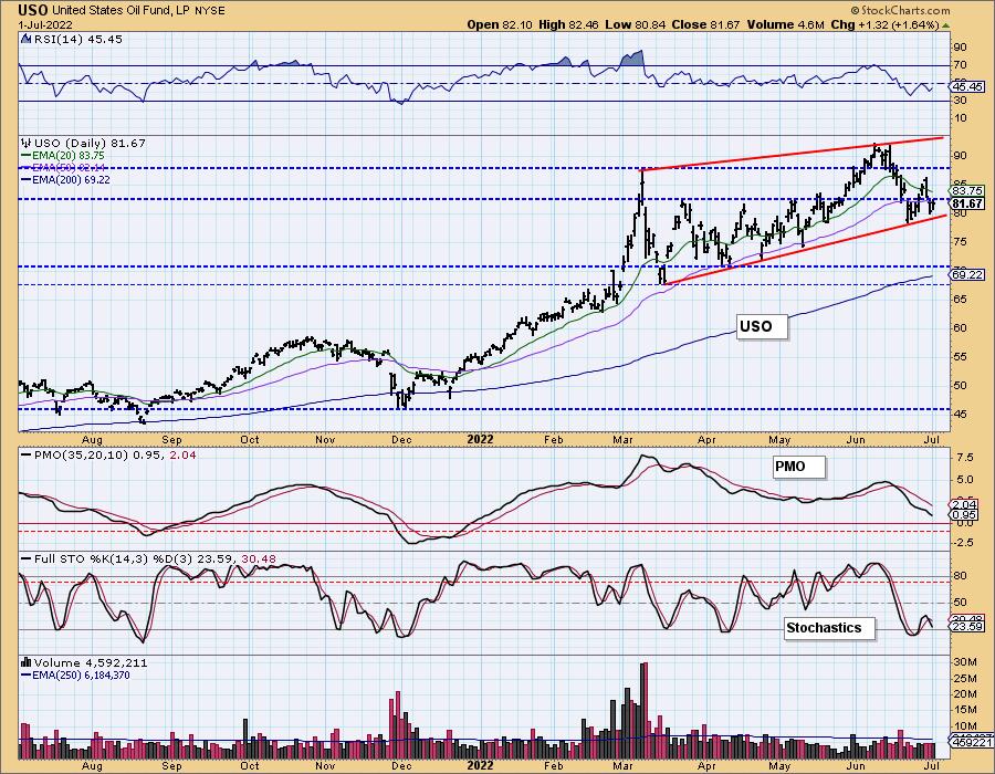
The large intermediate-term rising wedge is more obvious on the longer-term USO chart.
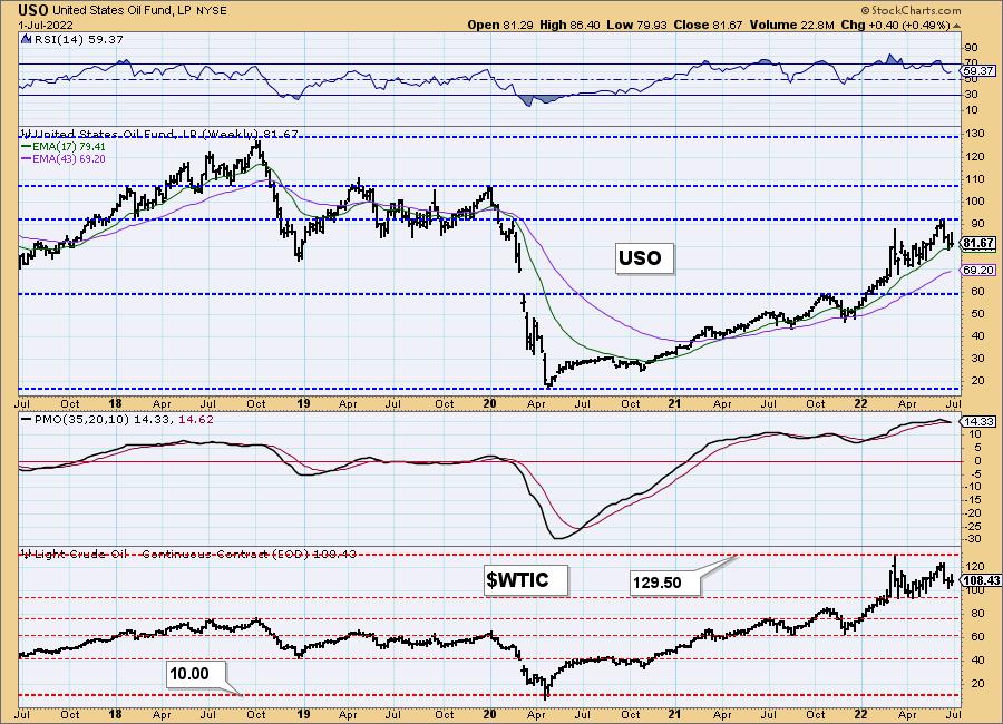
USO/$WTIC Weekly Chart: The weekly chart is breaking down. While the RSI remains positive, the weekly PMO triggered a crossover SELL signal this week. Support is holding on the 17-week EMA, but as noted in the opening, USO is looking tenuous at best.
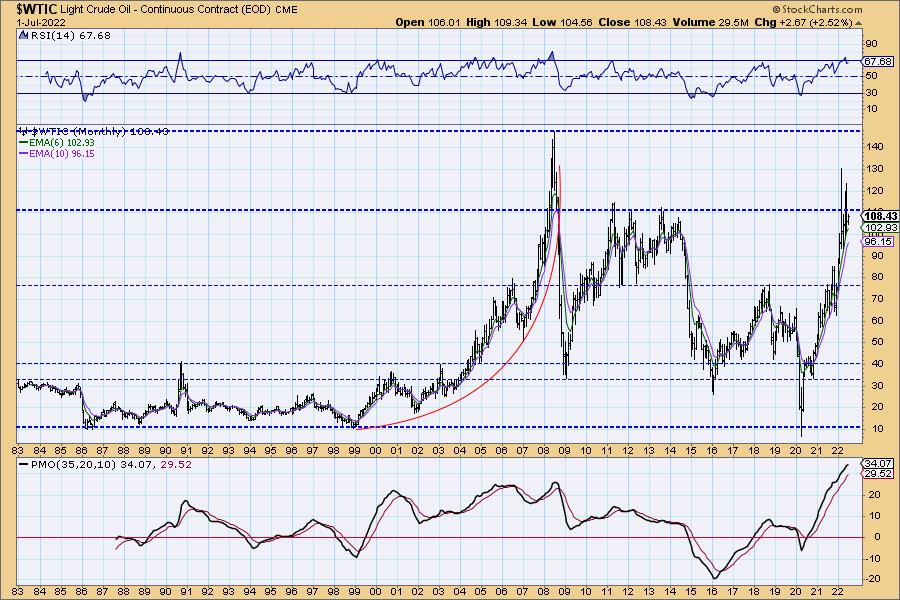
WTIC Monthly Chart: The monthly chart still looks fairly bullish. The monthly RSI is positive and not overbought and the monthly PMO is rising strongly. This long-term rally executed a double-bottom pattern. Price has basically reached the upside target and turned lower. Again, we don't trust Crude Oil, or Energy for that matter.
BONDS (TLT)
IT Trend Model: NEUTRAL as of 1/5/2022
LT Trend Model: SELL as of 1/19/2022
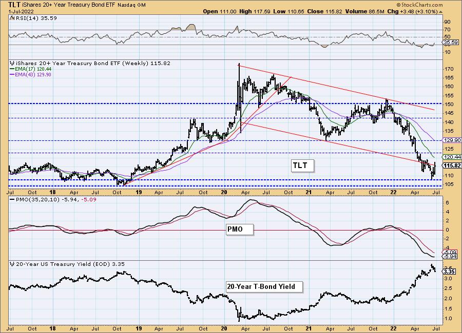
TLT Daily Chart: TLT got a lift this week as interest rates swiftly declined. Indicators are very bullish. The RSI just moved into positive territory, the PMO is rising on a crossover BUY signal and Stochastics just moved above 80 suggesting internal strength. Today price popped briefly above the 50-day EMA. We did see a bearish filled black candlestick that could mean a decline on Tuesday, but overall Bonds look fairly healthy as yields correct.
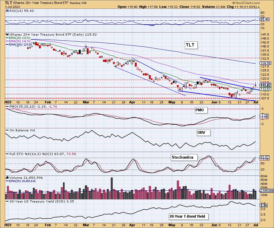
Yesterday, price executed a bullish falling wedge chart pattern and today we saw follow-through.
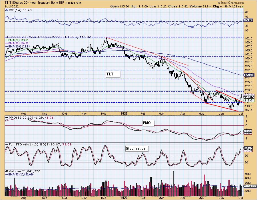
TLT Weekly Chart: Price dropped to long-term support and rebounded. In the process price dropped out of an already declining trend. Now TLT is in the process of recapturing it. The weekly RSI is negative, but now rising. The weekly PMO is bottoming. This rally looks solid.
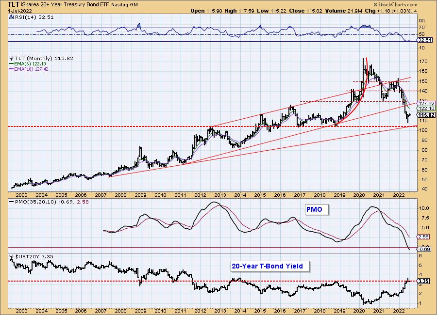
TLT Monthly Chart: In the long term, TLT still has some work to do. The monthly RSI is rising, but is in very negative territory. The monthly PMO just dropped below the zero line. However, notice the 20-year yield. It failed in its breakout above resistance. That suggests TLT will bounce off this long-term support level.
Good Luck & Good Trading!
Erin Swenlin and Carl Swenlin
Technical Analysis is a windsock, not a crystal ball. --Carl Swenlin
(c) Copyright 2022 DecisionPoint.com
Disclaimer: This blog is for educational purposes only and should not be construed as financial advice. The ideas and strategies should never be used without first assessing your own personal and financial situation, or without consulting a financial professional. Any opinions expressed herein are solely those of the author, and do not in any way represent the views or opinions of any other person or entity.
NOTE: The signal status reported herein is based upon mechanical trading model signals, specifically, the DecisionPoint Trend Model. They define the implied bias of the price index based upon moving average relationships, but they do not necessarily call for a specific action. They are information flags that should prompt chart review. Further, they do not call for continuous buying or selling during the life of the signal. For example, a BUY signal will probably (but not necessarily) return the best results if action is taken soon after the signal is generated. Additional opportunities for buying may be found as price zigzags higher, but the trader must look for optimum entry points. Conversely, exit points to preserve gains (or minimize losses) may be evident before the model mechanically closes the signal.
Helpful DecisionPoint Links:
DecisionPoint Alert Chart List
DecisionPoint Golden Cross/Silver Cross Index Chart List
DecisionPoint Sector Chart List
Price Momentum Oscillator (PMO)
Swenlin Trading Oscillators (STO-B and STO-V)
DecisionPoint is not a registered investment advisor. Investment and trading decisions are solely your responsibility. DecisionPoint newsletters, blogs or website materials should NOT be interpreted as a recommendation or solicitation to buy or sell any security or to take any specific action.
