
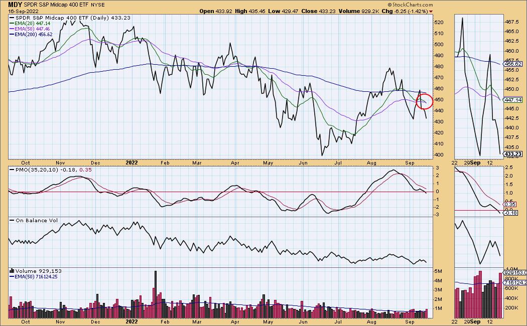
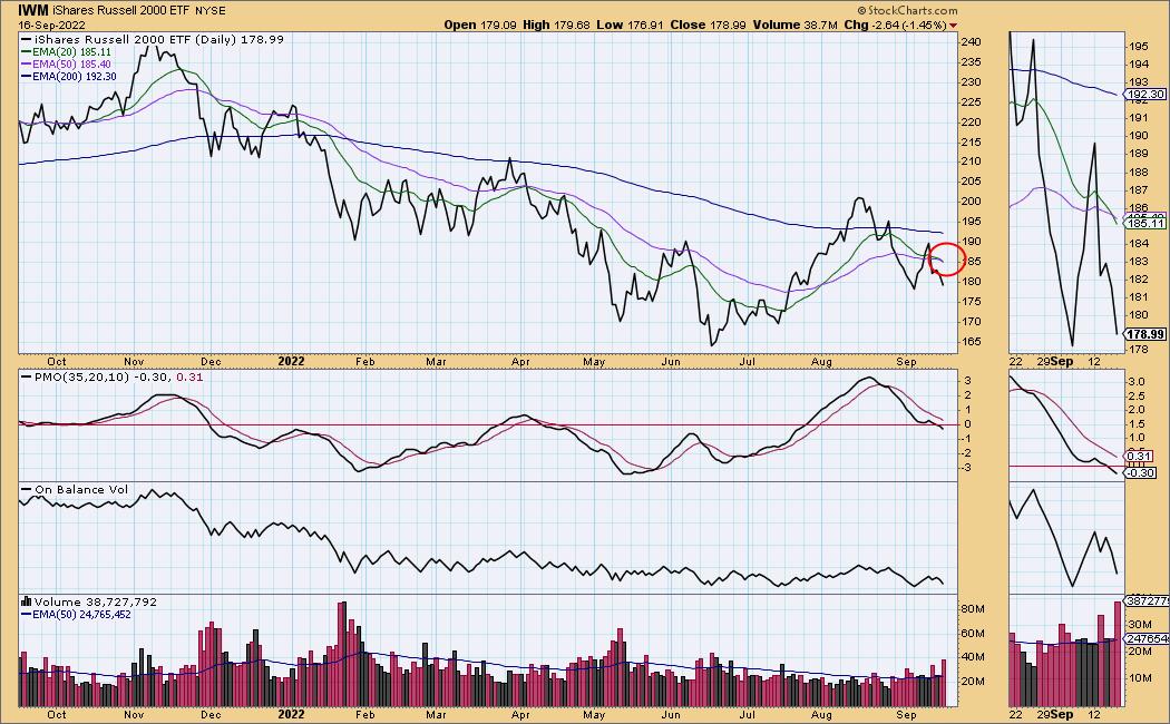
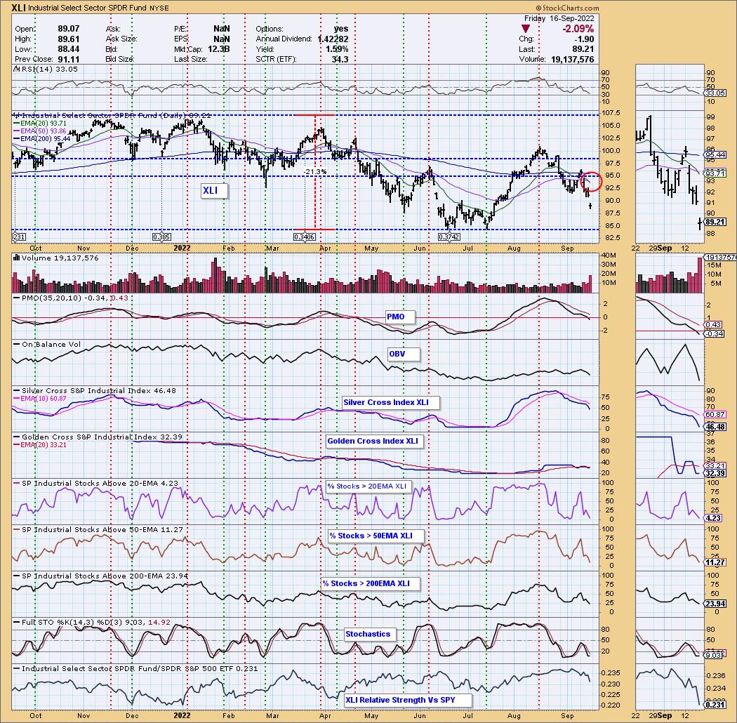
There were Dark Cross SELL Signals (the 20-day EMA crossed down through the 50-day EMA, below the 200-day EMA) on the S&P 400 (MDY), Russell 2000 (IWM), and the Industrial Sector (XLI). The only sectors that still hold Silver Crosses (20-day EMA above the 50-day EMA) are XLY, XLE, XLF and XLU.
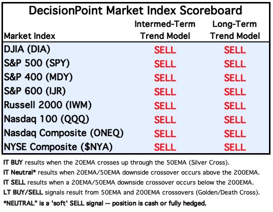
The DP Market Index Scoreboard shows us that ALL major indexes now have Dark Crosses.
The DecisionPoint Alert Weekly Wrap presents an end-of-week assessment of the trend and condition of the Stock Market, the U.S. Dollar, Gold, Crude Oil, and Bonds. The DecisionPoint Alert daily report (Monday through Thursday) is abbreviated and gives updates on the Weekly Wrap assessments.
Watch the latest episode of DecisionPoint on StockCharts TV's YouTube channel here!
MAJOR MARKET INDEXES
For Today: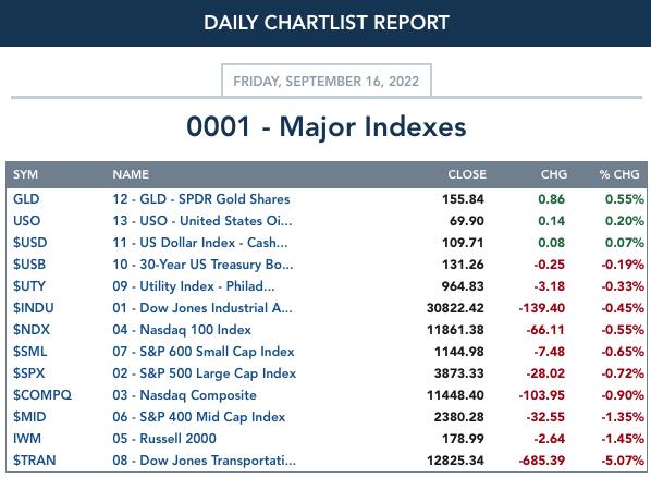
For the Week: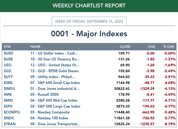
SECTORS
Each S&P 500 Index component stock is assigned to one of 11 major sectors. This is a snapshot of the Intermediate-Term (Silver Cross) and Long-Term (Golden Cross) Trend Model signal status for those sectors.
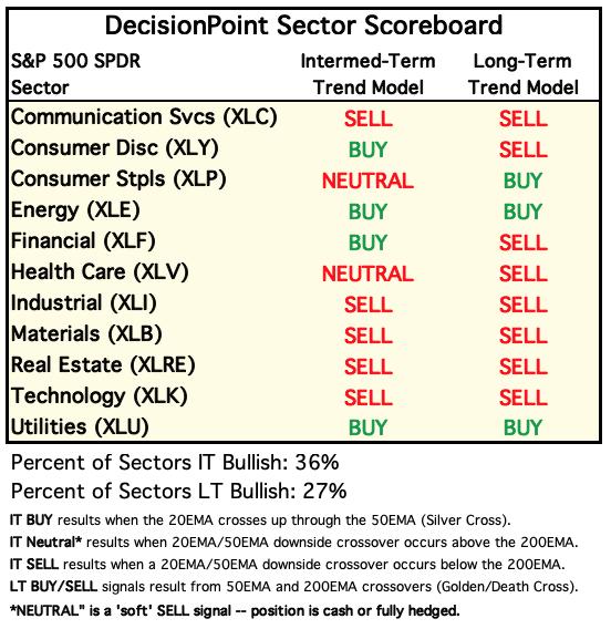
For Today: 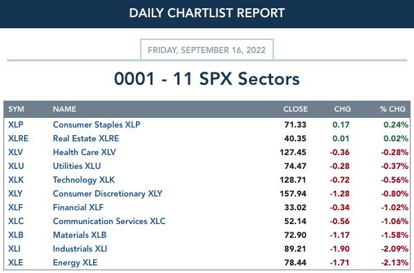
For the Week: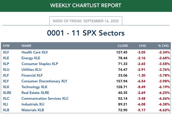
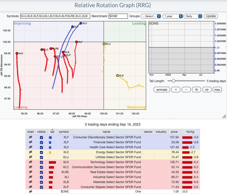
RRG® Daily Chart ($ONE Benchmark):
A rough week meant a bearish change on the daily RRG. We now have bearish southwest headings on XLC and XLRE. Even XLU has reversed into a bearish southwest heading. It could hit the Lagging quadrant next week instead of moving into Leading. The most bullish would have to be XLV and XLY with XLF not far behind as it gets reading to join the other two in the Improving quadrant. The rest have northward components to their headings and could still move into the Improving quadrant.
RRG® Weekly Chart ($ONE Benchmark):
The intermediate-term RRG is still mostly bullish given all but XLE are in either Leadings or Improving quadrants. As with the daily RRG, we have some headings that have switched into a bearish southwest direction: XLP and XLV. XLRE and XLC are about ready to change into that bearish heading. They are already on their way back into the Lagging quadrant. All others still have an opportunity to reach the Leading quadrant and join the strongest of the sectors, XLU. XLE has a strong bullish northeast heading that should get it to the Leading quadrant soon.
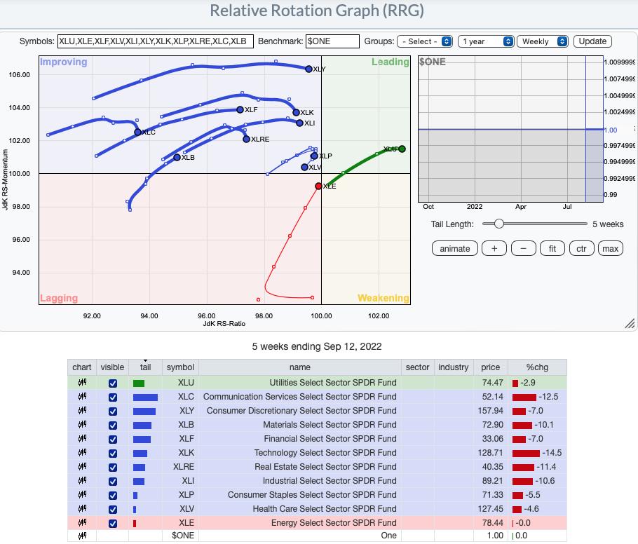
RRG® charts show you the relative strength and momentum for a group of stocks. Stocks with strong relative strength and momentum appear in the green Leading quadrant. As relative momentum fades, they typically move into the yellow Weakening quadrant. If relative strength then fades, they move into the red Lagging quadrant. Finally, when momentum starts to pick up again, they shift into the blue Improving quadrant.
CLICK HERE for an animated version of the RRG chart.
CLICK HERE for Carl's annotated Sector charts.
THE MARKET (S&P 500)
IT Trend Model: BUY as of 8/2/2022
LT Trend Model: SELL as of 5/5/2022
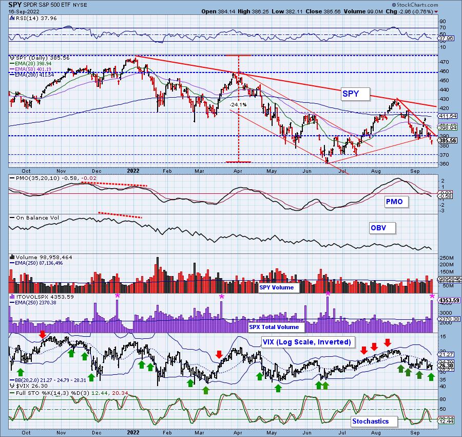
SPY Daily Chart: During end-of-quarter options expiration week we expect very high volume and low volatility. So only half our expectations were met -- high volume. The trading range was over 3% -- not super volatile, but not exactly quiet. We make a point of notifying our subscribers of each quarterly expiration so we don't mistake the high volume for something else, like a blowoff. It's just the massive rollover of options positions.
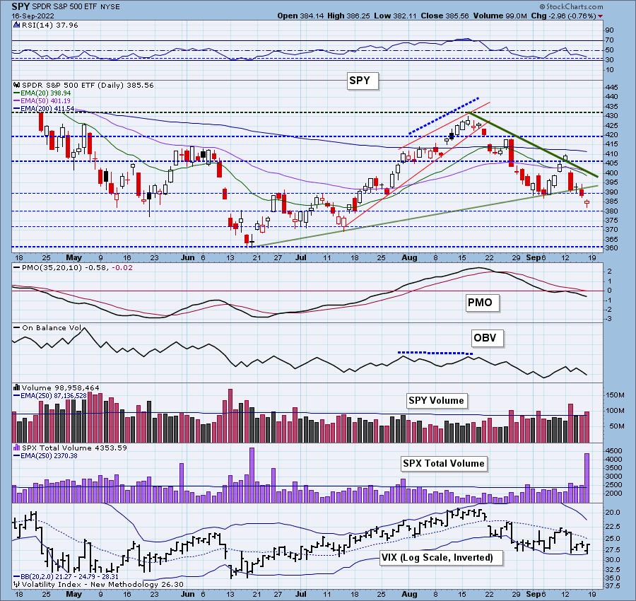
Indicators continue to deteriorate with the RSI now in negative territory below net neutral (50) and the PMO sinking into negative territory beneath the zero line. The VIX continues to oscillate below its moving average on our inverted log scale which tells us what we already know, the market is internally weak.
Here is last Monday's recording:
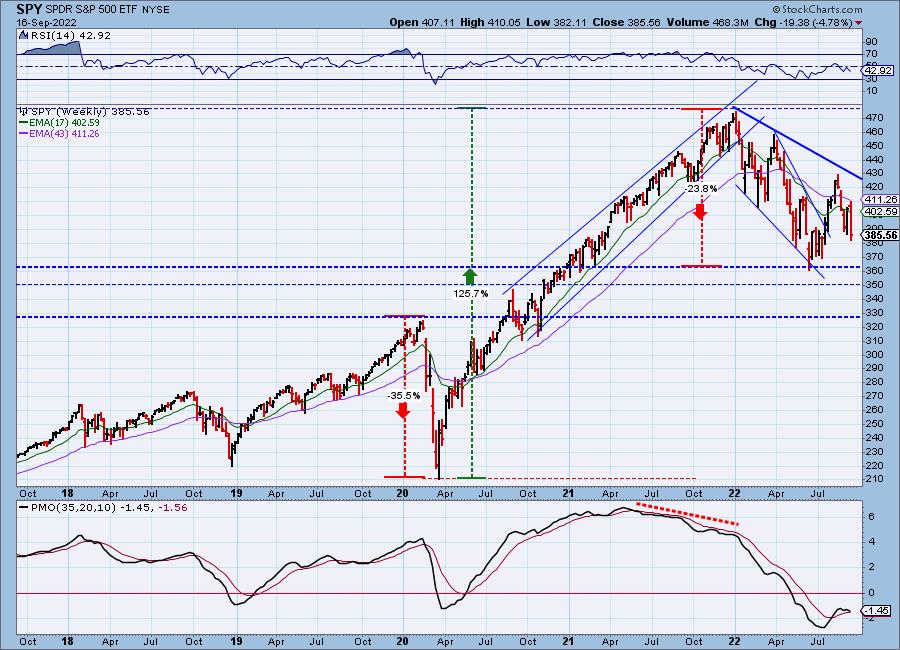
SPY Weekly Chart: We now view the price formation on the weekly chart as a broadening chart pattern. Volatility is increasing. Volatility is rarely our friend. Additionally, price was unable to test the intermediate-term declining trendline. Generally this means a continuation of the decline ahead. The weekly PMO is very close to a crossover SELL signal.
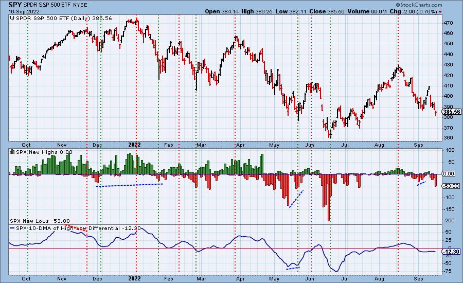
New 52-Week Highs/Lows: New Lows expanded greatly, but they are not yet oversold.
Climax Analysis: So here we have a prime example of why Carl belabors volume analysis on options expiration day. There was only one indicator with a climax reading -- SPX A-D Volume. SPX Total Volume was huge and may have tempted us to declare a climax day. But it was all caused by options expiration and should be ignored.
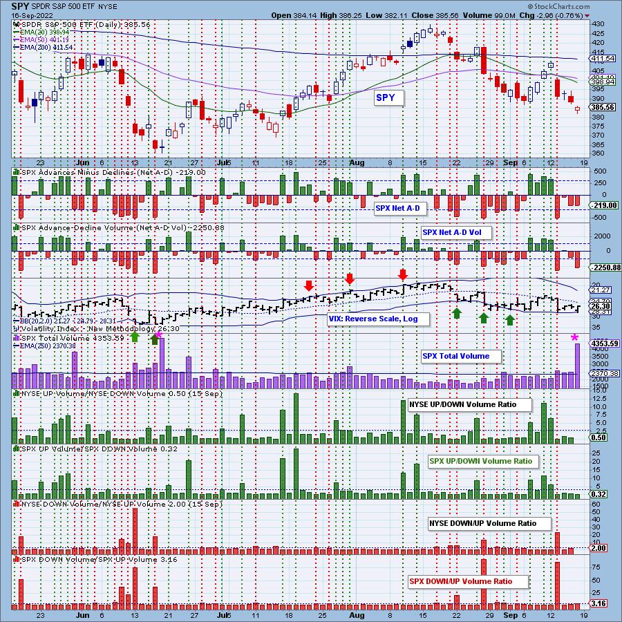
*A climax is a one-day event when market action generates very high readings in, primarily, breadth and volume indicators. We also include the VIX, watching for it to penetrate outside the Bollinger Band envelope. The vertical dotted lines mark climax days -- red for downside climaxes, and green for upside. Climaxes are at their core exhaustion events; however, at price pivots they may be initiating a change of trend.
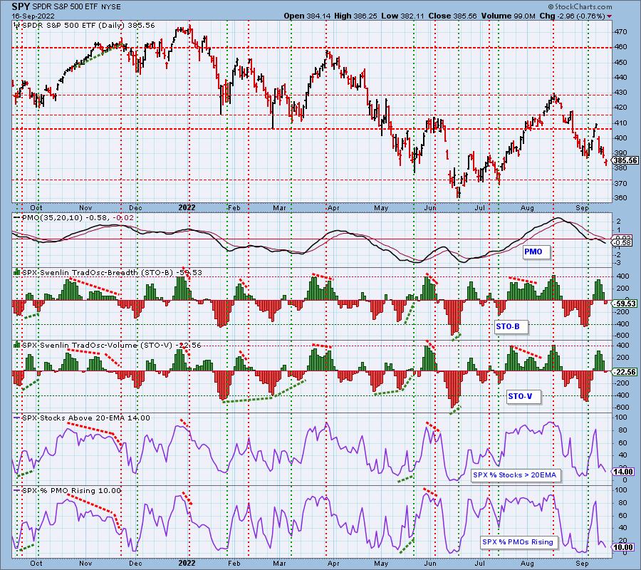
Short-Term Market Indicators: The short-term market trend is DOWN and the condition is NEUTRAL.
STOs have now entered negative territory. They are far from being considered oversold. While %Stocks with Rising Momentum is very low, we've seen lower.
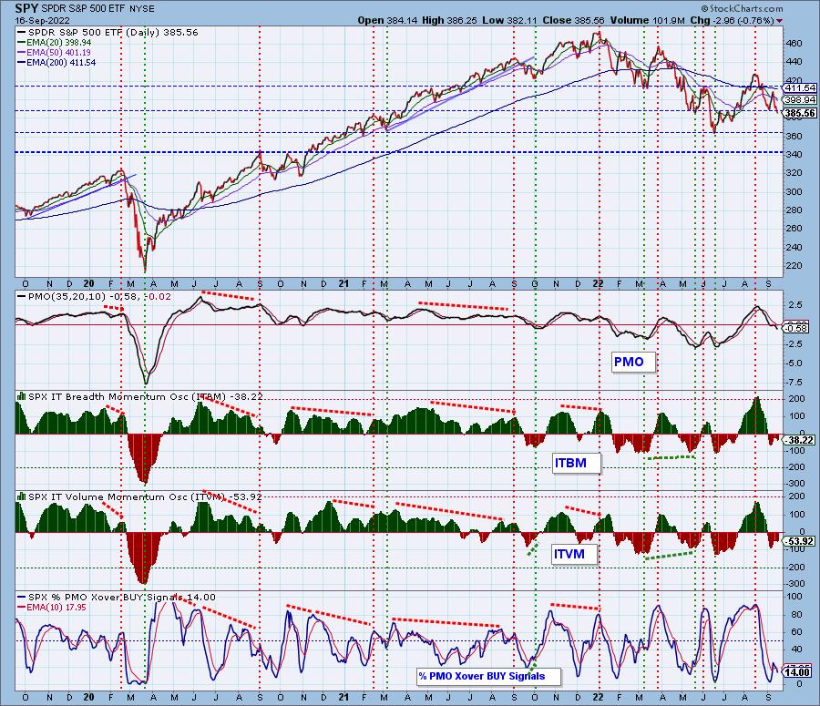
Intermediate-Term Market Indicators: The intermediate-term market trend is DOWN and the condition is NEUTRAL.
ITBM/ITVM are declining. They've been on point with calling tops and bottoms. Until they reverse or slow down we would expect more downside. %PMO BUY signals is very low, but as with %PMOs Rising, we've seen lower readings.
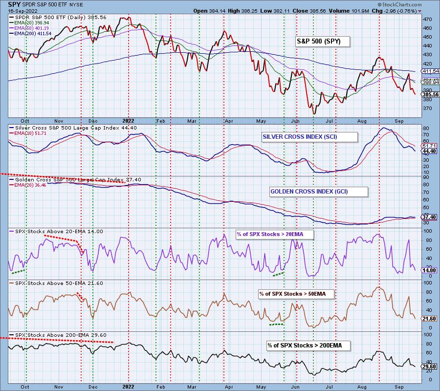
PARTICIPATION and BIAS Assessment: The following chart objectively shows the depth and trend of participation in two time frames.
- Intermediate-Term - the Silver Cross Index (SCI) shows the percentage of SPX stocks on IT Trend Model BUY signals (20-EMA > 50-EMA). The opposite of the Silver Cross is a "Dark Cross" -- those stocks are, at the very least, in a correction.
- Long-Term - the Golden Cross Index (GCI) shows the percentage of SPX stocks on LT Trend Model BUY signals (50-EMA > 200-EMA). The opposite of a Golden Cross is the "Death Cross" -- those stocks are in a bear market.
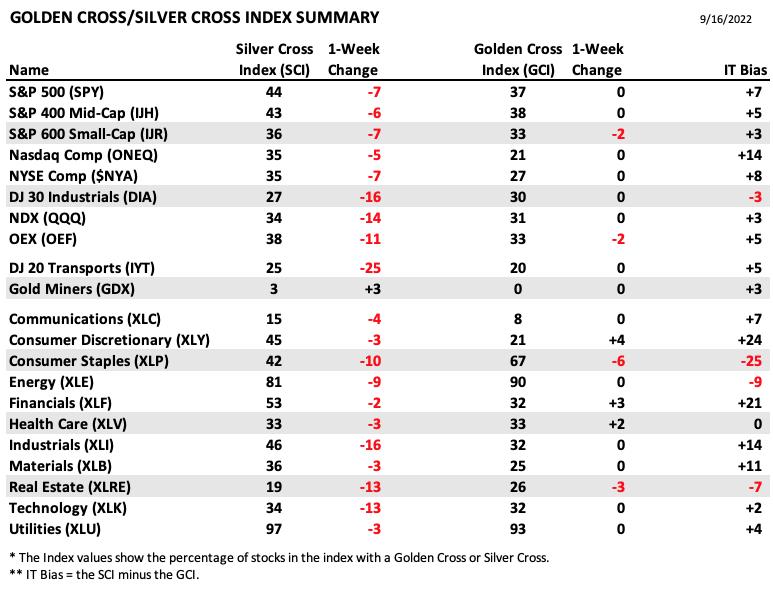
The following table summarizes participation for the major market indexes and sectors. The 1-Week Change columns inject a dynamic aspect to the presentation.
The biggest losers this week are the XLI, DJIA and DJTA as they lost over 16% of their Silver Cross BUY signals.
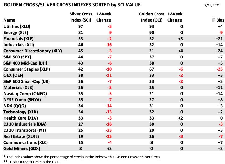
This table is sorted by SCI values. This gives a clear picture of strongest to weakest index/sector in terms of participation.
The only "winner" this week would be Gold Miners (GDX) which improved their SCI by 3%.
PARTICIPATION and BIAS Assessment: The following chart objectively shows the depth and trend of participation in two time frames.
- Intermediate-Term - the Silver Cross Index (SCI) shows the percentage of SPX stocks on IT Trend Model BUY signals (20-EMA > 50-EMA). The opposite of the Silver Cross is a "Dark Cross" -- those stocks are, at the very least, in a correction.
- Long-Term - the Golden Cross Index (GCI) shows the percentage of SPX stocks on LT Trend Model BUY signals (50-EMA > 200-EMA). The opposite of a Golden Cross is the "Death Cross" -- those stocks are in a bear market.
The bias is bearish in all three timeframes.
Short-term we have very low percentages of stocks above their 20/50-day EMAs.
Intermediate term the SCI has topped beneath its signal line and continues lower.
Long term the GCI is flat and the %Stocks > 50/200-day EMAs is lower than the GCI.
CONCLUSION: The market is weak and getting weaker. Unfortunately as weak as it is, indicators are not oversold and could certainly accommodate more downside. We don't see anything that would suggest we will get a strong rally next week. The FOMC isn't likely to allay investor fears. If anything they will compound it. The volatility seems to be getting worse and we don't see an end to that for some time. Be nimble if you have exposure in the market. Keep your investment horizons very short-term. Erin tends to be more of an intermediate-term trader, but during this bear she has had to continually shuffle positions. She is still 30% exposed but has rebalanced her portfolio yet again.
Calendar: FOMC meeting next week with the announcement on Wednesday. There is speculation that there will be a 100 basis point rate increase (versus 75).
Earnings Next Week: AutoZone (AZO), StitchFix (SFIX), General Mills (GIS), Lennar Homes (LEN), KB Homes (KBH), Costco (COST), Fedex (FDX) and Darden Restaurants (DRI).
Have you subscribed the DecisionPoint Diamonds yet? DP does the work for you by providing handpicked stocks/ETFs from exclusive DP scans! Add it with a discount! Contact support@decisionpoint.com for more information!
BITCOIN
Bitcoin was finally seeing follow through on the breakout from the bullish falling wedge. Price moved above both the 20/50-day EMAs, but the bottom fell out. The PMO has topped beneath the zero line and is nearing a crossover SELL signal. The RSI is negative and there is a clear short-term declining trend. Look for a test of the September low.
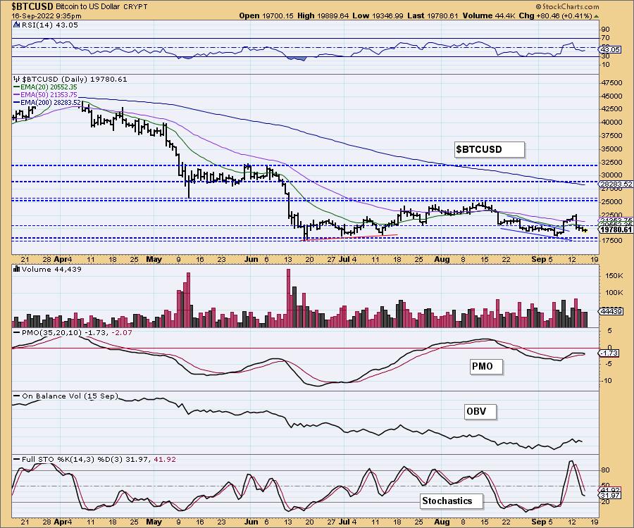
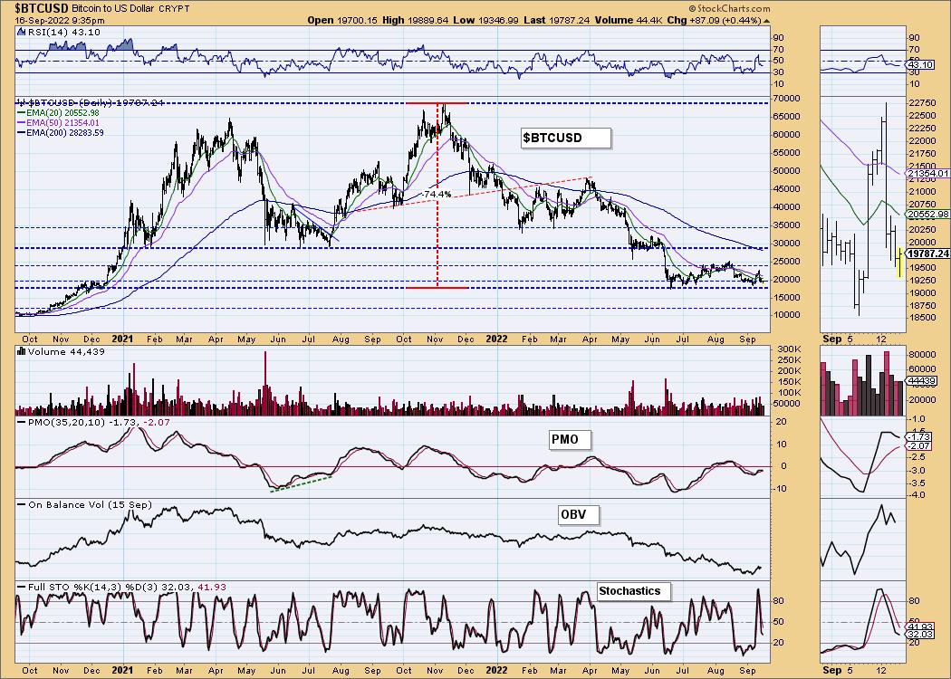
This chart is to show where some of the support/resistance lines come from.
INTEREST RATES
While many rates backed off slightly today, overall yields soared again this week. The FOMC announcement on Wednesday will likely goose them even higher.
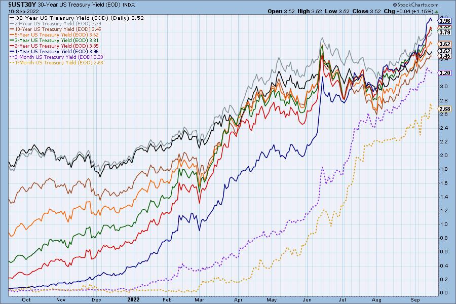
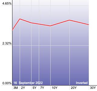
The Yield Curve Chart from StockCharts.com shows us the inversions taking place. The red line should move higher from left to right. Inversions are occurring where it moves downward.
{{{ Today the one-year yield hit 4.0% and is higher than all longer duration yields. }}}
10-YEAR T-BOND YIELD
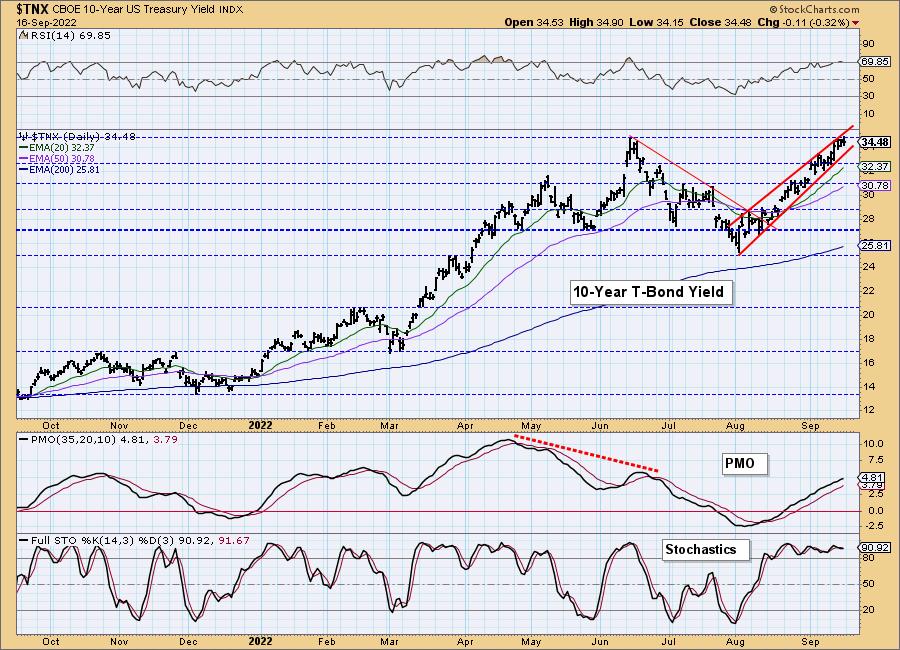
We have a clear bearish rising wedge on $TNX and it has hit overhead resistance. This would be the perfect place for a pullback. It likely will pull back and it needs to given the RSI is overbought again. Otherwise, indicators in general are strongly bullish. We should eventually see more multi-year highs.
MORTGAGE INTEREST RATES (30-Yr)**
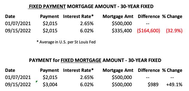
**We watch the 30-Year Fixed Mortgage Interest Rate, because, for the most part, people buy homes based upon the maximum monthly payment they can afford. As rates rise, a fixed monthly payment will carry a smaller mortgage amount. As buying power shrinks, home prices will come under pressure.
--
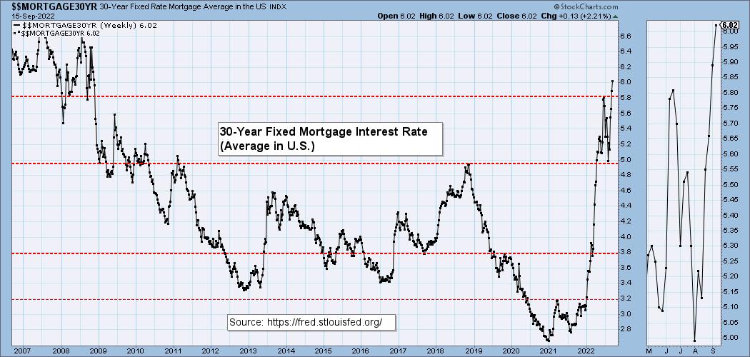
This week the 30-Year Fixed Rate rose from 5.89 to 6.02.
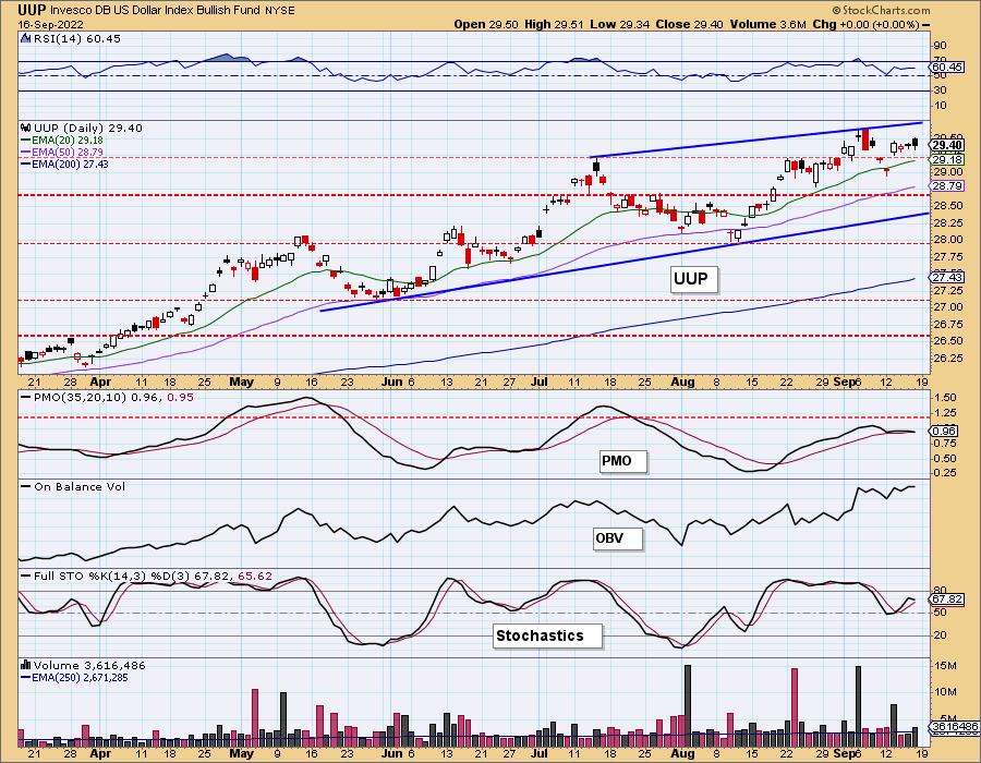
DOLLAR (UUP)
IT Trend Model: BUY as of 6/22/2021
LT Trend Model: BUY as of 8/19/2021
UUP Daily Chart: Another bearish filled black candlestick on UUP. The PMO nearly triggered a crossover SELL signal. Stochastics have topped before getting above 80. The RSI is still comfortably within positive territory, but the deterioration of the PMO and Stochastics is not good.
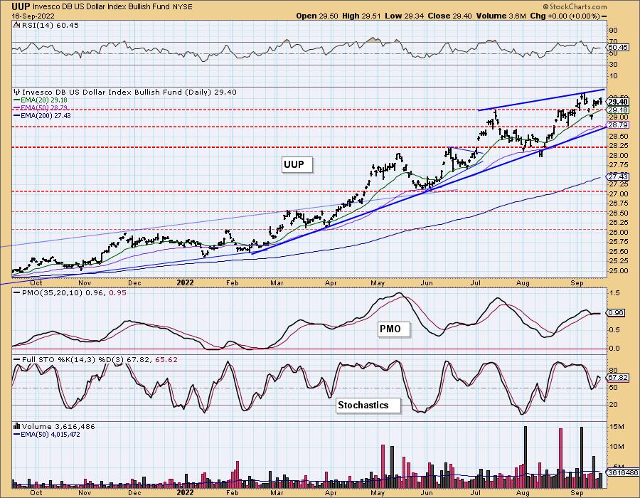
In the longer-term we have annotated a bearish rising wedge. The expectation is a breakdown of the rising bottoms trendline. Given indicators are deteriorating, we expect at worst a test of the rising trend and at best, chop and churn.
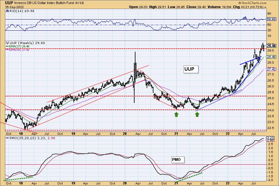
UUP Weekly Chart: Last week saw a breakout to new multi-year 'intraday' highs. This week we got a multi-year closing high. The weekly PMO and weekly RSI are bullish, but both are overbought. This is a good time to see a breakdown in the Dollar.
GOLD
IT Trend Model: NEUTRAL as of 5/3/2022
LT Trend Model: SELL as of 6/30/2022
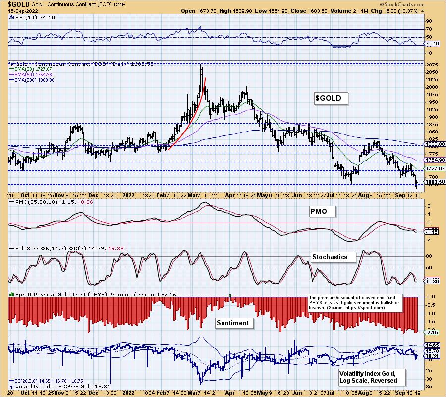
GOLD Daily Chart: Gold finished positively but didn't hold support intraday. We have a lower low and a lower high which isn't bullish. Indicators are about as flat as can be and aren't providing clues.
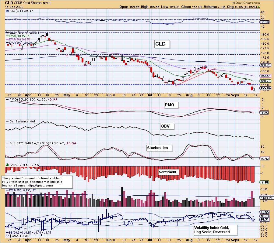
Discounts and the volatility index for Gold ($GVZ) suggest we will see a rally. Discounts are very high and given the recent puncture of the lower Bollinger Band on the inverted scale for $GVZ, we would expect higher prices.
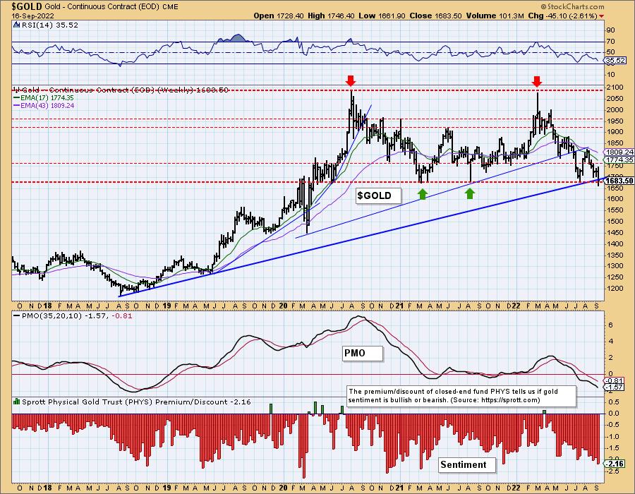
GOLD Weekly Chart: Discounts are at their highest level for the year. Extremely bearish sentiment suggests a possible price reversal ahead. With the Dollar looking weak, this is the perfect opportunity for Gold to rebound off the long-term rising bottoms trendline.
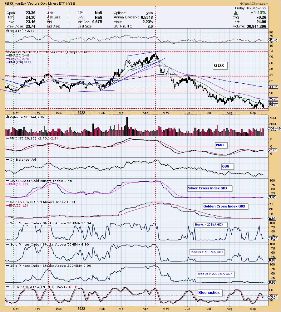
GOLD MINERS Golden and Silver Cross Indexes: Gold Miners bounced today of the August low. The RSI is still negative and Stochastics are flat and weak. Participation deteriorated quickly. Given our bullish outlook on Gold, we are looking for GDX to continue higher, but we really need to see more stocks above their 20/50-day EMAs.
(Full Disclosure: Erin owns GDX)
CRUDE OIL (USO)
IT Trend Model: NEUTRAL as of 7/8/2022
LT Trend Model: BUY as of 3/9/2021
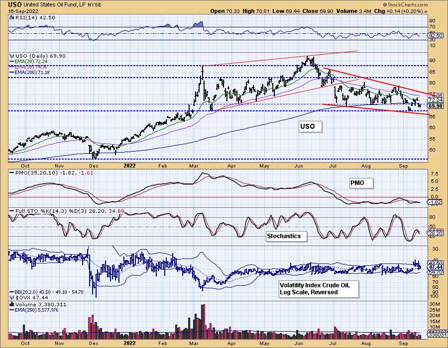
USO Daily Chart: Crude Oil has been all over the place. The volatility index for Crude Oil ($OVX) is oscillating above its moving average and that suggests internal strength. The bearish filled black candlestick is a problem. When these formations occur on USO, it nearly always leads to lower prices.
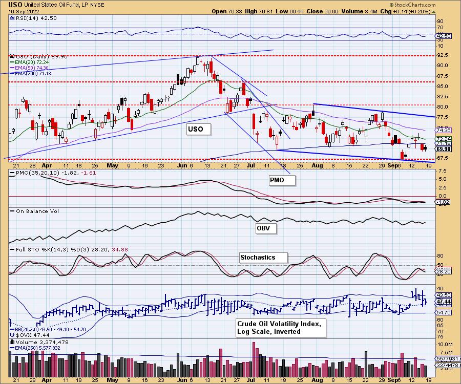
Indicators are weak given the negative RSI and falling, negative Stochastics. The PMO gives us some hope given it is flat and possibly nearing a crossover BUY signal. The problem is that it is very flat. We do see a bullish falling wedge pattern, but price will likely test this month's low before moving back up.
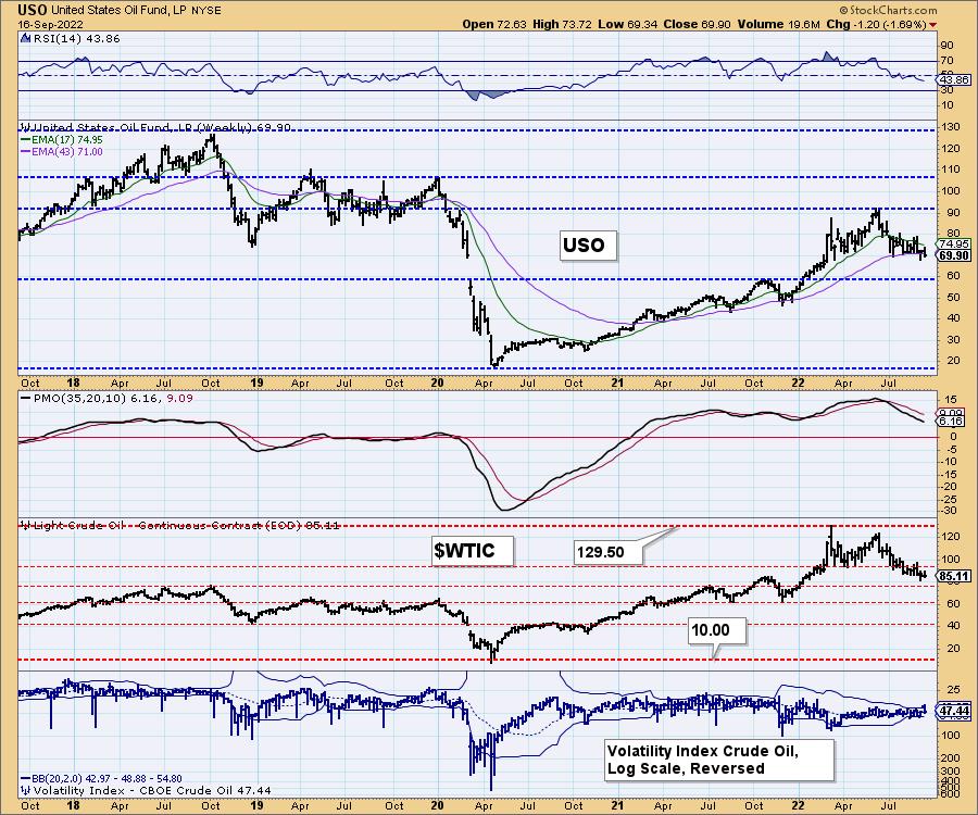
USO/$WTIC Weekly Chart: We have a clear topping formation on both USO and $WTIC. USO is losing support at the 43-week EMA, the weekly RSI is negative and the weekly PMO is declining. All suggest lower prices ahead.
BONDS (TLT)
IT Trend Model: SELLas of 8/19/2022
LT Trend Model: SELL as of 1/19/2022
TLT Daily Chart: TLT is in a declining trend and with indicators very weak and yields promising to move higher, we don't believe Bonds will do much.
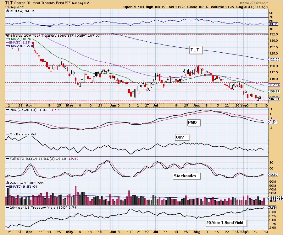
Support at the June low has basically been broken. Stochastics have topped in negative territory and the PMO is not at all encouraging.
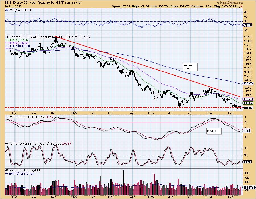
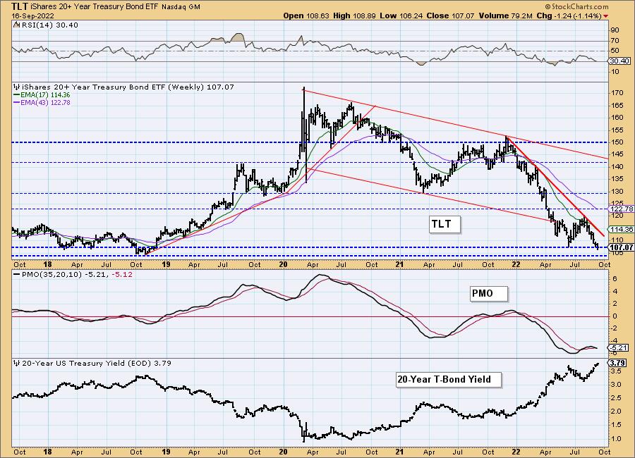
TLT Weekly Chart: TLT hasn't quite broken below the 2018 lows, but it is clearly on its way to doing so. The weekly RSI is negative and we have a new weekly PMO crossover SELL signal. The 20-year yield is making new multi-year highs so conversely, we expect TLT to continue to make multi-year lows.
Good Luck & Good Trading!
Erin Swenlin And Carl Swenlin
Erin is 30% exposed to the market.
Technical Analysis is a windsock, not a crystal ball. --Carl Swenlin
(c) Copyright 2022 DecisionPoint.com
Disclaimer: This blog is for educational purposes only and should not be construed as financial advice. The ideas and strategies should never be used without first assessing your own personal and financial situation, or without consulting a financial professional. Any opinions expressed herein are solely those of the author, and do not in any way represent the views or opinions of any other person or entity.
NOTE: The signal status reported herein is based upon mechanical trading model signals, specifically, the DecisionPoint Trend Model. They define the implied bias of the price index based upon moving average relationships, but they do not necessarily call for a specific action. They are information flags that should prompt chart review. Further, they do not call for continuous buying or selling during the life of the signal. For example, a BUY signal will probably (but not necessarily) return the best results if action is taken soon after the signal is generated. Additional opportunities for buying may be found as price zigzags higher, but the trader must look for optimum entry points. Conversely, exit points to preserve gains (or minimize losses) may be evident before the model mechanically closes the signal.
Helpful DecisionPoint Links:
DecisionPoint Alert Chart List
DecisionPoint Golden Cross/Silver Cross Index Chart List
DecisionPoint Sector Chart List
Price Momentum Oscillator (PMO)
Swenlin Trading Oscillators (STO-B and STO-V)
DecisionPoint is not a registered investment advisor. Investment and trading decisions are solely your responsibility. DecisionPoint newsletters, blogs or website materials should NOT be interpreted as a recommendation or solicitation to buy or sell any security or to take any specific action.
