
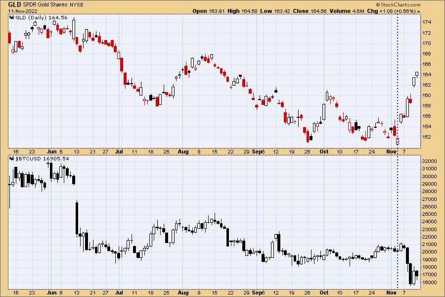
Carl has been saying for some time that cryptos are hurting gold by sucking up a lot of the cash that would otherwise go into gold. It appears that with the crash of FTX people have become averse to cryptos and may be moving toward gold. On the chart below we can see that gold and Bitcoin were more or less tracking together -- not necessarily with the same magnitude, but moving generally in the same direction. As FTX troubles surfaced this week, gold has rallied strongly and Bitcoin headed south in a big way. We can't be sure this divergence will continue, but it bears watching.
The DecisionPoint Alert Weekly Wrap presents an end-of-week assessment of the trend and condition of the Stock Market, the U.S. Dollar, Gold, Crude Oil, and Bonds. The DecisionPoint Alert daily report (Monday through Thursday) is abbreviated and gives updates on the Weekly Wrap assessments.
Watch the latest episode of DecisionPoint on StockCharts TV's YouTube channel here!
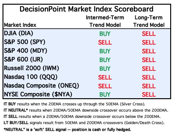
MAJOR MARKET INDEXES
For Today: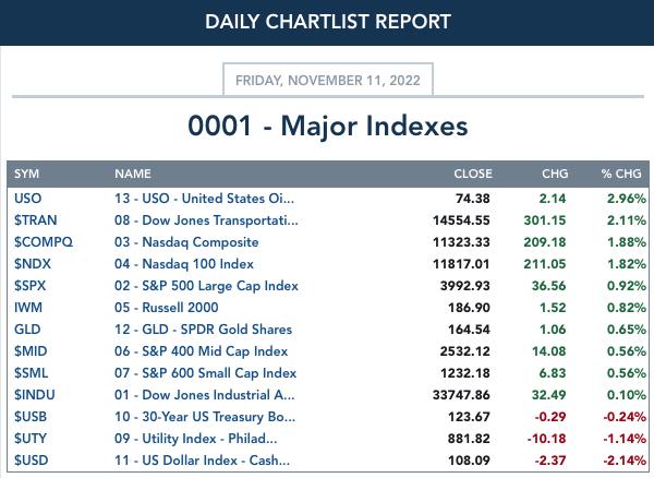
For the Week: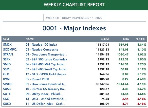
SECTORS
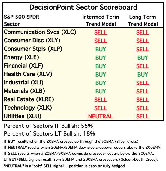
Each S&P 500 Index component stock is assigned to one of 11 major sectors. This is a snapshot of the Intermediate-Term (Silver Cross) and Long-Term (Golden Cross) Trend Model signal status for those sectors.
For Today: 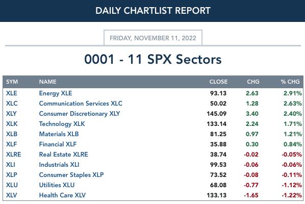
For the Week: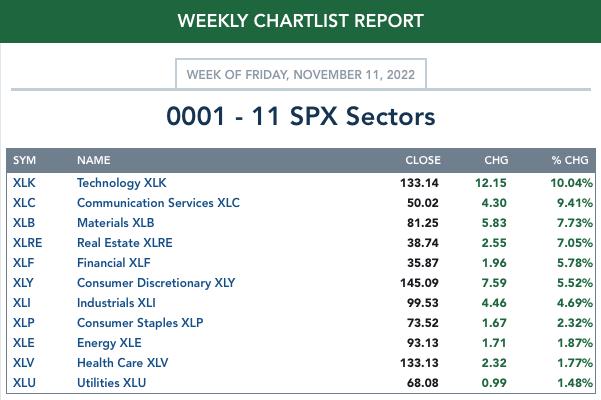
RRG® Daily Chart ($ONE Benchmark):
We don't actually need to see the RRG to see where new strength lies. A CandleGlance of the sectors tell you that new momentum is in XLB, XLC, XLK and XLY. On the daily RRG XLB, XLC and XLK have all three now have bullish northeast headings. XLY isn't far behind, it just doesn't have an eastward component yet to its heading.
No other sectors have northeast headings which surprised us. What is good is that even though we have southwest headings and south or west components to headings, all but two are on the right side of the graph. If they are on the right side of the graph it implies internal strength. Still, we would like to see the others reverse headings like XLC, XLB, XLK and XLY.
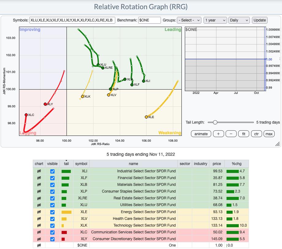
RRG® Weekly Chart ($ONE Benchmark): The weekly chart reflects new strength coming back into the market as all of the sectors are beginning to curl up into bullish northeast headings. Note that all but XLE are on the left side of the RRG, this tells us all of these sectors are still weak. XLB, XLF and XLV are within the Improving quadrant and moving toward Leading, but there is still overall weakness due to begin on the left hand side of the RRG.
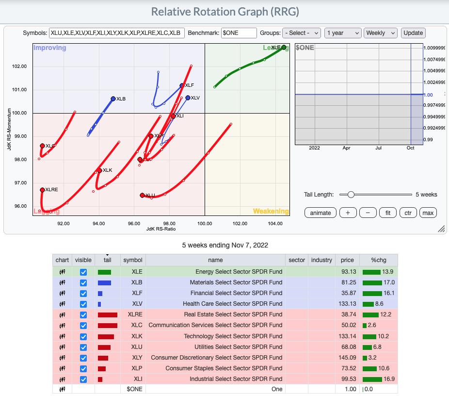
RRG® charts show you the relative strength and momentum for a group of stocks. Stocks with strong relative strength and momentum appear in the green Leading quadrant. As relative momentum fades, they typically move into the yellow Weakening quadrant. If relative strength then fades, they move into the red Lagging quadrant. Finally, when momentum starts to pick up again, they shift into the blue Improving quadrant.
CLICK HERE for an animated version of the RRG chart.
CLICK HERE for Carl's annotated Sector charts.
THE MARKET (S&P 500)
IT Trend Model: SELL as of 9/8/2022
LT Trend Model: SELL as of 5/5/2022
SPY Daily Chart: We started monitoring a new bearish rising wedge this week. Today price popped above the wedge. This would be a bullish conclusion to a bearish chart pattern which can be considered especially bullish.
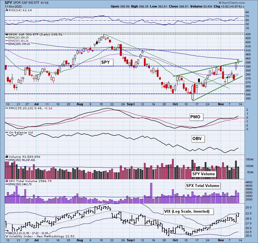
Indicators are currently confirming with the exception of the OBV which technically holds a negative divergence between its declining tops matched with price's rising tops. This condition could clear if we see more volume.
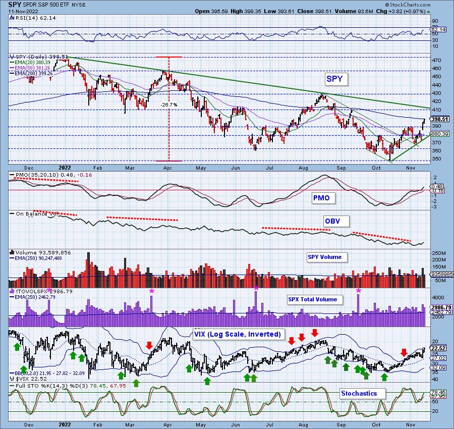
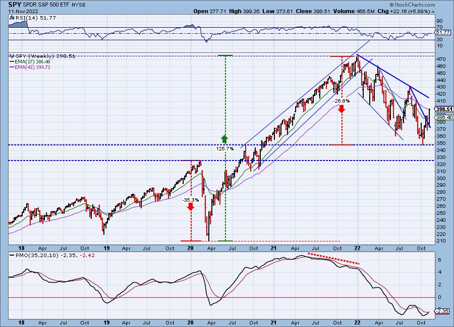
SPY Weekly Chart: Last week saw a failed attempt to break from the intermediate-term declining trend; this week price found success popping out and now testing the 43-week EMA. We got a new weekly PMO crossover BUY signal. Next up is to see if it can break from the long-term declining trend drawn from this year's high.
New 52-Week Highs/Lows: Currently there is a negative divergence between price tops and New Highs. Not a good situation, but since we don't have an actual price top, that condition could correct itself. We like that the 10-DMA of the High-Low Differential is turning up.
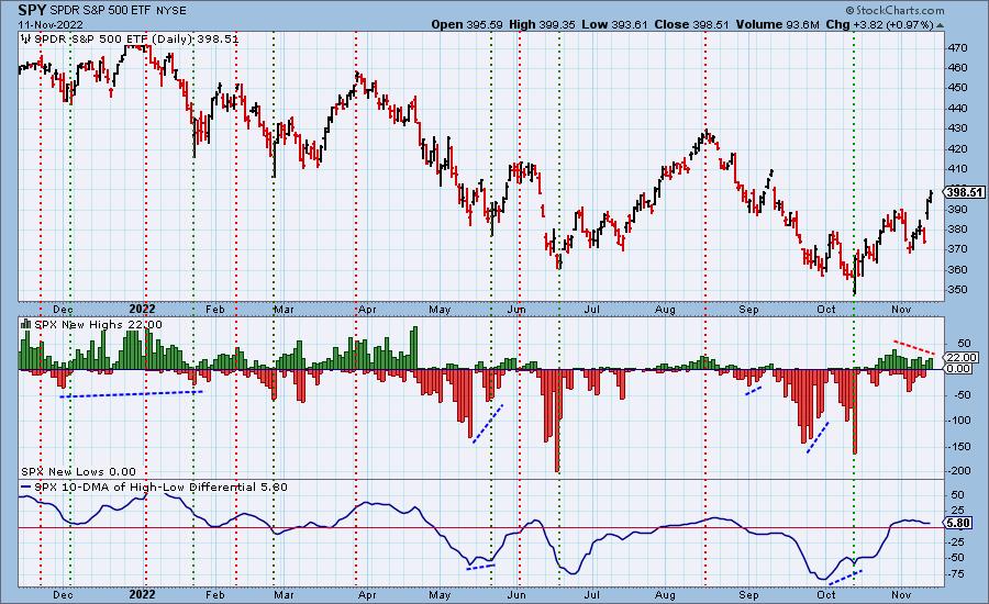
Climax Analysis: Climax readings were not unanimous today, nor were they as strong. Nevertheless, they were sufficient to declare today as having an upside exhaustion climax. The next thing we'll expect is some churn or a pullback, but we don't think the rally is over.
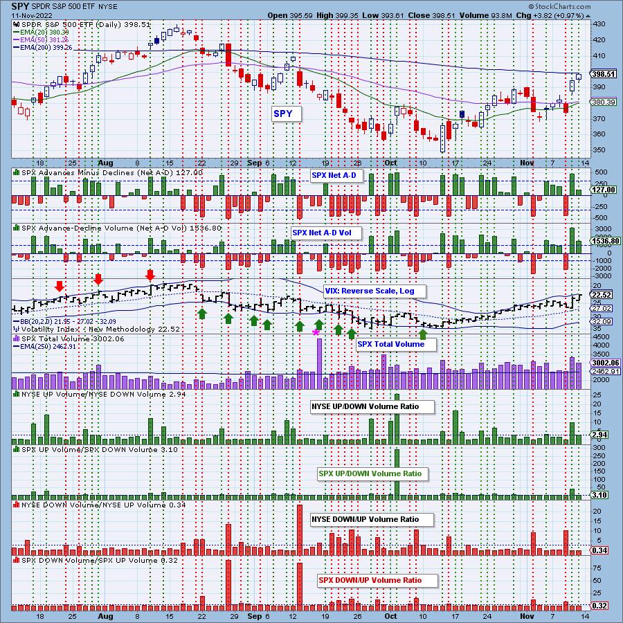
*A climax is a one-day event when market action generates very high readings in, primarily, breadth and volume indicators. We also include the VIX, watching for it to penetrate outside the Bollinger Band envelope. The vertical dotted lines mark climax days -- red for downside climaxes, and green for upside. Climaxes are at their core exhaustion events; however, at price pivots they may be initiating a change of trend.
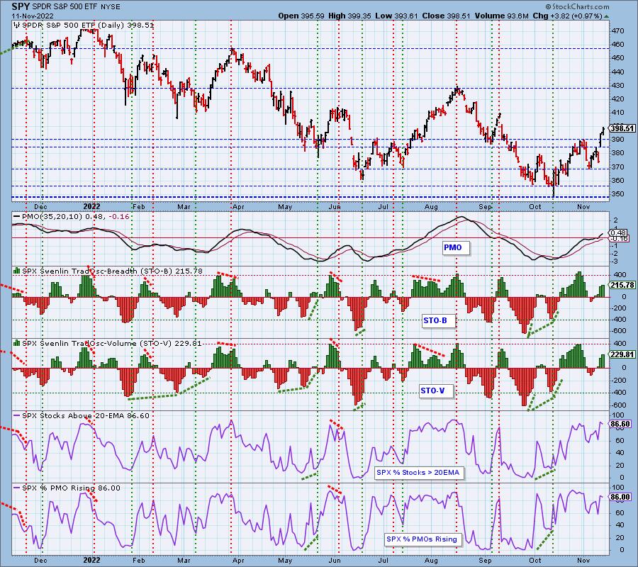
Short-Term Market Indicators: The short-term market trend is UP and the condition is OVERBOUGHT.
The STOs continue to rise and we consider them overbought. However, there is certainly plenty of room for them to move higher as we've seen far higher (more overbought) readings. It was a bit strange that we saw %PMOs Rising tick down today. Could give credence to today being an upside exhaustion climax.
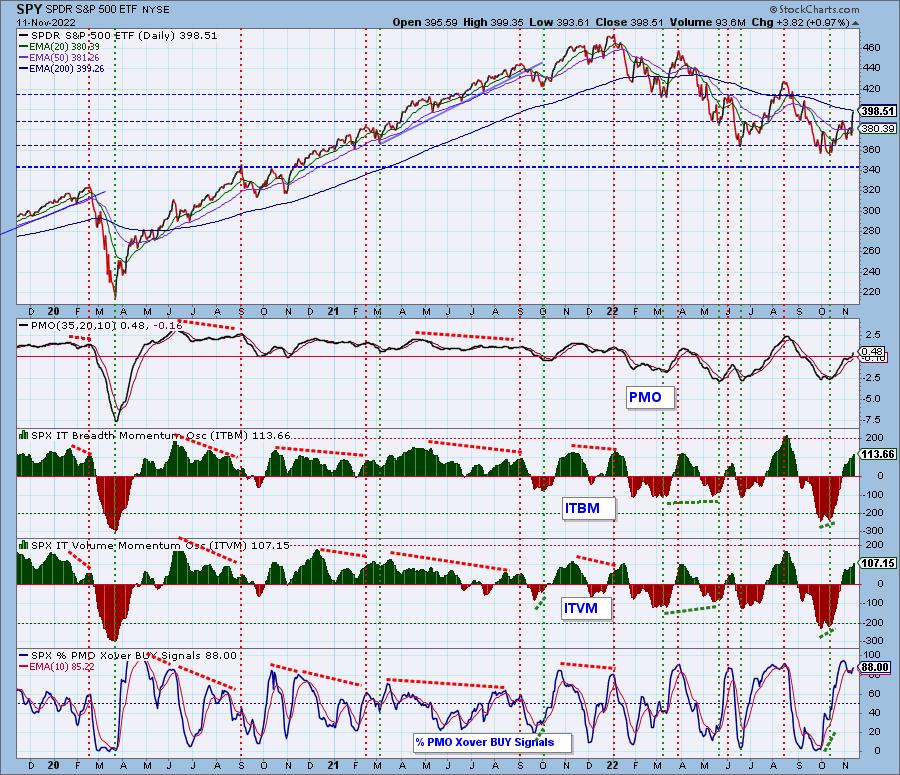
Intermediate-Term Market Indicators: The intermediate-term market trend is DOWN and the condition is OVERBOUGHT.
Like the STOs we consider current readings of the ITBM/ITVM to be overbought. They continue to rise and have seen far more overbought conditions, but nonetheless they are high enough to consider them overbought. %PMO BUY signals expanded on today's rally as would be expected.
PARTICIPATION and BIAS Assessment: The following chart objectively shows the depth and trend of participation in two time frames.
- Intermediate-Term - the Silver Cross Index (SCI) shows the percentage of SPX stocks on IT Trend Model BUY signals (20-EMA > 50-EMA). The opposite of the Silver Cross is a "Dark Cross" -- those stocks are, at the very least, in a correction.
- Long-Term - the Golden Cross Index (GCI) shows the percentage of SPX stocks on LT Trend Model BUY signals (50-EMA > 200-EMA). The opposite of a Golden Cross is the "Death Cross" -- those stocks are in a bear market.
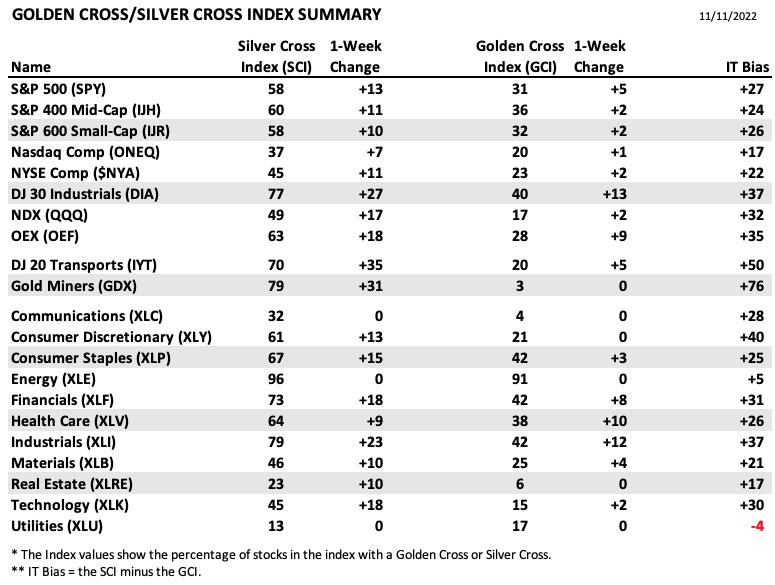
The following table summarizes participation for the major market indexes and sectors. The 1-Week Change columns inject a dynamic aspect to the presentation.
There was a lot of improvement in both the Silver Cross and Golden Cross Indexes this week.
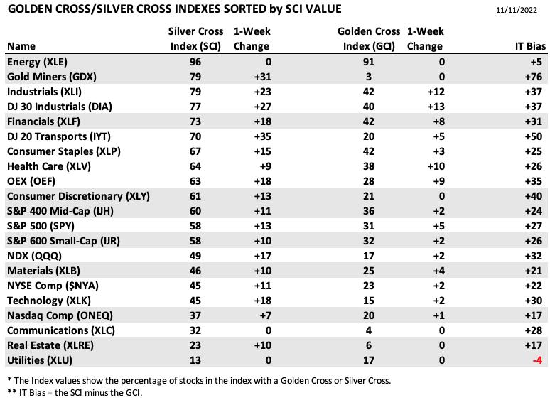
This table is sorted by SCI values. This gives a clear picture of strongest to weakest index/sector in terms of participation.
Thirteen ot the 21 Silver Cross Indexes are reading 50% or higher, which we consider to be bull market strength. That is not to say that we are now in a bull market, but participation is greatly improved.
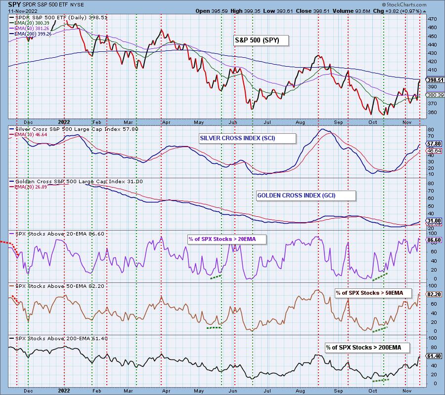
PARTICIPATION and BIAS Assessment: The following chart objectively shows the depth and trend of participation in two time frames.
- Intermediate-Term - the Silver Cross Index (SCI) shows the percentage of SPX stocks on IT Trend Model BUY signals (20-EMA > 50-EMA). The opposite of the Silver Cross is a "Dark Cross" -- those stocks are, at the very least, in a correction.
- Long-Term - the Golden Cross Index (GCI) shows the percentage of SPX stocks on LT Trend Model BUY signals (50-EMA > 200-EMA). The opposite of a Golden Cross is the "Death Cross" -- those stocks are in a bear market.
The Percentage of Stocks Above the 20-day EMA and 50-day EMA has reached overbought levels, which in a bear market is a pretty precarious situation and calls for a pullback.
We read the short-term bias a BULLISH. There are strong readings in participation of stocks > 20/50-day EMAs (albeit overbought). Those readings are also much higher than the SCI percentage.
The intermediate-term bias is BULLISH. The SCI is accelerating higher and holds a reading above 50%.
The long-term bias is NEUTRAL to BULLISH. The GCI is rising on a crossover and we have good participation of stocks above their 50/200-day EMAs.
CONCLUSION: The rally continued on today, but we had a few cracks in the foundation. First is the downside exhaustion climax which implies a pause in the action or pullback. Next are overbought conditions in some participation indicators. The OBV still holds a negative divergence with price and we saw a slight tick lower on stocks with rising momentum. On the flip side, there is still internal strength based on Stochastics, the PMO and a bullish conclusion to the bearish wedge. Synthesizing all of this we are looking for the bear market rally to continue. There will likely be some churn to digest this week's strong finish, but we see broad participation, enough to keep the short-term rising trend intact.
Calendar: Next week is options expiration. It is not an end-of-quarter expiration, so we do not expect unusually high volume; however, we should expect low volatility on Thursday and Friday.
Have you subscribed the DecisionPoint Diamonds yet? DP does the work for you by providing handpicked stocks/ETFs from exclusive DP scans! Add it with a discount! Contact support@decisionpoint.com for more information!
BITCOIN
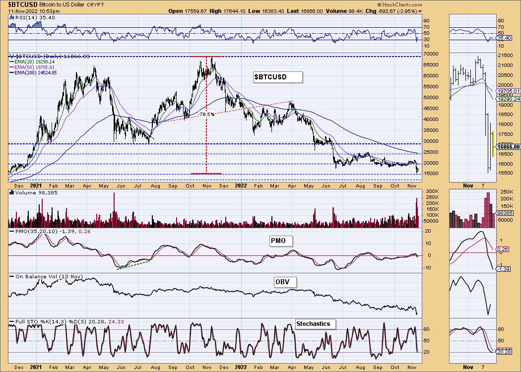
Bitcoin attempted to recapture its prior trading range, but failed. The collapse of FTX took all cryptos for a ride down. We could be looking at a new trading range for Bitcoin between $15,000 and $18,000. The indicators suggest it will be lucky to hold $15,000. The RSI turned down deep in negative territory below net neutral (50). The PMO is negative and moving quickly lower. Stochastics are stuck in the basement.
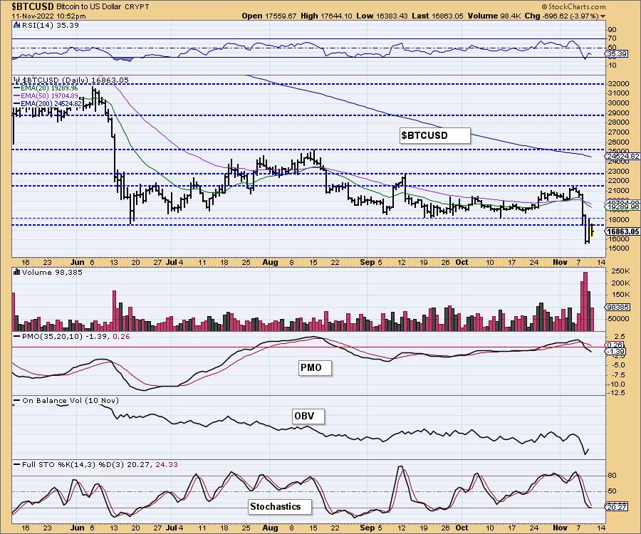
This chart is to show where some of the support/resistance lines come from.
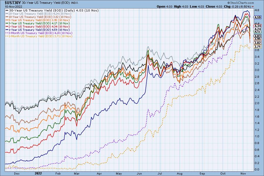
INTEREST RATES
Treasury bonds/notes/bills did not trade today.
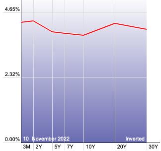
The Yield Curve Chart from StockCharts.com shows us the inversions taking place. The red line should move higher from left to right. Inversions are occurring where it moves downward.
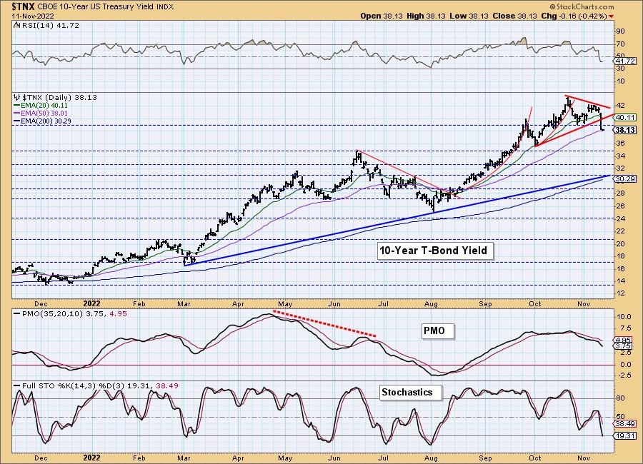
10-YEAR T-BOND YIELD
It was a rough week for $TNX as it lost support and confirmed an Adam & Eve Double-Top pattern. Currently support is holding at the 50-day EMA, but given the condition of the indicators, we expect a trip to 3.5%. We don't believe rates are through rising in the long term, but for now it appears we are getting a correction. This will put the wind at the back of the market to lift it higher.
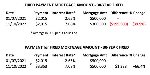
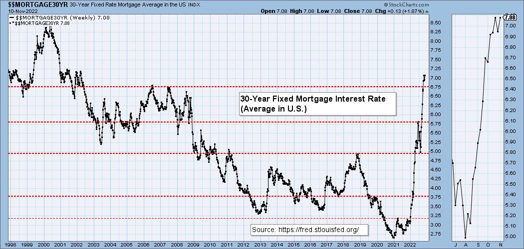
MORTGAGE INTEREST RATES (30-Yr)**
**We watch the 30-Year Fixed Mortgage Interest Rate, because, for the most part, people buy homes based upon the maximum monthly payment they can afford. As rates rise, a fixed monthly payment will carry a smaller mortgage amount. As buying power shrinks, home prices will come under pressure.**

--
This week the 30-Year Fixed Rate rose from 6.95 to 7.08.
DOLLAR (UUP)
IT Trend Model: BUY as of 6/22/2021
LT Trend Model: BUY as of 8/19/2021
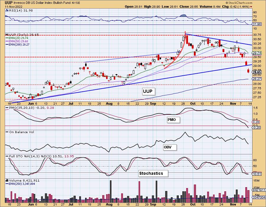
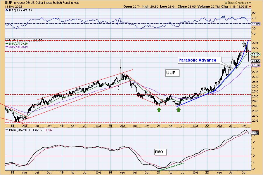
UUP Daily Chart: The Dollar saw a waterfall decline this week which is also fuel for a market rally. UUP is now oversold as far as the RSI is concerned, but the PMO is sailing lower and is not oversold. The 200-day EMA is arriving. We would look for a digestion period there.
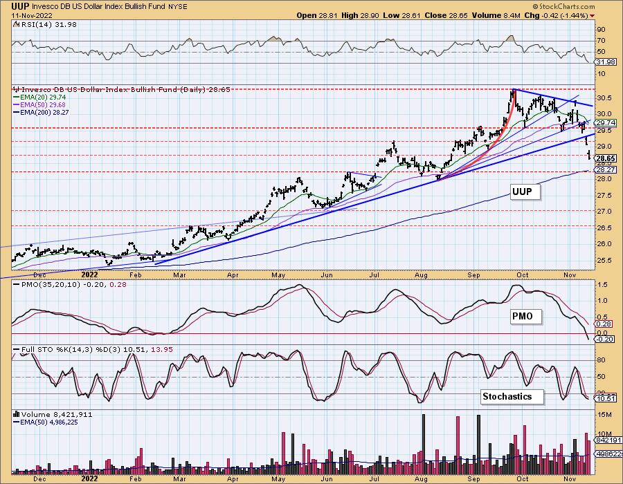
UUP Weekly Chart: Well, this looks like a textbook example of a parabolic advance and eventual collapse. When the fail, they generally fail spectacularly. The weekly PMO has now triggered a crossover SELL signal in very overbought territory.
GOLD
IT Trend Model: NEUTRAL as of 5/3/2022
LT Trend Model: SELL as of 6/30/2022
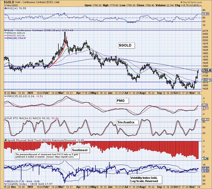
GOLD Daily Chart: The Dollar's demise has been Gold's fortune. The rally this week was stronger for Gold than the amount of weakness in the Dollar. There is definitely investor interest in Gold, possibly as part of the failure of crypto. Indicators are very strong. The RSI will be overbought soon, but today's breakout above the 200-day EMA suggests to us that Gold will stay overbought for some time.
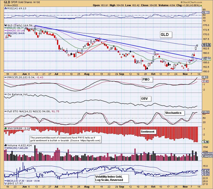
We have the 3rd highest discount reading since we began tracking them in 2010. This tells us that investors are still extraordinarily bearish on Gold. That is very bullish for gold prices and we think that sentiment is finally playing out in price.
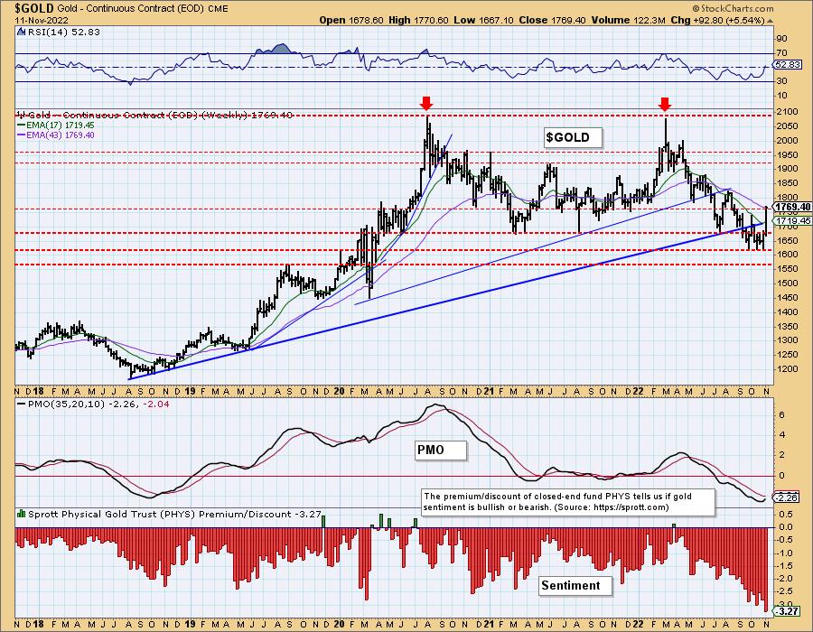
GOLD Weekly Chart: Price closed on the 43-week EMA, but technically was above it briefly. Price did overcome resistance in the long term. The weekly PMO has turned up. This is about the best setup we've seen for Gold in a long while.
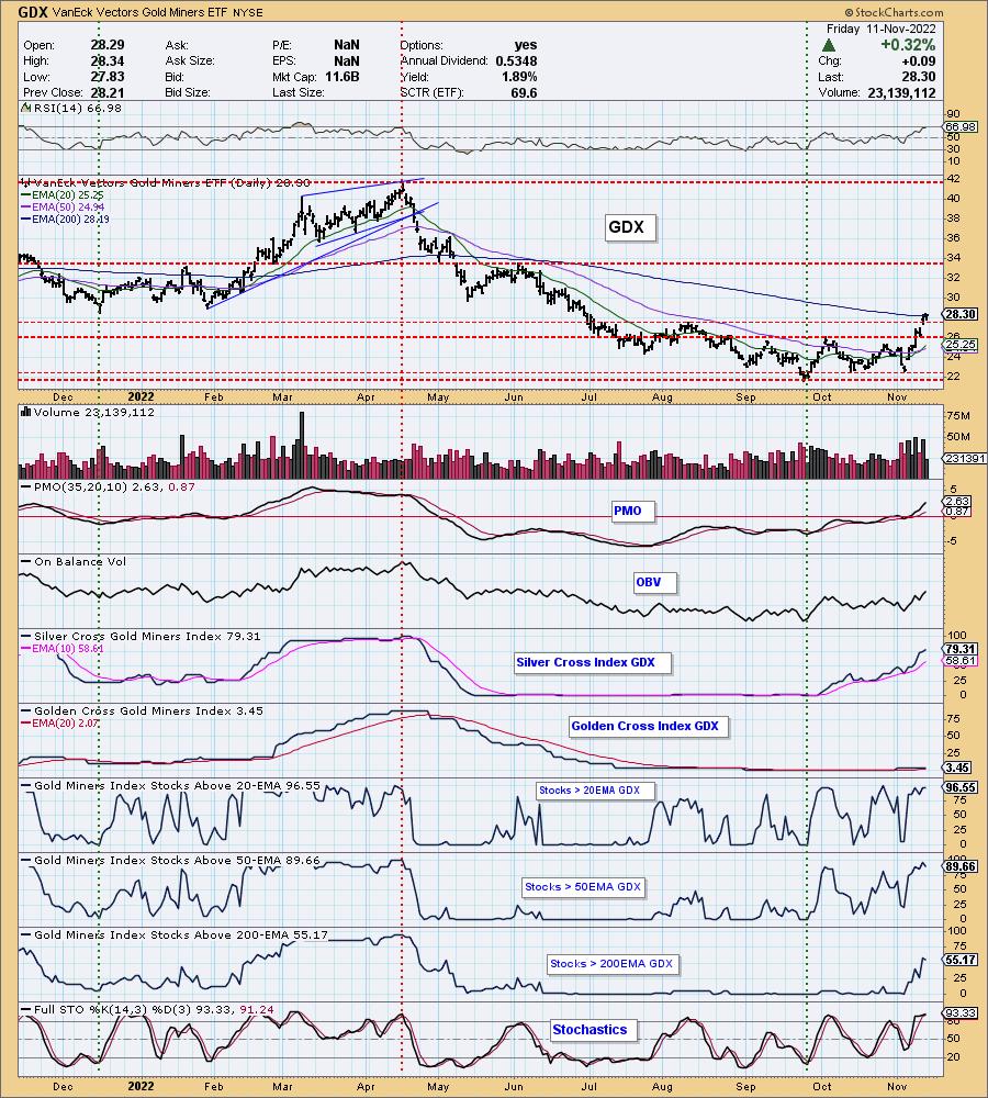
GOLD MINERS Golden and Silver Cross Indexes: Price closed above the 200-day EMA so that line of resistance has been broken. Participation is robust. We can't see anything here that would suggest a correction or breakdown ahead.
CRUDE OIL (USO)
IT Trend Model: BUY as of 11/4/2022
LT Trend Model: BUY as of 3/9/2021
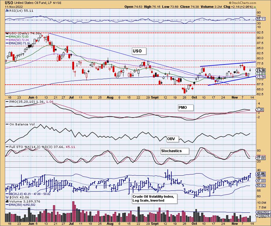
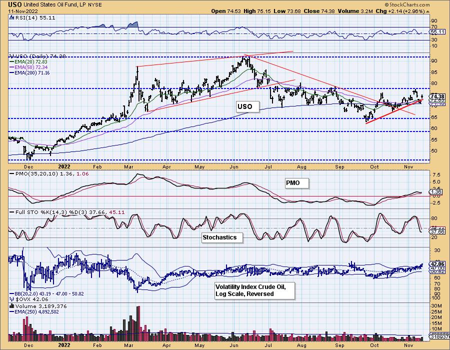
USO Daily Chart: USO gapped up today after testing the 200-day EMA yesterday. Now that we have a registered price low, we have annotated a new rising wedge formation. These are bearish, but it appears price will test the top of the wedge one more time. The PMO is still sketchy, but the RSI is positive and rising. Stochastics don't inspire confidence. Additionally $OVX popped well above the upper Bollinger Band on the inverted scale. That usually precedes a decline.
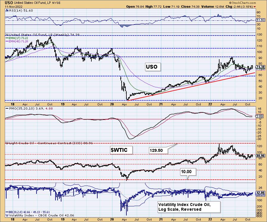
USO/$WTIC Weekly Chart: The weekly chart isn't particularly helpful. The RSI is neutral and the PMO is flat. We do note that USO didn't have to tap the rising bottoms line before trending back up which is bullish. $WTIC is struggling with overhead resistance currently.
BONDS (TLT)
IT Trend Model: SELLas of 8/19/2022
LT Trend Model: SELL as of 1/19/2022
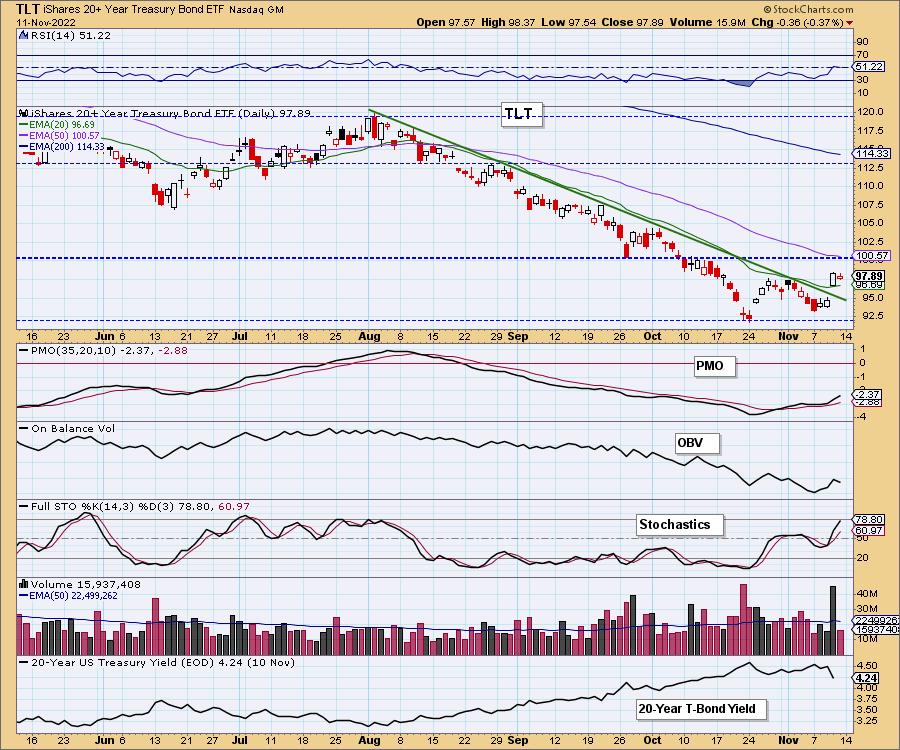
TLT Daily Chart: With yields topping this week, TLT managed to break its intermediate-term declining tops trendline. Additionally it made it back above the 20-day EMA. Today it paused. The PMO and Stochastics suggest more upside ahead. We're not so sure how much upside will be garnered, but it is time for a correction in yields. We see a double-bottom and the upside target would be about $102.50.
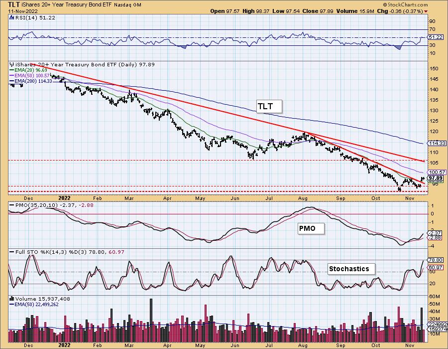
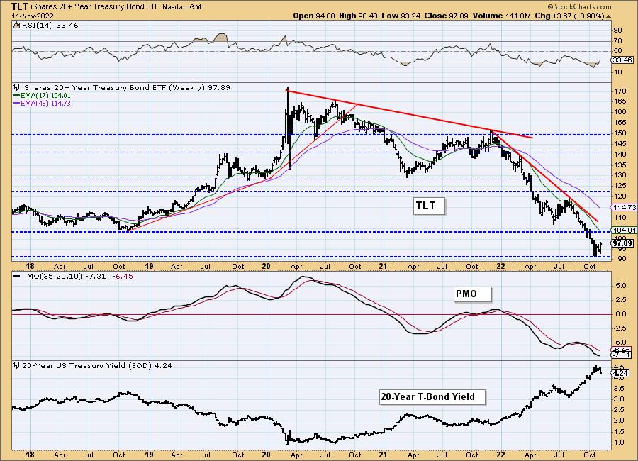
TLT Weekly Chart: It's difficult to see, but the weekly PMO did tick upward on this week's rally. Should we see a deeper correction in yields, we could see price moving to test the steep declining tops trendline. We don't believe yields will correct for much longer so it is too optimistic to think that declining trend will be broken.
Good Luck & Good Trading!
Erin Swenlin And Carl Swenlin
Technical Analysis is a windsock, not a crystal ball. --Carl Swenlin
(c) Copyright 2022 DecisionPoint.com
Disclaimer: This blog is for educational purposes only and should not be construed as financial advice. The ideas and strategies should never be used without first assessing your own personal and financial situation, or without consulting a financial professional. Any opinions expressed herein are solely those of the author, and do not in any way represent the views or opinions of any other person or entity.
NOTE: The signal status reported herein is based upon mechanical trading model signals, specifically, the DecisionPoint Trend Model. They define the implied bias of the price index based upon moving average relationships, but they do not necessarily call for a specific action. They are information flags that should prompt chart review. Further, they do not call for continuous buying or selling during the life of the signal. For example, a BUY signal will probably (but not necessarily) return the best results if action is taken soon after the signal is generated. Additional opportunities for buying may be found as price zigzags higher, but the trader must look for optimum entry points. Conversely, exit points to preserve gains (or minimize losses) may be evident before the model mechanically closes the signal.
Helpful DecisionPoint Links:
DecisionPoint Alert Chart List
DecisionPoint Golden Cross/Silver Cross Index Chart List
DecisionPoint Sector Chart List
Price Momentum Oscillator (PMO)
Swenlin Trading Oscillators (STO-B and STO-V)
DecisionPoint is not a registered investment advisor. Investment and trading decisions are solely your responsibility. DecisionPoint newsletters, blogs or website materials should NOT be interpreted as a recommendation or solicitation to buy or sell any security or to take any specific action. 11
