
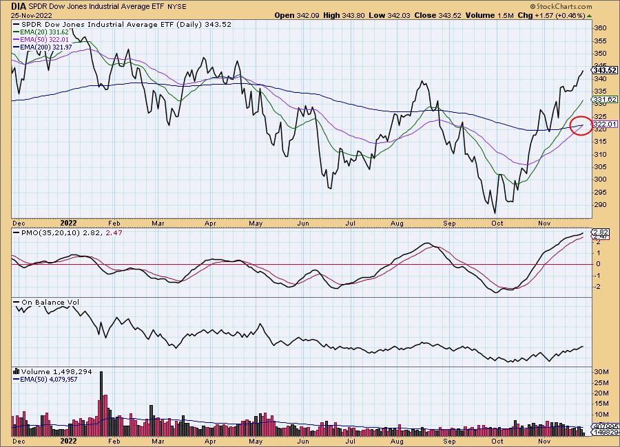
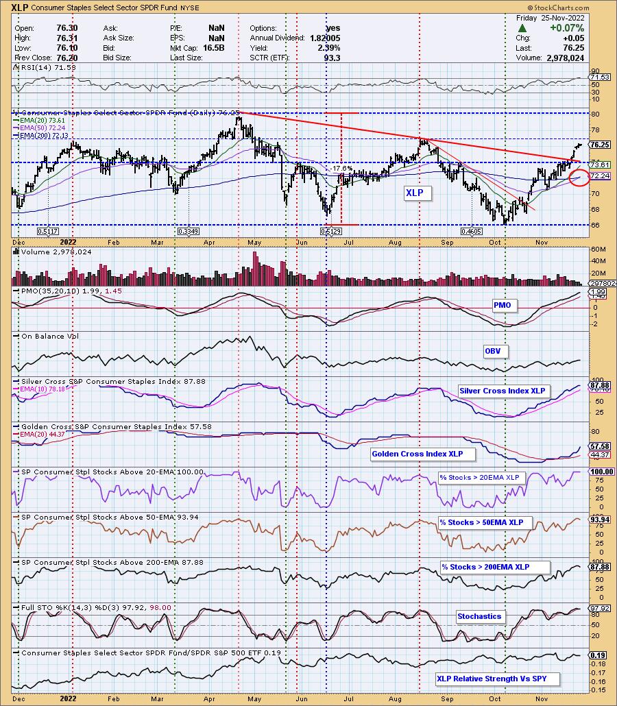
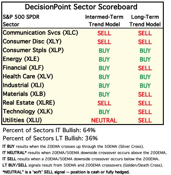
Market conditions are still gradually improving as the Dow Jones Industrial Average (DIA) and the Consumer Staples Sector (XLP) 50-day EMAs crossed up through their 200-day EMAs (Golden Cross), generating LT Trend Model BUY Signals.
DIA is the first of the eight market indexes we track to get the LT BUY Signal. It has bullishly broken out above resistance. The PMO is accelerating higher but is very overbought, particularly for a bear market. While this is positive, it could be arriving late to the party. Note that this signal will not switch back to a SELL until price drops below the 50-day EMA so this signal could be in force even if the market makes an abrupt downside reversal.
XLP is the fourth of the 11 S&P 500 sectors to have the LT BUY Signal. Note that XLP never declined -20% into bear market status. However, even for a bull market the PMO and RSI are very overbought. We aren't overly worried about overbought participation of stocks above their 20/50/200-day EMAs as those indicators can remain overbought for long periods of time. The Silver Cross Index (SCI) is another matter. It is getting overbought and it typically does not hold that condition long. Still the Golden Cross Index (GCI) isn't overbought. We like the look of this chart, but worry that price is hitting overhead resistance and might be in for a corrective move.
The DecisionPoint Alert Weekly Wrap presents an end-of-week assessment of the trend and condition of the Stock Market, the U.S. Dollar, Gold, Crude Oil, and Bonds. The DecisionPoint Alert daily report (Monday through Thursday) is abbreviated and gives updates on the Weekly Wrap assessments.
Watch the latest episode of DecisionPoint on StockCharts TV's YouTube channel here!
MAJOR MARKET INDEXES
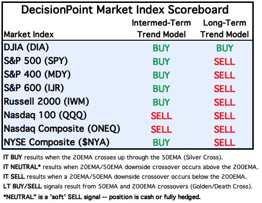
For Today: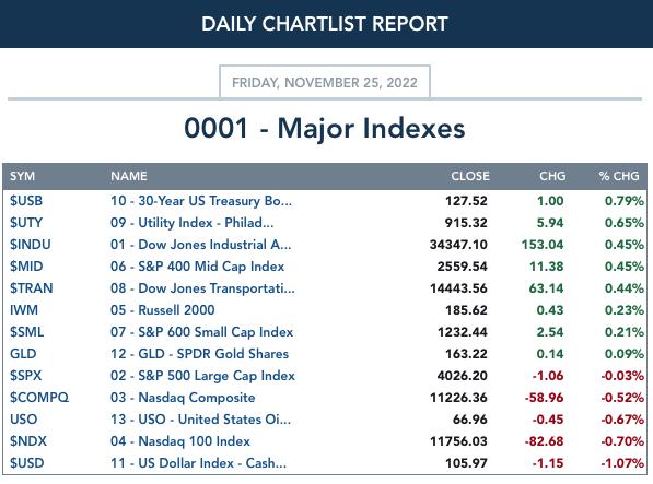
For the Week: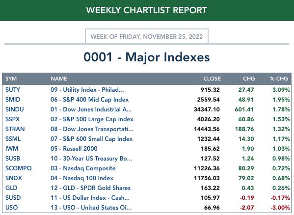
SECTORS
Each S&P 500 Index component stock is assigned to one of 11 major sectors. This is a snapshot of the Intermediate-Term (Silver Cross) and Long-Term (Golden Cross) Trend Model signal status for those sectors.
For Today: 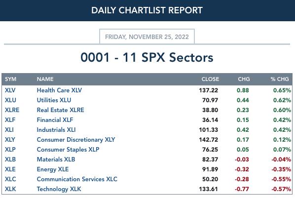
For the Week: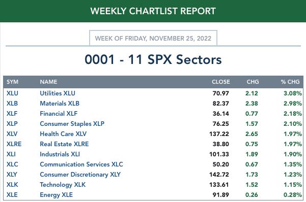
CLICK HERE for Carl's annotated Sector charts.
THE MARKET (S&P 500)
IT Trend Model: BUY as of 11/15/2022
LT Trend Model: SELL as of 5/5/2022
SPY Daily Chart: The bearish rising wedge is still there, but we note that the last price low did not test the bottom of the pattern. That suggests a move ahead that would at least test the top of the wedge. Primary indicators remain positive. The VIX again punctured the upper Bollinger Band on our reverse scale and that nearly always leads to a decline or at least pause afterward.
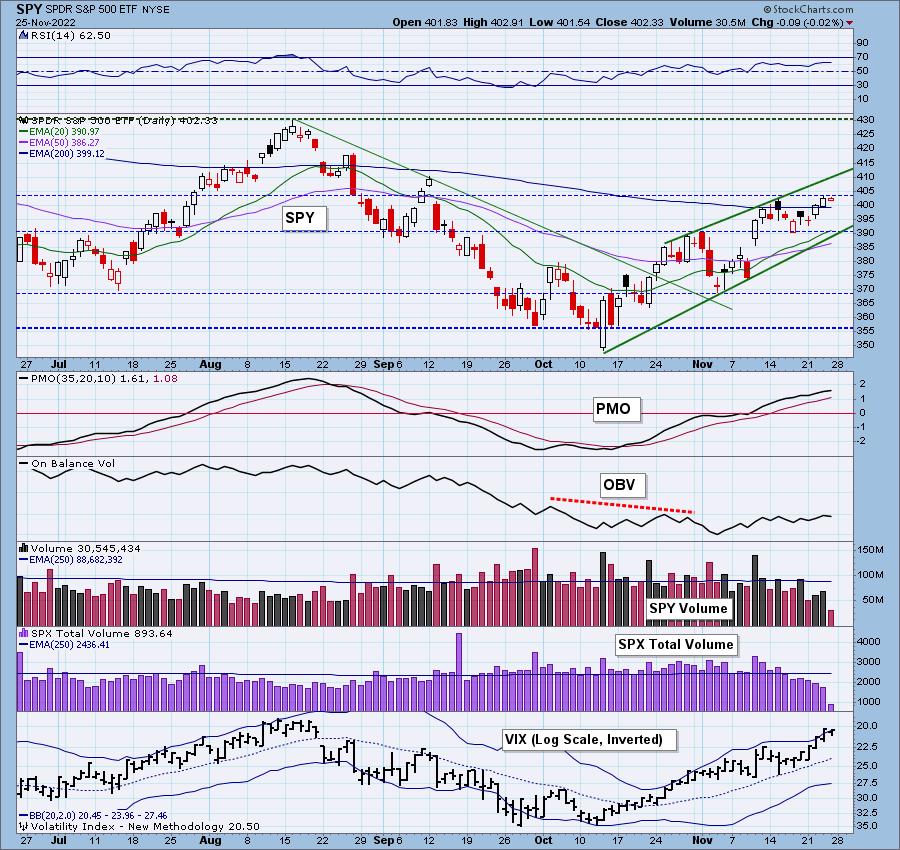
Stochastics are oscillating strongly above 80. We have extraordinarily low volume, but that is expected for the day after Thanksgiving.
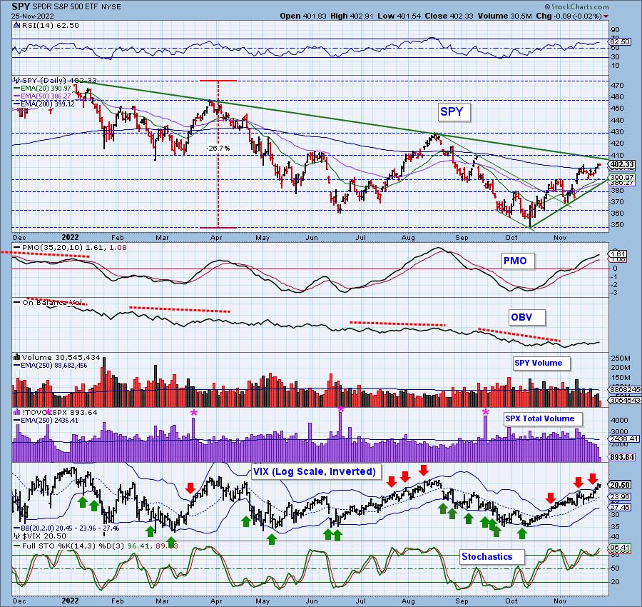
SPY Weekly Chart: The weekly PMO is still gaining after its oversold crossover BUY signal. Price is now getting close to testing the long-term declining trend. We should prepare for it to struggle at that area given the bear market overall. A breakout would tell us to look deeper into whether the bear is still here.
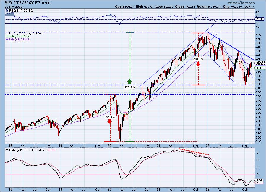
New 52-Week Highs/Lows: New Highs expanded this week as expected given the +1.59% gain by the SPY on the week. We like that the 10-DMA of the High-Low Differential is rising, but it is definitely overbought near term.
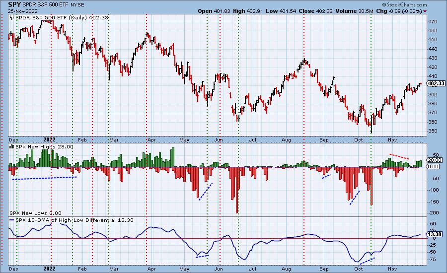
Climax Analysis: There were no climaxes today. SPX Total Volume was only 37% of the one-year daily average.
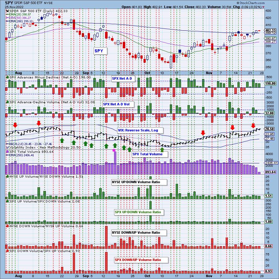
*A climax is a one-day event when market action generates very high readings in, primarily, breadth and volume indicators. We also include the VIX, watching for it to penetrate outside the Bollinger Band envelope. The vertical dotted lines mark climax days -- red for downside climaxes, and green for upside. Climaxes are at their core exhaustion events; however, at price pivots they may be initiating a change of trend.
Short-Term Market Indicators: The short-term market trend is UP and the condition is OVERBOUGHT.
We were happy to see STOs start rising again, but they are already in overbought territory now. Participation of stocks above their 20-day EMAs has been overbought most of this month. The negative divergence persists on %PMO BUY signals.
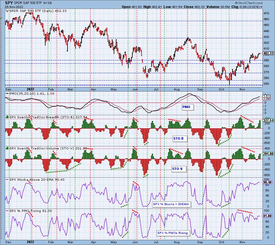
Intermediate-Term Market Indicators: The intermediate-term market trend is UP and the condition is OVERBOUGHT.
All of these indicators are overbought. One of the indicators we need to watch right now is %PMO BUY Signals compared the %PMOs Rising. We do see that this indicator is rising, but we have about 5% fewer rising PMOs, that could begin to damage that indicator.
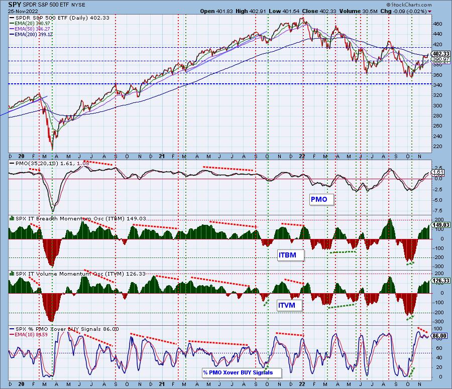
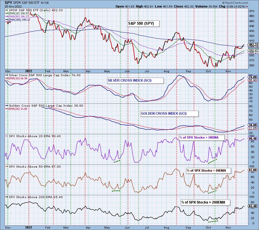
PARTICIPATION and BIAS Assessment: The following chart objectively shows the depth and trend of participation in two time frames.
- Intermediate-Term - the Silver Cross Index (SCI) shows the percentage of SPX stocks on IT Trend Model BUY signals (20-EMA > 50-EMA). The opposite of the Silver Cross is a "Dark Cross" -- those stocks are, at the very least, in a correction.
- Long-Term - the Golden Cross Index (GCI) shows the percentage of SPX stocks on LT Trend Model BUY signals (50-EMA > 200-EMA). The opposite of a Golden Cross is the "Death Cross" -- those stocks are in a bear market.
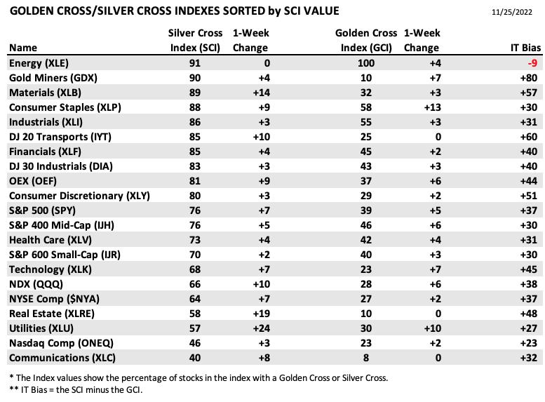
The following table summarizes participation for the major market indexes and sectors. The 1-Week Change columns inject a dynamic aspect to the presentation.
Utilities saw the greatest change in the SCI as its rally continues in earnest. The other interesting gain was in Real Estate which saw a +19 change to its SCI. Maybe lower mortgage rates will continue to push this sector higher.
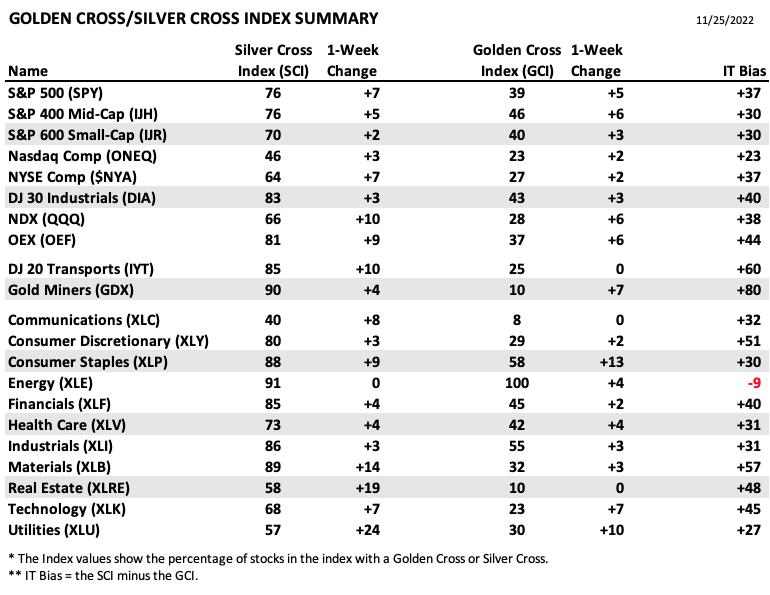
This table is sorted by SCI values. This gives a clear picture of strongest to weakest index/sector in terms of participation.
The Energy sector holds the highest SCI ranking, but we know it is overbought and deteriorating based on the negative IT Bias. Gold Miners continue to look strong with the SCI confirming.
PARTICIPATION and BIAS Assessment: The following chart objectively shows the depth and trend of participation in two time frames.
- Intermediate-Term - the Silver Cross Index (SCI) shows the percentage of SPX stocks on IT Trend Model BUY signals (20-EMA > 50-EMA). The opposite of the Silver Cross is a "Dark Cross" -- those stocks are, at the very least, in a correction.
- Long-Term - the Golden Cross Index (GCI) shows the percentage of SPX stocks on LT Trend Model BUY signals (50-EMA > 200-EMA). The opposite of a Golden Cross is the "Death Cross" -- those stocks are in a bear market.
The SCI is getting very overbought and so is participation above the 20/50-day EMAs (near-term overbought for %Stocks > 200-day EMA). Take the biases stated below and put them into perspective given so many overbought indicators. Mechanically, the bias is bullish in all three timeframes.
The Short-Term Bias is BULLISH. Participation is strong for stocks > 20/50-day EMAs.
The Intermediate-Term Bias is BULLISH. The SCI has a strong 76% reading and is rising. It is overbought so that is cautionary.
The Long-Term Bias is BULLISH. The GCI is accelerating higher and there are far more stocks above their 50/200-day EMAs v. the GCI percentage. The GCI should continue to gain traction.
CONCLUSION: It was a quiet week as far as volume, but price finished up +1.59%. Indicators are rising bullishly for the most part, but nearly all of our indicators are overbought. We should see more upside given the last price bottom held support and was above the bottom of the bearish rising wedge. However, overbought conditions are a big problem. It's been a really good run, but we now need to prepare for the inevitable pullback to clear these overbought conditions. Consider tightening stops to get you out quickly when the market takes a turn.
Erin is 35% exposed.
Have you subscribed the DecisionPoint Diamonds yet? DP does the work for you by providing handpicked stocks/ETFs from exclusive DP scans! Add it with a discount! Contact support@decisionpoint.com for more information!
BITCOIN
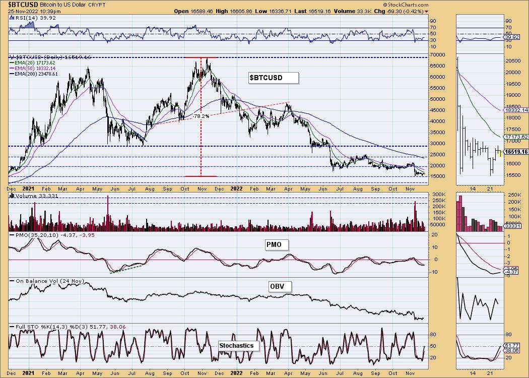
Bitcoin is establishing a new trading range after the FTX debacle. We don't think Bitcoin is safe from another one of these dastardly reorientations, but the PMO is beginning to look up as Stochastics rise strongly. We wouldn't be surprised if we see a test the top of the current trading range, but that's about all we see. Of course the 20-day EMA could stymy any try at resistance.
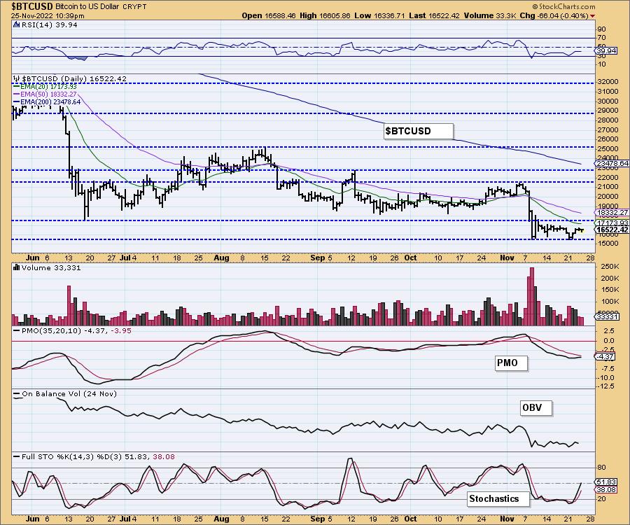
This chart is to show where some of the support/resistance lines come from.
INTEREST RATES
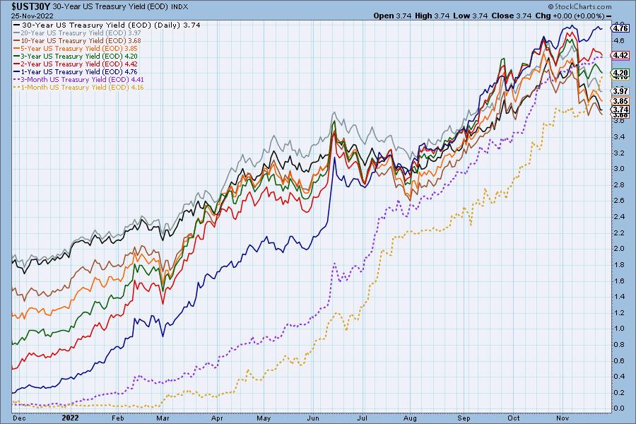
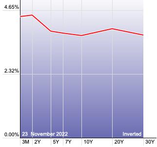
Yields took a breather this week and particularly today as the Bond market was closed.
The Yield Curve Chart from StockCharts.com shows us the inversions taking place. The red line should move higher from left to right. Inversions are occurring where it moves downward.
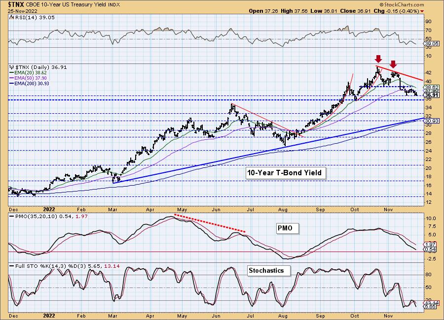
10-YEAR T-BOND YIELD
$TNX seems determined to hold support despite the very negative indicators. They are too weak to expect a big rally here. More than likely this is a pause as investors mull over what the FOMC might or might not do regarding the Fed funds rate.
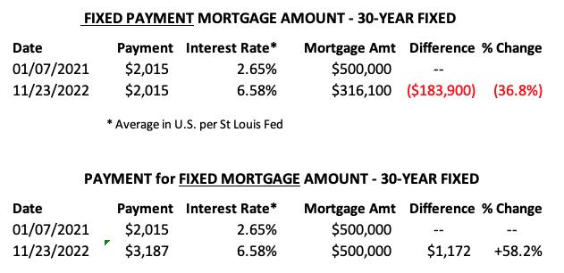
MORTGAGE INTEREST RATES (30-Yr)**
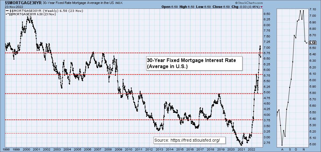
**We watch the 30-Year Fixed Mortgage Interest Rate, because, for the most part, people buy homes based upon the maximum monthly payment they can afford. As rates rise, a fixed monthly payment will carry a smaller mortgage amount. As buying power has been shrinking, home prices have come under pressure.
--
This week the 30-Year Fixed Rate fell from 6.61 to 6.58.
DOLLAR (UUP)
IT Trend Model: BUY as of 6/22/2021
LT Trend Model: BUY as of 8/19/2021
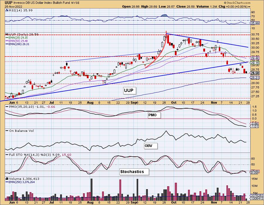
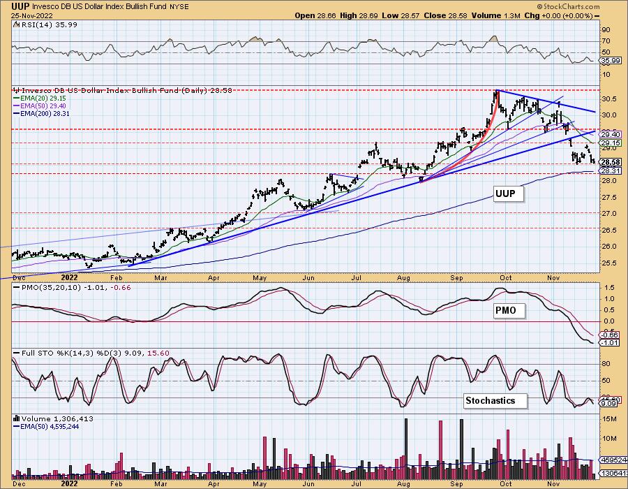
UUP Daily Chart: The Dollar is holding support, but today's bearish filled black candlestick suggests it will not hold here. If we do see a rally, that would set up a bullish double-bottom. It's too early to speculate further, but the failure to recapture the intermediate-term rising bottoms trendline is not encouraging. The indicators remain very negative as well.
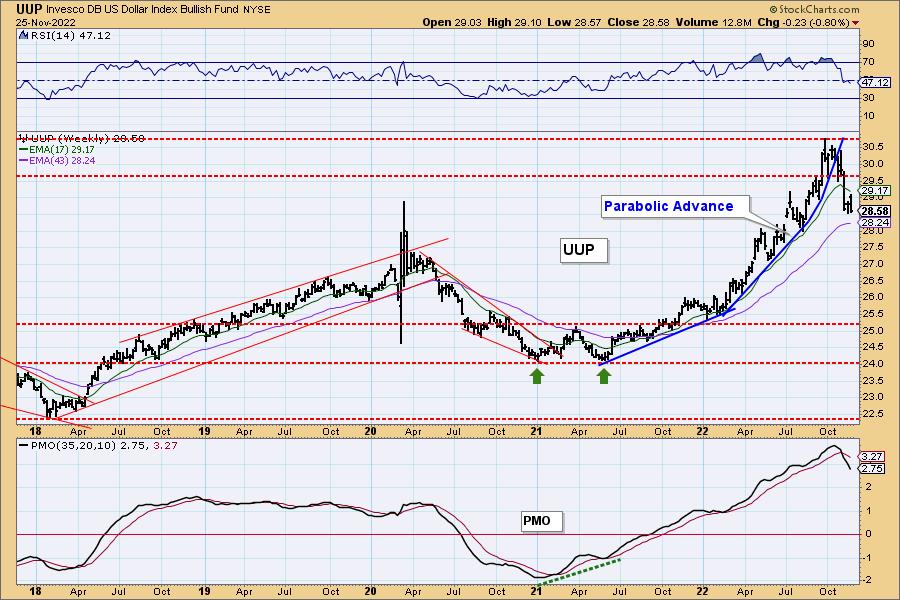
UUP Weekly Chart: The weekly chart suggests the Dollar will likely decline further. The weekly RSI turned down before reaching positive territory above net neutral (50). The weekly PMO is in a steep decline. The Dollar got overextended as it traveled in a bearish parabolic advance. This breakdown is a great example of a parabolic breakdown. Support at about $27.50 near the 2020 top is the area to look for a possible upside reversal.
GOLD
IT Trend Model: NEUTRAL as of 5/3/2022
LT Trend Model: SELL as of 6/30/2022
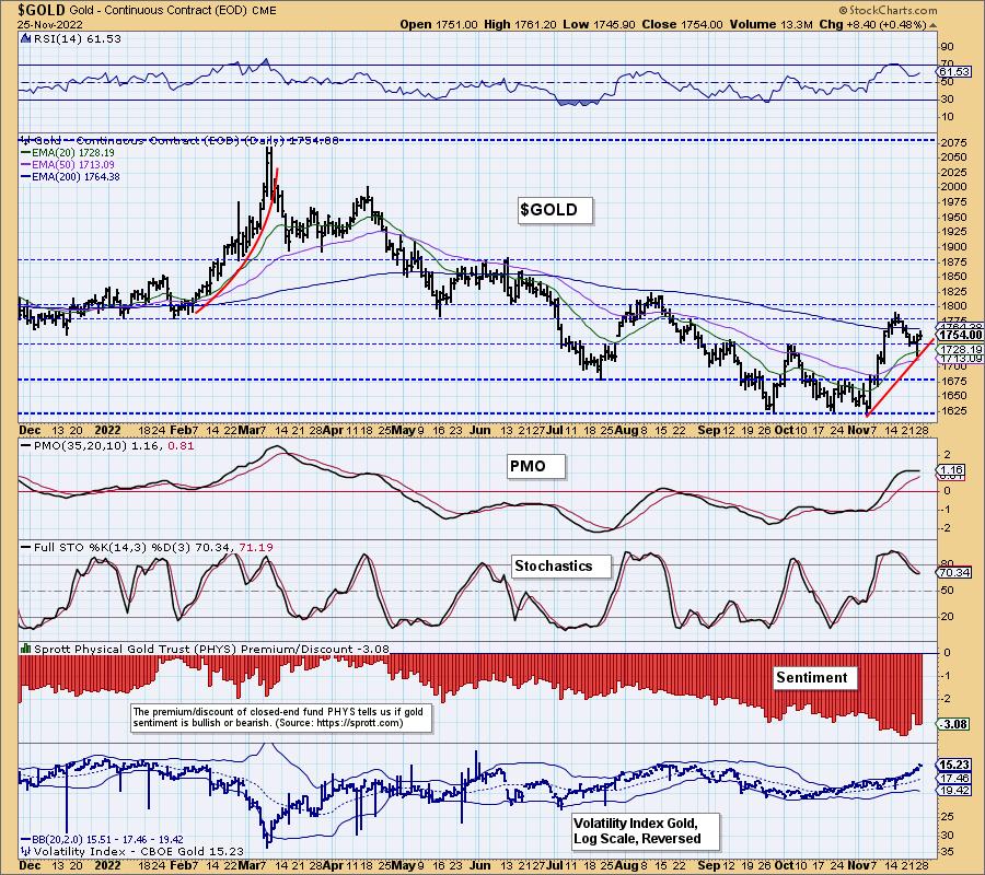
GOLD Daily Chart: If we are right about the Dollar then this new rally and short-term rising trend for Gold should continue. Indicators are completely useless right now as they are flat. However, based on the bearish UUP chart, we are bullish on Gold.
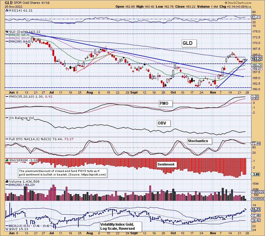
Discounts are trending lower on PHYS suggesting investors may start eyeing Gold again. The earlier rally likely got their attention and we expect this current one will hold their attention and bring them in.
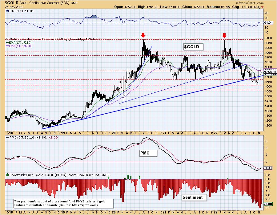
GOLD Weekly Chart: The weekly PMO had an official crossover BUY signal this week--another reason to like the setup on Gold right now. The pullback this week didn't just establish a new short-term rising trend on the daily chart, it held the long-term rising bottoms trendline that was previously broken.
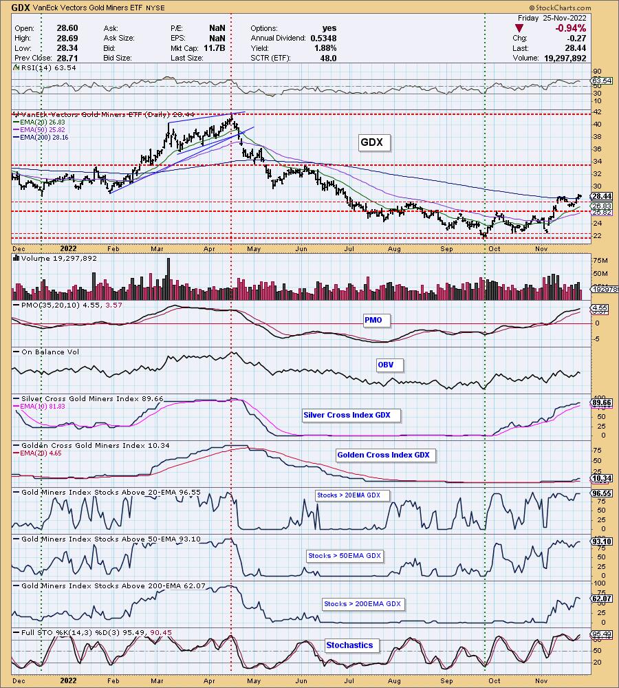
GOLD MINERS Golden and Silver Cross Indexes: Miners pulled back slightly today, but this week's breakout above the 200-day EMA looks great. Erin provided GDX as a "Diamond in the Rough" for ETF Day on Wednesday. Given the strong participation we are bearish. However, just as with the market overall, the SCI is overbought as are %Stocks > 20/50-day EMAs. That can clearly persist. We need only look back to March and April to prove the point. We are looking for GDX to test $34.
CRUDE OIL (USO)
IT Trend Model: NEUTRAL as of 11/21/2022
LT Trend Model: BUY as of 3/9/2021
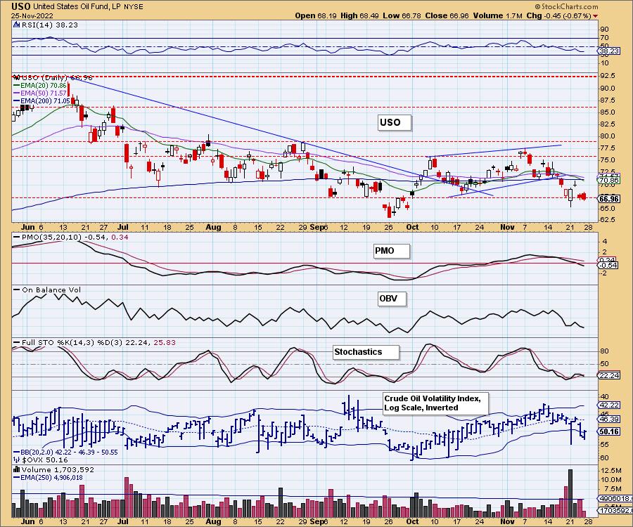
USO Daily Chart: Crude Oil attempted a rally, but it failed with a big gap down. Support is barely being held at the September low. Indicators are very pessimistic and suggest to us that USO will at least test the September low around $62.50.
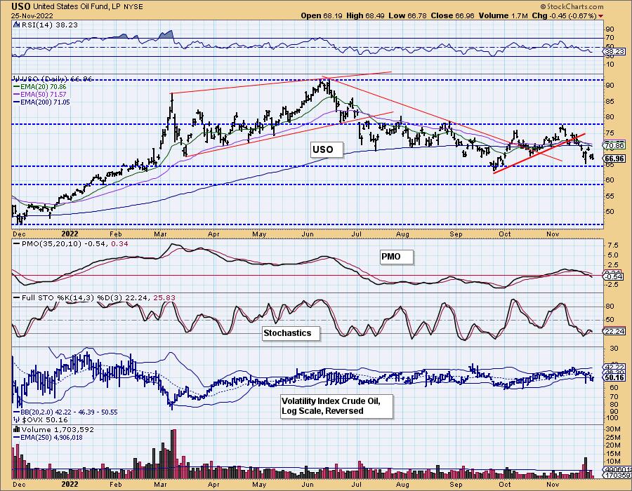
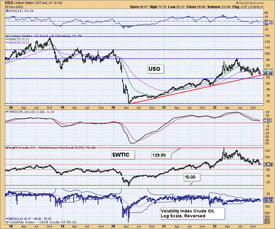
USO/$WTIC Weekly Chart: Strongest support lies just below $60. That would mean a break of the long-term rising bottoms trendline. $WTIC is already on that strong support line so sideways movement isn't out of the question, but overall we do expect that rising bottoms trendline to be broken as the world begins to bandaid the energy problem in Europe.
BONDS (TLT)
IT Trend Model: SELLas of 8/19/2022
LT Trend Model: SELL as of 1/19/2022
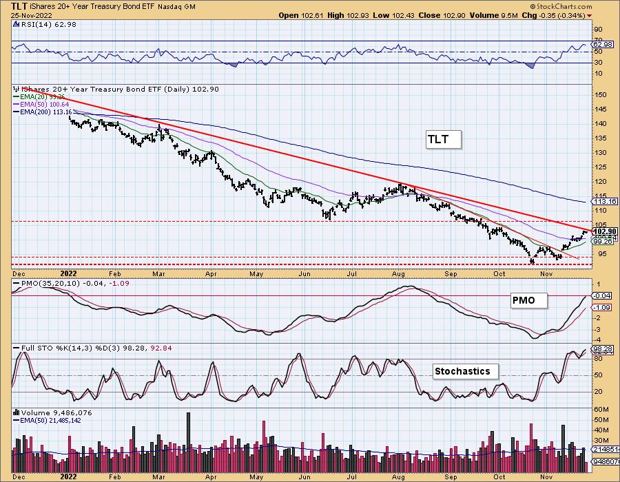
TLT Daily Chart: The indicators are incredibly bullish for TLT and with yields apparently not through with their declines, they should continue to see some love. The big problem for TLT would be the short-term bearish rising wedge that puts a pall over the bullish indicators. Upside potential is also quite limited in our minds.
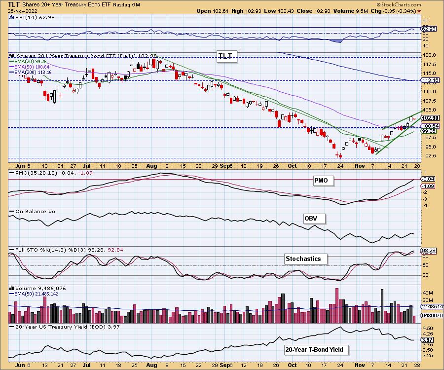
TLT is about to come in contact with a very long-term declining tops trendline. It was a problem in the summer and we expect it will be a problem this December. The PMO is overbought based on this long-term decline so while it is still rising, it wouldn't be surprising if it reversed soon with price.
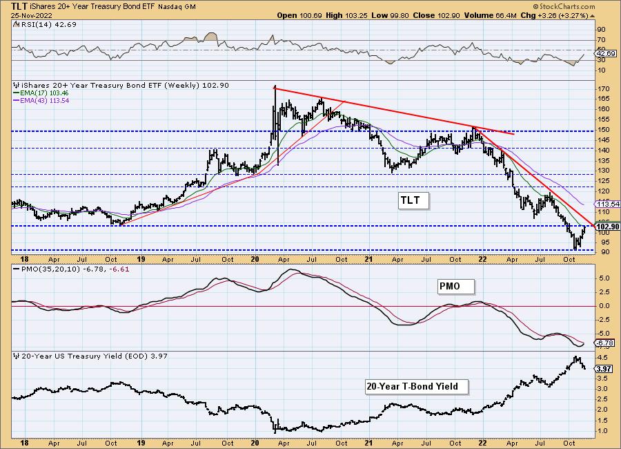
TLT Weekly Chart: The weekly PMO is rising and nearing a crossover BUY signal. Last time that signal arrived late. We think the same situation is brewing. Price is now up against long-term horizontal resistance at the 2018 low. The rally is likely approaching its end given the intense horizontal resistance, the intermediate-term declining trend and resistance at the 17-week EMA. All are pressuring price to move lower.
Good Luck & Good Trading!
Erin Swenlin And Carl Swenlin
Technical Analysis is a windsock, not a crystal ball. --Carl Swenlin
(c) Copyright 2022 DecisionPoint.com
Disclaimer: This blog is for educational purposes only and should not be construed as financial advice. The ideas and strategies should never be used without first assessing your own personal and financial situation, or without consulting a financial professional. Any opinions expressed herein are solely those of the author, and do not in any way represent the views or opinions of any other person or entity.
NOTE: The signal status reported herein is based upon mechanical trading model signals, specifically, the DecisionPoint Trend Model. They define the implied bias of the price index based upon moving average relationships, but they do not necessarily call for a specific action. They are information flags that should prompt chart review. Further, they do not call for continuous buying or selling during the life of the signal. For example, a BUY signal will probably (but not necessarily) return the best results if action is taken soon after the signal is generated. Additional opportunities for buying may be found as price zigzags higher, but the trader must look for optimum entry points. Conversely, exit points to preserve gains (or minimize losses) may be evident before the model mechanically closes the signal.
Helpful DecisionPoint Links:
DecisionPoint Alert Chart List
DecisionPoint Golden Cross/Silver Cross Index Chart List
DecisionPoint Sector Chart List
Price Momentum Oscillator (PMO)
Swenlin Trading Oscillators (STO-B and STO-V)
DecisionPoint is not a registered investment advisor. Investment and trading decisions are solely your responsibility. DecisionPoint newsletters, blogs or website materials should NOT be interpreted as a recommendation or solicitation to buy or sell any security or to take any specific action.
