
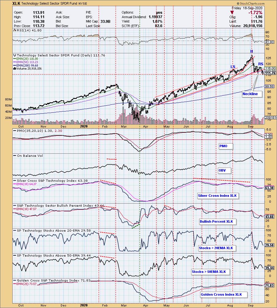
The Technology Sector has declined -13% from this month's high. A bearish head and shoulders pattern has formed, and the neckline was tested today. I don't have the statistics, but in my mind the head and shoulders pattern is very unreliable as a predictor; nevertheless, in the context of a long price advance and a rising trend line break, this could well be signalling a significant top. Should the pattern execute (break down through the neckline), the minimum downside target is about 95.
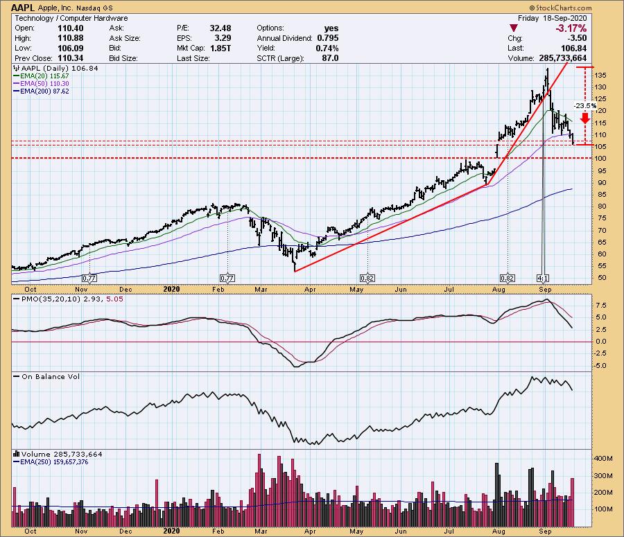
Apple is a significant contributor to the Technology Sector, so it is no surprise that it is also topping. Note that it is no longer a $2 trillion stock.
The DecisionPoint Alert Weekly Wrap presents an end-of-week assessment of the trend and condition of the Stock Market, the U.S. Dollar, Gold, Crude Oil, and Bonds. The DecisionPoint Alert daily report (Monday through Thursday) is abbreviated and gives updates on the Weekly Wrap assessments.
Watch the latest episode of DecisionPoint on StockCharts TV's YouTube channel here!
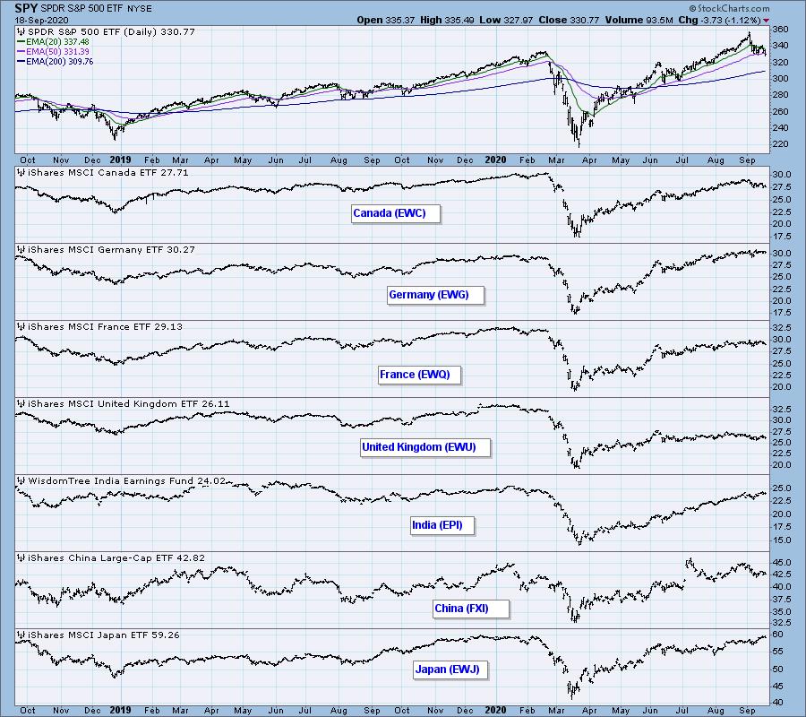
GLOBAL MARKETS
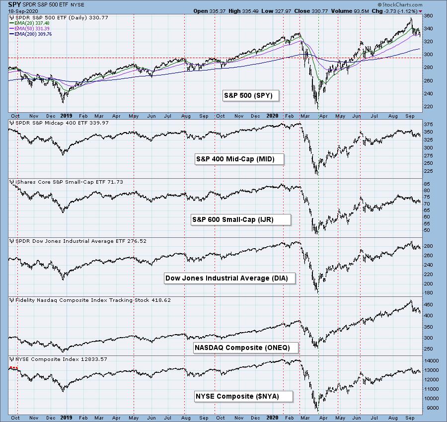
BROAD MARKET INDEXES
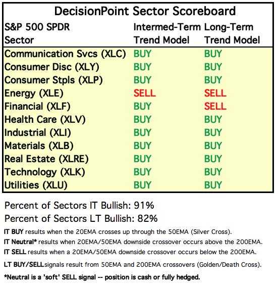
SECTORS
Each S&P 500 Index component stock is assigned to one, and only one, of 11 major sectors. This is a snapshot of the Intermediate-Term (Silver Cross) and Long-Term (Golden Cross) Trend Model signal status for those sectors.
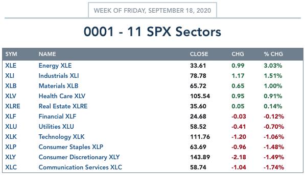
ETF TRACKER: This is a list of about 100 ETFs intended to track a wide range of U.S. market indexes, sectors, global indexes, interest rates, currencies, and commodities. StockCharts.com subscribers can acquire it in the DecisionPoint Trend and Condition ChartPack.
Top 10 . . .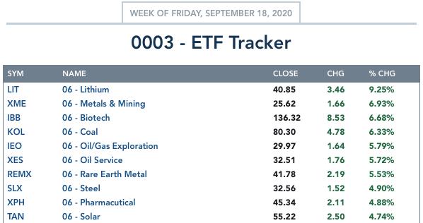
. . . and bottom 10: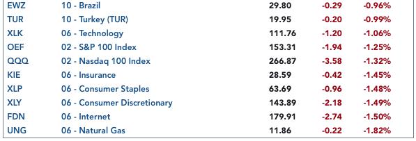
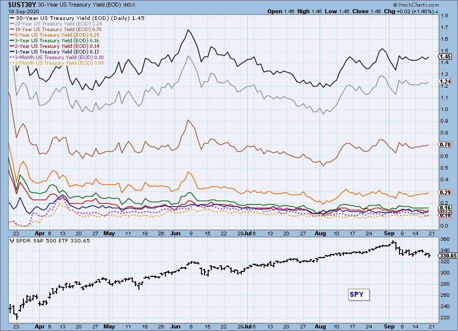
INTEREST RATES
This chart is included so we can monitor rate inversions. In normal circumstances the longer money is borrowed the higher the interest rate that must be paid. When rates are inverted, the reverse is true.
STOCKS
IT Trend Model: BUY as of 5/8/2020
LT Trend Model: BUY as of 6/8/2020
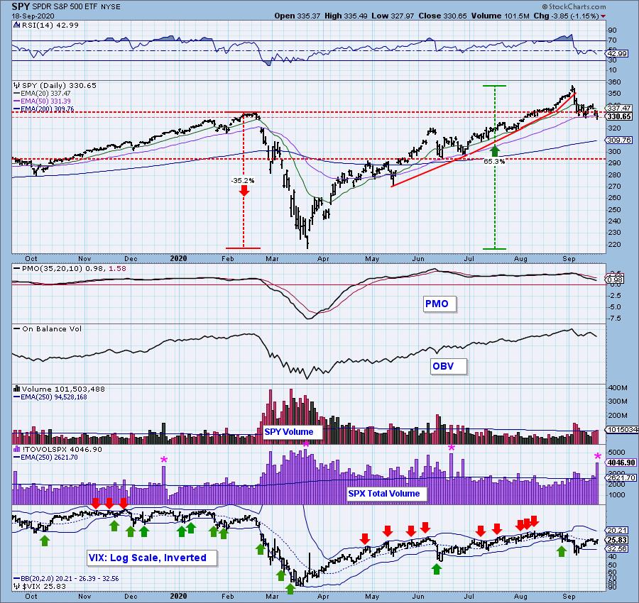
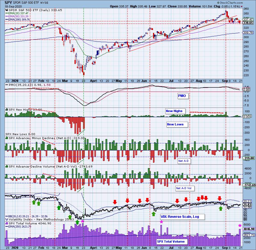
SPY Daily Chart: Last week I said that, because we had Quadruple Witching options, we should expect low volatility toward the end of this week, and very high volume on Friday. With a net change for the week of less than -1%, it maybe qualifies as low volatility, but with a -4% move from high to low, maybe not. We did get the high SPX Total Volume, which I always make a point to mention, because we don't to mistake the high volume as signifying any kind of conviction regarding price action. If there is conviction there, it is camouflaged by expiration activity.
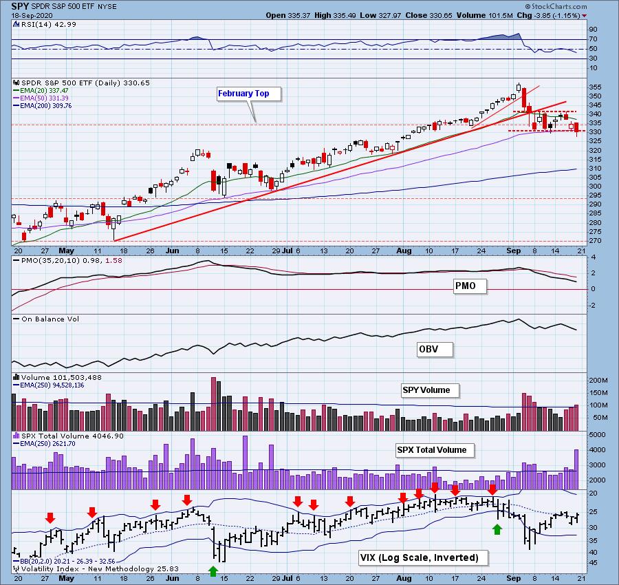
Price has broken down through the support line drawn across the February top, but it is not a decisive break yet. The daily PMO is still modestly overbought.
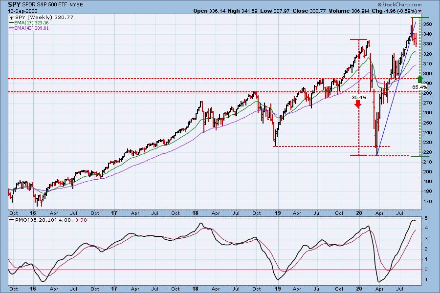
SPY Weekly Chart: The rising trend line has been broken, and the weekly PMO is very overbought and has topped. This is very negative, and it implies a substantial pullback.
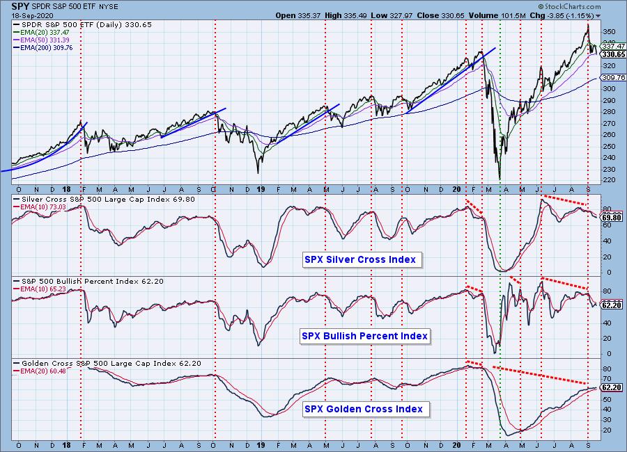
Participation: The following chart uses different methodologies for objectively showing the depth and trend of participation for intermediate- and long-term time frames.
- The Silver Cross Index (SCI) shows the percentage of SPX stocks on IT Trend Model BUY signals (20-EMA > 50-EMA).
- The Golden Cross Index (GCI) shows the percentage of SPX stocks on LT Trend Model BUY signals (50-EMA > 200-EMA).
- The Bullish Percent Index (BPI) shows the percentage of SPX stocks on Point & Figure BUY signals.
We can see the market's internal deterioration (negative divergences) prior to the all-time high. Since then the SCI and BPI are confirming the price decline. The GCI is normally slower to turn.
Climactic Market Indicators: Sometimes real-time interpretation of climax readings is not possible, and we need a little time before we can see the context. For example, it is clear now that Monday's climax was an upside exhaustion climax. Friday's climax occurred on the forth retest of the 50EMA this month, so it could represent downside exhaustion. Or, since it occurred two days from a price top, it could be downside initiation. I'm not inclined to give the bull the benefit of the doubt.
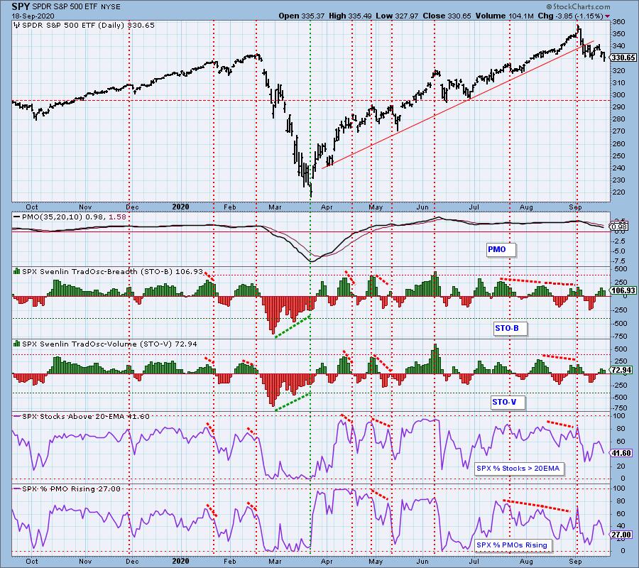
Short-Term Market Indicators: The short-term market trend is DOWN and the condition and market bias is NEUTRAL.
Intermediate-Term Market Indicators: The strong negative divergences going into the September top are really scary to look at. The rising trend line has been broken, so I assume that the intermediate-term market trend is changing to DOWN. The condition and market bias are NEUTRAL. To clarify, for four months we have been using the ITBM and ITVM zero lines as a measure of their oversold limit; however, with the potential trend reversal, we shift the downside limit to -200 for both indicators because we expect that they are going to move lower.
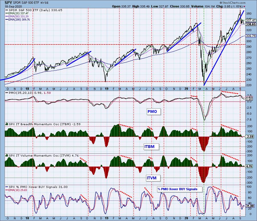
CONCLUSION: My leading comments regarding the Technology Sector set the tone for the rest of my analysis this week. Technology still drags the rest of the market with it, and it looks to be headed down. There is a head and shoulders top for that sector, and SPY has established a down trend. The weekly PMO is overbought and falling, which is a big deal, and there are strong negative divergences on our primary intermediate-term indicators. Bottom line is that I think the market has put in an important top and that it will be heading lower for some time.
Have you subscribed the DecisionPoint Diamonds yet? DP does the work for you by providing handpicked stocks/ETFs from exclusive DP scans! Add it with a discount! Contact support@decisionpoint.com for more information!
DOLLAR (UUP)
IT Trend Model: NEUTRAL as of 5/28/2020
LT Trend Model: SELL as of 7/10/2020
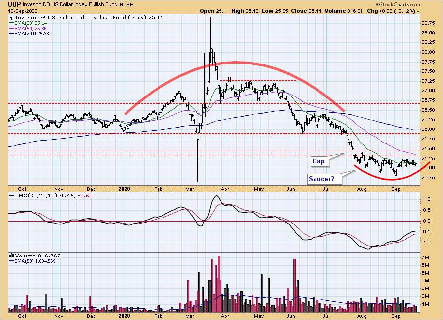
UUP Daily Chart: The saucer cluster, which is also an island with upside reversal potential, puts a positive spin on this chart; however, the daily PMO, which is trying to top below the zero line is an ominous sign. Note what happened when the PMO topped in July.
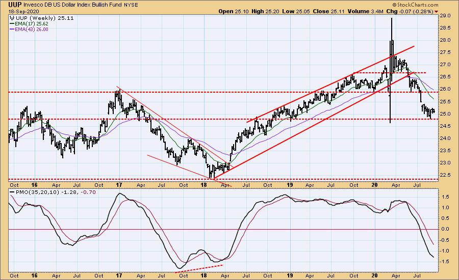
UUP Weekly Chart: [[comments]]
GOLD
IT Trend Model: BUY as of 3/24/2020
LT Trend Model: BUY as of 1/8/2019
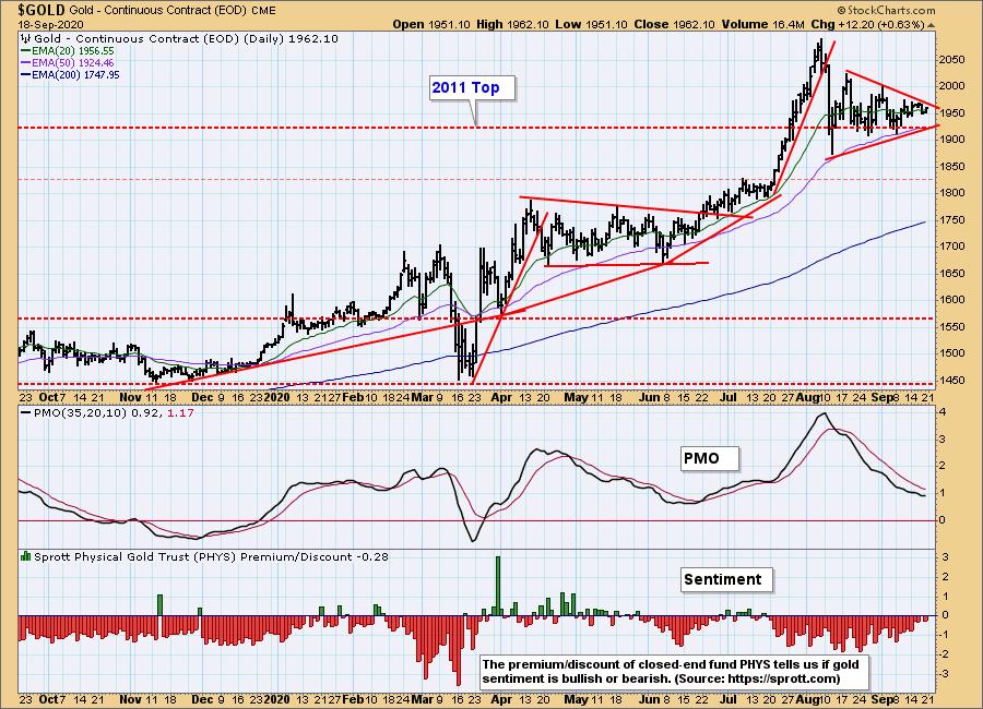
GOLD Daily Chart: The symmetrical triangle is a continuation pattern that allows gold to digest the too-fast advance from mid-July.
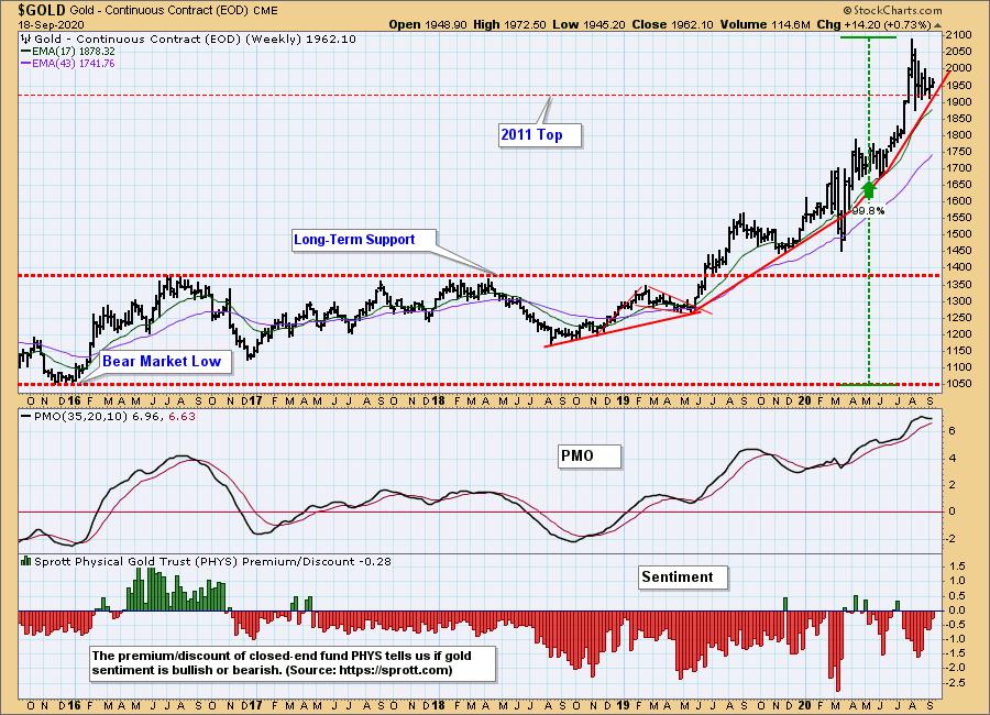
GOLD Weekly Chart: In my opinion, the best thing that could happen would be for gold to continue sideways for several weeks longer, so as to set a less accelerated angle of advance. Vertical moves like the one to the all-time high this year cannot be sustained. Continued consolidation will cause the weekly PMO to move down from current overbought readings and give us more confidence in the next rally.
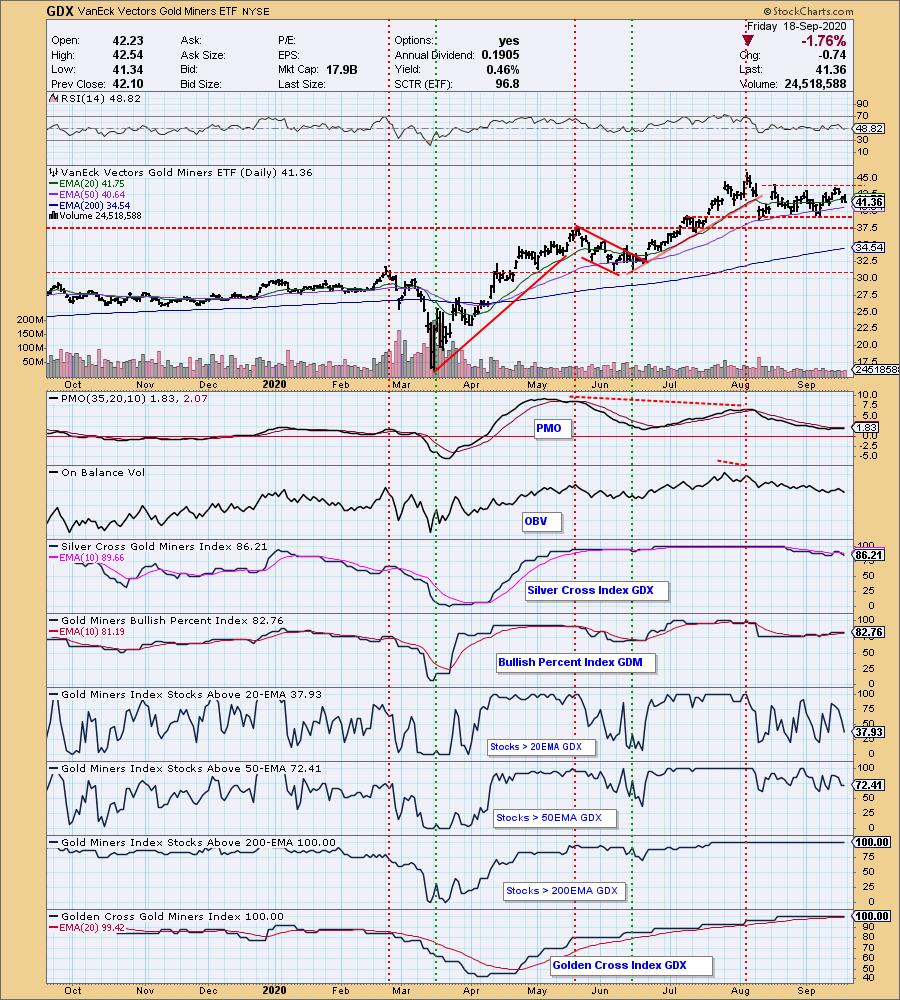
GOLD MINERS Golden and Silver Cross Indexes: I don't see any problems here, as GDX digests the advance from the June low, and waits for gold to make its next move.
CRUDE OIL (USO)
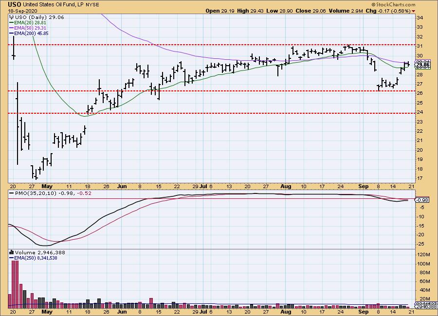
IT Trend Model: SELL as of 9/8/2020
LT Trend Model: SELL as of 2/3/2020
USO Daily Chart: I think that the low earlier this month may have set the low side of a trading range that will persist for some time -- the panic lows in April are probably too extreme. The line I drew at 24.00 I used the top of the gap in May is another possibility, the one I prefer because it permits a looser range. We'll see. Mainly, I think that we're waiting for the supply-demand issues to be resolved before there is a possibility of higher prices.
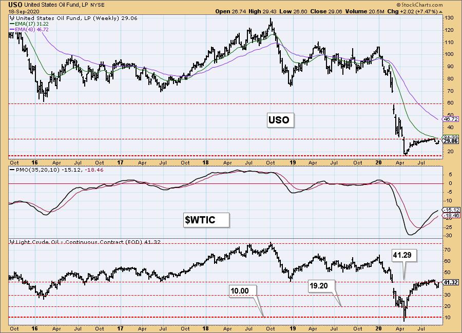
USO/$WTIC Weekly Chart: I have nothing to add for this time frame.
BONDS (TLT)
IT Trend Model: NEUTRAL as of 8/27/2020
LT Trend Model: BUY as of 1/2/2019
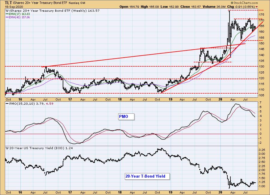
TLT Daily Chart: The Fed spoke this week, and it's still ZIRP for as far as the eye can see, so I don't expect much activity of any sort in bonds. The daily PMO is near zero and flat.
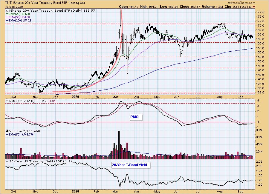
TLT Weekly Chart: The sideways price movement has the weekly PMO falling since April, a natural reaction that will send it to zero eventually.
Technical Analysis is a windsock, not a crystal ball.
Happy Charting! - Carl
Disclaimer: This blog is for educational purposes only and should not be construed as financial advice. The ideas and strategies should never be used without first assessing your own personal and financial situation, or without consulting a financial professional. Any opinions expressed herein are solely those of the author, and do not in any way represent the views or opinions of any other person or entity.
NOTE: The signal status reported herein is based upon mechanical trading model signals, specifically, the DecisionPoint Trend Model. They define the implied bias of the price index based upon moving average relationships, but they do not necessarily call for a specific action. They are information flags that should prompt chart review. Further, they do not call for continuous buying or selling during the life of the signal. For example, a BUY signal will probably (but not necessarily) return the best results if action is taken soon after the signal is generated. Additional opportunities for buying may be found as price zigzags higher, but the trader must look for optimum entry points. Conversely, exit points to preserve gains (or minimize losses) may be evident before the model mechanically closes the signal.
Helpful DecisionPoint Links:
DecisionPoint Alert Chart List
DecisionPoint Golden Cross/Silver Cross Index Chart List
DecisionPoint Sector Chart List
Price Momentum Oscillator (PMO)
Swenlin Trading Oscillators (STO-B and STO-V)