
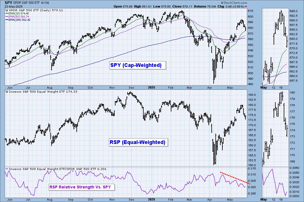
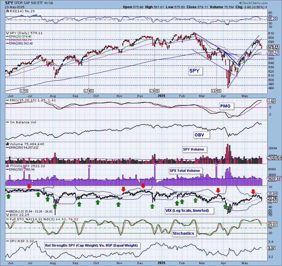
One indicator we watch closely is the relative strength line of RSP compared to the SP500. When it is falling on the chart as it is now, it means that mega-caps are taking charge of the market. Most of the time this is a good thing but as of late, it is a problem. Usually they can hold the market together. Instead they are leading it lower now. Be sure and monitor the Magnificent Seven charts as their bias will likely translate into future price action by the SPY.
The DecisionPoint Alert Weekly Wrap presents an end-of-week assessment of the trend and condition of the Stock Market, the U.S. Dollar, Gold, Crude Oil, and Bonds. The DecisionPoint Alert daily report (Monday through Thursday) is abbreviated and gives updates on the Weekly Wrap assessments.
Watch the latest episode of DecisionPoint on our YouTube channel here!
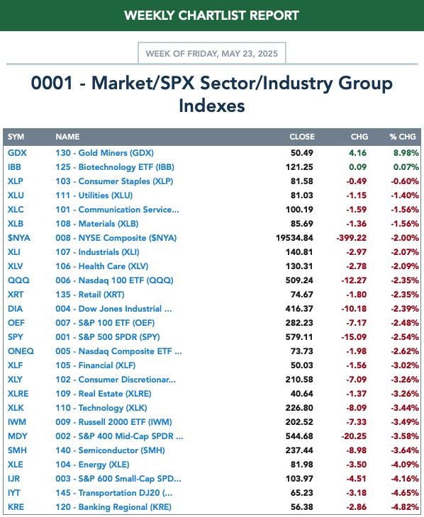
MARKET/SPX SECTOR/INDUSTRY GROUP INDEXES
Change Today: 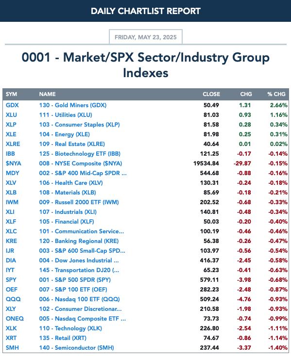
Change for the Week:
CLICK HERE for Carl's annotated Market Index, Sector, and Industry Group charts.
THE MARKET (S&P 500)
IT Trend Model: NEUTRAL as of 3/4/2025
LT Trend Model: SELL as of 4/16/2025
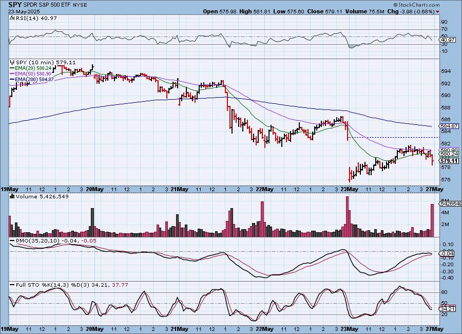
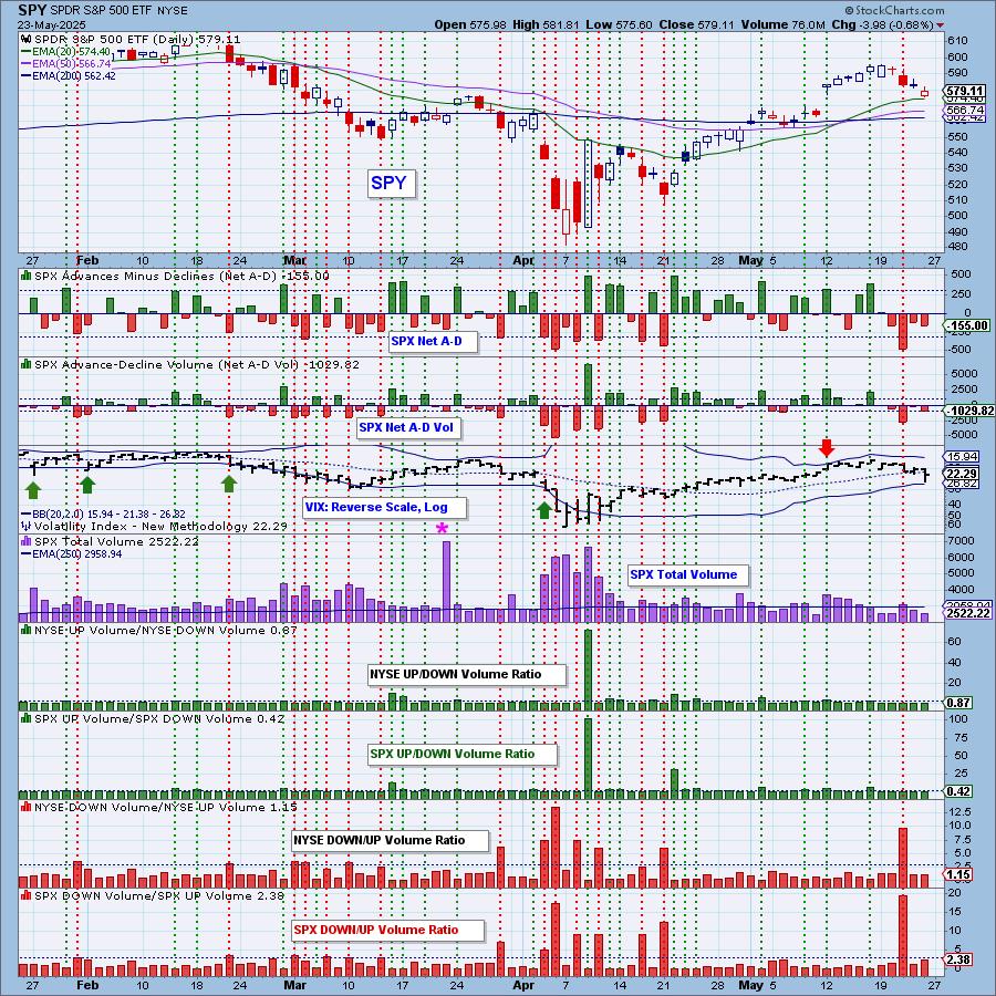
SPY 10-Minute Chart: The market gapped down at the open, but looked like it was going to make a recovery that would lead to positive territory. Not so. At about 2p the market turned lower and never recovered. It did close above the open, but it doesn't look very bullish going into trading Tuesday. The 10-minute PMO has topped and Stochastics are headed lower in negative territory.
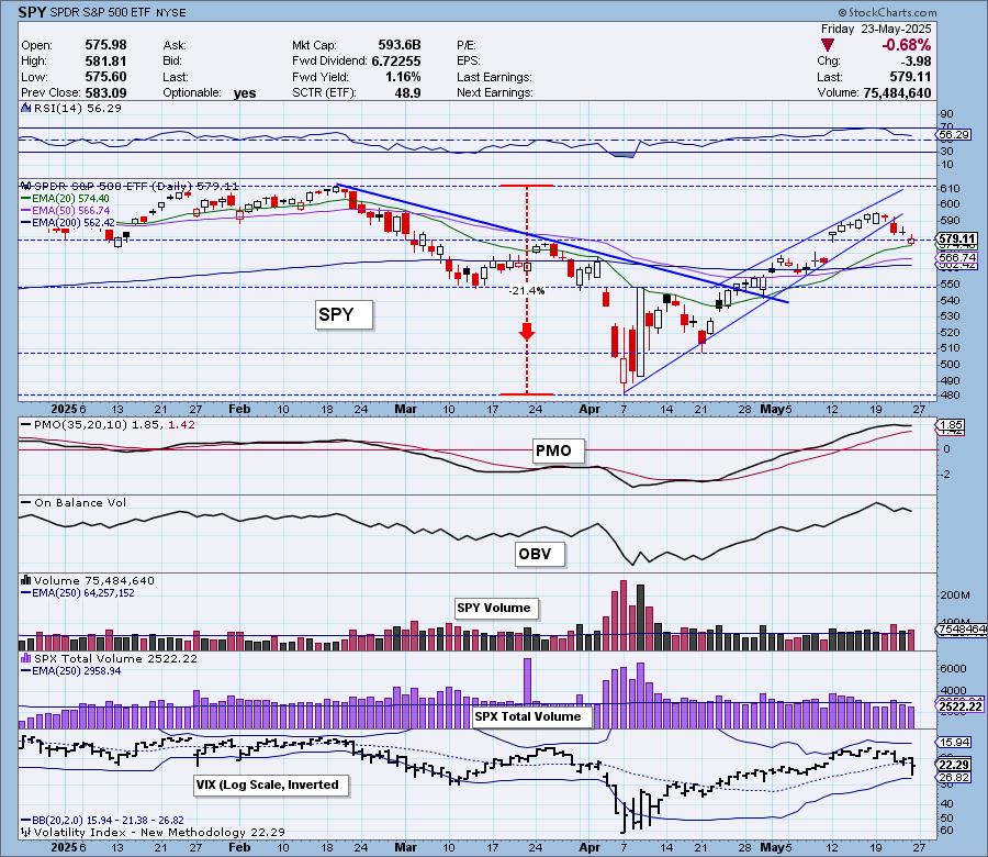
SPY Daily Chart: The bearish rising wedge executed as expected with a drop lower. Today saw a bullish hollow red candlestick but one look at the 10-minute bar chart and we know it is far from bullish. The PMO has topped and is headed lower toward its signal line.
The VIX nearly punctured the bottom Bollinger Band on the inverted scale which would have been slightly bullish as those punctures often lead to price reversals. Stochastics look terrible as they drop below 80. We already talked about mega-cap leadership on this new decline.
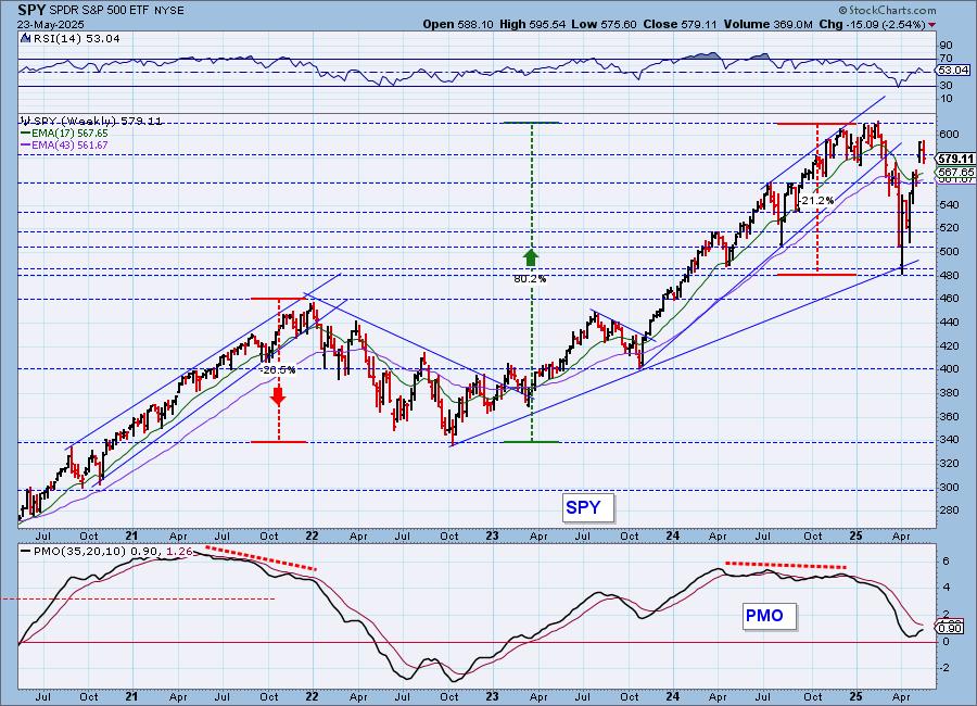
SPY Weekly Chart: There is a bullish "V" Bottom on the weekly chart. When you get 1/3rd retracement on the right side of the "V", the expectation is a breakout above the top of the left side of the "V". This implies all-time highs are still on the table. The weekly PMO is rising strongly toward a Crossover BUY Signal.
New 52-Week Highs/Lows: As expected New Highs are pulling back and New Lows are starting to see some expansion. The High-Low Differential has topped right in line with the market's top. It topped only just above the zero line which implies weakness.

Climax Analysis: There were no climax readings today.
*A climax is a one-day event when market action generates very high readings in, primarily, breadth and volume indicators. We also include the VIX, watching for it to penetrate outside the Bollinger Band envelope. The vertical dotted lines mark climax days -- red for downside climaxes, and green for upside. Climaxes are at their core exhaustion events; however, at price pivots they may be initiating a change of trend.
Short-Term Market Indicators: The short-term market trend is UP and the condition is OVERSOLD.
This is a good news, bad news chart today. The bad news is that Swenlin Trading Oscillators (STOs) dropped precipitously today which is a sign of extreme weakness. But, the good news is that they are getting oversold already. Participation is not oversold yet and it has dropped below our 50% bullish threshold. We only have 25% of the index showing rising momentum.
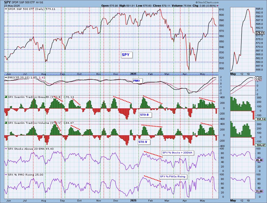
Intermediate-Term Market Indicators: The intermediate-term market trend is UP and the condition is OVERBOUGHT.
Unlike STOs, the ITBM and ITVM are still very overbought. They are falling and confirming the declining STOs. Typically when the ITBM and ITVM hit overbought territory and top (particularly at a market top like we have now), we see a pronounced drop in price. There was one exception to that rule at the end of 2023, but that isn't the norm. %PMO Xover BUY Signals are beginning to accelerate the decline. They are overbought and we usually see the indicator fail before or at market tops.
_______
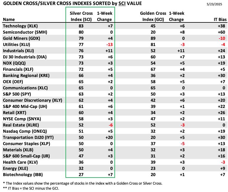
PARTICIPATION TABLES: The following tables summarize participation for the major market indexes and sectors. The 1-Week Change columns inject a dynamic aspect to the presentation. There are three groups: Major Market Indexes, Miscellaneous Industry Groups, and the 11 S&P 500 Sectors.
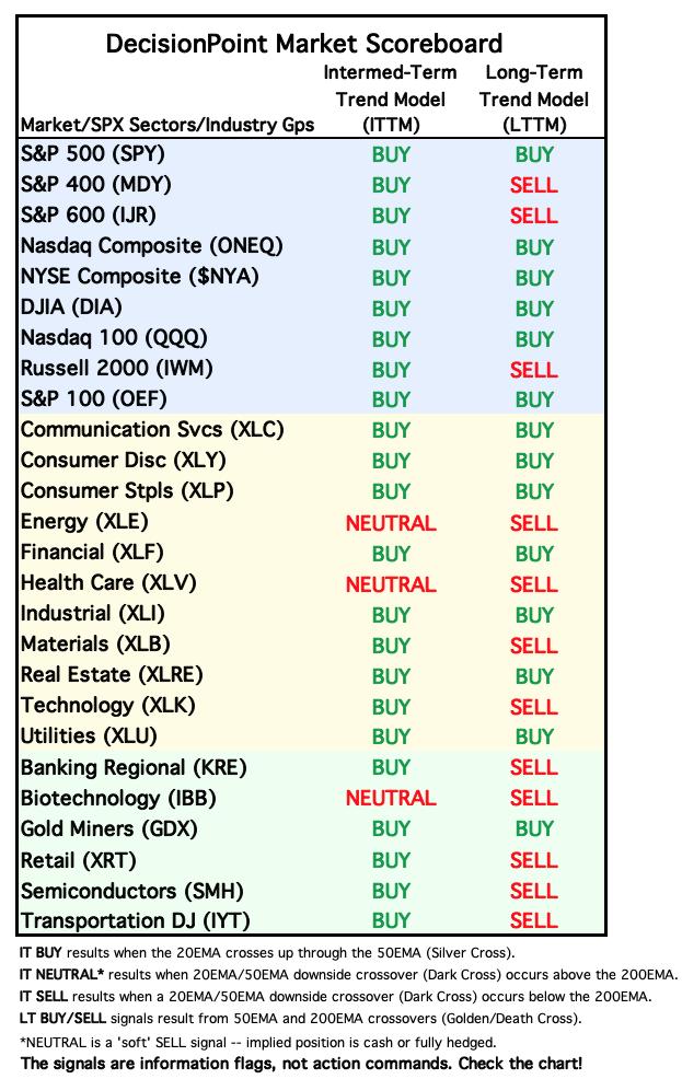
Overall IT Biases remain mostly bullish and positive. The market decline hasn't really done much damage yet. Only a few members lost points on the Silver Cross Index and Golden Cross Index.
The highest IT Bias goes to Semiconductors (SMH) which were the beneficiaries of this market recovery. Their foundation actually improved with an 8 point gain on the GCI. It didn't see an increase in the SCI so they are beginning to stall.
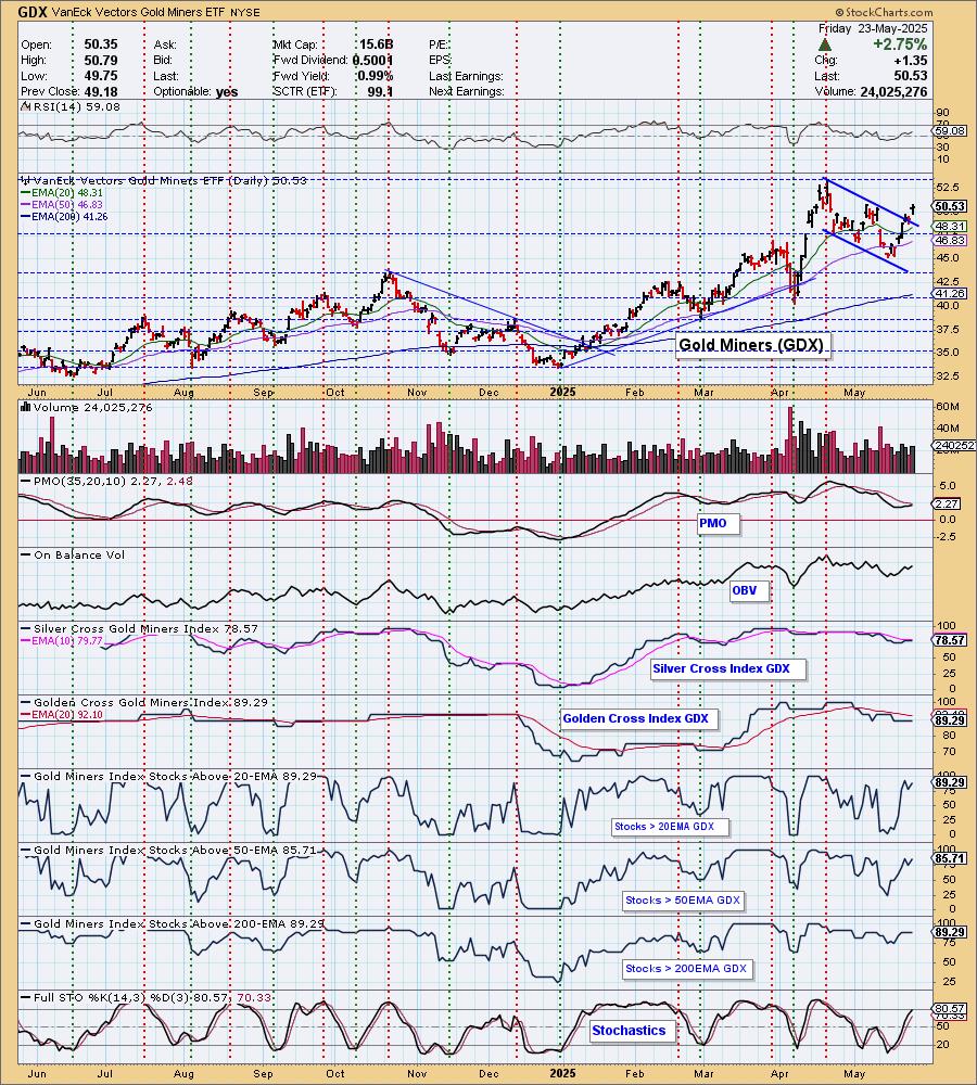
Gold Miners (GDX) may hold the lowest IT Bias but it is currently a major bright spot right now. The SCI is starting to see gains again and based on the bullish setup there, we expect more improvement.
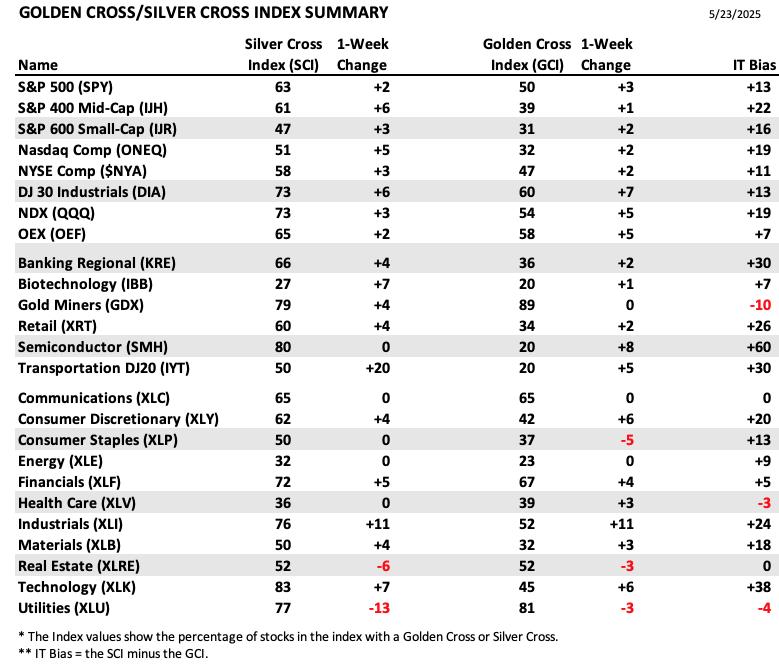
This table is sorted by SCI values. This gives a clear picture of strongest to weakest index/sector in terms of intermediate-term participation.
Technology (XLK) holds the highest SCI reading and it did see a nice gain this week. Unfortunately we know the tides are turning and this sector is likely to absorb most of the downside in the market.
Biotechs (IBB) hold the lowest SCI reading. They saw quite a bit of improvement, but we will say the Healthcare sector in general doesn't look good. We'll see if IBB can buck that trend.
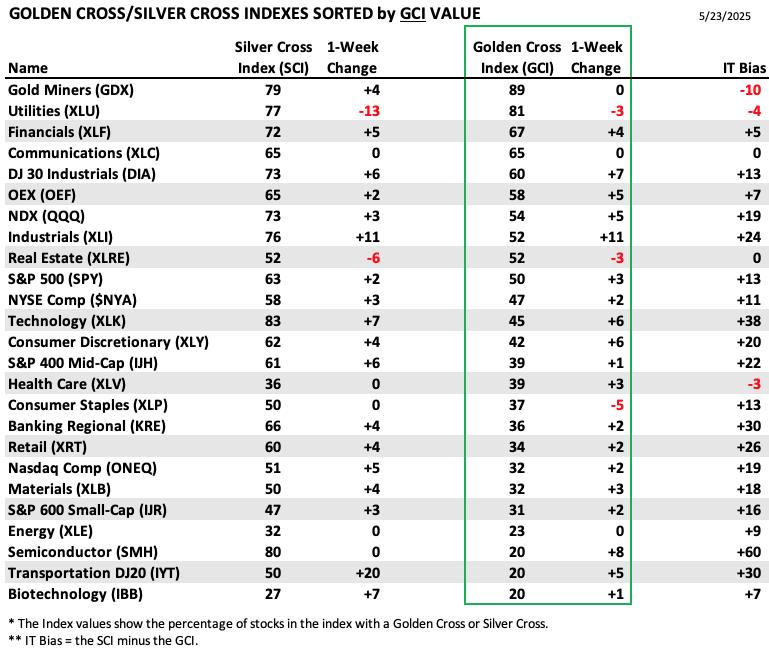
This table is sorted by GCI values. This gives a clear picture of strongest to weakest index/sector in terms of long-term participation.
GDX has the strongest foundation as it holds the highest GCI reading. It didn't see any gains, but it held up despite a recent decline. Now we watch for them to improve further on the back of bullish Gold.
Industrials (XLI) have been in a strong rally up until the recent decline. They saw the best improvement to the SCI, building on an already bullish rally higher. It is pulling back with the rest of the market right now and could see more weakness ahead.
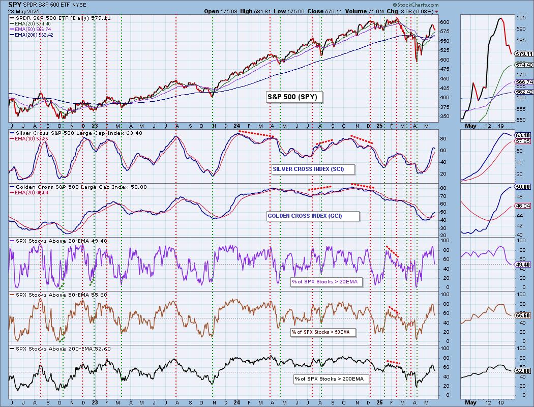
PARTICIPATION CHART (S&P 500): The following chart objectively shows the depth and trend of participation for the SPX in two time frames.
- Intermediate-Term - the Silver Cross Index (SCI) shows the percentage of SPX stocks on IT Trend Model BUY signals (20-EMA > 50-EMA). The opposite of the Silver Cross is a "Dark Cross" -- those stocks are, at the very least, in a correction.
- Long-Term - the Golden Cross Index (GCI) shows the percentage of SPX stocks on LT Trend Model BUY signals (50-EMA > 200-EMA). The opposite of a Golden Cross is the "Death Cross" -- those stocks are in a bear market.
The market bias is BULLISH in the intermediate and long terms.
Participation hasn't inched lower, it is dropping steeply right now. We need these indicators to begin to recover if we want price to recover. None of those indicators are oversold so they have plenty of opportunity to absorb more downside. This week the Silver Cross Index topped bearishly. It is still above its signal line so the IT Bias is still bullish, but this is a very bad sign. It is still holding above our bullish 50% threshold, but given the slide in participation, it is likely to slip beneath its signal line soon. The Golden Cross Index is still on the rise and based on %Stocks > 50/200EMAs being higher, we could see it continue to rise a bit longer. It is above its signal line so the LT Bias is BULLISH.
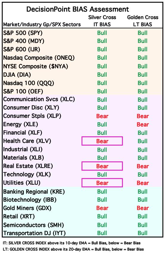
BIAS Assessment: The following table expresses the current BIAS of various price indexes based upon the relationship of the Silver Cross Index to its 10-day EMA (intermediate-term), and of the Golden Cross Index to its 20-day EMA (long-term). When the Index is above the EMA it is bullish, and it is bearish when the Index is below the EMA. The BIAS does not imply that any particular action should be taken. It is information to be used in the decision process.
The items with highlighted borders indicate that the BIAS changed today.
*****************************************************************************************************
CONCLUSION: One good short-term indicator is our Bias Table. It is starting to see Bearish Biases reentering. This is a bad sign. Participation has been slashed and our primary indicators are all in decline. We had been thinking this would be a short decline, but given participation isn't oversold yet and we have an overbought and declining ITBM/ITVM, we think there is more downside that needs to be worked through. Next week is likely to be difficult and that could leak into the intermediate term. The market is still headline driven and White House sensitive. New trade deals may be on the horizon and that would please Wall Street, but we can't count on that. We need to stay cautious.
Erin is 65% long, 0% short. (This is intended as information, not a recommendation.)
*****************************************************************************************************
CALENDAR

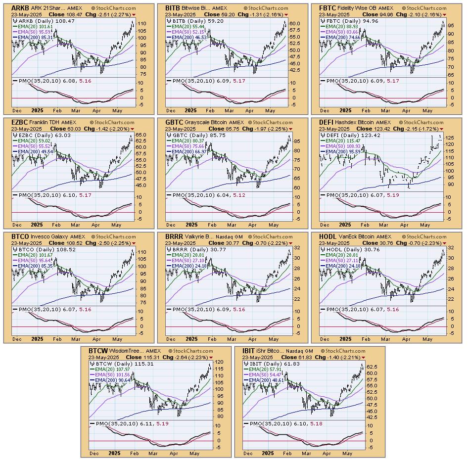
BITCOIN
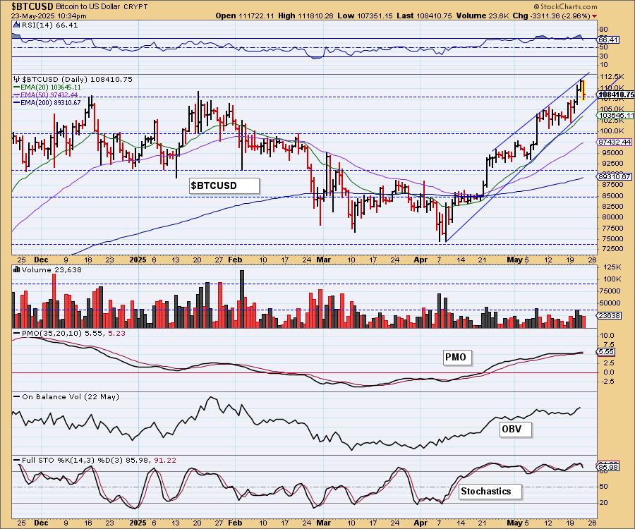
Bitcoin Daily Chart: We have annotated a rising wedge on Bitcoin which does tell us to expect a break in the rising trend. That could happen the next time it tests the rising bottoms trendline so we should be prepared for that. Stochastics did top, but remain above 80. The RSI moved out of overbought territory on today's big decline. The PMO is still rising. The indicators are still bullish enough that we could see the rising trend hold up a bit longer.
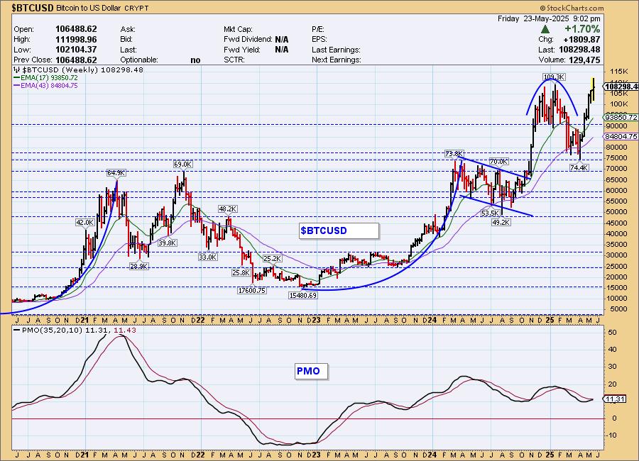
Bitcoin Weekly Chart: Bitcoin is on another near vertical rally that begs for a correction. Based on the weekly PMO, we should see it continue to make all-time highs, but we need to be on the lookout for a break in this steeply rising trend. Those are very hard to maintain.
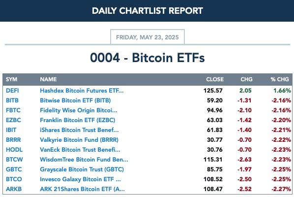
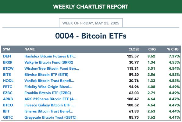
BITCOIN ETFs
Today:
This Week:
INTEREST RATES
Yields tipped over today but we are still looking for them to move higher from here given their strong rising trends. Shorter-term yields are consolidating right now, likely in preparation for another move higher. The Fed could step in later this year and at least help those short-term rates come down if they cut rates. This large trading range is likely to stay intact for a very long time.
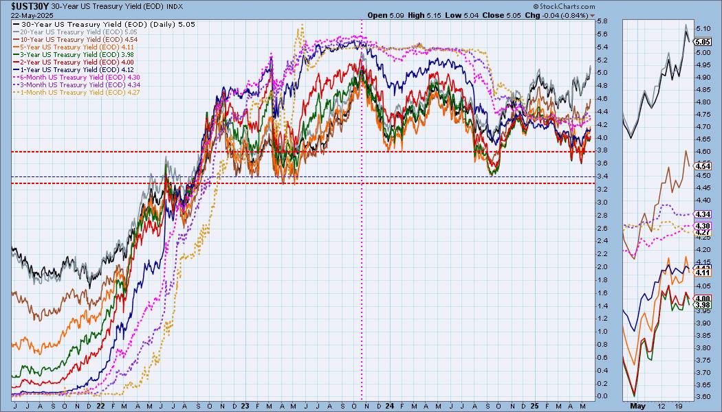
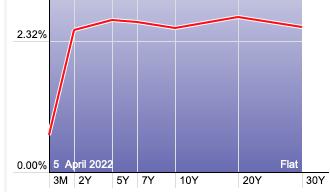
The Yield Curve Chart from StockCharts.com shows us the inversions taking place. The red line should move higher from left to right. Inversions are occurring where it moves downward.
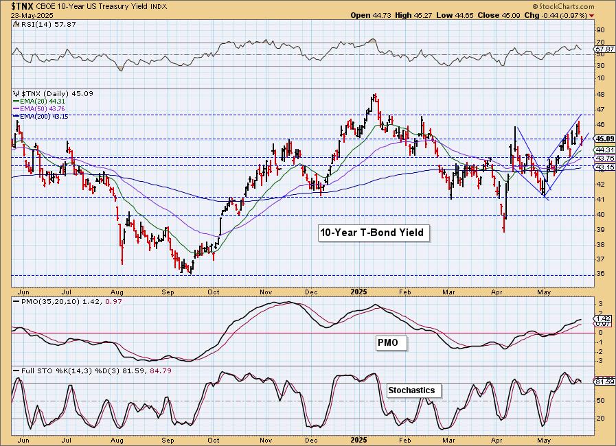
10-YEAR T-BOND YIELD
The rising wedge executed as expected. We were looking at it as a rising trend channel, but adjusted the annotations and found we have a bearish rising wedge. $TNX dropped out of the wedge as expected. The PMO is still rising, but we think in the short term we could see them drop back down to support at 4.4%.
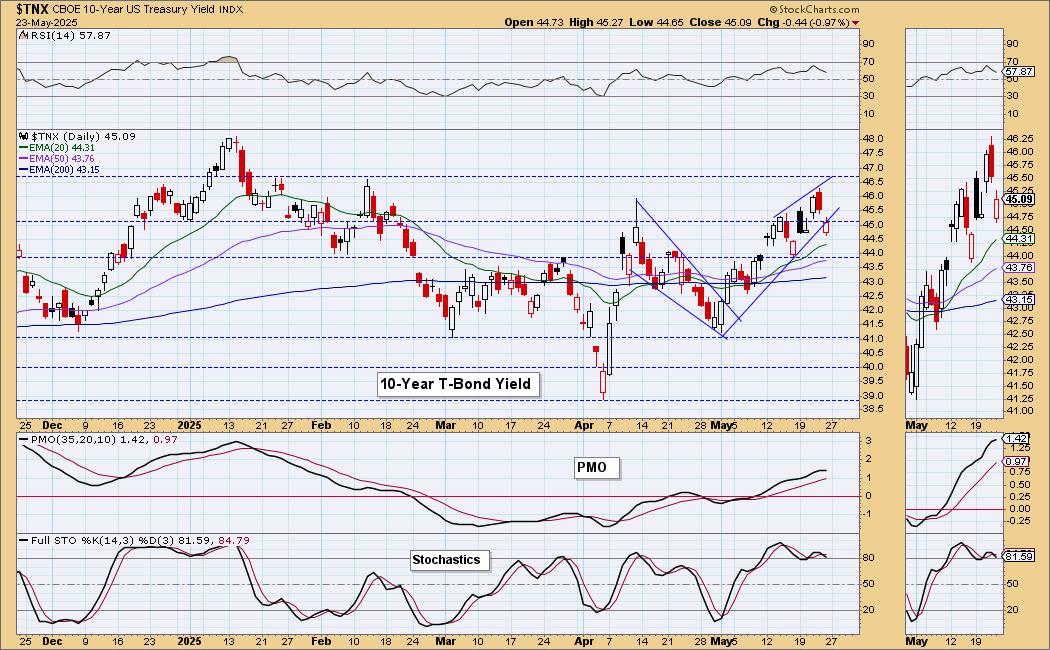
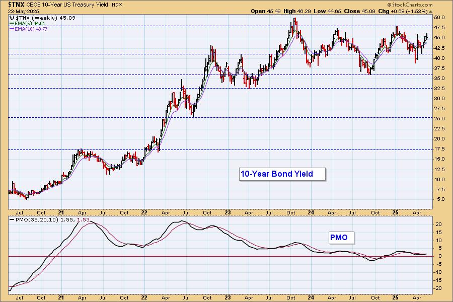
10-Year Bond Yield Weekly Chart: $TNX is in a long-term trading range. The yield did not need to test support before turning back up and that is bullish. We just saw a new weekly PMO Crossover BUY Signal so we are bullish in the intermediate term.
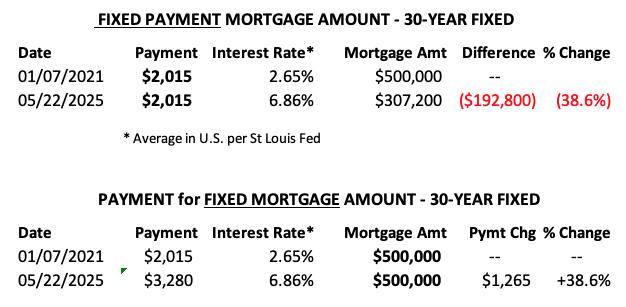
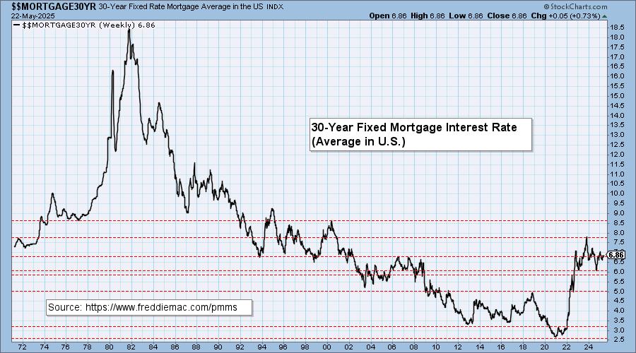
MORTGAGE INTEREST RATES (30-Yr)**
**We watch the 30-Year Fixed Mortgage Interest Rate, because, for the most part, people buy homes based upon the maximum monthly payment they can afford. As rates rise, a fixed monthly payment will carry a smaller mortgage amount, which shuts many buyers out of the market, and potential sellers will experience pressure to lower prices (to no effect so far).
--
This week the 30-Year Fixed Rate changed from 6.81 to 6.86.
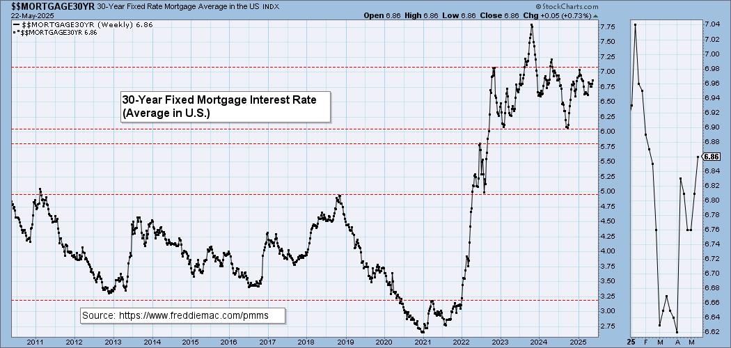
Here is a 50-year chart for better perspective.
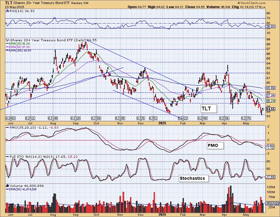
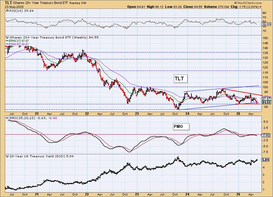
BONDS (TLT)
IT Trend Model: SELL as of 4/14/2025
LT Trend Model: SELL as of 12/13/2024
TLT Daily Chart: TLT is bouncing off support but it remains in a bearish declining trend. We could see a small gain given yields could be turning over, but the 20-year yield is still in a rising trend and we do expect that to continue. Stochastics have turned up so a short-term gain makes sense. We just don't see it getting any traction.
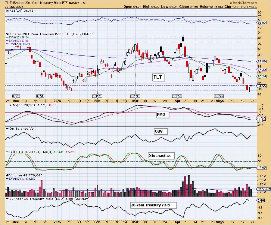
This is an area of very strong support so we aren't surprised it is rebounding right now.
TLT Weekly Chart: On a weekly chart, we see a breakdown out of the rising trend channel. Support is holding for now, but this looks like the base of a descending triangle which implies we will get a breakdown below support. The weekly PMO is in decline on a Crossover SELL Signal which is part of the reason we don't see Bonds rallying out of the declining trend drawn from the 2024 top.
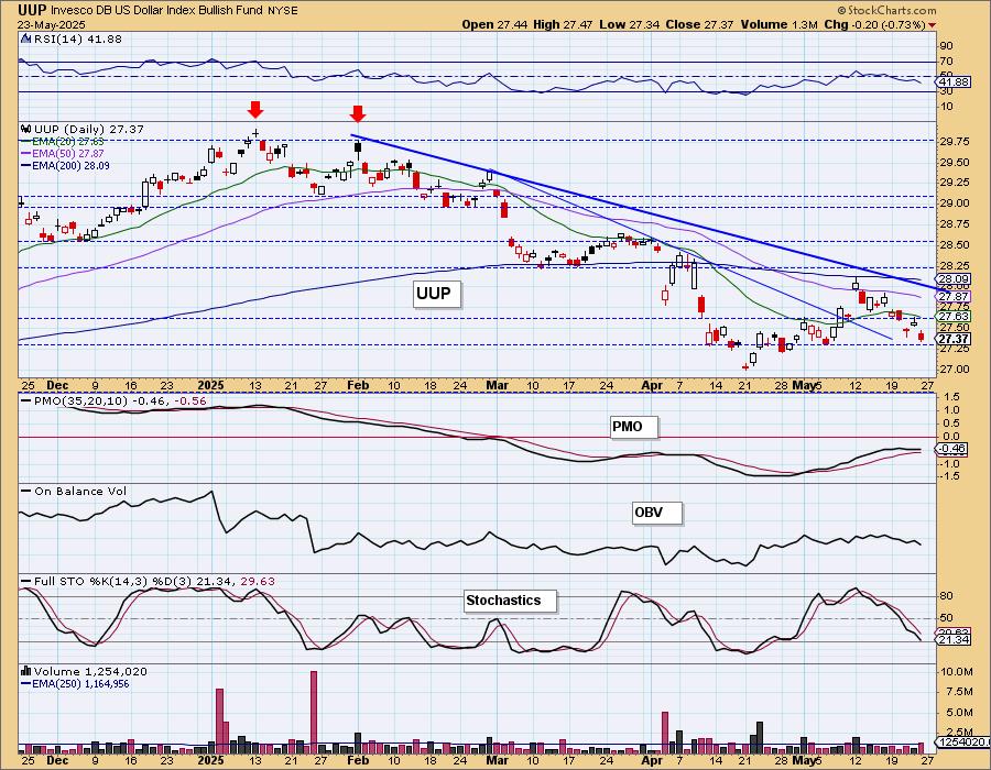
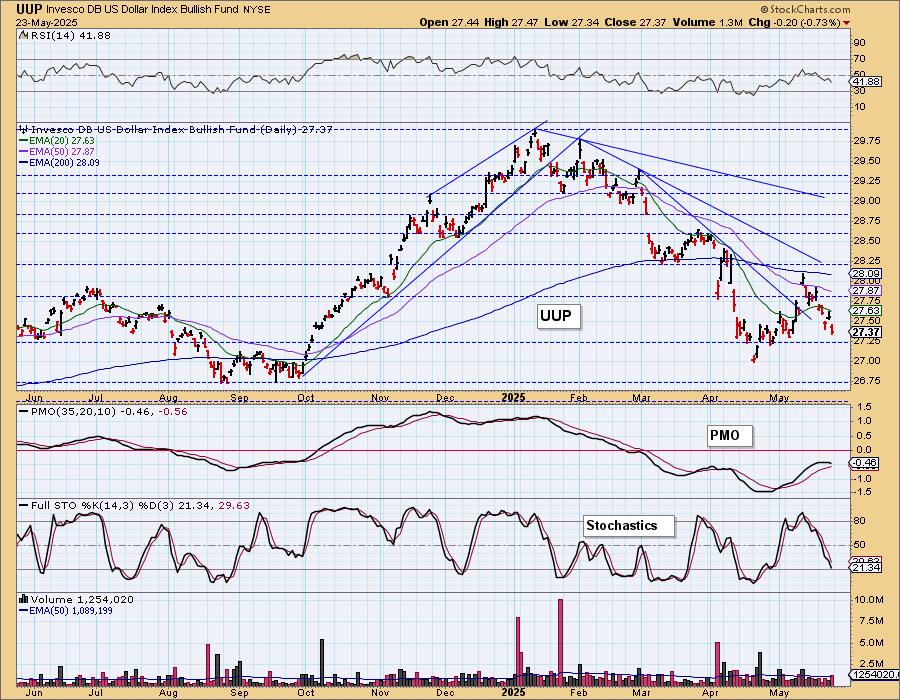
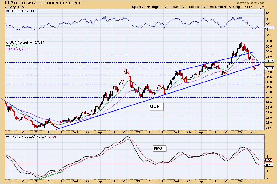
DOLLAR (UUP)
IT Trend Model: NEUTRAL as of 3/5/2025
LT Trend Model: SELL as of 4/25/2025
UUP Daily Chart: The lost its rising trend this week and started on a new declining trend. Support is about to be reached but Stochastics look very negative so we are expecting it to fail there. The RSI is moving lower in negative territory. The PMO is flat, but remains below the zero line. Price did not tap the top of the longer-term declining tops trendline and that is especially bearish. Look for more decline.
UUP Weekly Chart: UUP failed to capture the rising trend again. The weekly PMO has dropped below the zero line. This declining trend looks solid and will likely stick around longer.
GOLD
IT Trend Model: NEUTRAL as of 12/23/2024
LT Trend Model: BUY as of 10/20/2023
GLD Daily Chart: Gold is making its way back to the top of the flag formation. The Dollar is weak and that will put the wind at Gold's back. The RSI is back in positive territory and Stochastics are rising. The PMO looks uncertain. We're looking for a breakout.
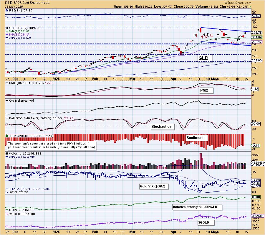
Discounts did get to oversold extremes so sentiment has been very bearish. Typically when we see extremely oversold conditions on discounts, we get rally. This new rally is coming off that extremely bearish sentiment as it should. The correlation remains strongly negative to the Dollar so weakness in the Dollar should show up as strength for Gold.
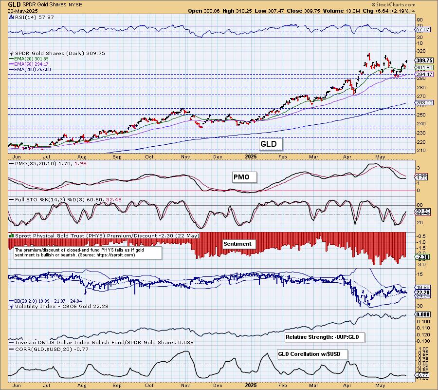
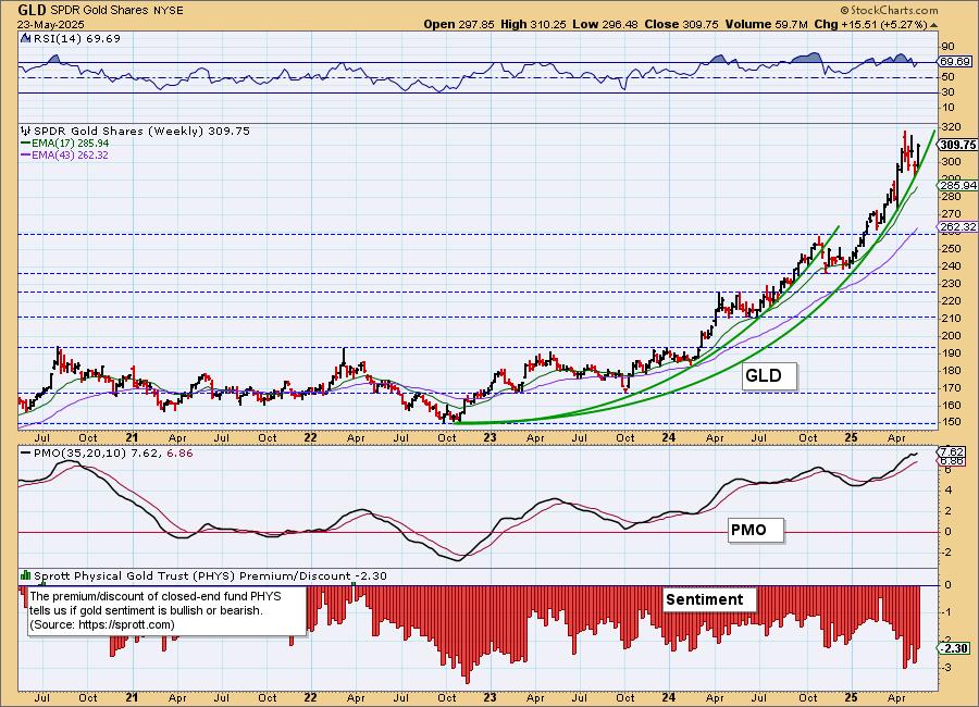
GLD Weekly Chart: We're still looking at a parabolic advance for Gold. The rally has not gotten vertical yet so more upside could be had. It is overdue for at least some consolidation, but fundamentals are just too good for Gold to get bearish.
GOLD MINERS Daily Chart: Gold hasn't broken out of its flag, but Gold Miners have. GDX looks very bullish. The market may be a minefield, but this area looks really good. The RSI is not yet overbought. The PMO is nearing a Crossover BUY Signal. Participation is incredibly strong. The Silver Cross Index isn't above its signal line, but it is reading at a very high 78.57 which is bullish. The Golden Cross Index has an even higher reading. We think the rally will continue alongside Gold.
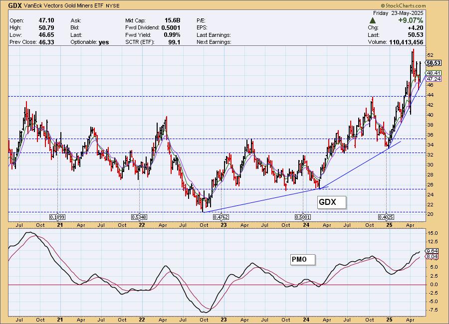
GDX Weekly Chart: We do have a parabolic advance on GDX. The rally isn't vertical yet, but it is getting there. For now this rising trend is holding up and we have that strong breakout above the 2024 high. The weekly PMO is also rising and did accelerate higher this week so we don't see an end to this rising trend yet.
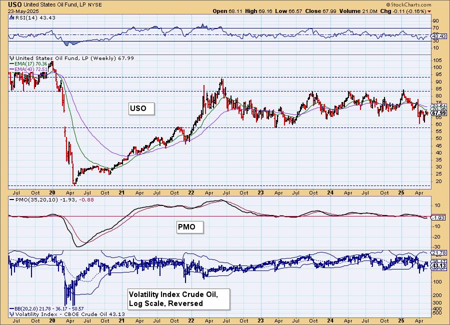
CRUDE OIL (USO)
IT Trend Model: NEUTRAL as of 2/27/2025
LT Trend Model: BUY as of 3/31/2025
USO Daily Chart: Crude Oil is struggling to get back above resistance. It had setup a very nice double bottom, but resistance at the confirmation line of the pattern was too much. It has been dwindling lower ever since. The PMO is rising, but it is below the zero line. The RSI is neutral and Stochastics are falling. We see a small declining trend and we would look for that to continue.
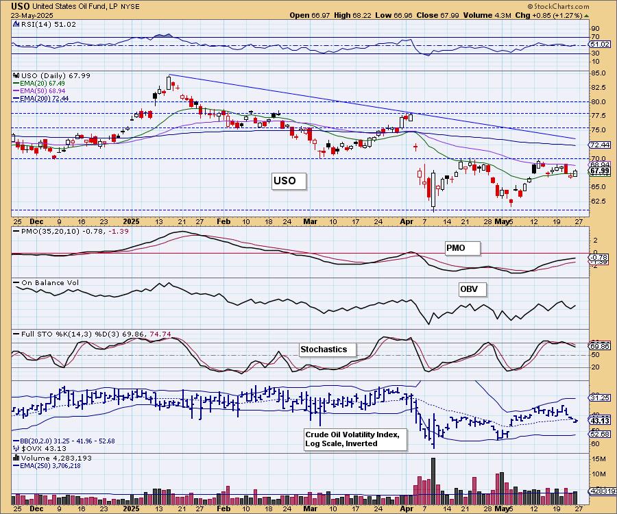
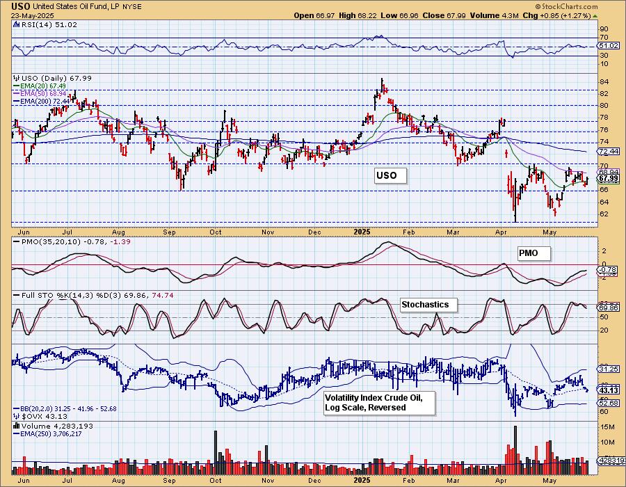
USO/$WTIC Weekly Chart: Price is coming off support. The weekly RSI is negative denoting weakness. The weekly PMO is technically falling below the zero line. The weekly chart seems to suggest this trading channel is in jeopardy. We're not ready to get that bearish on Crude but we do have to note that production levels are fairly high and unless demand picks up (which it could as summer isn't that far away), we think it will drift lower.
Good Luck & Good Trading!
Erin Swenlin and Carl Swenlin
Technical Analysis is a windsock, not a crystal ball. --Carl Swenlin
(c) Copyright 2025 DecisionPoint.com
Disclaimer: This blog is for educational purposes only and should not be construed as financial advice. The ideas and strategies should never be used without first assessing your own personal and financial situation, or without consulting a financial professional. Any opinions expressed herein are solely those of the author, and do not in any way represent the views or opinions of any other person or entity.
DecisionPoint is not a registered investment advisor. Investment and trading decisions are solely your responsibility. DecisionPoint newsletters, blogs or website materials should NOT be interpreted as a recommendation or solicitation to buy or sell any security or to take any specific action.
NOTE: The signal status reported herein is based upon mechanical trading model signals, specifically, the DecisionPoint Trend Model. They define the implied bias of the price index based upon moving average relationships, but they do not necessarily call for a specific action. They are information flags that should prompt chart review. Further, they do not call for continuous buying or selling during the life of the signal. For example, a BUY signal will probably (but not necessarily) return the best results if action is taken soon after the signal is generated. Additional opportunities for buying may be found as price zigzags higher, but the trader must look for optimum entry points. Conversely, exit points to preserve gains (or minimize losses) may be evident before the model mechanically closes the signal.
Helpful DecisionPoint Links:
DecisionPoint Alert Chart List
DecisionPoint Golden Cross/Silver Cross Index Chart List
DecisionPoint Sector Chart List
Price Momentum Oscillator (PMO)